
Abstract
The objective of this chapter is to introduce the concepts of calculated Datapoints and key performance indicators, which form the basis of statistical process control. In particular, both operate on Datapoints, but process them in a different way. Indeed, the former transform the incoming data in a static way, i.e., without taking into account its historical values. Contrarily, the latter process the data within a specified period and form the basis for further statistical analysis, e.g., pertaining to location and variability. Having such tools, a set of widget charts is introduced, which enable data visualization and analysis. Subsequently, practical examples concerning the development of statistical control charts are presented. The chapter is concluded with a set of training exercises, which validate the introduced knowledge.
You have full access to this open access chapter, Download chapter PDF
4.1 Data Processing Definitions
The objective of the preceding chapters was to introduce essential features of KIS.ME (cf. Chap. 2) and provide a list of typical logistic use cases for which it can be employed (cf. Chap. 3). Irrespective of the kind and structure of the system being developed, it involves a number of KIS.Devices, which provide several Datapoints (see Sect. 2.7). To make this chapter self-contained, let us recall that a Datapoint is a read only variable, which corresponds to a possibly time-varying property of a KIS.Device. It can be also defined as an exchanged value between the KIS.Device and KIS.MANAGER. In the preceding chapters, Datapoints were employed for developing the rules governing system behaviour as well as to graphically visualize it using Datapoint Charts. In this chapter, it will be shown how to process and analyse Datapoints. Let us recall that they are updated based on events associated with their current status. This means that, if the status of KIS.Devices changes, then an appropriate update message is sent to KIS.MANAGER. Having access to Datapoints, one can process them further by using scripts prepared using the FLEX programming language (see Appendix A). Such a processing procedure can be performed either instantly (real time) or over a predefined processing period which can be set to either 15, 30 or 60 min. For that purpose, let us introduce two definitions:
-
Calculated Datapoints (CDPs): FLEX language-based scripts enabling instant processing of Datapoints,
-
Key performance indicators (KPIs): FLEX language-based scripts enabling processing of Datapoints over a predefined processing period.
The concept of CDPs is rather straightforward, and as a simple example one can imagine a CDP script transforming frequency of KIS.BOX digital input from mHz to an equivalent period, i.e., \(T=\frac{1}{f}\), where T stands for the period and f is the frequency. Contrarily, the concept of KPIs requires further explanation. For that purpose, let us consider principles for the calculation and analysis of KPIs, which are presented in Fig. 4.1. It is possible to define a number of scripts performing a number of calculations based on selected Datapoints (cf. Calculation 1 and Calculation 2 in Fig. 4.1). Such KPI scripts can, of course, be defined over different processing periods while the results of the calculations are available at the and of such periods. Finally, they can be displayed and analysed using various widgets (see Sect. 2.5).

Principles for the calculation and analysis of KPIs

Sample KPI aggregation calculations
KPI: An introductory aggregation example
Let us consider sample KPIs, which provide some calculation results every 15 min. Such a process is illustrated in Fig. 4.2. The results provided can be further aggregated using various strategies. As can be observed, each KPI is calculated using 15-min processing period. From the start of the process one can observe that there are four such 15 min processing time windows. This clearly means that sample aggregations of the sum and average values of the calculation being considered can be summarized in Table 4.1.
The aggregation mechanism is to be clearly illustrated and explained in the subsequent sections of this chapter.
Furthermore, FLEX language commands available in KIS.ME are divided into five groups, which are given in Table 4.2. As a final conclusion, it can be stated that the Aggregations and Intervals commands are limited to KPIs only (see Appendix A for a detailed explanation).

Transition rule Green\(\rightarrow \)Red for KIS.BOX Red

Transition rule Red\(\rightarrow \)Green for KIS.BOX Red

Implementation of the Counterdmo CDP
4.1.1 Calculated Datapoints
The objective of this section is to provide a practical example concerning the design of sample CDPs. The example is implemented in Workshop 1 and uses KIS.BOX Red. For illustrative purposes, two simple rules were implemented, which are presented in Figs. 4.3 and 4.4. These two rules transfer KIS.BOX Red from one state to another. These states correspond to either the green or the red color of the KIS.BOX Red Button 1 operational LED. The same rules were implemented for KIS.the BOX Red Button 2 operational LED, but they are omitted for brevity. In both cases, the rule trigger is associated with pressing either the first or the second KIS.BOX Red button. Finally, the initial states of are initialized using the KIS.BOX Red digital twin (cf. Sect. 2.6), i.e., the corresponding operational LED colors are set to green. Let us start with employing a sample command, which is called Counter and belongs to the Miscellaneous group (cf. Appendix A.15). The syntax and the functionality of the above command can be summarized as follows:
and
where x is a possibly varying value while \(x_c\), \(x_p\) signify x at \(c>p\) time instances, whilst \(b_p\) stands for a possibly time-varying bias. Let us proceed to defining a CDP employing such a command. For that purpose, KIS.BOX Red should be selected from the available assets (Main menu\(\rightarrow \)Assets). Subsequently, one should select the KPI/Data processing

button and use the Create blank option

. As a result, a new Data Processing Definition can be formulated as the one presented in Fig. 4.5. The data processing definition was selected to be CDP and is called Counterdmo. Its entire implementation boils down to y=Counter[x,0], with x being an input Datapoint button1ColorKpiDuration. According to the above-described rules (cf. Figures 4.3 and 4.4), x may have two values only, i.e., 3 (green color) or 5 (red color). Thus, according to (4.2), Counterdmo can return only two values, i.e., either \(y=5-3=2\) (\(x_c=5\), \(x_p=3\)) or \(y=0+3-5=-2\) (\(x_c=3\), \(x_p=5\), \(b_p=0\)). This means that Counterdmo simply calculates the difference between consecutive values of x. To visualize this graphically, let us include the Datapoint Chart within the KIS.BOX Red dashboard (see Sect. 2.7). The resulting plot is portrayed in Fig. 4.6. Finally, it is important to underline the fact that, if x remains unchanged during a possible reconnection of the KIS.Device, then \(x_p=x_c\), and hence \(y=0\) is obtained. Let us proceed to a more advanced usage of the Counter command. Counterdmo can be easily redefined with a new syntax, i.e., y=Counter[x,x]. According to (4.2), Counterdmo can return only two values, i.e., either \(y=5-3=2\) (\(x_c=5\), \(x_p=3\)) or \(y=5+3-5=3\) (\(x_c=3\), \(x_p=5\), \(b_p=5\)). These results are visualized in Fig. 4.7. Let us consider another command, which simply filters the data by permanently returning the last value satisfying a given logical formula. For that purpose, let us define another CDP, which will be called Filterdmo and will employ the following syntax: y=Filter[Equal[x,3]] (or, equivalently, Filter[x==3]). If x can be either 3 or 5, then after the first occurrence of 3 the answer of the Filterdmo CDP remains at the level of 3 (see Fig. 4.8). It should be noted that the argument of the Filter command can be any logical relation, e.g., \( x>=3 \& \& x<=5\).

Variable x (red) and Counterdmo CDP calculation (green) for \(y=\text{ Counter }[x,0]\)

Variable x (red) and Counterdmo CDP calculation (green) for \(y=\text{ Counter }[x,x]\)

Variable x (red) and Filterdmo CDP calculation (green) for \(y=\text{ Filter }[Equal[x,3]]\)
Plotting workers’ idle state
Let us consider two workers performing identical works at a single assembly station. Both of them use KIS.BOX Red to indicate two states:
-
Assembly in progress: exemplified by the red color of operational LEDs,
-
Idle: exemplified by the green color of operational LEDs.
This means that Worker 1 uses KIS.BOX Red Button 1 while Worker 2 utilizes KIS.BOX Red Button 2. The rules for switching between assembly and idle states are given in Figs. 4.3 and 4.4. The problem is to indicate the time in which both workers are in idle state, i.e., the Button 1 and Button 2 operational LEDs are green. Let us consider a CDP performing such an action, which is called Idle and is given in Fig. 4.9. It uses input variables x and z, which are defined with two KIS.BOX Red Datapoints, i.e., button1ColorKpiDuration and button2ColorKpiDuration, respectively. The calculation involving such variables utilizes the If[] command (cf. Appendix A). If both x and z equal 3, then the KPI returns 1 and 0 otherwise. Note that 1 signifies the fact that both workers are in idle state, while the opposite situation means that at least one of them is performing an assembly process. As a result, Figs. 4.10 and 4.11 present the state evolution of Worker 1 and Worker 2. Finally, Fig. 4.12 clearly indicates the time periods for which both workers are in idle state. In spite of the simplicity of the CDP, it may have various practical applications, i.e., optimization of work distribution, part delivery schedules, etc.

Idle CDP

States of Worker 1

States of Worker 2

Evolution of the Idle CDP
The examples presented in this section are very simple and involve one- line commands. There are, of course, no restrictions behind developing multiple-line CDPs. Moreover, own variables can be used without any prior declarations, i.e., a variable begins its lifetime after assigning to it a value, which is realized by the following program:
Sample two-line code

> CDPs versus the Datapoint range
Note also that each CDP can operate with Datapoints of one KIS.Device only. It is possible to include Datapoints from different KIS.Devices indirectly, i.e.,
-
by using digital inputs of the KIS.Device for which the CDP is being developed;
-
by Rule engine to transmit Datapoint values the different KIS.Devices to the one for which the CDP is being developed.
Finally, let us recall that a complete list of the FLEX commands along with representative examples is given in Appendix A.
4.1.2 Key Performance Indicators
As indicated in Figs. 4.1 and 4.2, the functional nature of KPIs is significantly different than the one of CDPs. Indeed, CDPs process incoming data directly without any aggregation mechanisms, e.g., summation (cf. Figure 4.2). Thus, the objective of this section is to provide illustrative design examples pertaining to such aggregations as well as working on data within predefined processing periods.
Introduction to KPI design
Let us consider a worker performing an assembly process (cf. Sect. 4.1.1). KIS.BOX Red is used in this case to indicate two states:
-
Assembly in progress: exemplified by the red color of the KIS.BOX Red Button 1 operational LED,
-
Idle: exemplified by the green color of the KIS.BOX Red Button 1 operational LED.
The rules governing transitions between these two states are given in Figs. 4.3 and 4.4. Similarly as in Sect. 4.1.1, one can also easily configure a Datapoint Chart displaying the successive transitions between these two states, which simply includes the values of the button1ColorKpiDuration Datapoint. The objective of this introductory KPI example is to provide a periodic calculation of the number of products being assembled. Thus, under a state transition strategy being used, the KPI should periodically calculate the number of transitions of the KIS.BOX Red Button 1 operational LED from red to green. To settle the KPI implementation, the simple instruction y=Sum[If[x==3,1,0]] is used, where x stands for the button1ColorKpi Datapoint (see Appendix B). The remaining KPI parameters are as follows:
-
Processing period: 15 min;
-
Processing start: the data of starting calculations of the KPI, which is 09/22/2021;
-
Starting hour: the starting hour is 14.00;
-
Initial value: no values from previous periods are taken into account.
A new KPI design can be initiated in the same way as that of a CDP, and hence the resulting configuration window is given in Fig. 4.13, whilst the new KPI is called Sumdmo. It should be noted that KPIs cannot be displayed with the Datapoint Chart. This is caused by the fact that they should be aggregated using a desired operation (cf. Fig. 4.2), which can be one of the following:
-
SUM,
-
MIN,
-
MAX,
-
AVERAGE.
Such an aggregation can be achieved with suitable widgets (Sect. 2.5), which will be discussed in detail in Sect. 4.3. Following the approach described in Sect. 2.5, let us introduce the Single Value KPI widget, which will accompany the Datapoint Chart displaying the evolution of the button1ColorKpiDuration Datapoint. A sample configuration of the above widget is presented in Fig. 4.14. As can be observed, the aggregation type is SUM. Moreover, the date range of interest is the current day. However, according to Fig. 4.13, the Sumdmo KPI begins its lifetime at 14.00. Figure 4.15 presents the obtained results, which were recorded during one hour. They are summarized in Table 4.3 and can be easily calculated using the Datapoint Chart, i.e., the number of transitions from red to green (5–3). Thus, it is evident that the SUM of KPI values is equal to 10 whilst the MIN and MAX are equal to 2. As a consequence, the AVERAGE is equal to 2.5. Irrespective of the relative simplicity of the example being considered, it may have several practical applications pertaining to production/transportation flow and efficiency monitoring.

Implementation of the Sumdmo KPI

Configuration of the single value KPI widget

Sumdmo KPI aggregation
The objective of the remaining part of this section is to provide some template KPIs along with their prospective applications, which pertains to
-
monitoring task realization durations,
-
counting the number of button presses,
-
counting the number of assembled products per time unit,
-
first pass yield (FPY), i.e., the ratio between outgoing and incoming process units.
Monitoring task realization durations
Let us reconsider a worker from the previous example, which is equipped with KIS.BOX Red indicating its current working mode, i.e., either assembly or idle periods. The first objective is to implement the KPI which will calculate the sum of the assembly times within a 15-min processing period. Let us start with selecting an appropriate Datapoint, which is simply button1ColorKpiDuration. Thus, during the assembly process, it returns 5, which corresponds to the red color. This means that the implementation of the KPI should boil down to the following steps:
-
1.
Determine assembly states within the processing periods along with their durations.
-
2.
Sum all the above durations.
-
3.
The durations are expressed in milliseconds, and hence they should be converted to seconds and then rounded appropriately.
The implementation covering all the above steps is presented in Fig. 4.16, whilst a detailed explanation behind each command is given in Appendix A. Note that the calculation of the Duration KPI is started at 12.00 and no values from previous processing periods are taken into account. Let us proceed to the second objective, which pertains to calculating
-
the total sum of assembly durations for all processing periods,
-
the total average of assembly durations for all processing periods,
-
the minimum sum of assembly durations per processing period,
-
the maximum sum of assembly durations per processing period.
As previously, the above tasks can be easily implemented by installing the KPI Single Value widgets within the dashboard. Each of them should, of course, perform a different aggregation, i.e., SUM, AVERAGE, MAX, and MIN. Finally, a sample implementation along with the obtained results is presented in Fig. 4.17. Note that the maximum sum of durations per a processing period can be equal to \(15 \times 60 = 900 [s]\), which expresses the situation in which the assembly is permanently performed during 15 min. Contrarily, the minimum sum of durations per processing period can be equal to zero, which means that no assembly was performed within a processing period.

Implementation of the Duration KPI

Duration KPI aggregations
Number of assembled products per time unit
The example being considered operates within the same infrastructure as the previous one. Let us imagine that each push of a button corresponds to one product being assembled. Thus, let us start by selecting an appropriate Datapoint, which is button1Pressed and has an alias name x within the KPI definition. This Datapoint operates in a very specific way, i.e., it stores the timestamps corresponding to the beginning of pressing actions only. Thus, it is enough to calculate the number of logical true values of x within the processing period. Subsequently, the accumulated number of transitions has to be normalized over the time interval spent on realizing a given task. The above-stated objective can be realized with the KPI given by the following program:
Product per minute KPI

The first line is responsible for calculating the number of products, i.e., the total of KIS.BOX touches. The second one normalizes ProductSum over the respective time interval. Finally, the achieved results are given in milliseconds, and hence they have to be further normalized. Note also that the rounding operation is introduced to get a result, which is an integer value.
First pass yield
Let us consider a conventional product quality check point. It has two digital outputs, which are directly connected with KIS.BOX Red digital inputs. They provide a false–true–false sequence when a products passes (Input 1) or fails (Input 2) the quality test. Let us start with noting that Input 1 and Input 2 are represented by two Datapoints, i.e., input1Status and input2Status, respectively. Let us define two variables which are to be associated with these Datapoints, i.e., passed and failed. Let us recall that the percentage FPY is expressed by the ratio
where p and f stand for the number of failed and passed products, respectively. Finally, the KPI implementing (4.3) is given by the following:
First pass yield KPI

As in the previous example, the first two lines are responsible for calculating the p and f underlying (4.3). Subsequently, the total sum of products being tested is obtained. Finally, FPY is calculated according to (4.3) along with suitable rounding.
> Sharing CDPs and KPIs
Using Main menu\(\rightarrow \)Assets, and then selecting the desired KIS.Device, one can choose KPI/Data processing

. As a result, a full list of KPIs and CDPs defined for this KIS.Device is displayed. Moreover, each of them can be shared with compatible KIS.Devices of a designed asset group. For that purpose, the Share option should be used and the desired asset group chosen, e.g., Workspace 1. Once the sharing procedure is performed, the selected CDPs/KPIs are visible after using KPI/Data processing

within a designated asset group. However, sharing should be interpreted in such a way that a given CDP/KPI is inherited for all assets in a designated asset group. Indeed, Datapoints used within the shared CDP/KPI are taken from the inheriting KIS.Device instead of the original one.
4.2 Statistical Measures: Location and Variability
The objective of this section is to introduce essential concepts of statistical process control (SPC). However, before going into details, its is necessary to define a process [1,2,3] as follows:
> Process
A process is everything what is needed for transforming an input into an output for a customer.
Thus, SPC can be perceived as a quality control method, which employs statistical approaches to observe and control a process. This may result in keeping the desired process efficiency, assembling the demanded number of products with a desired quality, etc. This means that SPC deals with understanding and managing variability associated with a given process. For that purpose, a process parameter, i.e., a quantitative variable, which reflects the process quality must be selected. Irrespective of the process parameter being observed and controlled, it obeys some distribution, which has three crucial features:
-
shape,
-
central location,
-
variability.
Concerning the shape, the most common approach is to assume that the process parameter is normally distributed. Such a distribution is portrayed in Fig. 4.18. The Central location can be briefly perceived as an expected process parameter value whilst the variability signifies its spread around this value. Let us start with recalling the crucial measure of location, which is simply the mean or average value given by a well known formula:
where \(x_i\) is the i-th process parameter observation whilst n stands for the number of observations and \(\bar{x}\) is the mean value. This measure can be easily calculated by forming the KPI incorporating the Mean command (cf. Appendix A). Another useful location measure is a median , which is the parameter value at which half of the observations fall above and half below. However, KIS.ME does not provide a direct command which can be used to calculate that. Fortunately, for that purpose, percentiles, implemented with the Percentile command, can be efficiently employed.

Process parameter x versus its normal distribution function f(x) (to do)
> Percentile
A percentile is simply defined as a statistical measure indicating the process parameter value below which a given percentage of observations in a group of observations fall. Thus, the 50th percentile is the value below and over which 50% of the process parameter observations can be found. As a result, the KPI calculating the median value can be simply implemented as m=Percentile[x,50], where m stands for the median whilst x is the set of observations being analysed. Note also that all observations x are at or below the 100th percentile, i.e., m=Percentile[x,100].
Let us proceed to variability measures. The most common ones are the standard deviation, the variance and the range. The first of those is defined as
where \(\sigma \) signifies the standard deviation, which can be calculated by defining the KPI involving sigma=Stdev[x]. The second variability measure is simply a square of the first one, i.e., \(\sigma ^2\). Finally, the range is defined as the difference between the maximum and minimum values of \(x \in \mathbb {X}\). Thus, the resulting KPI should be implemented with range=Max[x,x]-Min[x,x]. Having measures of location and variability, one can distinguished two possible SPC states of the process [1]:
-
Process in control: The process is in the state of control if it is subject to common cause variations only, which can be expected in any set of observations \(\mathbb {X}\).
-
Process out of control The process is in the out-of-control state if it subject to both common and special cause variations. Thus, apart from the inevitable random and typical fluctuations, other unappealing factors affect process parameters.
A periodical evolution of a sample distribution of the process in control parameter is presented in Fig. 4.19. Even if a given process parameter is at an unacceptable level, e.g., FPY (4.3) is equal to 70%, one can be sure that such results can be expected for the subsequent time periods. Indeed, when one says that the process is in control, then this does not mean that it is working perfectly, but simply that it is predictable or periodically stable. Finally, improvements can be achieved by suitable rearrangement or optimization of the process. This is, however, beyond the scope of this section.

Periodical evolution of the process-in-control parameter distribution

Periodical evolution of the process-out-of-control parameter distribution
If the process parameter distribution changes with each periodically collected set of observations, then one has the process out of control. Such a situation is illustrated in Fig. 4.20. In practice, several processes obey such periodical behaviour. Thus, it is obvious that special cause variations should be identified and removed if possible. Similarly, the influence of common cause variations can be removed by a suitable analysis and improvement of the process.
Mean and standard deviation of assembly durations
Let us reconsider the example presented in Sect. 4.1.2 pertaining to monitoring task realization durations. The worker realizing such tasks is equipped with KIS.BOX Red indicating its current working mode, i.e., either assembly or idle periods. The objective is to implement KPIs calculating the mean and standard deviation of durations corresponding to the assembly mode. Moreover, the calculations should be realized within 15-min processing periods. As previously, the button1ColorKpiDuration Datapoint is used for calculation purposes whilst the results are visualized with the KPI Single Value widget. In particular, the widget should provide the maximum of the mean and standard deviation obtained during the last hour. The configuration of such a widget was described in Sect. 4.1.2, and hence it is omitted. Before going to the KPI implementation, let us also recall that the KIS.BOX Red Button 1 operational LED is governed by two rules, which change its color between red (assembly mode) and green (idle mode) with the trigger associated with pressing the respective button. Thus, during the assembly process the button1ColorKpiDuration Datapoint returns 5 (red color) and 3 (green color). Let us proceed to the KPI implementation, which starts by defining x as an alias name of the button1ColorKpiDuration Datapoint. As a result, the KPIs calculating the mean and the standard deviation of the assembly durations are given by the following programs:
Mean of assembly durations

Standard deviation of assembly durations

Finally, a sample of the performance of the above KPIs is presented in Fig. 4.21.

Sample maximum mean and standard deviation of assembly durations
Taking into account the discussion presented in this section, the results in Fig. 4.21 clearly show that the assembly process is realized with greater duration variability (cf. Max standard deviation). This clearly means that such a process has to be suitably improved to get more predictable and less variable results. For that purpose, a set of widget control charts is to be introduced in the subsequent section.
4.3 Understanding process performance with widgets: A practical way to statistical control charts
The objective of this section is to provide a practical guidance on using four widget control charts:
-
KPI Aggregated Chart;
-
KPI Single Value Column;
-
KPI Pie Chart;
-
KPI Single Period Chart.
They can by associated with any dashboard, which is located either in assets or asset groups (cf. Sect. 2.5). The first option can be accessed via Main menu\(\rightarrow \)Assets\(\rightarrow \)Edit dashboard\(\rightarrow \)Add widget, which results in the view portrayed in Fig. 4.22. The second option is to follow Main menu\(\rightarrow \)Asset groups and then select the desired workspace. Subsequently, Edit dashboard\(\rightarrow \)Add widget have to be chosen, which yield the view presented in Fig. 4.23. Irrespective of the selected design approach, the quadruple of control chart widgets possesses the same functionality, which is to be discussed in the subsequent part of this section.

KPI control charts within the asset dashboard

KPI control charts within the asset group dashboard
KIS.Device-based data generation
The control chart widgets being discussed in this section require data obtained with Datapoints of a given KIS.Device. Thus, to perform a unified presentation of all widgets, which can be easily reproduced, the following data generation approach is proposed:
-
Environment: It is defined with Workspace 1 and the dashboard of KIS.BOX Red.
-
Triggers: The triggers are based on the KIS.BOX Red Button 1 operational LED color, which can be either red or green. Additionally, each trigger is fired after one minute.
-
Actions: The associated actions are associated with changing the KIS.BOX Red Button 1 operational LED to an opposite value.
-
Initial condition: The KIS.BOX Red Button 1 operational LED is initialized with the associated digital twin (see Sect. 2.6), i.e., its color is set arbitrarily to either green or red.
The above functionality can be easily implemented using two rules, which are presented in Figs. 4.24 and 4.25. As a result of employing these, cyclically (every minute) changing values of the button1ColorKpiDuration Datapoint are generated, which are presented in Fig. 4.26. These data are to be used for statistical processing and visualization using the control chart widgets. Although the data presented in Fig. 4.26 looks like a uniform one with each cycle equal to one minute, there are some small discrepancies between cycle durations. This is related to the wireless transmission between the KIS.Device and KIS.MANAGER. Such behaviour is to be statistically analysed in the subsequent part of this section. This, however, requires defining suitable KPIs. In particular, it is proposed to employ two KPIs which will calculate mean values of the KIS.BOX Red Button 1 operational LED color durations over a 15-min processing period. Since there are only two colors, i.e., red and green, these KPIs are implemented as follows (with x being an alias of button1ColorKpiDuration):

First rule for KIS.BOX-based data generation

Second rule for KIS.BOX-based data generation

KIS.BOX-based data sequence
Mean of red color durations

Mean of green color durations

4.3.1 Single Value Column Chart
The objective of this section is to provide practical guidelines for using the KPI Single Value Chart, which is simply a bar plot displaying an aggregated value of a selected KPI within a specified aggregation period (cf. Figure 4.2). This widget has the following properties:
-
Headline: the widget name, displayed on it;
-
Label: the name of the bar plot;
-
KPI name: the selected KPI name;
-
Unit: the KPI unit, e.g., seconds [s];
-
Date range: the selected, possibly historical, date and time range, e.g., a working shift;
-
Aggregation type: KPI values calculated within processing periods are aggregated within the date range using one of the following aggregations: sum, average, max, min (cf. Figure 4.2);
-
Zones: color zones associating the value range of the bar plot with the selected color.
Fig. 4.27 illustrates a sample bar plot. It displays the KPI values corresponding to the mean KIS.BOX Red Button 1 operational LED green color durations. They are aggregated using the average aggregation operator between 8:00–16:00 h on October 13th, 2021.

Sample KPI single value column chart

Sample KPI single period chart
4.3.2 Single Period and Pie Charts
The section aims at describing the way of using the KPI Single Period Chart, which is a multiple bar plot displaying an aggregated value of selected KPIs within a specified aggregation period (cf. Fig. 4.2). This widget has the following properties:
-
Headline: the widget name, displayed on it;
-
KPI name: the selected KPI names, whose values are used to form multiple bar plots;
-
Label: the name of bar plot;
-
Color: the color associated with the bar plot;
-
Unit: the unit of the KPIs, e.g., seconds [s];
-
Date range: The selected, possibly historical, date and time range, e.g., a working shift;
-
Aggregation type: KPI values calculated within processing periods are aggregated within the date range using one of the following aggregations: sum, average, max, min (cf. Figure 4.2);
-
Stack KPI: Defines the display form of bars (either stacked or separated).
Figure 4.28 presents a sample two bar plot. It displays two KPI values corresponding to the mean KIS.BOX Red Button 1 operational LED durations of either the green or red color states, respectively. They were aggregated using an average aggregation operator between 8:00–16:00 h on October 13th, 2021. Note that the same single period is used for all bar plots. Additionally, the units are defined, i.e., seconds [s] are used as units. Finally, the stacked version of the above plot is presented in Fig. 4.29. Its appealing property is that it allows sum-based grouping of bar plots. Except for the bar plots, KIS.MANAGER provides a KPI pie chart. Apart from the Stack KPI, its properties are the same as those of the KPI Single Period Chart, but instead of using multiple bars a pie-like plot is employed. In particular, pieces of pies are proportional to the values of KPIs. As a result, the KPI pie chart counterpart of Fig. 4.29 is presented in Fig. 4.30. As can be observed, the percentage proportions between the pieces of the pie are displayed as well.

Sample KPI single period chart with stacked bar plots

Sample KPI pie chart

Sample KPI aggregated chart
4.3.3 Aggregated Chart
The objective of this section is to show how to exploit the most advanced chart widget, i.e., the KPI Aggregated Chart. Contrarily to the charts presented in the preceding section, this one performs aggregations, which are grouped within a selected time period, e.g., every hour within a specified aggregation period. This widget has the following properties:
-
Headline: the widget name, displayed on it;
-
KPI name: the selected KPI names, whose values are used to form multiple plots;
-
Label: the name of the plot;
-
Color: the color associated with the plot;
-
Unit: the KPI unit, e.g., seconds [s];
-
Date range: the selected, possibly historical, date and time range, e.g., a working shift;
-
Aggregation type: KPI values calculated within processing periods are aggregated within the date range using one of the following aggregations: sum, average, max, min (cf. Figure 4.2);
-
Stack KPI: defines the display form of the plot either stacked or separated.
-
Group by: the time spread between consecutive plots, e.g., one hour;
-
Combined y-axis: determines if either a single or separated y-axis is used for all plots;
-
Display as: separately determines the style of the plots, i.e., a bar, a line or filled triangles.
Figures 4.31 and 4.35 present the evolution of KPIs calculating the averaged mean durations of the KIS.BOX Red Button 1 operational LED, which can illuminate in either green or red, grouped by one hour. In particular, Fig. 4.31 presents a bar plot with individual y-axes. Figure 4.32 portrays the same data but with stacked bars. Subsequently, the data with a single y-axis is given in Fig. 4.33. Finally, Figs. 4.34 and 4.35 present the remaining plot options.

Sample KPI aggregated chart with stacked bars

Sample KPI aggregated chart with a single y-axis

Sample KPI aggregated chart with a line and bar plots

Sample KPI aggregated chart with a line and filled triangle plots
4.4 Control Charts: Comparison and Analysis
As already mentioned in Sect. 4.2, SPC requires special measures to check if a given process is in the statistical control state. Thus, if a variable shaping process performance is described by the same distribution, then it is in the statistical control state.
The objective of this section is to introduce selected control charts, which are statistical tools that can be used for monitoring the process. As a result, they can provide suitable alerts pertaining to some disturbance acting on the process, leading to its out-of-control state. Finally, based one such results, one can find and minimize the disturbance cause.
4.4.1 Histograms
A histogram can be perceived as a practical tool, which can be used for approximating the distribution of numerical data concerning a given variable (see Fig. 4.36). Its design boils down to dividing the range of values into equal intervals and then determining how many values are in each intervals. Such non-overlapping consecutive intervals of a variable are called bins. The most common approach is to assume that such bins (intervals) have equal widths. KIS.MANGER does not support histograms directly. Thus, the objective of this section is to provide a way of designing them. This can be realized in the following steps:

Sample histogram
-
Step 1: Find the minimum and maximum values of a variable x, i.e., \(x_{\min }\) and \(x_{\max }\).
-
Step 2: Select the number k and width w of histogram bins and then determine the bin ranges
$$\begin{aligned}&x:\quad x_{r,i+1} > x \ge x_{r,i},\end{aligned}$$(4.6)$$\begin{aligned}&x_{r,i}=x_{\min }+(i-1)w, \quad i=1,\ldots ,k. \end{aligned}$$(4.7) -
Step 3: For each bin, implement a KPI counting the values which fall inside it:
Histogram bin calculation

where xr1 stands for \(x_{r,i+1}\) whilst xr signifies \(x_{r,i}\).
-
Step 3: Visualize the KPIs using the KPI Single Period Chart and select summation as the aggregation method (see Sect. 4.3.2).

KPI single period chart-based histogram
> Grouping histograms
The above approach allows preparing histograms displaying data distribution inside a selected aggregation. However, by replacing the KPI Single Period Chart with the KPI Aggregated Chart (see Sect. 4.3.3), one can observe an evolution of the data distribution grouped by a specified time period, i.e., an hour or a day.
Figure 4.37 presents the histogram concerning red color durations of the KIS.BOX Red operational LED. A sample bin of this histogram is implemented as follows:

For the sake of presentational simplicity, the histogram has three bins only. An evolving histogram, which is grouped by hours, is presented in Fig. 4.38.

KPI aggregated chart-based evolving histogram
> Duration versus the processing period
Each KPI is periodically calculated within a given processing period, which can be set at 15, 30 or 60 min. Moreover, any KPI calculation is started at an full hour, e.g., 9.00 h. Let us reconsider the process of changing the KIS.BOX Red operational LED color every minute, i.e., after one minute the color is changed. Figure 4.30 clearly shows that the mean values of the durations corresponding to either the red or green color is not so close to 60 s. The reason behind such a situation is presented in Fig. 4.39. In this sample case, it can be observed that the KPI calculation ends at 10.00 h, and hence the last red color state duration (red corresponds to the numerical 5) is lower than 60 s. Such cases, as well as similar ones, which may happen at the beginning of the KPI calculation, have considerable influence on both the mean and the standard deviation. One of possible remedies is to eliminate improbable values using the Filter[] command and then calculate the mean and the standard deviation. One can also use different measures, e.g., the proportion between the sum of durations and the processing period time, which can be obtained with

Nevertheless, appropriate selection of the processing period is crucial for the correctness of the achieved results.

Duration versus processing period

Sample control chart
4.4.2 Control Charts with Limits
The objective of this section is to introduce crucial control charts:
-
\(\bar{x}\): the mean-based chart,
-
R: the range-based chart,
-
p: the proportion-based chart.
There are, of course, plenty of different control charts. However, their presentation is beyond the scope of this book, and hence the reader is referred to [1] for a comprehensive explanation. Irrespective of the control chart type, they are used to visualize the evolution of some statistical measure against the so-called lower and upper control limits (LCLs and UCLs) . Such a process is portrayed in Fig. 4.40. Apart from the above limit one can observe the center line, which is plotted at the level of the expected value of a given statistic. The only way to plot control charts in KIS.ME is to use the KPI Aggregated Chart, which can group the displayed data within a specified period, i.e., an hour or a day (cf. Sect. 4.3.3). Apart from the grouping period, it is suggested to select an appropriate KPI processing period, which should be lower than the grouping one. Thus, by selecting the average aggregation method in the KPI Aggregated Chart, the mean of a given statistics can be calculated. However, before proceeding to the practical implementation, let us provide calculation rules for all above-listed charts. Let us start with the \(\bar{x}\) chart, for which the central line \(\bar{\bar{x}}\) can be estimated using the data from previous processing period or can be assumed to be known. Subsequently, the control limits can be implemented with the well known three standard deviations rule. For that purpose, is should be recalled that the standard deviation of the mean is related to the standard deviation of the process variable \(\sigma \) in the following way: \(\sigma _{\bar{x}}=\sigma /\sqrt{n}\), were n is the sample size within the processing period. Note that in usual conditions the \(\sigma _{\bar{x}}\) has to be estimated, which can be realized using, e.g., one of the following formulas:
where
-
\(\bar{s}\) is the mean standard deviation calculated over m processing periods;
-
\(\bar{r}\) is the mean range calculated over m processing periods.
Moreover, \(d_1\) and \(d_2\) are known constants, which are given in Table 4.4. This can, of course, be realized under the assumption that the process is in the control state for a set of m processing periods being considered. Thus, the \(\bar{x}\) chart can be summarized as follows:
-
Center line: \(\bar{\bar{x}}\),
-
UCL: \(\bar{\bar{x}}+3\hat{\sigma }_{\bar{x}}\),
-
LCL: \(\bar{\bar{x}}-3\hat{\sigma }_{\bar{x}}\).
Using a similar line of reasoning, the R chart can be described:
-
Center line: \(\bar{r}\),
-
UCL: \(D_4\bar{r}\),
-
LCL: \(D_3\bar{r}\),
where \(m_r\) stands for the mean of the range of n measurements of the process variable while \(D_3\) and \(D_4\) are known constants, which are given in Table 4.4. Note that the constants for larger n are available, e.g., in [1]. Let us proceed to the control charts for proportions, which are widely known as p charts. One of the popular examples of using the p chart is to visualize the ratio between the number of defective items and their total (cf. 4.3). Similarly as in the previous cases, a natural candidate for the central line is the mean \(\bar{p}\) proportion calculated over m processing periods. Let us also recall that the process used for the calculation of \(\bar{p}\) has to be in the statistical control state. Finally, the p chart can be summarized as follows:
-
Center line: \(\bar{p}\),
-
UCL: \(\bar{p}+3\sigma _p=\bar{p}+3\sqrt{\frac{\bar{p}(1-\bar{p})}{n}}\),
-
LCL: \(\bar{p}-3\sigma _p=\bar{p}-3\sqrt{\frac{\bar{p}(1-\bar{p})}{n}}\).
Having all necessary ingredients, let us proceed to the implementation of the above control charts. We start with the \(\bar{x}\) chart. The variable being controlled is called x. Thus, the x chart can be implemented using the following steps:
-
Step 1: Determine \(\bar{\bar{x}}\) (used as xbar), set up a new KPI and give it the name CLxbar, whilst its implementation is realized as follows:

-
Step 2: Using either (4.8) or (4.9), determine \(\hat{\sigma }_{\bar{x}}\) (used as sigmax) and then set up two KPIs (UCLxbar and LCLxbar). Implement the LCL and UCL KPIs with the following programs:

Table 4.4 Constants for control chart design 
-
Step 3: Set up a new KPI and give it the name mx, along with the implementation shaped by

-
Step 4: Visualize CLxbar, LCLxbar, UCLxbar and mx with the KPI Aggregated Chart.


The implementation of the R chart can be realized in a similar way:
-
Step 1: Determine \(\bar{r}\) (used as br), and then set up a new KPI and give it the name CLR, whilst its implementation is realized as follows:

-
Step 2: Set up two KPIs (UCLR and LCLR). Implement the LCL and UCL KPIs with the following programs:


-
Step 3: Set up the new KPI and give it the name mr, along with the implementation shaped by

-
Step 4: Visualize CLR, LCLR, UCLR and mr with the KPI Aggregated Chart.


Assuming that the variable p can be calculated, e.g., in a similar way as (4.3), the implementation of the p chart boils down to the following:
-
Step 1: Determine \(\bar{p}\) (used as bp), set up a new KPI and give it the name CLp, whilst its implementation is realized as follows:
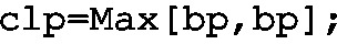
-
Step 2: Determine \(\sigma _p=\sqrt{\frac{\bar{p}(1-\bar{p})}{n}}\) (used as sigmap) and set up two KPIs (UCLp and LCLp). Implement the LCL and UCL KPIs with the following programs:


-
Step 3: Set up a new KPI and give it the name mp, along with the implementation shaped by
-
Step 4: Visualize CLp, LCLp, UCLp and mp with the KPI Aggregated Chart.


The objective of this section was to provide recipes for calculating essential control charts with KIS.ME. Note that it is mandatory to use aggregation functions inside a KPI implementation. Thus, the Max[variable, variable] command is employed, which in the case of a scalar variable returns simply its value.
4.5 Practical Example Revisited
Let us reconsider the data generation example introduced in Sect. 4.3. It pertains to alternately changing the KIS.BOX Red operational LED color from green to red. Each change is realize after one minute. The objective of this section is to provide dedicated implementations which can be directly used for this particular case.
Let us start with the implementation of the \(\bar{x}\) chart. Using the historical data from a set of processing periods, the mean \(\bar{\bar{x}}=61[s]\) and the mean range \(\bar{r}=1.5 [s]\) were obtained. Thus, applying these values to (4.9) with \(n=7\) yields \(\sigma _{\bar{x}}=0.547 [s]\). Having these values, four KIPs were implemented:
CLxbar:

UCLxbar:

LCLxbar:

mx:


\(\bar{x}\) chart
The values of these KPIs are calculated with a 15-min processing period, whilst the KPI Aggregated Chart is grouping and averaging their values every hour. The resulting \(\bar{x}\) chart is presented in Fig. 4.41. As can be observed, the mean values (blue line) are inside the control limits (red lines).
Let us proceed to the second chart, i.e., R. Using Table 4.4 for \(n=7\) gives \(D_3=0.0757\) and \(D_4=1.9249\). Having these values, four KIPs were implemented:
CLR:

UCLR:

LCLR:

mr:

The values of these KPIs are calculated with a 15-min processing period, whilst the KPI Aggregated Chart is grouping and averaging their values every hour. The resulting R chart is presented in Fig. 4.42. As can be observed, the mean range fluctuates in a more intense way that the mean value. However, it is close to the mean range (green line) and within the control limits (red lines).

R chart
Let us process to the last chart, i.e., p. The proportion being considered is defined as the ratio between the sum of red color durations and that of both red and green color durations. In this case, with 15-min processing period, one should expect (on average) \(n=15\), which corresponds to changing the color every minute. As a result, \(\sigma _p=0.129\) while \(\bar{p}=0.5\). Having these parameters, the implementation of the p chart boils down to programming the following KPIs:
CLp:

UCLp:

LCLp:

mp:

The values of these KPIs are calculated with a 15-min processing period, whilst the KPI Aggregated Chart is grouping and averaging those every hour. The resulting p chart is presented in Fig. 4.43.

p chart
As can be observed, the mean values (blue line) are inside the control limits (red lines).
4.6 Training Exercises
4.1
KIS.Device data generation revisited
Exercise requirements: The exercise requires access to one KIS.LIGHT.
-
1.
Similarly as in Sect. 4.3, implement a set of rules changing the KIS.LIGHT operational LED color from red to green. Both periods should be equal to one minute.
-
2.
Use the Datapoint chart to visualize KIS.LIGHT behaviour.
-
3.
Initialize the KIS.LIGHT color using its digital twin (cf. Sect. 2.6).
4.2
Your own way of calculating the mean and the standard deviation
Exercise requirements: The exercise requires access to one KIS.LIGHT and completion of Exc. 4.1.
-
1.
Without using Mean[] and Stdev[], according to (4.4) and (4.5), implement your own KPIs calculating the mean and standard deviations of KIS.LIGHT operational LED red color durations. Ensure also that all durations shorter than 60 s are appropriately filtered and that the KPI processing period is equal to 15 min.
-
2.
Use the KPI Single Period Chart to visualize the maximum values of the implemented KPIs within the selected aggregation period.
-
3.
use the KPI Aggregated Chart to visualize the maximum values of the implemented KPIs, which are grouped by the hour within the aggregation period.
4.3
Median assembly time
Exercise requirements: The exercise requires access to one KIS.BOX.
-
1.
Let us consider a single container that is fed to the assembly system. In particular, the container includes the following parts (digits):
$$\begin{aligned} C=\left[ 1,2,3,4,5,6,7,8,9,10\right] . \end{aligned}$$(4.10) -
2.
The assembly task boils down to writing down the subsequent digits from the container. Thus, if all letters are used, then the container is empty and another one can be processed assuming that it is available.
-
3.
Implement a set of rules ensuring that the KIS.BOX Button 1 operational LED is red during the assembly process and green otherwise. Associate triggers of these rules with pressing KIS.BOX Button 1.
-
4.
Implement a KPI providing information about median assembly time.
-
5.
Use a set of selected widgets to visualize the obtained results.
4.4
Histograms
Exercise requirements: The exercise requires access to one KIS.LIGHT and completion of Exc. 4.1.
-
1.
According to the approach presented in Sect. 4.4.1, implement KPIs calculating 10 equally sized histogram bins spread over the interval of [60, 65] seconds (use a 15-min processing period).
-
2.
Use the KPI Single Period Chart to visualize the histogram.
-
3.
Use the KIS.LIGHT digital twin to interrupt the automatic color changing of the KIS.LIGHT operational LED, i.e., hold its red color for one to three seconds from time to time.
-
4.
Analyze and explain the obtained results.
4.5
Control charts
Exercise requirements: The exercise requires access to one KIS.LIGHT and completion of Exc. 4.4.
-
1.
According to the approach presented in the Sect. 4.4.2, implement the \(\bar{x}\) and R charts;.
-
2.
Use the KIS.LIGHT digital twin to interrupt the automatic color changing of the KIS.LIGHT operational LED, i.e., hold its red color for one to three seconds from time to time.
-
3.
Analyze and explain the obtained results.
4.6
Sharing KPIs
Exercise requirements: The exercise requires access to two KIS.LIGHTs (assigned to the same workspace) and completion of Exc. 4.5.
-
1.
Share all KPIs associated with the KIS.LIGH used in Exc. 4.5 with the second KIS.LIGHT.
-
2.
Implement the \(\bar{x}\) and R charts for the first and second KIS.LIGHT within their common workspace.
-
3.
Compare and analyze control charts of both KIS.LIGHTs.
4.7
CDP calculation: Idle working time
Exercise requirements: The exercise requires access to two KIS.BOXes (assigned to the same workspace).
-
1.
Let us reconsider two workers performing identical tasks at a single assembly station. Both of them use KIS.BOX 1 to indicate two states:
-
Assembly in progress: Exemplified by the red color of operational LEDs,
-
Idle: Exemplified by the green color of operational LEDs.
This means that Worker 1 uses KIS.BOX 1 Button 1 while Worker 2 utilizes KIS.BOX 1 Button 2.
-
2.
Implement the switching rules between assembly and idle states (cf. Figs. 4.3 and 4.4).
-
3.
Repeat the above implementation for KIS.BOX 2, which is associated with a second pair of workers.
-
4.
Using the approach presented in Fig. 4.9, implement CDPs indicating the idle state in each group.
-
5.
For each worker group, i.e., each KIS.BOX, implement KPIs calculating the mean and the median idle time along with its standard deviation over 15-min processing periods.
-
6.
Use a set of selected widgets to visualize and analyze the obtained results.
4.7 Concluding Remarks
The preliminary objective of this chapter was to introduce the concepts of calculating Datapoints and key performance indicators. Both of them can be used for processing data, but in a completely different way. Indeed, CDPs do so in a static way without taking data history into account. Contrarily, KPIs operate within specific processing periods. This means that the entire processing period data set is used for calculating the KPI value. For that purpose, aggregation functions can be used. The periodical values of KPIs can be further aggregated within an arbitrary period. This can be achieved with a set of various KPI chart widgets, which were carefully described. As a result, essential statistical analysis can be realized with the well-known measures of location and variability. Apart from these numerical values, it was also shown how to implement histograms. The final part of the chapter discussed the concept of control charts, which can be efficiently used to keep the process under statistical control. The chapter was concluded with a set of training exercises, which validate the knowledge gathered within it.
References
T. Stapenhurst, Mastering Statistical Process Control (Elsevier, Amsterdam, 2013)
D.C. Montgomery, Introduction to Statistical Quality Control (John Wiley & Sons, London, 2020)
J.S. Oakland, Statistical Process Control (Routledge, London, 2007)
Author information
Authors and Affiliations
Corresponding author
Rights and permissions
Open Access This chapter is licensed under the terms of the Creative Commons Attribution 4.0 International License (http://creativecommons.org/licenses/by/4.0/), which permits use, sharing, adaptation, distribution and reproduction in any medium or format, as long as you give appropriate credit to the original author(s) and the source, provide a link to the Creative Commons license and indicate if changes were made.
The images or other third party material in this chapter are included in the chapter's Creative Commons license, unless indicated otherwise in a credit line to the material. If material is not included in the chapter's Creative Commons license and your intended use is not permitted by statutory regulation or exceeds the permitted use, you will need to obtain permission directly from the copyright holder.
Copyright information
© 2023 The Author(s)
About this chapter

Cite this chapter
Witczak, M., Seybold, L., Bulach, E., Maucher, N. (2023). Implementing and Using Essential Statistical Process Control. In: Modern IoT Onboarding Platforms for Advanced Applications. Studies in Systems, Decision and Control, vol 476. Springer, Cham. https://doi.org/10.1007/978-3-031-33623-2_4
Download citation
DOI: https://doi.org/10.1007/978-3-031-33623-2_4
Published:
Publisher Name: Springer, Cham
Print ISBN: 978-3-031-33622-5
Online ISBN: 978-3-031-33623-2
eBook Packages: Intelligent Technologies and RoboticsIntelligent Technologies and Robotics (R0)