
Abstract
Nonlinear dynamics perspective is an interesting approach to describe COVID-19 epidemics, providing information to support strategic decisions. This paper proposes a dynamical map to describe COVID-19 epidemics based on the classical susceptible-exposed-infected-recovered (SEIR) differential model, incorporating vaccinated population. On this basis, the novel map represents COVID-19 discrete-time dynamics by adopting three populations: infected, cumulative infected and vaccinated. The map promotes a dynamical description based on algebraic equations with a reduced number of variables and, due to its simplicity, it is easier to perform parameter adjustments. In addition, the map description allows analytical calculations of useful information to evaluate the epidemic scenario, being important to support strategic decisions. In this regard, it should be pointed out the estimation of the number deaths, infection rate and the herd immunization point. Numerical simulations show the model capability to describe COVID-19 dynamics, capturing the main features of the epidemic evolution. Reported data from Germany, Italy and Brazil are of concern showing the map ability to describe different scenario patterns that include multi-wave pattern with bell shape and plateaus characteristics. The effect of vaccination is analyzed considering different campaign strategies, showing its importance to control the epidemics.
1 Introduction
The novel coronavirus disease (COVID-19) is a devastating pandemic with unprecedent consequences that are promoting a huge crisis all over the world. In this regard, several scientific investigations have been developed based on different perspectives, covering distinct areas of human knowledge. Nonlinear dynamics perspective of COVID-19 has an increasing interest since it allows the understanding of the pandemic evolution and therefore, it is useful to establish proper health strategy plans. As a matter of fact, dynamical perspective is an interesting approach to deal with different aspects of biosystems [1].
The literature presents several approaches regarding dynamical epidemic models [2], generally employed to describe different infectious diseases. An interesting and useful approach is based on population dynamics, where different population groups are employed to represent the disease, establishing their evolution and interactions. Kermack and McKendrick [3] presented a pioneer work considering an epidemic models using three populations: susceptible, infected and recovered (SIR). This model shows that epidemic evolution cannot be terminated by all individuals becoming infected. The improvement of this approach was due to Anderson [4] and May [5] that considered an extra population: exposed (E). Nowadays, a well-established epidemic model is based on the susceptible-exposed-infected-removed (SEIR) framework, broadly employed to describe different infectious diseases as Influenza, Zika, HIV, among others. Additionally, a similar framework can be employed to describe other biological dynamics, such as the HTLV-I cell infection [6].
Hethcote [7] discussed the interpretation of the SEIR and other epidemic models. Zhao et al. [8] incorporated the age groups on the SEIR model, investigating the role of age on tuberculosis transmission. Dantas et al. [9] used SEIR-SEI model to describe the 2016 outbreak of Zika virus in Brazil, reporting the virus dynamics among the populations of humans and vectors. Some authors have also studied the mathematical aspects of the model, such as steady states and global stability [10,11,12]. Nowadays, these models are largely employed to describe COVID-19.
Lin et al. [13] proposed a conceptual model for COVID-19 in Wuhan–China considering individual behavior reaction to the outbreak scenario and governmenatal actions. Ramos et al. [14] developed a novel mathematical model taking into consideration undetected cases and different sanitary and infectiousness conditions of hospitalized people. This model was employed to study the evolution of COVID-19 in China and showed good agreements with reported data. Savi et al. [15] applied the SEIR descritpion to investigate the pandemic evolution in Brazil, after a model verification with data from China, Italy and Iran. Results showed the importance of both governmental and individual actions to control the virus spread and to reduce the number of infected population. Pacheco et al. [16] improved the model including hospital infrastructure and explicitly spliting removed populations into recovered and deaths. Khajanchi et al. [17] also treated hospitalization strategies, calibrating the model with reported data from India provinces and showing the model capabilities for predictions. Rai et al. [18] refined the SEIR model to consider the impact of social media advertisements in combating COVID-19 in India. Conclusions pointed out that the propagation of awareness through social media platforms might support the control of the disease spread. Chen et al. [19] used an extended SIR model considering two types of infected populations: detectable and undetectable. China pandemic were treated showing that one-day prediction errors are almost less than \(3\%\). Sujath [20] employed machine learning to predict COVID-19 evolution in India employing linear regression, multilayer perception and vector autoregression methods. Recently, special issues have been launched putting together research efforts dedicated to describe COVID-19 dynamics [21, 22].
From the mathematical point of view, SEIR epidemic models are governed by a system of ordinary differential equations, continuously describing the population evolution through time. Dynamical maps can be employed as alternative to continuous models, defining a discrete-time model governed by a system of algebraic equations that have advantages due to their simplicity. Alonso-Quesada et al. [23] pointed out that the use of discrete-time model instead of continuous-time is preferred since the computation effort can be considerably reduced. Concerning epidemic models, they are easier to parameterize, being more appropriate to understand disease transmission dynamics and to evaluate eradication policies, preserving the basic features of corresponding continuous-time models [24].
Kwon and Jung [25] employed a discrete version of the SEIR model to characterize the spread of coronavirus MERS in Korea, showing that an effective quarentine plan would reduce the infected population maximum number of \(69\%\) and MERS fade-out period may be shortened of \(30\%\). Din [26] analyzed the global stability of the equilibrium points of a discrete-time form of SIR model. Enatsu et al. [24] used a backward differential scheme to discretize a class of SIR differential model, analyzing the global stability of the epidemic equilibrium. Alonso-Quesada et al. [23] proposed a method to discretize the SEIR model considering natural births, deaths and reinfection. Cui et al. [27] built a discretized version of the SIR model using a nonstandard finite difference scheme. The model was applied to childhood diseases carrying out the new borns vaccination effect, showing that the discrete and continuous models have the same equilibrium points.
The effect of vaccination is often considered in epidemic models in order describe the disease spread control. Different vaccination strategies can be imagined for each disease and their models consider that vaccination rate can be a function of either time or the susceptible population. Pulse vaccination is one kind of strategy characterized to be periodic in time [28, 29]. On the other hand, continuous vaccination strategy is the alternative that is descbribed by Gumel et al. [30] that showed the potential impact of SARS vaccine over the pandemic that spread over to 32 countries in 2003. Alexander et al. [31] built a model to study the transmission of influenza virus, computing the threshold vaccination rate necessary for community wide control. Kabir and Tanimoto [32] considered the effects of information buzz and information costs on the vaccination effect. Other references also discussed the effects of this kind of vaccination [33, 34].
This work deals with a novel COVID-19 dynamical map that describes the epidemics from infected, cumulative infected and vaccinated populations. The discrete-time model is developed based on the SEIRV model that employs differential equations to deal with the evolution of susceptible-exposed-infected-removed-vaccinated populations. The novel map reduces the six coupled ordinary differential equations into three algebraic equations, being capable to capture the main features of the COVID-19 epidemics with less model variables and parameters. In addition, the simplicity of the model allows analytical calculations of useful information to evaluate epidemic scenarios. In this regard, for instance, one should mention the infection ratio and the herd immunization point, which are crucial information for strategic decision. The paper exploits the novel map through different perspectives. A model verification is carried out comparing its predictions with the classical SEIR differential model and reported data. In this regard, reported data from Germany, Italy and Brazil are analyzed showing good agreement between them and simulated results. A stability analysis is performed showing the conditions to control the epidemic spread and defining proper parameters for this aim. Different scenarios are investigated showing the rich dynamical perspective of COVID-19 epidemics that include multi-wave pattern with bell shape and plateaus characteristics. The effect of vaccination is carried out showing its importance to reduce the number of deaths considering different vaccination strategies. Results show that nonlinear dynamics perspective is an efficient tool to analyze COVID-19 epidemic evolution as long as a proper time scale is of concern.
2 Mathematical model
This work has the main goal to develop a dynamical map to describe COVID-19 epidemics based on the classical SEIR framework. An extra population is incorporated considering the effect of vaccination, defining an SEIRV model, which considers the following populations: susceptible, S; exposed, E; active infected, I; removed, R, that accounts for recovered and deaths; and vaccinated, V. In addition, the cumulative infected population C is incorporated as a useful model information. An essential assumption is that infection can occur only once, which means that reinfection is neglected and, once vaccinated, an individual cannot become infected anymore. Although it is not possible to assure that this is a correct hypothesis for the COVID-19 epidemic, it can be considered reasonable valid for a time scale where the loss of immunity is long when compared with the period of analysis [14, 15]. In addition, it is assumed that the population V accounts only for the vaccinated population, which excludes situations where vaccination occurs after the infection. On this basis, the governing equations are defined as follows.
where dot represents time derivative; \(\beta \) is the transmission rate that is directly associated with social isolation and virus infection capacity; \(\sigma ^{-1}\) is the mean latent period; \(\gamma ^{-1}\) is the infection period; and \(\upsilon =\upsilon (S)\) is the vaccination rate that is considered a function of the susceptible population. It should be pointed out that dimensionless variables are considered and therefore, \((S,E,I,R,V) \in [0,1]\) and \(S+E+I+R+V=1\). Since reinfection is neglected and the average immunity period after vaccination is usually longer than the mean latent period, an exposed individual can become infected before acquiring immunity. Therefore, the vaccinated population comes from the interaction with susceptible population, S. The total cummulative infected population is associated with infected population since both are related to the rate term \(\sigma E\) [9, 15].
The map is derived from the SEIRV differential model adopting some basic assumptions. By considering that each one of the populations is represented by X, its time derivative is given by: \({\dot{X}}=\lim _{\varDelta t \rightarrow 0} ( X(t+\varDelta t)-X(t))/\varDelta t\), which means that \({\dot{X}} \approx X_{n+1}-X_n \) if \(\varDelta t=1\) with n representing the n-th day. Under this assumption, the following steps are followed to build the dynamical map:
-
1.
Substituting Eq. (1b) into Eq. (1c), one obtains: \({\dot{I}}=\beta S I - {\dot{E}} - \gamma I\).
-
2.
It is assumed that the ratio E/I in the beginning of the outbreak is kept constant through the whole epidemic period, which means that \(E=\varLambda I\) and \({\dot{E}}=\varLambda {\dot{I}}\). Substituting both Eq. (1b) and Eq. (1c) into it, and assuming \(S\rightarrow 1\) (onset of outbreak), it yields \(\varLambda =\left( \gamma -\sigma +\sqrt{(\gamma -\sigma )^2 + 4 \beta \sigma } \right) /2\sigma \).
-
3.
Integrating Eq. (1d),
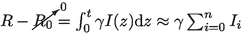 , together with step 2 assumption (\(E/I={\dot{E}}/{\dot{I}}=\varLambda \)) into \(S+E+I+R+V=1\), one can write the susceptible group S as a function of I: \(S=1-(1+\varLambda )I - \gamma \sum _i I_i - V\). Note that it is assumed \(R_0=0\) since \(R_0\) stands for the recovered population group during the beginning of the outbreak.
 -
4.
Substituting Eq. (1f) into Eq. (1c), one obtains \({\dot{C}}={\dot{I}}+\gamma I\). Therefore, \(C_{n+1}=C_n + I_{n+1}+(\gamma -1)I_n\).
-
5.
By considering a generic n, combining all the time steps, one can find that \(\gamma \sum _{i=0}^n I_i =C_{n+1}-I_{n+1}\), where it is assumed that \(I_0 \approx C_0 \), since the summation must consider all the active cases from the beginning of the outbreak.
-
6.
Since \(S+E+I+R=1\), the vaccination rate \(\upsilon (S)\) can be expressed as \(\upsilon (I,C,V)\).
 , together with step 2 assumption (
After this sequence, it is possible to isolate both \(I_{n+1}\) and \(C_{n+1}\) to present the COVID-19 map as follows
with
where \(\varLambda =E/I\) is a constant estimated by a parametric condition \((\beta ,\sigma ,\gamma )\). It is important to highlight that, the population E was explicitly eliminated by assuming the ratio E/I constant, but its effect is implicitly represented on the map dynamics. Moreover, despite this novel map is employed herein to describe COVID-19 dynamics, it can also be employed to describe the dynamics of other epidemics.
The general form of the vaccination rate is a function of the infected, cumulative infected and vaccinated populations, \(\upsilon =\upsilon (S)=\upsilon (I,C,V)\), which represents a specific vaccination strategy. Since \(0 \le V \le 1\), it is imposed the constraint \(v(I,C,V)=0 \forall (I,C,V)\) such that \(C+V=1\). The simplest vaccination strategy assumes a constant vaccination rate, \(\upsilon =\phi \), where \(\phi \) is a coefficient. A more realistic representation considers that the vaccination strategy is proportional to the susceptible population, \(\upsilon =\phi S\).
The population composed by \(C+V\) constitutes the individuals that cannot become infected by neglecting the possibility of reinfection. Under this assumption, the higher is the number of infected-vaccinated, the lesser is the number of susceptible individuals that can be infected. Furthermore, the absence of vaccination (\(V=0\)) reduces the map to a two-population dynamics I-C.
The total number of deaths, D, can be estimated based on the infected population. Therefore, the cumulative number of deaths is expressed by
where \(\mu \) is the death rate, usually around 2% for COVID-19 disease. It should be pointed out that the current number of deaths can be determined by the difference \(D_n - D_{n-1}\).
The transmission rate \(\beta \) is the critical parameter to characterize the COVID-19 dynamics, being related to social isolation and virus infectious capacity. Therefore, the increase of this parameter can represent a variant with more infectious capacity for the same level of social isolation or the reduction of the social isolation for the same virus variant infectious capacity. If virus variants are neglected, the transmission rate is directly related to social isolation. In any case, the transmission rate is clearly time dependent, which motivates the definition of \(\beta = \beta (n)\). This time dependence can be established from an adjustment with reported data, defining a proper fit. An interesting approach to match reported data is the use step functions, defined as follows for m steps.
The other parameters, \(\sigma \) and \(\gamma \), usually assume typical values for COVID-19 dynamics [13, 15]: \(\sigma =1/3\) and \(\gamma =1/5\). These parameters are employed in all simulations except when mentioned otherwise. The vaccination coefficient \(\phi \) can also vary through time which means that some vaccination campaigns can be modeled by step functions. This approach is interesting to describe situations related to the lack of vaccines, which is not an unusual situation for the COVID-19 pandemic.
2.1 Infection rate
The dynamical stability of the map can be evaluated from the definition of the infection rate r, defined as follows based on the ratio between two subsequent iterations,
The infectious increases in a specific time if \(r_n>1\), and decreases otherwise, if \(0<r_n<1\). The case \(r_n=1\) is the transition between both conditions. By taking the active infected given by Eq. (2a), one can obtain the ratio \(r_n\) as a function of \(I_n\) and \((C_n+V_n)\).
COVID-19 dynamics can be represented by the state space I-\((C+V)\) and a useful information is to identify \(r_n=1\), based on Eq. (7). This representative map is presented in Fig. 1a for various values of \(\beta \) and constant values of \(\sigma \) and \(\gamma \). Since the curves are related to \(r_n=1\), the region below each curve is associated with values of \(r_n>1\) while above the curve is related to \(r_n<1\). Therefore, the region below the curve is associated with a growth of active cases. The peak of I occurs when \(r_n=1\) is reached. Figure 1a allows one to obtain the number of total infected plus vaccinated required to prevent the increase of the number of active cases regardless the number of currently infected and considering specific parametric combination. In other words, when the sum \(C+V\) reaches a critical value, the infected population I necessarily decreases. In this regard, the herd immunization point, \(P_h\), is defined when this critical situation is achieved and \(I=0\) (see Fig. 1b). In other words, for a specific parametric combination, if \(C+V \ge P_h\), then \(r<1 \forall \, I\).

State space I-\((C+V)\) with infection rate equals to 1 (Eq. (7) with \(r=1\)) for constant values of \((\sigma ,\gamma )\) and \(\beta \) ranging from 0.2 to 1 with step of 0.1 (a), and the herd immunization point \(P_h\) indication for \(\beta =0.5\) (b)
The value of the herd immunization point \(P_h\) can be analytically defined as a function of the parameters \((\beta ,\sigma ,\gamma )\). By considering \(r_n=1\) and \(I_n=0\) in Eq. (7) and after some algebraic manipulation, one obtains the following expression
Note that this is a function of the transmission rate \(\beta \) and the infectious period \(\gamma ^{-1}\), being not dependent on the latent period \(\sigma ^{-1}\). Moreover, it is noticeable that an increase of the transmission rate \(\beta \) results in a higher value of \(P_h\). In other words, the higher is the transmission rate, the higher is the infected-vaccinated population needed to achieve the herd immunization point. In the limit \(\beta \rightarrow \infty \), it yields \(P_h\rightarrow 1\), which means that to have \(r_n<1\), it is necessary that \(100\%\) of the population becomes either infected or vaccinated. Finally, adopting \(P_h=0\), one obtains \(\beta =\gamma \), which means that for any \(\beta <\gamma \) the number of active cases necessarily decreases regardless the number of I or \((C+V)\). Therefore, the higher is the average infectious period, given by \(\gamma ^{-1}\), the lower is the transmission rate coefficient required.
In order to present an interpretation of the COVID-19 map and the herd immunization point, consider the subspace \((I_{n+1}\)-\(I_n)\) that is a function of \((\beta ,\sigma ,\gamma ,C)\), neglecting the vaccination effect. By assuming constant values of \(\sigma \) and \(\gamma \), the map can be observed as a function of \((\beta ,C)\). Figure 2 presents the influence of these parameters on the map curve showing a parabola that reduces its maximum value with the increase of either \(\beta \) or C. The dashed curve represents \(I_{n+1}=I_n\) that is the region where \(r=1\). Therefore, equilibrium points and their stability define the herd immunization point. Note that the fixed point \(({\bar{I}},{\bar{C}})=(0,C)\) is stable if \(\text {d}I_{n+1} / \text {d}I_n < 1\). Thus, the threshold point \(P_h\) is calculated for \(\text {d}I_{n+1} / \text {d}I_n = 1\), which results in
that is the same result of Eq. (8): \(P_h = 1 - \gamma /\beta \).
In the sequel, the COVID-19 map is applied to describe the epidemic dynamics using reported data from Germany, Italy and Brazil as references.
3 Model Verification
The novel COVID-19 map is now employed to perform a dynamical analysis of the pandemic. Reported data from the novel COVID-19 epidemics in Germany, Italy and Brazil are employed as reference aiming to validate the model and to show its capabilities to predict COVID-19 scenarios. Reported data are taken from Worldometer (https://www.worldometers.info/). The comparison is established by considering nondimensional values, dividing each population by the total population of the country. In this regard, the following values are adopted to each country: Germany \(N_\text {ger} =83.03 \times 10^6\); Italy \(N_\text {ita} = 60.36 \times 10^6\); Brazil \(N_\text {bra} = 211 \times 10^6\). The time period ranges from 6th March of 2020 to 21st January of 2021. Due to natural seasonality in reported data, a 7 day average is employed, giving rise to a new data set. Both infected I and cumulative C populations are of concern showing a two-wave pattern. For Germany and Italy cases, the first wave peak occurred after April 2020, while the Brazilian case shows a longer first wave, which is actually a plateaus pattern. Therefore, the Brazilian second wave started from a high level value. On the other hand, Germany and Italy present the second wave peak around December 2020 and the number of active cases are droping at the end period. Based on these observations, COVID-19 is characterized by different patterns. A bell shape behavior is the essential point to be observed, but it is clear the possibility of either multi-wave or plateaus patterns.

Map \(I_{n+1}\)-\(I_n\) for \(\beta =0.8\) and varying C from 0 to 1 with a step of 0.2 (a); and with constant \(C=0.2\) and varying \(\beta \) from 0.2 to 1.2 with step of 0.2 (b). The dashed line stands for \(I_{n+1}=I_n\)
COVID-19 map is able to represent the bell shape behavior by considering proper parameters. Based on this, consider a restrict period of the reported data given by the first 120 days. Figure 3 presents results of the map simulations compared with reported data using the least square method (LSM) for the fitting process. It is noticeable a good agreement between numerical and reported data. Transmission rate is described by step functions adjusted for each country: \(\beta _{\text {ger}}\) for Germany, \(\beta _{\text {ita}}\) for Italy and \(\beta _{\text {bra}}\) for Brazil. These functions are displayed in Eq. (10), where \(n=0\) yields 6th March 2020.

Infected active cases I for Germany (a), Italy (b) and Brazil (c) for the first 120 days of the period range employed. The continuous line stands for reported data and dashed line for the map simulation, which employed \(\sigma =1/3\), \(\gamma =1/5\) and \(\beta \) furnished by Eq. 10
In addition to reported data, model verification establishes a comparison of the COVID-19 map with the SEIRV model that is integrated employing the fourth-order Runge-Kutta method with a \(10^{-2}\) time step. The vaccination effect is neglected in this stage, adopting \(V=\upsilon =0\). Analytic considerations and an explicit discrete-continuous comparison are of concern.
Due to the bell shape characteristics of active cases, three different aspects characterize an outbreak: the peak of the active cases curve, \(I_\text {max}\); the time instant where the peak occurs, \(t_\text {max}\); and the area below the curve, which is proportional to the total infected \(C(t\rightarrow \infty )\). This latter characteristic can be confirmed by analyzing the SEIR model, substituting Eq. (1e) into Eq. (1c) and integrating from the beginning of the outbreak to its end, which gives
and therefore, since \(I(t \rightarrow \infty )=I(0)=C(0)=0\), it yields
These three aspects can be used to build the model signature in 3D charts \((I_\text {max}\) - \(t_\text {max}\) - \(C(t \rightarrow \infty ))\). The variation of the three parameters \((\beta ,\sigma ,\gamma )\) generates a solid object that defines the model signature. In order to facilitate the signature view, the 3D chart is split into two 2D maps. Additionally, \(\sigma \) and \(\gamma \) are assumed to be constant and \(\beta \) is free to vary. On this basis, a curve belonging to the model signature is obtained characterizing a scenario. Different combinations for \((\sigma ,\gamma )\) are picked up to compare the novel map and the SEIR model, as presented in Fig. 4 considering \(C_0=I_0=10^{-5}\). In general, it is noticeable that the signature predicted by both models are in close agreement considering the total cases against \(t_\text {max}\). This convergence takes place regardless the parametric condition. On the other hand, Fig. 4 shows that the signature of both models diverge for bigger values of \(\beta \), being the map less sensitive to \(\beta \) variation. Besides, the same effect is obtained with the increase of \(\gamma ^{-1}\). Nevertheless, there is a region where both models diverge from each other. This divergence does not imply that both models cannot be used to model the evolution of the outbreak, representing just a quantitative divergence. It should be pointed out that both models present the same trend for parametric variation. Moreover, within the convergence region, the same \(\beta \) value does not necessarily generate the same combination \((I_\text {max}, t_\text {max}, C(t \rightarrow \infty ))\) for both models. Therefore, it should be noticed that there is a good qualitative agreement between the novel map and the classical SEIR model.

Comparison between SEIR (continuous line) and map (dashed line) models with \(\sigma =1/3\) for \(I_\text {max}\) against \(t_\text {max}\) (a); and \(C(t \rightarrow \infty )\) (which is independent of \(\sigma \)) (b)
3.1 Multi-wave scenarios
Based on epidemic reported data, it is clear that COVID-19 dynamics has a multi-wave bell shape pattern. The previous section presented results showing the capability of the map to describe a single bell shape. This section is dedicated to evaluate the multi-wave pattern. Variations of the transmission rate is the most important parameter to capture this multi-wave behavior. This strategy is now employed to verify the capability of the COVID-19 map to represent reported data. Once again, COVID-19 epidemic in Germany, Italy and Brazil are employed as reference. The comparison among numerical simulations and reported data is now carried out for the whole period range employing the least square method to perform adjustment. Transmission rate is defined by step functions presented in Eq. 13. Figure 5 presents the comparison between numerical simulations and reported data showing a good agreement for all countries. Based on that, it is possible to conclude that the COVID-19 map captures reported data including the multi-wave scenario. The main difficulty is the proper determination of the transmission rate.

Infected active cases I for Germany (a), Italy (b) and Brazil (c) for the whole period range employed. The continuous line stands for reported data and dashed line for the map simulation, which employed \(\sigma =1/3\), \(\gamma =1/5\) and \(\beta \) furnished by Eq. 13
4 COVID-19 dynamical analysis
The novel COVID-19 map is now employed to perform a dynamical analysis of the epidemics. Reported data time series is employed to calculate the transmission rate \(\beta (n)\) at each time step for each country using the Newton’s method. Figure 6 presents the estimated transmission rate, \(\beta (n)\), together with the infected active cases I showing that the reported data is reproduced accordingly. It is observed that transmission rate are bigger during the first part of the outbreak. The reduction that follows is associated with social isolation policies. It should be pointed out that the growth of active cases are related to periods where \(\beta \) is bigger than \(\approx 0.2\), the value estimated by considering \(P_h = 0\). This is more explicit during the first and second epidemic waves where it is possible to observe the increase of the cases.

Transmission rate \(\beta \) (continuous line) ploted with active cases I (dashed line) for each country. The red dashed line stands for \(\beta =\gamma =0.2\) for the herd immunization point \(P_h=0\)

a Death ratio \(\mu \) along time for each country. b Herd immunization \(P_h\) as a function of transmission rate \(\beta \) [Eq. (8)] with \(\gamma =1/5\) (COVID-19 parameter). The dotted (Germany), dot-dashed (Italy) and dashed (Brazil) lines indicate \(P_h\) required for \(\beta =0.78\), 0.68 and 0.84, respectively for Germany, Italy and Brazil

Comparison between different vaccination strategies with \(\beta =0.25\): \(\upsilon =\phi \) (solid line) and \(\upsilon =\phi S\) (dashed line). Herein, it was employed \(I_0=10^{-3}\) and COVID-19 parameters

Effect of vaccination in Germany (\(\beta _\text {ger}=0.227\)) (a), Italy (\(\beta _\text {ita}=0.230\)) (b) and Brazil (\(\beta _\text {bra}=0.224\)) (c). The continuous lines stand for reported data where the final point is represented by a solid point. Dashed lines yield numerical simulations from this point on for three different vaccination coefficients, yielding \(\phi =0\), \(10^{-3}\) and \(10^{-2}\)
The analysis of deaths from COVID-19 infection is now of concern. The death ratio \(\mu \) stands for the ratio between total cases and total deaths. Since the number of cases is directly associated with the transmission rate, it is expected that this ratio is a function of time, \(\mu =\mu (n)\). Figure 7a presents \(\mu \) adjusted from reported data considering Germany, Italy and Brazil. Note that this ratio varies through time showing that it assumes bigger values at the beginning of the outbreak. As time goes by, values evolve to lower values, probably due to the development of healing strategies. The average of \(\mu \) for the last 90 days of the period range is \(1.86\%\) for Germany, \(3.95\%\) for Italy and \(2.68\%\) for Brazil. These values are employed from now on to evaluate the vaccination effect.
The relationship between transmission rate and herd immunization can be established by considering the number of total infected required to maintain the infection rate less than one \((r<1)\). Equation (7) can be used in order to build the herd immunization threshold point \(P_h\) as a function of \(\beta \) (Fig. 7b). The average of transmission rate values during the first seven days of the period range is 0.91 for Germany, 0.62 for Italy and 1.26 for Brazil. Based on these values, the herd immunization point \(P_h\) is achieved only with total infected cases C above 0.78, 0.68 and 0.84, respectively, as depicted in Fig. 7b. This scenario suggests that the only way to avoid a high number of infected without social isolation is the vaccination. Therefore the sum \(C+V\) can be big enough in order to allow a big value of \(\beta \) coefficient. The effect of vaccination is explored in the following section.
5 Effect of vaccination
This section investigates the effect of vaccination on the COVID-19 dynamics. It is adopted a situation where the vaccination starts on the last day of the reported data period: 21st January 2021. The transmission rate employed is the mean value from \(\beta (n)\) of the last 90 days of the period range (see Fig. 6) which yields: \(\beta _\text {ger}=0.227\), \(\beta _\text {ita}=0.230\) and \(\beta _\text {bra}=0.224\). Moreover, three vaccination scenarios are analyzed with the following coefficients: \(\phi =0\), \(10^{-3}\) and \(10^{-2}\), where the case \(\phi =0\) stands for no vaccination. Besides that, two vaccination campaign models are treated: \(\upsilon =\phi \) and \(\upsilon =\phi S\). On this basis, the vaccinated population V is described by one of the following equations:
It should be pointed out that either Eq. 14a or 14b can be combined with Eq. 2a and 2b, which reduces the dynamical system to two independent equations, associated with variables \((I,C+V)\). Based on that, Fig. 8 presents a comparison between these two vaccination models considering two vaccination coefficients and \(\beta =0.25\). An essential dynamical characteristic is represented by the peak time instant, \(t_\text {max}\), and the difference \(C(t\rightarrow \infty )-C_0\). Both models yield approximately the same outbreak evolution for this value of \(\beta \) and the two values of \(\phi \). Concerning the herd immunization point, one should notice that \(t_\text {max}\rightarrow 0\) when \(C_0+V_0 \rightarrow P_h\) for both values of \(\phi \) and both models.
Based on this analysis, it should be pointed out that the vaccination models generate similar responses for \(\beta =0.25\). Therefore, for the sake of simplicity, the simplest model is employed to represent the vaccination approach: \(\upsilon =\phi \). Figure 9 presents the effect of vaccination on the evolution of the epidemic for each country, showing that vaccination has a huge impact on the COVID-19 dynamics. The higher the vaccination rate is, the lower is the peak reached by active cases and the lower is the total infected population. Moreover, the time required to achieve, for instance, \(I=10^{-4}\) - one infected individual for each ten thousand inhabitants, takes place sooner for higher vaccination rates. As expected, the absence of vaccination causes the worst scenario. These conclusions are the same for all the three countries pointing that the vaccination is the only possibility to increase \(P_h\) without increasing C.
An interesting point that can be evaluated is the influence of vaccination coefficient \(\phi \) on the total infected population \(C(t\rightarrow \infty )\). Figure 8 presents this analysis where the higher number of cases is achieved with the absence of vaccination \((\phi =0)\). Moreover, the sensitivity of total infected with respect to vaccination rate is given by the curve slope. The higher sensitivity occurs for lower vaccination rates.
The effect of vaccination is summarized in Table 1 showing the total infected population, total deaths and the date when the infected population reaches \(I=10^{-4}\) for the three vaccination strategies. The death rate \(\mu \) is adopted based on the average of the final 90 days: \(1.86\%\) for Germany, \(3.95\%\) for Italy, and \(2.68\%\) for Brazil. Without vaccination, the total infected population reaches \(24.75\%\), \(29.27\%\) and \(22.83\%\) in Germany, Italy and Brazil, respectively. If the vaccination is implemented with \(10^{-2}\) rate, the number of total deaths can drop to \(35\%\), \(67\%\) and \(59\%\) in these three countries, respectively. The estimated date to reach \(I=10^{-4}\) shows that the vaccination reduced this period in several months, which means that the vaccination drastically anticipates the end of a huge crisis.
6 Conclusions
This paper proposes a dynamical map to describe COVID-19 epidemics based on the classical SEIRV differential model. This novel map describes COVID-19 dynamics from three populations: active infected, cumulative infected and vaccinated. The discrete-time map is advantageous for several reasons: (i) it reduces the number of model variables when compared to the continuous SEIRV model; (ii) it is described by three algebraic equations, being easier to be implemented and to perform parameter adjustments; (iii) analytical tools can be employed to define useful information such as the infection rate and the herd immunization point. The herd immunization point is a function of the transmission rate and the infectious average period, being independent of the mean latent period. Model verification compares the map simulations with the classical SEIR model and reported data showing good agreements. Reported data from Germany, Italy and Brazil show that the map is capable to capture the main features of the COVID-19 epidemics, including multi-wave with bell shape and plateaus patterns. Nonlinear dynamics perspective shows to be an interesting approach allowing the analysis of the main features of the COVID-19 epidemics and different patterns are reproduced with proper parameter choices. The effect of vaccination is investigated using the novel map and different strategies to describe the vaccination campaigns. Results show that proper vaccination rate can dramatically reduce the total infected population. The analytical estimation of the herd immunization point allows the evaluation of the end of the pandemic crisis indicating the proper vaccination strategy. Based on these results, the novel map can be employed as a useful tool for COVID-19 scenario evaluation, being an easy alternative to be employed.
References
A. Marcelo, Chaos and order in biomedical rhythms. J. Br. Soc. Mech. Sci. Eng. 27, 157–169 (2005)
S. Busenberg, K. Cooke, Vertically transmitted diseases: models and dynamics (Springer, New York, 2012), p. 257
S. Gandon, M. Mackinnon, S. Nee, A. Read, A contribution to the mathematical theory of epidemics. Proc. R. Soc. A: Math. Phys. Eng. 772, 700–721 (1927)
R.M. Anderson, R.M. May, Population biology of infectious diseases: Part I. Nature 280, 361–367 (1979)
R.M. May, R.M. Anderson, Population biology of infectious diseases: Part II. Nature 280, 455–461 (1979)
S. Khajanchi, S. Bera, T.K. Roy, Mathematical analysis of the global dynamics of a HTLV-I infection model, considering the role of cytotoxic T-lymphocytes. Math. Comput. Simul. 180, 354–378 (2021)
W.H. Herbert, The mathematics of infectious diseases. Soc. Ind. Appl. Math. 42, 599–653 (2000)
Y. Zhao, M. Li, S. Yuan, Analysis of transmission and control of tuberculosis in Mainland China, 2005–2016, based on the age-structure mathematical model. Int. J. Environ. Res. Public Health 14 (2017)
E. Dantas, M. Tosin, A. Cunha, Calibration of a SEIR-SEI epidemic model to describe the Zika virus outbreak in Brazil. Appl. Math. Comput. 338, 249–259 (2018)
M.Y. Li, J.R. Graef, L. Wang, J. Karsai, Global dynamics of a SEIR model with varying total population size. Math. Biosci. 160, 191–213 (1999)
A. Korobeinikov, Lyapunov functions and global properties for SEIR and SEIS epidemic models. Math. Med. Biol. 21, 75–83 (2004)
D. Greenhalgh, Hopf bifurcation in epidemic models with a latent period and nonpermanent immunity. Math. Comput. Model. 25, 85–107 (1997)
Q. Lin, S. Zhao, D. Gao, Y. Lou, S. Yang, S.S. Musa, M.H. Wang, Y. Cai, W. Wang, L. Yang, D. He, A conceptual model for the coronavirus disease 2019 (COVID-19) outbreak in Wuhan, China with individual reaction and governmental action. Int. J. Infect. Dis. 93, 211–216 (2020)
B. Ivorra, M.R. Ferrández, M. Vela-Pérez, A.M. Ramos, Mathematical modeling of the spread of the coronavirus disease 2019 (COVID-19) taking into account the undetected infections. The case of China. Commun. Nonlinear Sci. Numer. Simul. 88 (2020)
P.V. Savi, M.A. Savi, B. Borges, A mathematical description of the dynamics of coronavirus disease 2019 (Covid-19): a case study of Brazil. Comput. Math. Methods Med. (2020)
P.M.C.L. Pacheco, M.A. Savi, P.V. Savi, COVID-19 dynamics considering the influence of hospital infrastructure: an investigation into Brazilian scenarios. Nonlinear Dyn. (2021)
S. Khajanchi, K. Sarkar, J. Mondal, K.S. Nisar, S.F. Abdelwahab, Mathematical modeling of the COVID-19 pandemic with intervention strategies. Results Phys. 25 (2021)
R.K. Rai, S. Khajanchi, P.K. Tiwari, E. Venturino, A.K. Misra, Impact of social media advertisements on the transmission dynamics of COVID-19 pandemic in India. J. Appl. Math. Comput. (2021)
Y.C. Chen, L. PingEn, C.S. Chang, T.H. Liu, A time-dependent SIR model for COVID-19 with undetectable infected persons. IEEE Trans. Netw. Sci. Eng. 7, 3279–3294 (2020)
R. Sujath, J.M. Chatterjee, A.E. Hassanien, A machine learning forecasting model for COVID-19 pandemic in India. Stoch. Env. Res. Risk Assess. 34, 959–972 (2020)
J.A. Tenreiro Machado, J. Ma, Nonlinear dynamics of COVID-19 pandemic: modeling, control, and future perspectives. Nonlinear Dyn. (2020)
S. Boccaletti, W. Ditto, G. Mindlin, A. Atangana, Modeling and forecasting of epidemic spreading: the case of Covid-19 and beyond. Chaos Solit Fractal (2021)
S. Alonso-Quesada, M. De la Sen, A. Ibeas, On the discretization and control of an SEIR epidemic model with a periodic impulsive vaccination. Commun. Nonlinear Sci. Numer. Simul. 42, 247–274 (2017)
Y. Enatsu, Y. Nakata, Y. Muroya, Global stability for a class of discrete sir epidemic models. Math. Biosci. Eng. 7, 347–361 (2010)
C.M. Kwon, J.U. Jung, Applying discrete SEIR model to characterizing MERS spread in Korea. Int. J. Model. Simul. Sci. Comput. 7, 1–13 (2016)
Q. Din, Qualitative behavior of a discrete SIR epidemic model. Int. J. Biomath. 9, 16–18 (2016)
Q. Cui, X. Jiabo, Q. Zhang, K. Wang, An NSFD scheme for SIR epidemic models of childhood diseases with constant vaccination strategy. Adv. Differ. Equ. 2014, 1–15 (2014)
S. Gandon, M. Mackinnon, S. Nee, A. Read, Imperfect vaccination: some epidemiological and evolutionary consequences. Proc. R. Soc. B: Biol. Sci. 270, 1129–1136 (2003)
X. Wang, Y. Tao, X. Song, Pulse vaccination on SEIR epidemic model with nonlinear incidence rate. Appl. Math. Comput. 210, 398–404 (2009)
A.B. Gumel, C.C. Mccluskey, J. Watmough, An sveir model for assessing potential impact of an imperfect anti-SARS vaccine. Math. Biosci. Eng. 3, 485–512 (2006)
M.E. Alexander, C. Bowman, S.M. Moghadas, R. Summers, A.B. Gumel, B.M. Sahai, A vaccination model for transmission dynamics of influenza. SIAM J. Appl. Dyn. Syst. 3, 503–524 (2004)
K.M. Ariful Kabir, J. Tanimoto, Vaccination strategies in a two-layer SIR/V-UA epidemic model with costly information and buzz effect. Commun. Nonlinear Sci. Numer. Simul. 76, 92–108 (2019)
A.B. Gumel, S.M. Moghadas, R.E. Mickens, Effect of a preventive vaccine on the dynamics of HIV transmission. Commun. Nonlinear Sci. Numer. Simul. 9, 649–659 (2004)
C.M. Kribs-Zaleta, J.X. Velasco-Hernández, A simple vaccination model with multiple endemic states. Math. Biosci. 164, 183–201 (2000)
Acknowledgements
The authors would like to acknowledge the financial support of the Brazilian Research Agencies CNPq, CAPES and FAPERJ.
Author information
Authors and Affiliations
Corresponding author
Rights and permissions
About this article

Cite this article
dos Reis, E.V.M., Savi, M.A. A dynamical map to describe COVID-19 epidemics. Eur. Phys. J. Spec. Top. 231, 893–904 (2022). https://doi.org/10.1140/epjs/s11734-021-00340-5
Received:
Accepted:
Published:
Issue Date:
DOI: https://doi.org/10.1140/epjs/s11734-021-00340-5