
Abstract
A pilot scheme uses upper air data from a few extreme hottest days to identify those and other extreme hottest days measured by 3 stations sampling the California Central Valley (CV). Prior work showed that CV extreme heat wave onsets have characteristic large scale patterns in many upper-air variables; those patterns also occur for the hottest days. A pilot scheme uses areas of two upper-air variables with high significance and consistency to forecast extreme surface temperatures. The scheme projects key parts of composite patterns for one or more variables onto daily weather maps of the corresponding variables resulting in a ‘circulation index’ for each day. The circulation index measures how similar the pattern on that day is to the composite patterns in areas dynamically relevant to a CV extremely hot day, with a larger value for a stronger match and larger amplitude. The scheme is tested on the development period (1979–1988) and on the subsequent 18 year ‘independent’ period (1989–2006). The pilot scheme captures about half of the rare events in the development period, with similar skill for the independent period. Based only on 16 days of extreme heat in the first 10 years, the scheme is not intended to represent the general distribution; however the circulation index has similar kurtosis, variance, and skewness as the observed maximum temperatures. Properties of the high end tail of the distribution are notably improved by adding the second predictor. The scheme outperforms simply using 850 hPa temperature above the CV.
1 Introduction
Maximum temperatures above 40°C are a regular feature of summer in the Central Valley of California, USA (hereafter CV). The Sacramento Valley (SV) constitutes approximately the northern third of the CV with most of the rest being the San Joaquin Valley (SJV), while a small portion is known locally as ‘the Delta’ where the Sacramento and other CV rivers empty through the Carquinez Strait into San Francisco Bay. The CV is bounded by high mountains to the east (the Sierra Nevada), the Cascades to the north, the Transverse Ranges to the south and Coastal Ranges to the east. Home to 5 million people and regarded as the most agriculturally productive region in the world, the social and economic importance provides ample motivation to study CV heat waves.
There is no universally appropriate definition of a heat wave. Several definitions are presented in Table 1; most are based on exceeding one or more thresholds. The different definitions arise from different interests of the authors and from different data available to study. For example, Meehl and Tibaldi (2004) simulate future climate and do not have surface station observations to consult. For the CV, the dewpoint depression is often large during the hottest summer days, so even though the dry bulb temperatures become very high during the day, the event may not meet the heat wave criteria of Robinson (2001) due to warm, but arid nocturnal minimum temperatures.
Other studies take a different approach, and focus on comparing the statistics instead of trying to identify events. Schär et al. (2004) combine 4 stations scattered across Switzerland, average their values over each month to create a monthly time series and compare the extreme 2003 European heat wave with the previous worst event in 1947 (they emphasize standard deviations above the mean). Schär et al. then compare downscaled temperatures from a historical simulation at model grid points in northern Switzerland. From that comparison, Schär et al. gain confidence in their simulations of how the mean and variability might increase by the end of this century. Palecki et al. (2001) use apparent temperature values both maximum and daily averages to compare the severe 1995 and 1999 heat events that afflicted the Chicago, USA, area. They do not use a threshold or any other criterion to define the heat wave specifically. Instead, they compare maps of peak values at stations over the region in the two heat waves. In this study we adopt an approach that is similar to elements of Schär et al. and Palecki et al.
We focus on the individual hottest dates; we emphasize the number of standard deviations above the mean; and we aggregate information over a region. The primary advantages of expressing the data in terms of standard deviations are: (1) to allow comparison and aggregation between stations with differing variability and means, and (2) to identify hotter as well as the hottest dates since a range of high temperatures occurs over time. The focus upon the ‘circulation index’ on every individual date (instead of on heat wave periods) allows the index calculated by our scheme to be flexible to use with different criteria (such as different thresholds, similar to those in Table 1) and to provide analysis of the tail of the distribution when applying our circulation index in later work. In addition, we are interested in identifying the key portions of the large scale weather patterns during the hottest days. Since the circulation patterns are of greater interest than the actual temperature, we work with anomaly data in order to remove the seasonal cycle and increase the sample size and thereby identify the circulations responsible for the worst heat. (Anomaly data are those data from which the long term daily mean, or LTDM, has been removed.)
Bachmann (2008) considered the spatial extent of heat waves based on Sacramento (KSAC) criteria. Several criteria were tested, the two she emphasized differed from (and results were compared with) corresponding criteria used by Grotjahn and Faure (2008). Her criteria are given in Table 1. Various properties were compared between KSAC and 29 other stations in CA, NV, OR, and WA. Bachmann found that days of extreme maximum temperatures at KSAC were often unusually hot days in the western valleys of OR and WA, as well as the remainder of the CV. For example, during days meeting her heat waves criteria, in which the KSAC maximum temperature averaged 1.89 standard deviations above normal, Portland OR (KPDX) was 0.94 and Seattle WA (KSEA) was 0.96 standard deviations above average; in contrast, much closer Reno (KRNO) was only 0.81. California cities strongly influenced by coastal upwelling and distant from the CV had little association with KSAC (e.g. Eureka CA, KEKA was 0.19 on those dates). Other stations along the central California coast (e.g. KSFO and KMRY) are more strongly linked to the interior valleys and they have heat waves dates strongly matched to KSAC dates. Dates of extreme temperatures at stations in interior valleys of OR and WA matched corresponding dates at KSAC as well as NV stations KRNO and KTPH. In general, KSAC maximum temperatures were more highly correlated with Reno and Tonopah NV than with interior valley stations of OR and WA, with highest correlation 1 day after KSAC. Within the CV, Bachmann found some lag present in the timing of hottest temperatures between the northern and southern ends of the CV. Bakersfield’s (KBFL) daily maximum temperatures had slightly higher correlation (0.84) when lagged 1 day after KSAC than when the 0 lag correlation (0.75) was calculated. Hence, heat waves affecting KSAC are elongated north–south, often extending into the Pacific Northwest, a result consistent with the discussion in Grotjahn and Faure.
Gershunov et al. (2009, hereafter GCI) look at heat waves affecting a larger region that includes both CA and NV. Hence GCI emphasize only those events that tended to have the most affect on those two states. GCI are interested in health effects of extreme heat and emphasize the hottest absolute temperatures and also elevated overnight minimum temperatures (which inhibit a person’s recovery from high heat during daytime). Consequently, they discuss 5 ‘nighttime’ separately from 5 ‘daytime’ elevated temperature events. The 23–25 July 2006 record-breaking heat wave rates high in both of their categories and is discussed separately by GCI. The study here is interested in the large scale weather patterns, so anomaly fields are used from the hottest days affecting the meteorologically homogeneous CV.
A low level subsidence inversion, light winds over a valley surrounded by mountains, as well as high heat and abundant sunshine to drive photochemical transformations, are factors that cause generally poor air quality to accompany hot days in the CV. Bao et al. (2008) describe the mesoscale circulations within the CV during a high ozone episode in 2000. While the maximum temperatures of the CV were elevated during part of their 5 day period, other days were near normal. They describe the three dimensional flow using horizontal maps, trajectories, and time (of day) versus elevation plots. The low level flow within the CV is complex (see Zhong et al. 2004; and their references). This complex flow is characterized as having these elements: (1) a sea breeze that enters primarily through the Carquinez Strait (from San Francisco Bay) that splits to track north and south into the Sacramento (SV) and San Joaquin (SJV) valleys and that (2) is concentrated into a low level nocturnal jet (east side of the SJV), plus (3) two mesoscale eddies (Schultz and Fresno, see Fig. 11 in Bao et al.) all of which (4) have a strong diurnal variation (upslope in daylight and downslope at night). While the period studied by Bao et al. included some near-normal and some hot days (no extremely hot days) Bao et al. find elements of this complex flow with some moderation by a large scale flow tending to favor offshore or downslope components on the hotter days. On the hotter days, the low level upslope and onshore parts of the motion are weakened and made more shallow in favor of weakened near surface upslope or even some areas of downslope flow over the Sierra Nevada Mountains as well as offshore flow over the central California coast during the afternoon. Above the shallow boundary layer, the flow tends to have a downslope and offshore component. In this report, the discussion will focus upon these offshore and downslope components of the flow above the surface boundary layer but the reader should be aware that the actual directions of the flow at specific locations and elevations within the region are quite complex.
The hottest days affecting the CV are associated with offshore flow and large scale subsidence. The subsidence is locally enhanced where the winds above the inversion are also directed down the western slope of the Sierra Nevada Mountains. The offshore winds oppose or restrict to a shallow layer cooling sea breezes. The sinking helps elevate lower troposphere temperatures by adiabatic compression. The inversion top is typically ~1.2 km (Iacobellis et al. 2009) above ground level during summer. During nighttime, the strong subsidence inversion is extended downward to the surface by radiative cooling. The CV is cloud-free during a heat wave (indeed during much of summer) thus the solar radiation absorbed by the ground during daytime rapidly heats up the shallow boundary layer. Thermals produced by surface heating cannot mix the heat through a deep layer because the temperatures (at 700 and 850 hPa) are already hot due to the subsidence. Hence, CV heat waves are associated with and preceded by both unusually high overnight minimum temperatures (especially at the top of the subsidence inversion) and offshore winds in the lower troposphere (above the inversion).
Unusually high maximum temperatures at the southern end of the Sacramento Valley are associated with specific anomaly patterns of several variables (Grotjahn and Faure 2008). The anomaly patterns at the onset of Sacramento’s hottest weather have consistent and large scale elements. An upper level ridge is centered near or just off the North American west coast in the geopotential height and lower tropospheric temperature fields. The geopotential ridge is preceded by a trough upstream over the central Pacific and that trough is preceded by a ridge near the Dateline. The horizontal winds have significant anomalies consistent with geostrophic balance relative to the height anomalies. The oceanic trough helps strengthen (and build a westward extension) of the ridge near the coast through horizontal temperature advection. The westward extension of that upper ridge amplifies the sinking over California, thereby intensifying the low level inversion and subsequent CV surface temperatures. Hence, the highest anomalies in lower tropospheric temperatures are located at or slightly offshore as both a consequence of and a driver for the subsidence and offshore winds required by an extreme CV heat wave. While the locations of the large scale trough and the ridge upstream of it varies quite a bit from one CV heat wave onset to the next, the patterns described here near the coast and over California are present at the onset of every one of the hottest events. This consistency is sensible dynamically; the weather pattern provides the necessary lower troposphere heat and subsidence.
This paper describes a scheme by which key parts of the large scale upper air daily anomaly circulation that are dynamically linked to CV hottest days are compared with corresponding parts of daily weather maps to predict the occurrence of extreme CV hottest days. While the scheme is based on just 16 days of data (the 1% of the days that are hottest during a fraction of the period) the scheme has notable skill in predicting those extremely rare events, occurring 1% of the time during the whole period. The primary purposes of this article are thus: (1) to describe this scheme and (2) suggest some future applications of the methodology. The scheme as described here is a prototype intended to demonstrate the notion that dynamically relevant upper air features can provide useful skill in downscaling to forecast surface maximum temperature extremes over the CV. Finally, the paper discusses the synoptic situation when the CV summer maximum temperature anomalies are highest.
2 Methodology
Grotjahn and Faure (2008) noticed a high degree of similarity between the individual members of ensembles of weather maps at the onset of the hottest heat waves in the CV city of Sacramento. The similarity is strongest where the ensemble average is unusually high or unusually low. The high degree of similarity suggests that key parts of the weather patterns will be strongly linked to the hottest days. This section outlines the methodology of a ‘pilot scheme’ that compares those key parts with daily weather maps to identify the hottest events in a record. To make the test more rigorous an out-of-sample test is made: the key parts are defined from maps during the hottest days in the 10-year 1979–1988 period, but the comparison is applied to a longer time period: 1979–2006. The scheme is designated a ‘pilot’ scheme since the project was intended to prove a concept.
The scheme described here is based on composite maps from a few of the hottest dates for the CV as a whole. To identify those ‘hottest’ dates, the normalized daily anomaly values of maximum temperature are calculated at 3 CV stations: Red Bluff (KRBL), Fresno (KFAT), and Bakersfield (KBFL). A normalized maximum temperature anomaly on a given date is found by subtracting the LTDM of maximum temperature for that day of the year from the maximum temperature that day and then dividing the result by the long term daily value of the standard deviation (LTDSD) for that station for that day of the year. (The actual values for the LTDM and LTDSD are based on the 28 values for each date. The variation over the season is further smoothed by combining values from adjacent days.) Hence, the normalized anomaly data vary in a comparable manner about a zero mean for each of the 3 stations. Figure 1 shows the normalized maximum temperatures for the 3 stations and for Sacramento. Sacramento is not used in our CV station combination because it is close to the Delta and thereby influenced by weak sea breezes that do not reach the other 3 stations. Figure 1 makes clear that the 3 stations selected do not always agree; not surprisingly, most such disagreements are between the stations that are furthest apart and often result from the time lag mentioned above. The normalized daily anomalies from the 3 stations are averaged together to get a ‘representative’ maximum temperature anomaly for the CV as a whole each day; the result will be called the CV normalized maxTa. Clearly, a better representation of the maximum temperature for the CV could be devised, using more stations and possibly addressing the lag in timing, but this pilot project did not test other combinations. The criterion used to identify the ‘hottest dates’ was that all 3 stations must have a normalized anomaly greater than or equal to 1.6 on that date. Over the 28 year record of 3,416 dates, this criterion was met on 33 dates; about 1% of the total number of dates.

Time series of normalized daily maximum temperature anomalies at stations: KRBL (green squares), KSAC (blue dots), KFAT (brown + symbols), and KBFL (red circles) are shown for June–September months from 1979 to 2006. Anomalies are with respect to each station’s long term daily mean on that day of the year (LTDM) for maximum temperature; normalizations are by the long term daily standard deviation (LTDSD) for the station. A blue line marks the threshold value 1.6 used to identify the 33 hottest dates for the CV as a whole. Abscissa is June–September days counting from 1 June 1979
The time series in Fig. 1 show some of the strongest CV heat waves such as: 11–16 September 1979, 16–19 July 1988, 30 August to 5 September 1988, 2–4 July 1991, 2–8 June 1996, and 20–25 July 2006. The 2006 event set a variety of all time records for stations in the CV (Blier 2007) and it exhibits many of the large scale upper air patterns typical of extreme CV heat waves (Grotjahn and Faure 2008) discussed above. The 2006 heat wave brought record hot temperatures to most of California and also to regions in Nevada, Oregon, Idaho, and Wyoming (Kozlowski and Edwards 2007; GCI).
We tested 12GMT daily anomalies of temperature (Ta) at 850 hPa and meridional wind component (Va) at 700 hPa because Grotjahn and Faure found these variables to have a large scale pattern, easily resolvable by a climate model. Also, Ta at 850 hPa is obviously in the lower atmosphere and is likely to be highly correlated with surface temperature. It is emphasized that the relevant portion of this field is offset to the west of the CV for reasons having to do with the thermal low position and related regional circulation. To illustrate the importance of using offshore points, additional calculations using the 3 points in the gridded reanalysis data that lie over the CV are also tested. It is also emphasized that 12GMT is an early morning time locally, and local forecasters tend to emphasize high overnight lows as preceding intense heat the next day. Some readers may think the 850 hPa temperature at 0GMT (the next day) would be a better predictor, since that time is very close to the 23GMT local time (typically) of highest surface temperature, hence data using that time are also tested in a scheme described later.
The skill in identifying CV hottest days will be shown to improve by including a circulation variable along with the 850 hPa temperature variable. The choice of these variables and levels was dictated by a possible future application. Daily values of meridional wind (V) at 700 and temperature (T) at 850 hPa are archived at the National Center for Atmospheric Research (NCAR) from several historical and some IPCC scenario runs of the NCAR community climate system model, CCSM3. In general, model archives have typically stored daily values of few upper air variables at a few levels, especially from high resolution simulations. So, the data used here are of the type and resolution available to apply this pilot scheme to study future climate change with a medium-resolution climate model.
The pilot scheme includes methods to find target dates from which composites are formed and parts of those composites are used to ‘predict’ the observed CV maximum surface air temperature. The scheme has the following steps:
-
1.
Select the station data. Daily maximum surface (2 m) air temperature (maxT) data are used from 3 CV stations: KRBL, KFAT, KBFL. These stations have long records of reliable data. Neither KSAC nor KSCK are used because those stations can be influenced by weak sea breezes that affect only the Delta region, but not the rest of the CV. Daily maxT data from the June–September, 1979–2006 months were obtained. (The 28 years with 122 days each year equals 3,416 dates.) September is included in the season since measured maxT values for CV stations during that month are more comparable to corresponding values in June than June is to either July or August.
-
2.
Make the station data inter-comparable. The variability differs between the 3 CV stations and with the time of the year. To compare and combine the station data, the maxT data are expressed relative to the LTDM maxT and normalized by the long term daily maxT standard deviation (LTDSD) for each station and date. Both the LTDM of maxT and the LTDSD of maxT were carefully calculated for each day of June–September for each station. The 28 year period was too short to define smoothly varying maxT LTDMs and LTDSDs, so a running average was used for each date (±5 days was sufficient). Hence, there are 122 maxT LTDMs and 122 LTDSDs for each station. The maxT LTDM was subtracted from the observed maxT to get maxTa on a particular date at a particular station. maxTa was then divided by the station’s LTDSD for that date to get the ‘normalized maxTa’. These data are plotted in Fig. 1.
-
3.
Choose a criterion and identify the target dates. Individual time series of normalized maxTa were considered. For this pilot project, the criterion was simply that a target date for extreme CV heat occurs when the normalized maxTa exceeds 1.6 simultaneously at all 3 stations. This criterion identified 33 target dates from the 28 summer periods. Since the record length is 3,416, this is about 1% of the total period studied. About half of these dates (16) occur in the first 10 years of the total period. Those first 16 dates will be used to construct the target composites needed by the pilot scheme predictor.
-
4.
Prepare the upper air data. NCEP/DOE AMIP-II gridded upper air 2× daily data (2.5° × 2.5° resolution) are used (Kanamitsu et al. 2002). The specific variables and region are: V at 700 and T at 850 hPa for the 1979–2006 period over the region 0–70N and 140E–270E. Many fewer satellite data are incorporated into the reanalysis data prior to 1979, and that governed beginning the period of study in 1979. The LTDM was carefully calculated for each variable at each grid point in this region on each day of June–September. Two-dimensional grids of Va and Ta were calculated for each day by subtracting the respective LTDMs of V and T from the daily values at each grid point.
-
5.
Create several two-dimensional fields needed for the predictor variable.
-
a.
‘Target composites’ are formed from averaging the daily anomaly fields Va at 700 and Ta at 850 hPa at 12 GMT on the first 16 target dates. Figure 2 shows the 16 members of the target composite for Ta at 850 hPa.
Fig. 2 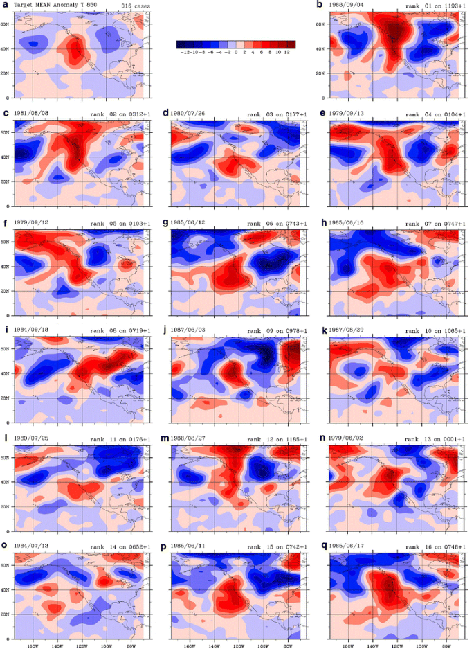
a Ta at 850 hPa target ensemble mean. b–q The 16 members of the target ensemble. The dates shown are those where each of the 3 CV stations used (KBFL, KFAT, KBFL) each had normalized maxTa >1.6 during the 1979–1988 summers. Date and rank are indicated on each panel with rank 1 being the hottest anomaly
-
b.
‘Sign-counts’ are calculated at each grid point. Sign counts record the sign of the anomaly for each member of the target ensemble at each grid point. If all 16 members had positive sign at a particular grid point the sign-count is +16 at that point. If 13 are negative and 3 positive, the sign-count is −10. This simple measure identifies how consistent the pattern is at that point among the ensemble members.
-
c.
As a test, empirical orthogonal functions (EOFs) of Ta at 700 and 850 were created from the 33 target dates. Since the target dates were all extreme hottest days and some dates were sequential, the leading EOF at either pressure level explained ~40% of the variance among the 33 occurrences of a field on the hottest dates. (EOFs were not calculated for Va.) In early tests of the pilot scheme, using EOFs of Ta at 850 performed better than using the composite Ta, however those tests are not shown here.
Figure 3 illustrates the target composite fields for Va at 700 and Ta at 850. It is important to note that the highest values of Ta and sign-counts are at the coast or offshore. Hence, one would expect to predict CV hottest days better using several grid points offshore instead of using the 3 grid points over the CV. The dynamical reasons for this will be discussed later.
Fig. 3 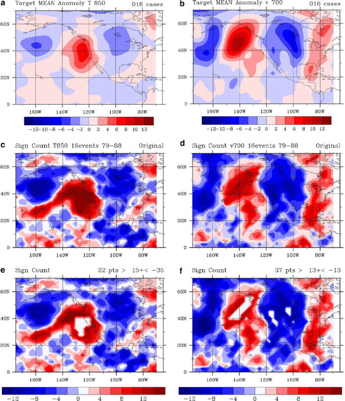
Target ensemble means and sign counts (see text) of daily anomaly values: Ta at 850 hPa (left column) and of Va at 700 hPa (right column). a, b Target ensembles using the 16 target dates of extreme CV normalized maxTa that occur in the 1979–1988 time period. c, d Are the corresponding sign counts where positive values (red) correspond to consistently positive values among the ensemble members and consistently negative values (blue) for negative sign counts. The ‘holes’ in the sign counts plotted in e and f indicate what grid points were used to calculate the circulation index predictor
-
a.
-
6.
Calculate the predictors each day. A daily circulation index is calculated for each predictor (Ta at 850 and Va at 700 hPa here). The predictor is based on how similar the daily values are to the target composite over a select group of grid points. The group of grid points was chosen from those clusters of points that were highly consistent between the members of the target composites, i.e. those clusters of points with a large sign count (either positive or negative). The pilot scheme multiplies the daily value of Ta at 850 times the target ensemble at those grid points whose sign count is >15; those products are then summed and finally divided by the number of grid points used. In essence, the calculation is an unnormalized projection of part of the daily field onto the corresponding part of the relevant target composite. The resulting predictor measures how strongly that day’s Ta pattern matches the corresponding target composite. Larger positive values of the predictor mean the day’s pattern matches the target composite more closely and/or has larger relevant amplitude. Negative predictor values indicate that the day has the ‘opposite’ anomaly pattern (e.g. a trough where the target composite has a ridge). A similar predictor was calculated for Va at 700 hPa. The ‘circulation index’ is a combination of these predictors. For example, 0.7 times the predictor value for the Ta at 850 hPa plus 0.3 times the predictor value for Va at 700 hPa could define the circulation index used for each day. Figure 3 also indicates which grid points were used when comparing the target ensemble with the corresponding daily maps.


Three other predictor schemes will be shown for comparison purposes. One uses the same Ta grid points as in the pilot scheme, but does not use the Va field. The purpose of that scheme is to show the improvement when using a second upper air variable. The other two schemes use just the Ta values at 850 hPa at the 3 grid points directly above the CV. The purpose of these two schemes is to show how the pilot scheme has skill not just because the temperature at 850 hPa will be similar to the surface maximum temperature beneath these points but that the use of points offshore, as expected from the dynamics, will have greater skill in finding the hottest days. The two versions of the scheme using only grid points over the CV are 12 h apart; one (labeled 12GMT) occurs 11 h (typically) before the maxTa occurs and corresponds to the time used for the pilot scheme, the other (labeled 0GMT) occurs nearly simultaneously with the hottest surface air temperatures.
Some readers may wonder why a regression scheme is not used. A regression scheme is a logical choice when a predictand is sought for a larger number of observed values. In contrast, this study focuses on the rare extreme values. In a regression scheme, the first predictor might be the one most highly correlated with the observed quantity one wants to forecast. Subsequent predictors are added based upon which predictor results in the greatest reduction of error variance. For the problem studied here, the goal is to capture as many of the extremely rare events as possible with a limited choice of predictors, use the predictand values to define the tail of the distribution, and use that information to deduce various quantities (such as return period). In regression analysis, minimizing a squared estimation error results in formulas for regression coefficients, but such is not the case here. There are only a few extreme events and they are heterogeneously distributed (though data are sometimes pre-processed to improve that). Data are clustered mainly towards one side of the range examined. The author does not know of a formula to optimally combine two predictors so iteration is employed. The approach here is further constrained by casting the problem in terms of the extremely limited set of archived daily variables (and levels) available for the indicated climate model.
3 Results
The circulation index was compared with the normalized maxTa values for the CV 3-station average. A few combinations of two predictors were tested. The two predictors using 2 ensembles are: Ta at 850 hPa and Va at 700 hPa using the first 16 dates and using the 33 dates from the entire record. Little will be said about the experiments using ensembles based on the 33 dates from the 1979–2006 full record. Emphasis is placed on the schemes having a training period and separate independent period from the full record. However, tests using the leading extreme 850 hPa Ta EOF performed better than using the composite 850 hPa Ta when all 33 dates were input into the composites and EOF calculation. The first 16 events that satisfy the definition in Table 1 occur in the first 10 years: 1979–1988 of the period of study. The circulation index was calculated for that period and the subsequent 18 years. Four combinations tested and described here to construct the circulation index are: 1.0/0.0, 0.67/0.33, 0.75/0.25, and (averaging the last two) 0.71/0.29 for Ta/Va predictors.
Figure 4 shows a comparison between the observations and the circulation index defined using the 0.71 and 0.29 combination of the Ta and Va predictors. All summer days of all the years in the study are shown. It should be immediately clear that the circulation index and the observed normalized maxTa are very similar. Also, there is no apparent degradation in the similarity between the first 10 and the last 18 years of the record. Noting that the scheme was only based on a few very hot days and was only intended to identify the rare hottest events, the ability of the scheme to pick up near-normal and cold anomaly dates would appear to be a bonus.

Time series comparison of pilot scheme circulation index predictor (blue dots) with daily normalized maximum temperature anomaly (normalized maxTa) averaged for 3 CV stations (red dots). The 33 target dates on which all 3 CV stations had normalized maxTa >1.6 are indicated with a blue circle drawn around the predictor value for that date. The green line is drawn at 1.6 (~2% of red values >1.6). All summers in the 28 year record are shown to illustrate the high similarity between the predictor and the 3-station average normalized maxTa. The abscissa is June–September days counting from 1 June 1979
The circulation index captures some elements of the general distribution of maximum surface air temperature, though that is not the primary purpose. The skill is obviously related to the similarity between surface and 850 hPa temperatures, though the nearly 12 h time difference should not be ignored. Table 2 summarizes the general properties of the observed distribution of normalized maxTa along with the corresponding properties of the pilot scheme and three other comparison schemes. Since anomaly data are used, the mean is essentially zero by design in all cases. The variance is similar in each scheme but that quantity could be easily adjusted by a simple multiplier of the data. The more interesting properties are the higher moments: skewness and kurtosis. The observed normalized maxTa are negatively skewed, meaning the ‘tail’ is longer on the ‘left’ side below the median than on the side above the median (i.e. ‘heavier’ above the median). The observed normalized maxTa also have a notable negative kurtosis (‘platykurtic’), meaning the higher values of the distribution are broader and the tails lower than a normal distribution. Adding the second upper air variable to the pilot scheme improves the matching in the skewness and the kurtosis, and does especially well with the kurtosis. The two schemes using only gridded Ta values above the CV (the right 2 columns in Table 2) do a good job capturing the skewness, though the earlier time (12GMT) does better than using values near the time of maximum surface temperature (0GMT). The kurtosis is not so well captured when using the grid points above the CV, being the incorrect sign for 0GMT values. Overall, the values of the four schemes presented in Table 2 are similarly highly correlated with (observed) normalized maxTa.
As for the primary mission of finding those ~1% of the days that are hottest, the combination of Ta and Va in the pilot scheme has some success (Table 3). Of the top 33 values of the circulation index, 15 match the original group of 33 target dates. Only 2 of the top 33 dates of the circulation index are ‘busts’ in this sense: having a high circulation index on a day when the 3-station average is less than one standard deviation above normal. (There is no obvious unusual trait linking these busts though in both cases the KRBL temperature drops more than 1 standard deviation from the day before.) Also, 22 of the 33 largest circulation indices match dates when the 3-station normalized maxTa average exceeds the lowest value (1.686) from the target dates matching the definition in Table 1. For comparison, Table 3 includes related statistics for the other 3 schemes. Adding Va to the Ta improves the success in capturing the most extreme event dates (from 11 to 15). Adding Va to Ta improves the dates captured from: 5 to 7 of the first 16 events and from 6 to 8 of the 17 events in the ‘independent’ time period, for an overall improvement in the successful capture rate from 33 to 45%. The schemes using values of grid points above the CV do not do as well as the pilot scheme, especially when the upper air values are close in time to the surface temperature maximum.
Some very hot days in the CV are not pegged as target dates because one station is just below the 1.6 threshold of normalized maxTa even when the other 2 stations are well above it. So the 1.6 threshold for all stations is somewhat artificial in missing some very hot dates. The 3-station average normalized maxTa is >1.686 for all of our 33 target dates, but more than 33 days have 3-station average normalized maxTa >1.686. Cast the opposite way: only 18 of the top 33 of the 3-station average normalized maxTa are also members of the 33 target dates (when all 3 stations must also each exceed 1.6). There can be extremely high values at some stations and hot, but not extreme values at other stations on some dates; this situation makes the 3-station average very large but not all stations exceed the 1.6 threshold value. So the 15 events in the top 33 based on the 3-station average that are not in our 33 extreme events are not captured as well by our scheme in part because larger scale patterns do not create uniformly extreme temperatures over the CV. For example, using the largest values of the 3-station normalized maxTa average: 11 of the highest 30 values of the circulation index match dates of the 30 highest values of the 3-station average. (These 11 are also in the 18 dates that match the 33 target dates.) The highest 30 3-station average values are all >1.870. This measure is comparable for two of the other comparison schemes, and notably better than using the 3 grid points above the CV at 0GMT (Table 3).
While Fig. 4 shows results for a particular choice of the weighting between Ta and Va, the results are not sensitive to that relative weighting. For Ta/Va wieghts of 0.67/0.33: 14 of the top 31 circulation index values are in the original group of 33 target dates, 11 are in the top 30 of the 3-station average (not using a threshold). Similarly, for Ta/Va weights of 0.75/0.25: 14 of the top 30 circulation indices are in the original group of 33 and 11 of the top 30 indices are in the top 30 of the 3-station average values. General properties: the correlation (all >0.81), the root mean squared error (~0.4 which is 2–3 K), and the bias (essentially zero) are nearly the same for these 3 combinations that include Va. This relative lack of sensitivity is a necessary (though not sufficient) condition for applying the technique in other contexts, such as to climate model output.
The discussion of hits and near misses of the target dates may suggest measures of skill that apply to the occurrence or not of an event, such as the probability of detection (POD) score, false alarm ratio (FAR) and critical success index (CSI). Marzban (1998) has analyzed these and other scores applied to rare events. If the issue were simply capturing the 33 events or not, then the POD = 0.455; FAR = 0.545; and CSI = 0.294 for this pilot scheme (Table 3). For reference, the CSI would be 0.009 if no dates were ‘forecast’ and 0.005 for random guesses, two threshold measures of no skill (Marzban 1998). The CSI has sometimes been referred to as the threat score and variations that include skill measured relative to random chance have been proposed (see Stephenson et al. 2008, for a review). The events are so rare that their prediction by chance is essentially zero (see * values in Table 3) so the equitable threat score is not notably different from the CSI. However, Stephenson et al (2008) suggest using a related measure, the extreme dependency score (EDS) for rare events. The EDS scores are also given in Table 3. By all of these measures the pilot scheme clearly has skill. For comparison, the pilot scheme event verification measures are much better than using 850 hPa temperature for grid points over the CV (POD = 0.303, FAR = 0.697, CSI = 0.178). While encouraging, such measures have limited value for both the current analysis and our future purpose in designing a scheme that relates upper air patterns and extreme surface maximum temperature. Near misses should not be lumped together with all misses and all hits treated equally because the purpose of the scheme is to capture the shape, scale and other properties of the tail of the distribution of maximum surface temperature. Hence, the magnitude (how far above some threshold) as well as ‘near misses’ just below a threshold are relevant. The intended purpose also means that lower moments of the distribution (like the mean and the variance) are less interesting than higher moments (skewness and kurtosis).
The similarity between circulation index and observed maximum temperature during all summer dates is explored further. The correlation between the two sets of points in Fig. 4 is 0.83. Kanamitsu and Kanamaru (2007a hereafter KK2007a) compare dynamically downscaled (to 10 km) data (labeled CaRD10) from the Regional Spectral Model of Juang and Kanamitsu (1994) along with NCEP/NCAR Reanalysis (hereafter NNR; Kalnay et al. 1996) data to maximum temperature observations at 12 California stations, including 5 in the CV. KK2007a show the August 2000 maximum temperature correlations between observations and for those 12 stations to be on average: 0.75 and 0.77 for CaRD10 and NNR respectively. However, the CV stations have individually higher correlations. Kanamitsu and Kanamura (2007b; hereafter KK2007b) show correlations for individual stations: 0.89/0.62 for KBFL in CaRD10/NNR data, 0.89/0.89 for KFAT in CaRD10/NNR, and 0.84/0.64 for KRDD (which is somewhat near KRBL). The RMSE values for daily maximum temperature reported by KK2007b are: 1.6/2.8 K for KBFL in CaRD10/NNR data, 1.6/1.8 for KFAT in CaRD10/NNR, and 2.1/2.9 for KRDD in CaRD10/NNR. The root mean squared difference (RMSD) between the points in Fig. 4 is 0.44, which converts to 1.4–1.9 K. (A range is given for the RMSD because the LTDSD used to normalize varies, being much larger in June and September than in July and August.) To directly compare with Kanamitsu and Kanamaru, we calculated statistics for all the August months and found the RMSD to be 1.6 K. The circulation index has essentially no bias (0.0031 K) averaged over all 3,416 days. KK2007b find maximum temperature bias values for CaRD10 of ~2 K for August 2000, so to compare, our average bias using only August dates is −0.027 K which is very similar to the sum of the observed values (−0.028) for the same months. Hence, the pilot scheme circulation index performs as well (maybe better than) an excellent downscaling model and much better than interpolating the reanalysis data.
The pilot scheme’s average RMSD of 1.4–1.9 K seems comparable, if not better than, the mean error by the US Weather Research and Forecasting (WRF) model (Skamarock et al. 2005) in forecasting high temperatures for the CV. In early testing of model output statistics for the contiguous states, WRF had a mean absolute error of ~3 K for maximum temperatures (see http://www.nws.noaa.gov/mdl/synop/wrfmoseval.htm). More specifically to the CV, Valade (2009) used the WRF model to simulate 2-m surface air temperature (SAT) in the San Joaquin Valley (SJV) during the record-breaking 2006 heat wave. She compared the daytime maximum WRF SATs against California Irrigation Management Information System (CIMIS) station data and found typical errors of 3–4 K. Valade (2009) also showed that the nighttime minimum SATs are much better simulated than the maximum SATs by WRF, consistent with data in KK2007a and KK2007b where the daily mean values are more accurate than the maximum temperature values. Caldwell et al. (2009) downscale NCAR CCSM finite volume (1 × 1.25°) simulations and remark that maximum temperature bias is smaller than minimum temperature while stating that daily average summer SATs are ‘several degrees’ K higher than observed. Soong et al. (2006) compare WRF and MM5 (the Pennsylvania State University/NCAR mesoscale model version 5; Grell et al. 1994) simulations during an ozone pollution event: 31 July to 2 August, 2000. Though the simulation period is very short, Soong et al. report CV SAT RMSE values of: 3.15/1.97 K for WRF/MM5 temperatures at KSAC, 2.49/1.92 K for central SJV stations, and 2.70/2.05 K for southern SJV stations. Soong et al. report daily mean temperatures, so simulated maximum temperatures may have larger errors. Hence, our simple circulation index, intended to find rare extreme hottest days, has comparable or better skill than benchmark regional models. This unintended skill expands the usefulness of this scheme. But, if the goal was to capture the normalized maxTa for all situations (cold, near-normal, and hot days) then a simpler formulation like the 3 grid points above the CV 12 h before the time of maximum temperature performs a little better than the pilot scheme (Table 2). The pilot scheme does however, capture the most extreme values better (and the kurtosis) and that portion of the distribution is more important for extreme value statistical analysis (e.g. Coles 2001).
Extreme value statistics has several tools for analyzing the tail of a distribution. Table 3 also includes the scale and shape parameter values for a generalized Pareto distribution (GPD) fit to the top 33 values of the observations and each of the 4 schemes. The data were calculated using the extRemes toolkit (Stephenson and Gilleland 2006; Gilleland et al. 2010). The scale parameter (σ) is related to the inverse of the magnitude; generally, the larger the scale value the smaller the values of the probability density function (PDF). The shape parameter (ξ) is an indicator of how long the tail is; generally, the larger the shape parameter, the more rapidly the PDF decreases as temperature anomaly increases, while negative values tend to straighten out the ‘curve’ in the tail and thus create a zero crossing (i.e. an upper bound). The location parameter is specified to single out the top 33 values for each scheme and the schemes have a little different ranges of values than do the observations. Some difference in the shape parameter should follow from the change in location between the time series. However, the differences between the thresholds are not large. Despite the differences in the ranges of values, the pilot scheme approximates best the observed values of both GPD parameters. The schemes based on the 3 grid points above the CV tend to be flatter with longer, lower, tails. Capturing these properties of the tail is important for estimating other quantities, such as a return period for an event of a particular amplitude. The shape and scale parameter values do change slowly as the number of values (used by the GPD) is increased (by lowering the thresholds), though similar rankings hold for the top 2% of the values even though the pilot scheme was only intended to approximate the top 1%. As the number of values being fit increases, the performance of just using grid points above the CV improves relative to the other schemes since those schemes have a better depiction of the overall distribution.
A variation of our circulation index was based on using all 33 target dates from the entire record instead of the 16 in the first 10 years. The results were similar (correlation of 0.85, for example). Among the experiments, results were compared when using a correlation versus the projection; the projection gave superior results.
4 Physical interpretation and conclusions
4.1 Physical interpretation of the hottest days weather pattern
The hottest days are associated with unusually warm lower tropospheric temperatures (especially at 700 and 850 hPa) near and off the northwest coast of California (see Fig. 5a). The placement of the larger anomaly just offshore and the resultant high CV surface temperatures can be understood from simple dynamics. By having the strongest temperature anomaly there, the upper level ridge in geopotential (especially at 500 and 300 hPa) is enhanced on its western side. Normally that ridge is centered over the Rocky Mountains, but during the hottest days it stretches further west. So, instead of mid-tropospheric southwesterlies over the western Great Basin, there are westerlies and northwesterlies. These changes enhance the sinking over the Sierra Nevada Mountains of California (Fig. 5b) since the thermal wind brings negative vorcitiy advection over northeastern California. The westward extension of the mid-tropospheric geopotential ridge causes the 700 hPa level flow to become less westerly and even have an (offshore) easterly component over the CV during extreme hottest days. An offshore component also develops at 850 hPa. The surface flow develops a downslope component over the western side of the Sierra Nevada Mountains (Fig. 5d) especially at night when reinforced by the local thermal and topographic circulation.

Composite synoptic weather patterns at the onset of the 14 Sacramento California heat waves studied by Grotjahn and Faure (2008). a Temperature at 850 hPa with a 2 K interval. b Pressure velocity with 2 Pa/s interval and where positive values mean sinking motion. c Sea level pressure with 2 hPa interval. d Surface wind vectors with shading applicable to the zonal component. Areas with yellow (lighter inside dark) shading are positive (above normal) anomalies that are large enough to occur only 1.5% of the time by chance in a same-sized composite; areas that are blue (darker inside light) shading are negative anomalies occurring only 1.5% of the time
The placement of the maximum temperature anomaly offshore also causes the surface ‘thermal low’ in sea level pressure (SLP) to be displaced westward resulting in a trough along the coast. In contrast, SLP over the Great Basin is significantly enhanced (Fig. 5c) and the resulting SLP gradient drives easterlies over the CV (Fig. 5d). The winds above the subsidence inversion over the CV and coastal ranges are thus blowing in a direction with an offshore component, inhibiting any sea breeze from entering the CV. The placement of the 850 hPa temperature anomaly maximum off the coast also causes the flow there to be parallel to the shore or off the shore in the lower troposphere. Hence the large scale flow does not support cooling onshore winds.
Topography creates complex local circulations in the large scale environment described in Fig. 5. During the afternoon, there is often a shallow layer of near-surface air moving up the western slope of the Sierra Nevada Mountains (i.e. a ‘valley breeze’) driven by the strong daytime heating. The sinking described here occurs above that shallow layer. The large scale circulation with a down slope component over the Sierra Nevada Mountains is reinforced at night by drainage flow driven by radiational cooling at the higher elevations.
The large scale sinking creates a subsidence inversion over the CV. The closest relevant sounding is at Oakland California (KOAK). In the July 2006 extreme heat wave the sounding at KOAK is unusually moist as pointed out by GCI, however the dewpoint depression is generally large above the subsidence inversion even for that event. Figure 6 shows the morning and afternoon soundings at the first of the 3 days of that event that are in the 33 dates emphasized here. During early morning (Fig. 6a) the strong inversion extends to the surface. The inversion top is at 941 hPa (607 m above ground level, AGL). The subsidence inversion is easily seen in the following afternoon sounding (Fig. 6b) with a shallow surface layer (0–171 m above the ground) with positive lapse rate. The subsidence inversion bottom is at 987 hPa (171 m AGL) and the top is at 976 hPa (272 m AGL). Above the subsidence inversion the lapse rate is ~8.2 K/km during both time periods. From the morning to the afternoon sounding, the lowered top of the subsidence inversion and the lowered dewpoints at a given level (above the inversion) are consistent with the large scale sinking. Despite the sinking and large dewpoint depression, the precipitable water (PW) values are high for KOAK; both values are more than 2 standard deviations above the mean for July. Generally higher moisture was present in the region prior to the onset of the event; KOAK precipitable water values reached 43.86 mm (1.73 inches) on 19 July, four days prior to the onset of the event. PW declined over subsequent days as the 2006 event reached its maximum on 25 July 2006.

Soundings at station KOAK of temperature (solid line) and dewpoint (dashed line) at the onset of the extreme heat during the July 2006 heat wave. A subsidence inversion is quite common over the region during summer and especially during heat waves. The subsidence inversion is very low and shallow in the afternoon sounding. Dewpoints at most elevations above the inversion are lower in the afternoon than in the morning sounding. Despite the subsidence, the precipitable water content in this sounding is more than two standard deviations above the July normal for KOAK
During the daylight hours the surface heating from absorbing solar radiation is trapped in the shallow layer below the inversion and the 2 m air temperature rapidly rises. A contributing factor to the rapid rise in temperatures within the shallow inversion layer is the dry soil prevailing over most of California during this time of year (with high soil moisture over much of the heavily irrigated CV). Drought that leads to lowered soil moisture is sometimes associated with heat waves (e.g. Lyon and Dole 1995) but not necessarily as the primary factor (Trenberth and Branstator 1992). For European heat waves, low soil moisture created by a dry spring and summer (if not a drought the preceding winter as well) has been linked to summer heat waves (Vautard et al. 2007; Zampieri et al. 2009). So why is soil moisture not an important factor for the CV hottest days? Soil moisture is less of a factor for the CV because the soil moisture during JJAS is quite consistent from 1 year to the next over the CV and adjacent lands within California. In the CV, the (extensive) irrigated areas are irrigated to similar moisture levels each year, and the surrounding unirrigated regions experience drought each summer. In contrast, over France, say, soil moisture has much greater interannual variability during summer. Hence, over the CV the large scale daily circulation dominates the effect of soil moisture in creating the hottest days.
Dynamically, the placement of the maximum temperature anomaly just offshore leads to a chain of events that result in the hottest CV SATs. Large scale sinking and downslope flow adiabatically warms the lower tropospheric air. Daytime heating cannot be mixed through a large depth of the atmosphere. A shift of the SLP low to the coast with a build up of SLP to the east builds a pressure gradient to oppose cooling ocean breezes. The uniform consistency of these key parts of the large scale circulation, given the wide spectrum of weather patterns that have occurred historically, argues that those key parts are required for the hottest events. Indeed, the success of the pilot scheme demonstrates the same link when it picks up very hot events in years that were not used to define the pilot scheme.
A remaining issue is to explain the success of the pilot scheme during near-normal and unusually cool events. Clearly, the pilot scheme emphasizes lower troposphere temperatures and so it is well correlated (Table 2) with surface maximum temperature anomaly. However, the connection is more interesting than that. It is well known to local forecasters that the onshore push of an upper level trough promotes a thicker marine boundary layer and drives onshore breezes. The land-falling upper level trough is of course associated with unusually cool lower tropospheric temperatures near the northwest coast of California. Hence, the lower troposphere temperature anomaly pattern during a summertime cool day has similar shape, but opposite sign to the pattern for the hottest days. Since the sign is opposite in the key parts used by the pilot scheme, negative values of the circulation index are linked to the cool periods just as positive values are to the hot periods.
The larger region and shorter summer season in Gershunov et al (2009; GCI) limit comparison with the study here. First, their region is meteorologically heterogeneous, so their events tend to affect a fraction of the domain for each case they emphasize (their Table 4). Three sources of heterogeneity include, timing of systems to traverse their region, topographic elevation, and maritime influence. The climatological windflow for the CV during summer is a sea breeze (e.g. Zhong et al. 2004) which does not extend into NV. Weak sea breezes can moderate CV temperatures (somewhat) during events that bring unusual heat into NV or the eastern CA deserts. Second, GCI emphasize 2 ‘daytime’ (and 1 mixed daytime and nighttime) heat waves that overlap with the time period used here. Those 3 events are part of the 22 periods of hottest days here; but some events not included in GCI have hotter absolute (as well as anomaly) temperatures across the CV. Third, GCI use June–August data; but, temperatures in September are more similar to those in June than June temperatures are to either August or July temperatures when one considers just the CV. Several extreme events that occur in late August and early September including the largest anomaly during our period (4 September 1988) for the combination of the 3 stations which are used here to represent the CV. (On 4 September 1988 the maximum temperatures were: 47.8°C (118°F) at KRBL, 41.7°C (107°F) at KFAT, and 42.8°C (109°F) at KBFL).
Gershunov et al. (2009) discuss some differences (mainly in the precipitable water) between their 5-member composites for nighttime and daytime extreme events. Their 5 extreme nighttime events in their composite all occur in our period of data but these are not dates of notable heat in the CV. The daily temperature anomaly (normalized by standard deviation) averaged for the CV for the dates of the nighttime cases ranges from 0.6 to 1.7. The nighttime dates used by GCI are not consistent with extreme heat for the CV, though some GCI dates just miss dates of high heat in the CV. The author did not test whether ‘nighttime’ events identified only from CV observations correspond to extreme CV heat. Interestingly, one of the GCI nighttime dates precedes a CV hottest day used here (14 July 1990). That timing may be related to westward migration of the southern portion of the upper level ridge suggested in the time sequence preceding the heat waves onset as can be seen in Grotjahn and Faure (2008; Fig. 8). The 500 hPa geopotential height composites shown by GCI have a large scale ridge that looks essentially the same for both their types of events (within a subjective variation that one might expect given the small ensemble sizes). That ridge is much like what is shown in Grotjahn and Faure. The difference in composites emphasized by GCI centers on precipitable water being much higher for their ‘nighttime’ events, but that field is not used here as a predictor.
4.2 Conclusions and future work
The first conclusion is that many of the extremely hottest days affecting the CV can be identified from the large scale weather pattern. The success of the pilot scheme is due in part to the similarity between variations in surface temperatures and lower tropospheric temperatures just above the subsidence inversion present over the region. The success of the pilot scheme is also related to a large scale flow that both creates strong subsidence and enhances offshore flow over much of central and northern California. The large scale upper level flow might be viewed as superimposed upon a complex topographic and thermally driven flow that includes sea/land breeze tendencies; upslope/downslope tendencies; and other mesoscale circulations with strong diurnal variation. The climatological complex topographic and thermally driven flow must be inhibited by both large scale subsidence as well as a shift of the thermal low to the coast if not offshore (the latter is captured, in part, by the offshore grid points used in the pilot scheme). Capturing this interaction between synoptic and mesoscale circulations relates to the second conclusion of this study.
A second conclusion is that the pilot scheme works better than simply using those lower tropospheric (850 hPa) temperatures directly over the CV. The schemes using the few points above the CV do have slightly better performance in capturing the entire distribution of CV normalized maxTa values, but they do not perform as well as the pilot scheme in capturing the hottest extremes of the distribution. A clue to why the pilot scheme performs better in that latter regard comes from considering the time of day used. Using grid point values only over the CV 12 h before the time of maximum surface temperature performs better than using those same grid points at essentially the same time as the maximum temperature (near 0GMT) at the surface below. The reason why 12 h before is a better predictor (of extremes) concerns how strong the low level inversion is; higher 850 hPa temperature 12 h prior is a proxy measure for a stronger low level subsidence inversion. In simple terms, the stronger inversion traps more subsequent daylight heating elevating the surface temperatures later in the day. Again, the pilot scheme exploits how much the large scale circulation on a summer day matches the composite circulation structure (and strength); and thus how much the large scale circulation on that day sets up the environment for heat to develop and the climatological cooling circulation to be inhibited. The simplistic choice of 850 hPa T only above the CV does not assess how well the large scale circulation will inhibit the climatological cooling sea breeze except perhaps indirectly, so it does not work as well in capturing the extreme events.
The third conclusion is that the pilot scheme appears to perform as well as an elaborate pairing of a regional model driven by large scale data. Even in a simple prototype form, the pilot scheme picks out many of the rare events that occur during the time period, including rare events in an independent time period.
The performance of the scheme can likely be improved by several ways. Some improvements worthy of testing include: more upper air predictor variables than 2, more CV stations to represent better CV-wide maximum temperatures, and more years and hence more extreme events to increase the sample size. However, the reader is reminded that the variables and levels chosen for the pilot scheme were dictated by the restricted set available in archives at the time of this writing. Additional experiments might: use different threshold values (to explore the stability of the extreme statistics such as a GPD fit), and use different combinations of grid points and pressure levels for the projection. Since the ensemble mean can be dominated by exceptionally large values from a few of the extreme events, alternatives to the target ensemble composites are worth exploring, such as: using EOFs that capture the primary hottest days pattern in upper-air variables, or regressing the values of an upper air variable at each grid point against the observed maxTa to define the pattern (e.g. at 1.6 STD of maxTa above normal).
The scheme was devised in part to be used as a tool to interrogate the output from medium-resolution climate models. Given the success and likely improvements to the scheme, one is encouraged to try the scheme with model data. Applying this scheme to a climate model could: show how well the model captures natural variability in general and the pattern present during extreme CV hottest days in particular. Such an analysis of historical simulations provides a benchmark for future climate simulations by that model, and allows one to separate future exceedances of a temperature threshold due to changes in variability from changes due to a secular trend of temperature.
References
Bachmann B (2008) The spatial extent of California heat waves. MS thesis, Atmospheric Science Program, University of California Davis, March, 164 pp. PDF available at: http://atm.ucdavis.edu/~grotjahn/EWEs/
Bao J-W, Michelson SA, Persson POG, Djalalova IV, Wilczak JM (2008) Observed and WRF-simulated low-level winds in a high-ozone episode during the Central California Ozone Study. J Appl Meteorol 47:2372–2394
Beniston M (2004) The 2003 heat wave in Europe: a shape of things to come? An analysis based on Swiss climatological data and model simulations. Geophys Res Lett 31:L02202. doi:10.1029/2003GL018857
Blier W (2007) The record-breaking Central California heat wave of July 2006. 22nd conference on weather analysis and forecasting/18th conference on numerical weather prediction, 25–29 June 2007, Park City, Utah. PDF available at: http://ams.confex.com/ams/22WAF18NWP/techprogram/paper_123744.htm
Caldwell P, Chin H-N, Bader D, Bala G (2009) Evaluation of a WRF dynamical downscaling simulation over California. Clim Change 95:499–521. doi:10.1007/s10584-009-9583-5
Coles SG (2001) An introduction to statistical modeling of extreme values. Springer Series in Statistics, 208 pp
Gershunov A, Cayan DR, Iacobellis SF (2009) The great 2006 heat wave over California and Nevada: signal of an increasing trend. J Clim 22:6181–6203
Gilleland E, Katz RW, Young G (2010) Extremes toolkit: weather and climate applications of extreme value statistics, 75 pp. Available at: http://www.isse.ucar.edu/extremevalues/extreme.pdf
Gosling SN, McGregor GR, Paldy A (2007) Climate change and heat-related mortality in six cities. Part 1: model construction and validation. Int J Biometeorol 51:525–540
Grell G, Dudhia J, Stauffer D (1994) A description of the fifth-generation Penn State/NCAR mesoscale model (MM5) NCAR Technical Note, NCAR/TN-398+STR, 122 pp
Grotjahn R, Faure G (2008) Composite predictor maps of extraordinary weather events in the Sacramento California region. Weather Forecast 23:313–335
Hajat S, Kovats RS, Atkinson RW, Haines A (2002) Impact of hot temperatures on death in London: a time series approach. J Epidemiol Comm Health 56:367–372
Iacobellis S, Norris J, Kanamitsu M, Tyree M, Cayan D (2009) Climate variability and california low-level temperature inversions. California Energy Commission Report CEC-500-2009-020-F. Available at: http://www.energy.ca.gov/2009publications/CEC-500-2009-020/CEC-500-2009-020-F.PDF
Juang H-M, Kanamitsu M (1994) The NMC nested regional spectral model. Mon Weather Rev 122:3–26
Kalnay E, Kanamitsu M, Kistler R, Collins W, Deaven D, Gandin L, Iredell M, Saha S, White G, Woollen J, Zhu Y, Leetmaa A, Reynolds R, Chelliah M, Ebisuzaki W, Higgins W, Janowiak J, Mo K, Ropelewski C, Wang J, Jenne R, Joseph D (1996) The NCEP/NCAR 40-year reanalysis project. Bull Am Meteorol Soc 77:437–471
Kanamitsu M, Kanamaru H (2007a) Fifty-seven-year California reanalysis downscaling at 10 km (CaRD10). Part I: system detail and validation with observations. J Clim 20:5553–5571
Kanamitsu M, Kanamaru H (2007b) Fifty-seven-year California reanalysis downscaling at 10 km (CaRD10). California Energy Commission PIER Project Report, CEC-500-2006-071, 82 pp. Available at: http://www.energy.ca.gov/publications/displayOneReport.php?pubNum=CEC-500-2006-071
Kanamitsu M, Ebisuzaki W, Woollen J, Yang SK, Hnilo J, Fiorino M, Potter G (2002) NCEP-DOE AMIP-II Reanalysis (R-2). Bull Am Meteorol Soc 83:1631–1643
Kozlowski D, Edwards L (2007) An analysis and summary of the July 2006 record-breaking heat wave across the state of California. NOAA Western Region Technical Attachment No. 07-05, 42 pp. Available at: http://www.wrh.noaa.gov/wrh/07TAs/ta0705.pdf
Lipton K, Grumm R, Holmes R (2005) Forecasting heat waves using climatic anomalies. 21st conference on weather analysis/17th conference on numerical weather prediciton, 1–5 Aug 2005. Available at: http://ams.confex.com/ams/pdfpapers/94498.pdf
Lyon B, Dole RM (1995) A diagnostic comparison of the 1980 and 1988 U.S. summer heat wave-droughts. J Clim 8:1658–1675
Marzban C (1998) Scalar measures of performance in rare-event situations. Weather Forecast 13:753–763
Meehl G, Tebaldi C (2004) More intense, more frequent, and longer lasting heat waves in the 21st century. Science 305:994–997
Palecki M, Changnon S, Kunkel K (2001) The nature and impacts of the July 1999 heat wave in the Midwestern United States: learning from the lessons of 1995. Bull Am Meteorol Soc 82:1353–1367
Robinson P (2001) On the definition of a heat wave. J Appl Meteorol 40:762–775
Schär C, Vidale P, Lüthi D, Frei C, Häberli C, Liniger M, Appenzeller C (2004) The role of increasing temperature variability in European summer heatwaves. Nature 42:332–336. doi:10.1038/nature02300
Skamarock W, Klemp J, Dudhia J, Gill D, Barker D, Wang W, Powers J (2005) A description of the advanced research WRF version 2. NCAR/TN-468+STR, 88 pp
Soong S-T, Martien P, Archer C, Tanrikulu S, Bao J-W, Wilczak J, Michelson S, Jia Y, Emery C (2006) Comparison of WRF/CAMx and MM5/CAMx simulations for an ozone episode in California. Joint between the 8th conference on atmospheric chemistry and the 14th joint conference on the applications of air pollution meteorology with the A&WMA, 1 Feb 2006, Atlanta GA, USA. Available at: http://ams.confex.com/ams/Annual2006/techprogram/paper_104587.htm
Stephenson A, Gilleland E (2006) Software for the analysis of extreme events: the current state and future directions. Extremes 8:87–109. doi:10.1007/s10687-006-7962-0
Stephenson DB, Casti B, Fero CAT, Wilson CA (2008) The extreme dependency score: a non-vanishing measure for forecasts of rare events. Meteorol Appl 15:41–50. doi:10.1002/met.53
Trenberth KE, Branstator GW (1992) Issues in establishing causes of the 1988 drought over North America. J Clim 5:159–172
Valade A (2009) Evaluation of the simulation of the 2006 California heat wave by WRF using satellite and ground-based observations. MS thesis, Atmospheric Science Program, University of California Davis, December, 92 pp
Vautard R, Yiou P, D’Andrea F, de Noblet N, Viovy N, Cassou C, Polcher J, Ciais P, Kageyama M, Fan Y (2007) Summertime European heat and drought waves induced by wintertime Mediterranean rainfall deficit. Geophys Res Lett 34:L07711. doi:10.1029/2006GL028001
Zampieri M, D’Andrea F, Vautard R, Ciais P, de Noblet-Ducoudré N, Yiou P (2009) Hot European summers and the role of soil moisture in the propagation of Mediterranean drought. J Clim 22:4747–4758
Zhong S, Whiteman CD, Bian X (2004) Diurnal evolution of the three-dimensional wind and temperature structure in California’s Central Valley. J Appl Meteorol 43:1679–1699
Acknowledgments
The author is grateful to Dr. Masao Kanamitsu for sharing unpublished data from his downscaling system CaRD10 and for directing the author to some of his downscaling results for the CV. The NCEP/DOE AMIP-II Reanalysis (NDRa2) data used in this study have been obtained from the NOAA/OAR/ESRL PSD, Boulder, Colorado, USA, from their Web site at http://www.cdc.noaa.gov/. The author acknowledges the very helpful discussions of this project and its results with Drs. Fabio D’Andrea, Cholaw Bueh, Ian Faloona, Philippe Naveau, David Stephenson, Renato Vitolo, and Pascal Yiou (alphabetical listing). The helpful comments of Renato Vitolo and two anonymous reviewers improved the ms. The use of the extremes toolkit (for calculating shape and scale parameters of a GPD for various thresholds) is acknowledged. Specifically, the extRemes: Extreme value toolkit for R package version 1.62. http://CRAN.R-project.org/package=extRemes was developed by Eric Gilleland, Rick Katz and Greg Young (2010). The author acknowledges support from a France-Berkeley Fund grant to consult with researchers in France and England about this work.
Open Access
This article is distributed under the terms of the Creative Commons Attribution Noncommercial License which permits any noncommercial use, distribution, and reproduction in any medium, provided the original author(s) and source are credited.
Author information
Authors and Affiliations
Corresponding author
Rights and permissions
Open Access This is an open access article distributed under the terms of the Creative Commons Attribution Noncommercial License (https://creativecommons.org/licenses/by-nc/2.0), which permits any noncommercial use, distribution, and reproduction in any medium, provided the original author(s) and source are credited.
About this article
Cite this article
Grotjahn, R. Identifying extreme hottest days from large scale upper air data: a pilot scheme to find California Central Valley summertime maximum surface temperatures. Clim Dyn 37, 587–604 (2011). https://doi.org/10.1007/s00382-011-0999-z
Received:
Accepted:
Published:
Issue Date:
DOI: https://doi.org/10.1007/s00382-011-0999-z