
Abstract
This chapter provides an overview of the factors that will govern the rise in global mean surface temperature (GMST) over the rest of this century. We evaluate GMST using two approaches: analysis of archived output from atmospheric, oceanic general circulation models (GCMs) and calculations conducted using a computational framework developed by our group, termed the Empirical Model of Global Climate (EM-GC). Comparison of the observed rise in GMST over the past 32 years with GCM output reveals these models tend to warm too quickly, on average by about a factor of two. Most GCMs likely represent climate feedback in a manner that amplifies the radiative forcing of climate due to greenhouse gases (GHGs) too strongly. The GCM-based forecast of GMST over the rest of the century predicts neither the target (1.5 °C) nor upper limit (2.0 °C warming) of the Paris Climate Agreement will be achieved if GHGs follow the trajectories of either the Representative Concentration Pathway (RCP) 4.5 or 8.5 scenarios. Conversely, forecasts of GMST conducted in the EM-GC framework indicate that if GHGs follow the RCP 4.5 trajectory, there is a reasonably good probability (~75 %) the Paris target of 1.5 °C warming will be achieved, and an excellent probability (>95 %) global warming will remain below 2.0 °C. Uncertainty in the EM-GC forecast of GMST is primarily caused by the ability to simulate past climate for various combinations of parameters that represent climate feedback and radiative forcing due to aerosols, which provide disparate projections of future warming.
You have full access to this open access chapter, Download chapter PDF
Keywords
2.1 Introduction
The objective of the Paris Agreement negotiated at the twenty-first session of the Conference of the Parties of the United Nations Framework Convention on Climate Change (UNFCCC) is to hold the increase in global mean surface temperature (GMST ) to well below 2 °C above pre-industrial levels and to pursue efforts to limit the increase to 1.5 °C above pre-industrial levels. The rise in GMST relative to the pre-industrial baseline, termed ΔT , is the primary focus throughout this book. We consider measurements of GMST from three data centers: CRU ,Footnote 1 GISS ,Footnote 2 and NCEI Footnote 3 and use the latest version of each data record available at the start of summer 2016. The current values of ΔT from these data centers are 0.828 °C, 0.890 °C, and 0.848 °C respectively.Footnote 4 The rise in GMST during the past decade is more than half way to the Paris goal to limit warming to 1.5 °C. Carbon dioxide (CO2 ) is the greatest waste product of modern society and global warming caused by anthropogenic release of CO2 is on course to break through both the Paris goal and upper limit (2.0 °C) unless the world’s voracious appetite for energy from the combustion of fossil fuels is soon abated.
Forecasts of ΔT are generally based on calculations conducted by general circulation models (GCMs ) that have explicit representation of many processes in Earth’s atmosphere and oceans. For several decades, most models have also included a treatment of the land surface and sea-ice. More recently, models have become more sophisticated by adding treatments of tropospheric aerosols , dynamic vegetation, atmospheric chemistry, and land ice. Chapter 5 of Houghton (2015) provides a good description of how GCMs operate and the evolution of these models over time.
The calculations of ΔT by GCMs considered here all use specified abundances of greenhouse gases (GHGs ) and precursors of tropospheric aerosols . These specifications originate from the Representative Concentration Pathway (RCP ) process that resulted in four scenarios used throughout IPCC (2013): RCP 8.5, RCP 6.0, RCP 4.5, and RCP 2.6 (van Vuuren et al. 2011a). The number following each scenario indicates the increase in radiative forcing (RF ) of climate, in units of W m−2, at the end of this century relative to 1750, due to the prescribed abundance of all anthropogenic GHGs . The GCMs use as input time series for the atmospheric abundance of GHGs as well as the industrial release of pollutants that are converted to aerosols. Each GCM projection of ΔT is guided by the calculation, internal to each model, of how atmospheric humidity, clouds , surface reflectivity, and ocean circulation all respond to the change in RF of climate induced by GHGs and aerosols (Houghton 2015). If the response to a specific process further increases RF of climate, it is called a positive feedback because it enhances the initial perturbation. If a response decreases RF of climate, is it called a negative feedback. The total effect of all responses to the prescribed perturbation to RF of climate by GHGs and aerosols is called climate feedback , which can vary quite a bit between GCMs , mainly due to the treatment of clouds (Bony et al. 2006; Vial et al. 2013). GCMs also provide estimates of the future evolution of precipitation, drought indices, sea-level rise, as well as variations in oceanic and atmospheric temperature and circulation (IPCC 2013).
Our focus is on analysis of projections of ΔT for the RCP 4.5 (Thomson et al. 2011) and RCP 8.5 scenarios (Riahi et al. 2011). Atmospheric abundances of the three most important anthropogenic GHGs given by the RCP 4.5 and RCP 8.5 scenarios are shown in Fig. 2.1. Under RCP 8.5, the abundances of these GHGs rise to alarmingly high levels by end of century. On the other hand, for RCP 4.5, CO2 stabilizes at 540 parts per million by volume (ppm) (~35 % higher than contemporary level) and methane (CH4 ) reaches 1.6 ppm (~10 % lower than today) in 2100. The atmospheric abundance of nitrous oxide (N2O ) continues to rise under RCP 4.5, reaching 0.37 ppm by end of century (~15 % higher than today).

GHG abundance, 1950–2100. Time series of the atmospheric CO2 , CH4 , and N2O from RCP 2.6 (van Vuuren et al. 2011b), RCP 4.5 (Thomson et al. 2011), RCP 6.0 (Masui et al. 2011), RCP 8.5 (Riahi et al. 2011), and observations (black) (Ballantyne et al. 2012; Dlugokencky et al. 2009; Montzka et al. 2011). Values of GHG mixing ratios from RCP extend back to 1860, but this figure starts in 1950 since most of the rise in these GHGs has occurred since that time. See Methods for further information
The ΔRF of climate associated with RCP 4.5 and RCP 8.5 are shown in Fig. 2.2, using the grouping of GHGs defined in Chap. 1. The contrast between these two scenarios is dramatic. For RCP 4.5, ΔRF of climate levels off at mid-century, reaching 4.5 W m−2 at end-century. For RCP 8.5, ΔRF rises throughout the century, hitting 8.5 W m−2 near 2100. Both behaviors are by design (Thomson et al. 2011; Riahi et al. 2011). While CO2 remains the most important anthropogenic GHG for both projections , other GHGs exert considerable influence.

ΔRF of climate due to GHGs , 1950–2100. Time series of ΔRF of climate, RCP 4.5 (top) and RCP 8.5 (bottom), due to the three dominant anthropogenic GHGs (CO2 , CH4 , and N2O ) plus contributions from all ozone depleting substances (ODS ), other fluorine bearing compounds such as HFCs, PFCs, SF6, and NF3 (Other F-gases), and tropospheric O3. Shaded regions represent contributions from specific gases or groups. See Methods for further information
The RCPs are meant to provide a mechanism whereby GCMs are able to simulate the response of climate for various prescribed ΔRF scenarios, in a manner that allows differences in model behavior to be assessed. Evaluation of GCM output has been greatly facilitated by the Climate Model Intercomparison Project Phase 5 (CMIP5 ) (Taylor et al. 2012), which maintains a computer archive of model output freely available following a simple registration procedure,Footnote 5 as well as the prior CMIP phases.
Two other scenarios, RCP 6.0 (Masui et al. 2011) and RCP 2.6 (van Vuuren et al. 2011b), were considered by IPCC (2013). The mixing ratio of CO2 peaks at about 670 ppm at end-century for RCP 6.0 (Fig. 2.1); the climate consequences for this scenario clearly lie between those of RCP 4.5 and RCP 8.5. For RCP 2.6, CO2 peaks mid-century and slowly declines to 420 ppm at end-century.Footnote 6 According to the authors of RCP 2.6, this scenario “is representative of the literature on mitigation scenarios aiming to limit the increase of global mean temperature to 2 °C”. While this is true for literal interpretation of the output of the GCMs that contributed to the most recent IPCC report (Rogelj et al. 2016), below we show these GCMs likely over-estimate the actual warming that will occur in the coming decades.
Figure 2.3 shows projections of ΔT from the CMIP5 GCMs found using RCP 4.5 and RCP 8.5. Observations of ΔT from CRU , NCEI , and GISS up to year 2012, as well as the CRU estimate of the uncertainty on ΔT , are shown. The green hatched trapezoid in Fig. 2.3 is the “indicative likely range for annual mean ΔT ” provided by Chap. 11 of IPCC (2013).Footnote 7 Section 11.3.6.3 of this report states:

Observed and GCM simulated global warming . (a) Time series of global, annually averaged ΔT relative to pre-industrial baseline from 41 GCMs that submitted output to the CMIP5 archive covering both historical and future time periods, using RCP4.5 (light blue). The maximum and minimum values of CMIP5 ΔT are indicated by the dark blue dashed lines, while the multi-model-mean is denoted by the dark blue solid line. Also shown are global, annually averaged observed ΔT from CRU , GISS , and NCEI (black) along with error bars (grey) that represent the uncertainty on the CRU time series. The green trapezoid represents the indicative likely range for annual average ΔT for 2016–2035 (i.e., top and bottom of trapezoid are upper and lower limits, respectively) and the green bar represents the likely range for the mean value of ΔT over 2006 to 2035, both given in Chap. 11 of IPCC (2013); (b) same as (a), expect for 38 GCMs that submitted output to the CMIP5 archive covering both historical and future time periods using RCP8.5 (red). After Fig. 11.25a and 11.25b of (IPCC 2013). See Methods for further information
some CMIP5 models have a higher transient response to GHGs and a larger response to other anthropogenic forcings (dominated by the effects of aerosols ) than the real world (medium confidence). These models may warm too rapidly as GHGs increase and aerosols decline
and
over the last two decades the observed rate of increase in GMST has been at the lower end of rates simulated by CMIP5 models.
In other words, the projections of ΔT by the CMIP5 GCMs tend to be too warm based on comparison of observed and modeled ΔT for prior decades (Stott et al. 2013; Gillett et al. 2013). The trapezoid shown in Fig. 2.3 represents an expert judgement of the upper and lower limits for the evolution of ΔT over the next two decades. The vertical bar is the likely mean value of ΔT over the 2016–2035 time period. This projection is meant to apply to all four RCPs: i.e., it considers the full range of possible future values for CO2 , CH4 , and N2O between present and 2035.
Our analysis of the Paris Climate Agreement will be based on the CMIP5 GCM output as well as calculations conducted using an Empirical Model of Global Climate (EM-GC) developed by our group (Canty et al. 2013). The EM-GC is described in Sect. 2.2. While the EM-GC tool only calculates ΔT , this simple approach is computationally efficient, allowing the uncertainty on ΔT of climatically important factors such as radiative forcing by tropospheric aerosols and ocean heat content to be evaluated in a rigorous manner. We then compare estimates of how much global warming over the 1979–2010 time period can truly be attributed to human activity (Sect. 2.3). Following a brief comment on the so-called global warming hiatus (Sect. 2.4), we turn our attention to projections of ΔT (Sect. 2.5). The green trapezoid in Fig. 2.3 is featured prominently in Sect. 2.5: projections of ΔT found using the EM-GC approach are in remarkably good agreement with this IPCC (2013) expert judgement of ΔT over the next two decades, lending credence to the accuracy of our empirically-based projections .
2.2 Empirical Model of Global Climate
Earth’s climate is influenced by a variety of anthropogenic and natural factors. Rising levels of greenhouse gases (GHGs ) cause global warming (Lean and Rind 2008; Santer et al. 2013b) whereas the increased burden of tropospheric aerosols offset a portion of the GHG-induced warming (Kiehl 2007; Smith and Bond 2014). The most important natural drivers of climate during the past century have been the El Niño Southern Oscillation (ENSO ), the 11 year cycle in total solar irradiance (TSI ), volcanic eruptions strong enough to penetrate the tropopause as recorded by enhanced stratospheric optical depth (SOD) (Lean and Rind 2008; Santer et al. 2013a), and variations in the strength of the Atlantic Meridional Overturning Circulation (AMOC ) (Andronova and Schlesinger 2000). Climate change is also driven by feedbacks (changes in atmospheric water vapor, lapse rate,Footnote 8 clouds , and the surface albedo in response to radiative forcing induced by GHGs and aerosols) (Bony et al. 2006) and transport of heat from the atmosphere to the ocean that drives a long term rise in the temperature of the world’s oceans (Levitus et al. 2012).
Our Empirical Model of Global Climate (EM-GC) (Canty et al. 2013) uses an approach termed multiple linear regression (MLR) to simulated observed monthly variations in the global mean surface temperature anomaly (termed ΔT i , where i is an index representing month) using an equation that represents the various natural and anthropogenic factors that influence ΔT i . The EM-GC formulation represents:
-
RF of climate due to anthropogenic GHGs , tropospheric aerosols , and land use change
-
Exchange of heat between the atmosphere and ocean, in the tropical Pacific, regulated by ENSO
-
Variations in TSI reaching Earth due to the 11 year solar cycle
-
Reflection of sunlight by volcanic aerosols in the stratosphere, following major eruptions
-
Exchange of heat with the ocean due to variations in the strength of AMOC
-
Export of heat from the atmosphere to the ocean that causes a steady long-term rise of water temperature throughout the world’s oceans
The effects on ΔT of the Pacific Decadal Oscillation (PDO ) (Zhang et al. 1997) and the Indian Ocean Dipole (IOD) (Saji et al. 1999) are also considered.
The hallmark of the MLR approach is that coefficients that represent the impact of GHGs , tropospheric aerosols , ENSO , major volcanoes , etc. on ΔT i are found, such that the output of the EM-GC equations provide a good fit to the observed climate record. The most important model parameters are the total climate feedback parameter (designated λ ) and a coefficient that represents the efficiency of the long-term export of heat from the atmosphere to the world’s oceans (designated κ). Our approach is similar to many prior published studies, including Lean and Rind (2009), Chylek et al. (2014), Masters (2014), and Stern and Kaufmann (2014) except ocean heat export (OHE , the transfer of heat from the atmosphere to the ocean) is explicitly considered and results are presented for a wide range of model possibilities that provide reasonably good fit to the climate record, rather than relying on a single best fit. Most of the prior studies neglect OHE and typically rely on a best fit approach.
A description of the EM-GC approach is provided in the remainder of this section. While we have limited the use of equations throughout the book, they are necessary when providing a description of the model. We’ve concentrated the use of equations in the section that follows; comparisons of output from the EM-GC with results from the CMIP5 GCMs are presented in other sections with use of little or no equations.
2.2.1 Formulation
The Empirical Model of Global Climate (Canty et al. 2013) provides a mathematical description of observed temperature. As noted above, temperature is influenced by a variety of human and natural factors. Our approach is to compute, from the historical climate record, numerical values of the strength of climate feedback and the efficiency of the transfer of heat from the atmosphere to the ocean. We then use these two parameters to project global warming .
Here we delve into the mathematics of the EM-GC framework. Those without an appetite for the equations are encouraged to fast forward to Sect. 2.3. There will not be a quiz at the end of this chapter.
Our simulation of observed temperature involves finding values of a series of coefficients such that the model Cost Function:
is minimized. Here, ΔTOBS i and ΔTEM-GC i represent time series of observed and modeled monthly, global mean surface temperature anomalies, σ OBS i is the 1-sigma uncertainty associated with each temperature observation, i is an index for month, and N MONTHS is the total number of months. The use of σ 2OBS i in the denominator of Eq. 2.1 forces modeled ΔTEM-GC i to lie closest to data with smaller uncertainty, which tends to be the latter half of the ΔTOBS i record.
The expression for ΔTEM-GC i is:
where model input variables (described immediately below) are used to calculate the model output parameters C i and γ. In Eq. 2.2 GHG ΔRF i , Aerosol ΔRF i , and LUC ΔRF i represent monthly time series of the ΔRF of climate due to anthropogenic GHGs , tropospheric aerosol, and land use change ; λP = 3.2 W m−2 °C−1 is the response of surface temperature to a RF perturbation in the absence of climate feedback (“P” is used as a subscript because this term is called the Planck response function by the climate modeling community (Bony et al. 2006)); SOD i−6, TSI i−1, ENSO i−3 represent indices for stratospheric optical depth, total solar irradiance, and El Niño Southern Oscillation lagged by 6 months, 1 month, and 3 months, respectively; AMV i , PDO i , and IOD i represent indices for Atlantic Multidecadal Variability (a proxy for the strength of AMOC ), the Pacific Decadal Oscillation, and the Indian Ocean Dipole; and Q OCEAN i / λP is the Ocean Heat Export term. The use of temporal lags for SOD, TSI , and ENSO is common for MLR approaches: Lean and Rind (2008) use lags of 6 months, 1 month and 4 months, respectively, for these terms. These lags represent the delay between forcing of the climate system and the response of RF of climate at the tropopause, after stratospheric adjustment. These lags are discussed at length in our model description paper (Canty et al. 2013). Finally, the AMV , PDO , and IOD terms have traditionally not been used in MLR models. Below, results are shown with and without consideration of these three terms. No lag is imposed for these three terms since the indices used to describe these processes vary slowly with respect to time.
The coefficients (C 1 to C 6) that multiply the various model terms, as well as the constant term C 0 and the variable γ , are found using multiple linear regression, which provides numerical values for each of these parameters such that the Cost Function (Eq. 2.1) has the smallest possible value. The term γ in Eq. 2.2 is the dimensionless climate sensitivity parameter. If the net response of changes in humidity, lapse rate, clouds , and surface albedo that occur in response to anthropogenic ΔRF of climate is positive, as is most often the case, then the value of γ is positive.
The estimate of Q OCEAN is based on finding the value of the final model output parameter κ, the ocean heat uptake efficiency coefficient with units of W m−2 °C−1 (Raper et al. 2002) that best fits a time series of ocean heat content (OHC ), where:
The subscripts i − 72 in Eq. 2.3 represent a 6 year (or 72 month) lag between the anthropogenic ΔRF perturbation and the export of heat to the upper ocean. The numerical estimate of this lag is based on the simulations described by Schwartz (2012); the projections of global warming found using the EM-GC framework are insensitive to any reasonable choice for the this lag. Since the model is based on matching perturbations in RF of climate to variations in temperature, the flow of heat from the atmosphere to the ocean is modeled as a perturbation to the mean state induced by anthropogenic RF of climate (i.e., Q OCEAN in Eq. 2.2 depends only on “delta” terms that represent human influence on climate). Finally, the net effect of human activity on ΔT is the sum of GHG warming , aerosol cooling, very slight cooling due to land use change , and ocean heat export:
Equations 2.1–2.4 constitute our Empirical Model of Global Climate. Of the model inputs, the aerosol ΔRF term is the most uncertain. As shown below, there is a strong relation between the value of the climate sensitivity parameter γ and the magnitude of aerosol ΔRF . This dependency is well known in the climate community, as discussed for example by Kiehl (2007). Also, there is a wide variation in the value of κ , depending on which dataset is used to specify OHC .
Figures 2.4 and 2.5 provide a graphical illustration of how the model works. The simulations in these figures use estimates for GHG and aerosol ΔRF from RCP 4.5, tied to the best estimate for aerosol ΔRF in year 2011 (AerRF2011) of −0.9 W m−2 from IPCC (2013), and a time series for OHC in the upper 700 m of the global oceans that is an average of six published studies. In the interest of keeping the attention of those reading this far, we describe a few simulations prior to delving into further details about the model parameters.

Observed and EM-GC simulated global warming , 1860–2015. Ladder plot showing CRU observed global, monthly mean ΔT from CRU (black) and as simulated by the EM-GC (red), both relative to pre-industrial baseline (top rung); the contribution to ΔT from humans (orange) (second rung), and contributions from natural sources of climate variability due to fluctuations in the output of the sun and major volcanic eruptions (third rung), and ENSO (fourth rung). The final rung compares modeled and measured ocean heat content (OHC ), where the data show the average (used in the model) and standard deviation of OHC from six data sets. See Methods for further information

Observed and EM-GC simulated global warming , 1860–2015. Same as Fig. 2.4, except the EM-GC equations have been expanded to include the effects of the Atlantic Meridional Overturning Circulation (AMOC ), the Pacific Decadal Oscillation (PDO ), and the Indian Ocean Dipole (IOD). The fifth rung of the ladder plot shows contributions to variations in ΔT from fluctuations in the strength of the AMOC ; the sixth rung shows contributions from PDO and IOD. See Methods for further information
Figure 2.4 is a so-called “ladder plot” that compares a time series of observed, monthly values of ΔT (top rung) from CRU (black) to the output of the model (red). For the simulation in Fig. 2.4, the AMV , PDO , and IOD terms have been neglected. The model provides a reasonably good description of the observed global temperature anomaly. The red curve on the top panel is the sum of the orange curve on the second panel (total effect of human activity), the blue and purple curves on the third panel (volcanic and solar terms), and the cardinal curve on the fourth panel (ENSO ), plus the regression constant C 0 (not shown). Finally, the bottom panel shows a comparison of a time series of OHC (available only from 1950 to 2007) to the modeled Q OCEAN term.
Figure 2.5 is similar to Fig. 2.4, except here the model has been expanded to include the AMV , PDO , and IOD terms in Eq. 2.2. The OHC comparison is not shown in Fig. 2.5 because it looks identical to the bottom panel of Fig. 2.4. The red curve on the top panel of Fig. 2.5 is the sum of the curves shown in the rest of the panels, plus the constant C 0. The top panel of Fig. 2.5 shows remarkably good agreement between observed ΔT from CRU (black) and modeled ΔT found using the EM-GC equation (red). Consideration of these three additional ocean proxies improves the simulation of ΔT around year 1910 and in the mid-1940s (Fig. 2.5) compared to the results shown in Fig. 2.4, which lacked these terms. Most of this improvement is due to the use of AMV as a proxy for variations in the strength of the Atlantic Meridional Overturning Circulation, which only recently has been recognized as having a considerable effect on global climate (Schlesinger and Ramankutty 1994; Andronova and Schlesinger 2000). In our approach, the PDO (Zhang et al. 1997) and the IOD (Saji et al. 1999) have little expression on global climate, which is a common finding using MLR analysis of the ~150 year long record of ΔT (Rypdal 2015; Chylek et al. 2014). Also, upon inclusion of the AMV proxy (Fig. 2.5), the cooling after major volcanic eruptions is diminished by nearly a factor of two relative to a MLR analysis that neglects this term (volcanic term in Fig. 2.5 compared to volcanic term in Fig. 2.4). This finding could have significant implications for the use of volcanic cooling as a proxy for the efficacy of geo-engineering of climate via stratospheric sulfate injection (Canty et al. 2013).
Additional detail on inputs to the Empirical Model of Global Climate is provided in Sect. 2.2.1.1. More explanation of the model outputs is given in Sect. 2.2.1.2. Both of these sections are condensed from our model description paper (Canty et al. 2013), including a few updates since the original publication.
2.2.1.1 Model Inputs
The ΔRF due to GHGs is based on global, annual mean mixing ratios of CO2 , CH4 , N2O , the class of halogenated compounds known as ozone depleting substances (ODS ), HFCs, PFCs, SF6, and NF3 (Other F-gases) provided by the RCP 4.5 (Thomson et al. 2011) and RCP 8.5 (Riahi et al. 2011) scenarios. Annual abundances are interpolated to a monthly time grid, because monthly resolution is needed to resolve short-term impacts on ΔT of processes such as ENSO and volcanic eruptions. Values of ΔRF for each GHG are computed using formula originally given in Table 6.2 of IPCC (2001) except the pre-industrial value of CH4 has been adjusted to 0.722 ppm, following Table AII.1.1a of (IPCC 2013). The ΔRF due to tropospheric O3 is based on the work of Meinshausen et al. (2011), obtained from a file posted at the Potsdam Institute for Climate Impact Research website. The sum of ΔRF due to CO2 , CH4 , N2O , ODS , Other F-gases, and tropospheric O3 constitutes GHG ΔRF i in Eq. 2.2.
The ΔRF due to aerosols is the sum of direct and indirect effects of six types of aerosols, as described in Sect. 3.2.2 of Canty et al. (2013). The six aerosol types are sulfate , mineral dust , ammonium nitrate , fossil fuel organic carbon , fossil fuel black carbon , and biomass burning emissions of organic and black carbon . The direct ΔRF for all aerosol types other than sulfate is also based on the work of Meinshausen et al. (2011), again obtained from files posted at the Potsdam Institute for Climate Impact Research website. Different estimates for RCP 4.5 and RCP 8.5 are used, since it is assumed that reduction of atmospheric release of aerosol precursors will occur more quickly in RCP 4.5, in lock-step with the decreased emission of GHGs in this scenario relative to RCP 8.5. The direct RF due to sulfate is based on the work of Smith et al. (2011). Scaling parameters are used to multiply the direct ΔRF of aerosols, to account for the aerosol indirect effect, as described in Sect. 3.2.2of Canty et al. (2013).
Figure 2.6 shows total ΔRF (black line) due to tropospheric aerosols that was used as EM-GC input (i.e., the term Aerosol ΔRFi in Eq. 2.2) for the calculations shown in Figs. 2.4 and 2.5, as well as the contribution to aerosol ΔRF from the six classes of aerosols. This particular time series, based on RCP 4.5, has been designed to match the IPCC (2013) best estimate of AerRF2011 (aerosol ΔRF in year 2011) of −0.9 W m−2.

Aerosol ΔRF versus time, RCP 4.5, for AerRF2011 = −0.9 W m−2 (open square), The figure shows ΔRF for six aerosol components (as indicated), the sum ΔRF for all aerosols that warm (red), the sum of ΔRF for all aerosols that cool (blue), and the net ΔRF of aerosols (black). See Methods for further information
As detailed in Canty et al. (2013), a specific value of AerRF2011 can be found using a variety of combinations of scaling parameters that account for the aerosol indirect effect. Figure 2.7a shows time series of aerosol ΔRF for RCP 4.5 designed to match five rather disparate estimates of AerRF2011 from IPCC (2013):

Aerosol ΔRF versus time, RCP 4.5 and 8.5. (a) Various scenarios for AerRF2011 of −0.1. −0.4, −0.9, −1.5, and −1.9 W m−2 (open squares) for RCP 4.5 aerosol precursor emissions; (b) same as (a), except for RCP 8.5 emission scenarios. See Methods for further information
-
−0.9 W m−2 (best estimate)
-
−0.4 and −1.5 W m−2 (upper and lower limits of the likely range, denoted by the upper and lower edges of rectangle marked “Expert Judgement” in Fig. 7.19b of IPCC (2013), which are the 17th and 83d percentiles of the estimated distribution)
-
−0.1 and −1.9 W m−2 (upper and lower limits of the possible range, denoted by the error bars on the “Expert Judgement” rectangle in Fig. 7.19b, which are the 5th and 95th percentiles of the estimated distribution)
Figure 2.7b shows aerosol ΔRF designed to match these same five values of AerRF2011, except for the RCP 8.5 emission of aerosol precursors. Three estimates of Aerosol ΔRF are shown for each value of AerRF2011, found using scaling parameters described in Methods.
Variations in the RF of climate due to the land use change (LUC ) is the final anthropogenic term considered in our EM-GC. Numerical values of LUC ΔRF i in Eq. 2.2 are based on Table AII.1.2 of IPCC (2013). This term, which has an extremely minor effect on computed ΔT and is included for completeness, represents changes in the reflectivity of Earth’s surface caused, for example, by conversion of forest to concrete. The release of carbon and other GHGs due to LUC is not represented by this term, but rather by the GHG ΔRF i term.
We next describe data used to define EM-GC inputs of stratospheric optical depth (SOD), total solar irradiance (TSI ), El Niño Southern Oscillation (ENSO ), Atlantic Multidecadal Variability (AMV ), Pacific Decadal Oscillation (PDO ), and the Indian Ocean Dipole (IOD). These measurements are discussed in considerable detail by Canty et al. (2013); therefore, only brief descriptions are given here.
The time series for SOD i in Eq. 2.2 is based on the global, monthly mean data set of Sato et al. (1993), available from 1850 to the end of 2012.Footnote 9 This time series makes use of ground-based, balloon-borne, and satellite observations, and represents perturbations to the stratospheric sulfate aerosol layer induced by volcanic eruptions that are energetic enough to penetrate the tropopause. The Sato et al. (1993) dataset compares reasonably well with an independent estimate of SOD provided by Ammann et al. (2003), which is based on a four-member ensemble simulation of volcanic eruptions by a GCM that resolves the troposphere and stratosphere and is available from 1890 to 2008 (Fig. 2.18 of IPCC IPCC 2007). The value of SOD is held constant at 0.0035 for October 2012 onwards, due to unavailability of data from the Sato et al. (1993) for more recent periods of time. The Sato et al. (1993) SOD record resolves the recent eruptions of Kasatochi, Sarychev and Nabro (Rieger et al. 2015; Fromm et al. 2014), but stops short of the April 2015 eruption of Calbuco that deposited sulfate into the high latitude, summer stratosphere (Solomon et al. 2016). Since the perturbation to global SOD due to volcanic eruptions between the end of 2012 and summer 2016 is small, the use of a constant value for SOD since October 2012 has no bearing on any of our scientific conclusions. The use of i − 6 as the subscript for SOD in Eq. 2.2 represents a 6 month delay between volcanic forcing and surface temperature response; a delay of ~6 months was found by the thermodynamic analyses of Douglass and Knox (2005) and Thompson et al. (2009) and a 6 month delay is used in the MLR studies of Lean and Rind (2008) and Foster and Rahmstorf (2011).
The time series of TSI i in Eq. 2.2 is based on two data sets. For years prior to 1978, TSI originates from reconstructions that make use of the number, location, and darkening of sunspots as well as various measurements from ground-based solar observatories (Lean 2000; Wang et al. 2005). Since 1978, TSI is based on various-spaced based measurements. The magnitude of TSI varies with the well characterized 11 year sunspot cycle , due to distortion of magnetic field lines caused by differential rotation of the sun.Footnote 10 A 1 month lag for TSI i is used in Eq. 2.2 because this yields the largest value of C 2, the common approach for defining slight temporal offset between perturbation (solar output) and response (global temperature) in MLR-based models (Lean and Rind 2008).
The time series of ENSO i in Eq. 2.2 is based on the Tropical Pacific Index (TPI), computed as described by Zhang et al. (1997). This index represents the anomaly of sea surface temperature (SST) in the region bounded by 20°S to 20°N latitude and 160°E to 80°W longitude, relative to a long-term climatology. The SST record of HadSST3.1.1.0 (Kennedy et al. 2011a, b)Footnote 11 has been used to compute TPI. A 3 month lag has been applied to ENSO , because this provides the highest correlation between TPI and a simulated response of GMST to ENSO that was computed using a thermodynamic approach (Thompson et al. 2009).
The time series for AMV i in Eq. 2.2 is based on the time evolution of area weighted, monthly mean SST in the Atlantic Ocean, between the equator and 60°N (Schlesinger and Ramankutty 1994). Here, data from HadSST3.1.1.0 have been used (same citations and web address as for ENSO ). As shown in the Supplement of Canty et al. (2013), nearly identical scientific results are obtained using SST from NOAA . The AMV index is a proxy for changes in the strength of the Atlantic Meridional Overturning Circulation (AMOC ) (Knight et al. 2005; Stouffer et al. 2006; Zhang et al. 2007; Medhaug and Furevik 2011). Others use Atlantic Multidecadal Oscillation (AMO) to describe this index, but we prefer AMV because whether or not the strength of the AMOC varies in a purely oscillatory manner (Vincze and Jánosi 2011) is of no consequence to the use of this proxy in the EM-GC framework.
There are two important details regarding AMV i that bear mentioning. This index represents the fact that, during times of increased strength of the AMOC , the ocean releases more heat to the atmosphere.Footnote 12 There is considerable debate regarding whether the strength of AMOC varies over time (e.g., Box 5.1 of IPCC (2007) and Willis (2010)). Our focus is on anomalies of AMOC over time; hence, the AMV i index is de-trended.Footnote 13 As shown in Fig. 5 of Canty et al. (2013), various choices for how this index is de-trended have considerable effect on the shape of the resulting time series, which is important for the EM-GC approach. Here, total anthropogenic ΔRF of climate is used to de-trend AMV i , because this method appears to provide a more realistic means to infer variations in the strength of AMOC from the North Atlantic SST record than other de-trending options (Canty et al. 2013). The second detail involves whether monthly data should be used for the AMV i index, since the AMOC is sluggish and variations of North Atlantic SST on time scales of a year or less likely do not represent variations in large-scale, ocean circulation. Throughout this chapter, the AMV i index has been filtered to remove all components with temporal variations shorter than 9 years; only variations of SST on time scales of a decade or longer are preserved. The interested reader is invited to examine Fig. 7 of (Canty et al. 2013) to see the impact of various options for how AMV i is filtered.
A major international research effort has provided new insight into temporal variations of the strength of AMOC (Srokosz and Bryden 2015). The RAPID-AMOC program, led by the Natural Environment Research Council of the United Kingdom, is designed to monitor the strength of the AMOC by deployment of an array of instruments at 26.5°N latitude, across the Atlantic Ocean, which measure temperature, salinity and ocean water velocities from the surface to ocean floor (Duchez et al. 2014). Analysis of a 10 year (2004–2014) time series of data reveals a decline in the strength of AMOC over this decade, similar to that shown by our proxy (AMOC ladder, Fig. 2.5) over this same period of time.
The PDO represents the temporal evolution of specific patterns of sea level pressure and temperature of the Pacific Ocean poleward of 20°N (Zhang et al. 1997), which is caused by the response of the ocean to spatially coherent atmospheric forcing (Saravanan and McWilliams 1998; Wu and Liu 2003). The PDO is of considerable interest because variations correlate with the productivity of the fishing industry in the Pacific (Chavez et al. 2003). An index based on analysis of the patterns of SST conducted by the University of WashingtonFootnote 14 is used.
The IOD indexFootnote 15 represents the temperature gradient between the Western and Southeastern portions of the equatorial Indian Ocean (Saji et al. 1999). The IOD index is used so that all three major ocean basins are represented. Variations in the IOD have important regional effects, including rainfall in Australia (Cai et al. 2011). However, global effects are small, most likely due to the small size of the Indian Ocean relative to the Atlantic and Pacific oceans.
The increase in the RF of climate due to human activity causes a rise in temperature of both the atmosphere and the water column of the world’s oceans (Raper et al. 2002; Hansen et al. 2011; Schwartz 2012). The oceanographic community has used measurements of temperature throughout the water column, obtained by a variety of sensor systems and data assimilation techniques, to estimate the time variation of the heat content of the world’s oceans (OHC , or Ocean Heat Content) (Carton and Santorelli 2008). Generally the focus has been on the upper 700 m of the oceans.
Considerable uncertainty exists in OHC . Figure 2.8 shows estimates of OHC in the upper 700 m of the world’s oceans from six studies: Ishii and Kimoto (2009), Carton and Giese (2008), Balmaseda et al. (2013), Levitus et al. (2012), Church et al. (2011), Gouretski and Reseghetti (2010) as well as the average of the data from these six studies. Ostensibly, all of the studies make use of similar (if not the same) measurements from expendable bathy-thermograph (XBT) devices and the more accurate conductivity temperature depth (CTD) probes. Use of CTDs began in the 1980s, and expanded considerably in 2001 based on the deployment of thousands of drifting floats under the Argo program (Riser et al. 2016). Alas, the ocean is vast and much is not sampled. The differences in OHC shown in Fig. 2.8 published by various groups represent different methods to fill in regions not sampled by CTDs, as well as various assumptions regarding the calibration (including fall rate correction) of data returned by XBTs.

Ocean Heat Content (OHC ) versus time from six sources (colored, as indicated). The black solid line is the average of the six measurements used in most of the EM-GC calculations. See Methods for further information
The Q OCEAN i term in Eq. 2.3 is the EM-GC representation of OHE in units of W m−2: i.e., OHE is heat flux. The quantity OHC represents the energy content of the upper 700 m of the world’s oceans. To relate OHC and OHE , several computational steps are necessary. First, the OHC values shown in Fig. 2.8 are multiplied by 1.42 (which equals 1/0.7) to account for the estimate that 70 % of the rise in OHC of the world’s oceans occurs in the upper 700 m (Sect. 5.2.2.1 of IPCC 2007). This multiplication is carried out because ocean heat export in the model must represent the entire water column. As stated above, a 6 year lag is assumed between perturbation and response (Schwartz 2012). Next, OHC is divided by 3.3 × 10¹⁴ m2, the surface area of the world’s oceans. Finally, a value for κ is derived so that the change in OHC over the period of time covered by a particular data set (i.e., the average time derivative) is matched, rather than attempting to model the ups and downs of any particular OHC record. Since the ups and downs of the various records are uncorrelated, it is more likely these variations reflect measurement noise rather than true signal.
2.2.1.2 Model Outputs
In addition to the regression coefficients, two additional parameters are found by the EM-GC: the climate sensitivity parameter (γ in Eq. 2.2) and the ocean heat uptake efficiency coefficient (κ --> in Eq. 2.3). As described in Sect. 2.5, values of γ and κ --> inferred from the prior climate record are used to obtain projections of ΔT , assuming γ and κ --> remain constant in time. In this section, some context for the numerical values of γ and κ is presented. Two additional model output terms, the climate feedback parameter (λ ) and Equilibrium Climate Sensitivity (ECS ), both of which are found from γ , are described. Finally, a metric for model performance, χ2, which plays an important role for the projections of ΔT , is defined.
The value of κ found using the OHC record for the upper 700 m of the world’s oceans, averaged from six studies, is 0.62 W m−2 °C−1 (bottom panel, Fig. 2.4). As stated in Sect. 2.2.1.1, the calculation of κ considers the increase in temperature for depths below 700 m by scaling observations from the upper part of the ocean. Of the six OHC datasets, Ishii and Kimoto (2009) results in the smallest value for κ (0.43 W m−2 °C−1) and Gouretski and Reseghetti (2010) leads to the largest value (1.52 W m−2 °C−1). All of the values of κ found using various time series for OHC fall within the range of empirical estimates and coupled ocean-atmosphere model behavior that is shown in Fig. 2 of Raper et al. (2002). As such, the representation of ocean heat export in the EM-GC framework is realistic, given the present state of knowledge. If the true value of κ changes over time, then our projections of ΔT based on an assumption of constant κ will require modification. Past measurements of OHC are too uncertain to infer, from the prior record, whether κ has changed. The nearly factor of 3 difference in κ inferred from various, credible estimates of OHC is certainly much larger than any reasonable change in κ that could have occurred during the time of OHC observations.
The value of γ found for the EM-GC simulation shown in Fig. 2.5 is 0.49. This means the increase in RF of climate due to GHGs , tropospheric aerosols , and land use change from 1860 to present must be increased by ~50 % (i.e., multiplied by 1.49) to obtain best fit to observed ΔT . In other words, the sum of all climate feedbacks must be positive. Model parameter γ represents the sensitivity of climate to all of the feedbacks that occur in response to the perturbation to RF at the tropopause induced by humans, and is related to the climate feedback parameter λ via:
This formulation for the relation between γ and λ is commonly used in the climate modeling community (see Sect. 8.6 of IPCC (2007)). We record λ rather than γ on all of the EM-GC ladder plots (Figs. 2.4 and 2.5) because λ is more directly comparable to GCM output, such as that in Table 9.5 of IPCC (2013).
Equilibrium climate sensitivity (ECS ) is also given on the top rung of the EM-GC ladder plots. This metric represents the increase in ΔT of the climate system after it has attained equilibrium, in response to a doubling of atmospheric CO2 . In the EM-GC framework ECS is expressed asFootnote 16:
ECS is often used to compare and evaluate climate simulations. The EM-GC run shown in Fig. 2.5 has an ECS of 1.73 °C, which means that if CO2 were to double (i.e., reach 560 ppm, twice the pre-industrial value of 280 ppm) and if all other GHGs were to remain constant at their pre-industrial level, then ΔT would rise to a level about midway between the Paris target (1.5 °C) and upper limit (2.0 °C). As will soon be shown, ECS is a difficult metric to use for evaluating climate models because it depends rather sensitively on both aerosol ΔRF and ocean heat content , both of which have considerable uncertainty.
The top rung of each EM-GC ladder plot also contains a numerical value for reduced chi-squared (χ2), a parameter that defines the goodness of fit between a series of observed and modeled quantities. In our framework, χ2 is defined as:
where 〈ΔTOBS j 〉, 〈ΔTEM ‐ GC j 〉, and 〈σ OBS j 〉, represent the annually averaged observed temperature anomaly, the annually averaged modeled temperature anomaly, and the uncertainty of the annually averaged observed temperature anomaly, respectively, and N FITTING PAREMETERS equals 6 for the simulation shown in Fig. 2.4 (four regression coefficients plus the two parameters γ and κ ) and equals 9 for Fig. 2.5 (three additional regression coefficients). The formula for χ2 is expressed in terms of annual averages, rather than monthly values, due to the statistical behavior of the two time series that appear in the formula.Footnote 17
The EM-GC simulation in Fig. 2.4 has χ2 = 1.52. In the world of physics, this would be termed a reasonably good model simulation. Such an impression is also apparent based on visual inspection of the red and black curves on the top rung of Fig. 2.4. The EM-GC simulation in Fig. 2.5 has χ2 = 0.81, which is an exceptionally good simulation both in the literal interpretation of χ2, as well as visual inspection of Fig. 2.5. For the quantitative assessments of the amount of global warming that can be attributed to humans, as well as the projections of future global warming, EM-GC simulations are weighted by 1/χ2, such that the better the goodness of fit (i.e., the smaller the value of χ2) the larger the weight. Chapter 7 of Taylor (1982) provides a description of the utility of this weighting approach.
2.2.1.3 The Degeneracy of Earth’s Climate
Figure 2.9 shows simulations of Earth’s climate that differ only due to choice of ΔRF due to tropospheric aerosols . Figure 2.9a shows results for AerRF2011 of −0.4 W m−2 (upper limit of IPCC (2013) likely range), −0.9 W m−2 (IPCC best estimate), and −1.5 W m−2 (lower limit of IPCC likely range). For each simulation, the upper rung of a typical EM-GC ladder plot is shown, but with ΔT projected into the future. Projections use values of λ and κ associated with each simulation, together with RCP 4.5 for GHG abundances and aerosol precursor emissions. Each simulation uses the OHC record based on the average of the six studies shown in Fig. 2.8. For our projections of ΔT , the only term considered is ΔTHUMAN (Eq. 2.4): i.e., we assume that the future change in temperature will be based on GHG warming and aerosol cooling from RCP 4.5, climate feedback , and ocean heat export. It is also assumed that natural factors such as ENSO , solar, and volcanoes will have no influence on future temperature. The second rung of Fig. 2.9 shows ΔTHUMAN as well as the contributions from individual terms (here the OHE term is not shown for clarity because it is small and nearly the same for each simulationFootnote 18). The GMST experienced in 2015 was unusually large due to the effect of ENSO , which is illustrated by inclusion of the ENSO rung for Fig. 2.9b.Footnote 19

Observed and EM-GC simulated global warming , 1860–2015 as well as global warming projected to 2060. (a) Top rung of a typical ladder plot, comparing EM-GC modeled (red) and CRU observed (black) ΔT , as well as three of the terms that drive ΔTHUMAN (Eq. 2.4) computed for the AerRF2011 = −0.4 W m−2, the IPCC (2013) upper limit of the likely range for ΔRF due to anthropogenic, tropospheric aerosols . The projection of ΔT to 2060 uses the indicated value of λ . The gold circles at 2060 are placed at the Paris target (1.5 °C) and upper limit (2.0 °C); (b) same as (a), except calculations conducted for AerRF2011 = −0.9 W m−2, the IPCC (2013) best estimate of ΔRF due to aerosols. Here, the contribution to ΔT from ENSO is also shown, so that the connection of anomalous warm conditions in 2015 to projected ΔT can be better visualized. The contribution of ENSO to ΔT is only shown once, since it is similar for all three simulations; (c) same as (a), except for AerRF2011 = −1.5 W m−2, the IPCC (2013) lower limit of the likely range for ΔRF due to anthropogenic, tropospheric aerosols. All calculations used the mean value of OHC computed from the six datasets shown in Fig. 2.8
Figure 2.9 shows that the climate record can be fit nearly equally well using the EM-GC approach for two contrasting scenarios:
-
(1)
tropospheric aerosols have had little overall effect on prior climate due to a near balance of cooling (primarily sulfate aerosols) and heating (primarily black carbon aerosols) and the climate feedback (numerical value of λ ) needed to fit observed ΔT i is small (Fig. 2.9a).
-
(2)
tropospheric aerosols have offset a considerable portion of the GHG warming over the prior decades because cooling (sulfate ) has dominated heating (black carbon ) and the climate feedback needed to fit observed ΔT i is large (Fig. 2.9c).
If whatever value of climate feedback (model parameter λ ) needed to fit the past climate record is assumed to be unchanged into the future, then projections of global warming under scenario 2 (Fig. 2.9c) far exceed those of scenario 1 (Fig. 2.9a). The fundamental reason for this dichotomy is that RF of climate due to all types of tropospheric aerosols will be much lower in the future than it has been in the past, due to public health legislation designed to improve air quality (Fig. 1.10). Future warming thus depends on ΔRF due to GHGs (same for both scenarios) and climate feedback (larger for scenario 2). When two different models can produce similarly good fits to a data record under contrasting assumptions, such as scenarios 1 and 2 above, physicists term the problem as being degenerate. Simply put, the degeneracy of Earth’s climate introduces a fundamental uncertainty to projections of global warming.
The degeneracy of our present understanding of Earth’s climate has important implications for policy. Figure 2.9 also contains markers, placed at year 2060, of the goal (1.5 °C warming) and upper limit (2.0 °C) of the Paris Climate Agreement. Again, all of the projections in Fig. 2.9 are based on RCP 4.5; the three simulations represent the present “likely” range of uncertainty in ΔRF of climate associated with the RCP 4.5 aerosol precursor specification. The projection of ΔT in Fig. 2.9a lies below the Paris goal for the entire time period; the projection of ΔT in Fig. 2.9b hits the Paris goal right at 2060, whereas the projection of ΔT in Fig. 2.9c falls between the Paris goal and upper limit in 2060. Later in this chapter we show projections out to year 2100, which is especially important since simulated temperatures are all rising at the end of the time period used for Fig. 2.9.
The calculations shown in Fig. 2.9 suggest that if the present uncertainty in ΔRF due to tropospheric aerosols could be reduced, then global warming could be projected more accurately. There is considerable effort in the climate community to reduce the uncertainty in this term. It is beyond the scope of this book to review the widespread efforts in this area; such reviews are the domain of large, community wide efforts such as the decadal surveys of measurement needs conducted by the US National Academy of Sciences (NAS).Footnote 20 Bond et al. (2013) published a detailed evaluation of the radiative effect due to black carbon (BC) aerosols and concluded the most likely value was 0.71 W m−2 warming, from 1750 to 2005, which far exceeds the IPCC (2007) estimate of 0.2 W m−2 warming over this same period of time. The IPCC (2013) best estimate of ΔRF for BC aerosols is 0.4 W m−2 warming, from 1750 to 2011. If the Bond et al. (2013) estimate is correct, then all else being equal, the absolute value of the best estimate for AerRF2011 would drop, relative to the −0.9 W m−2 value given by IPCC (2013). Given the cantilevering between climate feedback and AerRF2011 (Fig. 2.9) and the sensitivity of future ΔT to climate feedback, this modification would induce a corresponding decline in the associated projection of ΔT . Much more work is needed to better quantify ΔRF due to aerosols, because of the complexity of aerosol types that affect the direct RF term (Kahn 2012) as well as difficulties in assessing the effect of aerosols on clouds (Morgan et al. 2006; Storelvmo et al. 2009).
2.2.1.4 Equilibrium Climate Sensitivity
The degeneracy of the climate record also limits our ability to precisely define equilibrium climate sensitivity (ECS ), the warming that occurs after climate has equilibrated with 2 × pre-industrial CO2 (Kiehl 2007; Schwartz 2012; Otto et al. 2013). The values of ECS associated with the three simulations shown in Fig. 2.9 are 1.4, 1.7, and 2.4 °C, for AerRF2011 values of −0.4 W m−2, −0.9 W m−2, and −1.5 W m−2, respectively. We conclude from Fig. 2.9 that if ocean heat export occurs in a manner similar to that described by the OHC determined by averaging six data records, then ECS lies between 1.4 and 2.4 °C.
Alas, if only the climate system were this simple. As shown in Fig. 2.8, the OHC record is also quite uncertain. Figure 2.10 shows three additional simulations of Earth’s climate, similar except for choice of OHC . All three simulations shown in Fig. 2.10 use the IPCC (2013) best estimate of −0.9 W m−2 for AerRF2011. Figure 2.10a utilizes the OHC record of Ishii and Kimoto (2009), which yields the smallest value of κ among all available datasets, 0.43 W m−2 °C−1. Figure 2.10c makes use of the OHC record of Gouretski and Reseghetti (2010) that yields the largest value of κ , 1.52 W m−2 °C−1. The OHC record of Levitus et al. (2012), which lies closest to the average of the six OHC determinations (Fig. 2.8), results in an intermediate value of κ equal to 0.68 W m−2 °C−1 (Fig. 2.10b). The second rung of each ladder plot of Fig. 2.10 shows the contributions to ΔTHUMAN from GHGs , tropospheric aerosols , and OHE .Footnote 21 The value of ECS ranges from 1.6 °C to 2.5 °C, depending on which dataset for OHC is used. These simulations reveal a second degeneracy of the climate record, which further impacts our ability to define ECS . If the export of heat from the atmosphere to the oceans is truly as large as suggested by the OHC record of Gouretski and Reseghetti (2010), then Earth’s climate exhibits considerably larger sensitivity to the doubling of atmospheric CO2 than if the OHC record of Ishii and Kimoto (2009) is correct.


(a) Observed and EM-GC simulated global warming , 1860–2015 as well as global warming projected to 2060. Top rung of a typical ladder plot, comparing EM-GC modeled (red) and CRU observed (black) ΔT , as well as three of the terms that drive ΔTHUMAN (Eq. 2.4) computed for the AerRF2011 = −0.9 W m−2, the IPCC (2013) best estimate for ΔRF due to aerosols , and comparison of modeled and measured OHC , for a simulation that derives a value for κ that provides best fit to the OHC dataset of Ishii and Kimoto (2009). (b) Same as (a), expect for a simulation that derives a value for κ that provides best fit to the OHC dataset of Levitus et al. (2012). (c) Same as (a), expect for a simulation that derives a value for κ that provides best fit to the OHC dataset of Gouretski and Reseghetti (2010). Note how the values of Equilibrium Climate Sensitivity given in (a)–(c) respond to changes in OHC , whereas the transient climate response (red curve, upper rung of each ladder plot) are nearly identical. Also, smaller values of Attributable Anthropogenic Warming Rate (AAWR ) are found as OHC rises, due to interplay of the OHE and aerosol terms within ΔTHUMAN
Despite these complexities, an important pattern emerges upon comparison of ECS inferred from observations to ECS from GCMs . Figure 2.11 shows ECS from GCMs that had been used in IPCC (2007), the more recent IPCC (2013) GCMs , and a subset of the IPCC (2013) GCMs that participated in an evaluation process known as the Atmospheric Chemistry and Climate Model Intercomparison Project (ACCMIP). The ACCMIP GCMs tend to have more sophisticated treatment of tropospheric aerosols than the rest of the CMIP5 GCMs (Shindell et al. 2013). Figure 2.11 also shows three recent, independent estimates of ECS from the actual climate record: two based on analyses conceptually similar to our EM-GC approach, albeit quite different in design and implementation (Schwartz 2012; Masters 2014) and a third that examined Earth’s energy budget in detail over various decadal periods (Otto et al. 2013). The right hand side of Fig. 2.11 shows ECS found using our EM-GC framework, for the six estimates of OHC that appear in Fig. 2.8.

Equilibrium Climate Sensitivity from the literature and EM-GC simulations. Estimates of ECS from six previously published studies (left most points, black) and from six runs of our Empirical Model of Global Climate (right most points, colors). For the six points to the left, words below the axis are the citation for the ECS value. For the six colored points to the right, the words below the axis denote the origin of the OHC record used in the particular EM-GC simulation. See Methods for further information
Figure 2.11 shows that published values of ECS from GCMs (average of the three best estimates is 3.5 °C) are considerably larger than estimates of ECS from the actual climate record. This pattern holds upon comparison of GCM -based ECS to values found using empirically-based estimates of ECS found by other research groups (mean value 2.1 °C) and using our EM-GC framework (mean value 1.6 °C).
These three estimates of ECS are important for policy. The mean value of ECS from GCMs (3.5 °C), taken literally and ignoring changes in other GHGs , indicates CO2 must be kept far short of the 2 × pre-industrial level to achieve the Paris upper limit of 2 °C warming. The mean of the three empirically based estimates of ECS from other groups (2.1 °C) suggests the Paris upper limit can perhaps be achieved if the rise of CO2 can be arrested before reaching the 2 × pre-industrial level, whereas the mean value ECS from our EM-GC framework (1.6 °C) suggests that if society manages to keep CO2 from reaching 2 × pre-industrial level, the Paris goal might be achieved. Of course, these statements are all contingent on minimal future growth of other GHGs . Also, we stress that all of the estimates of ECS , even those from our EM-GC framework, are associated with considerable uncertainty. Nonetheless, the various ECS estimates in Fig. 2.11 suggest climate feedback within GCMs is larger than in the actual climate system,Footnote 22 which would explain the tendency for so many CMIP5 GCM projections of ΔT to lie above the green trapezoid in Fig. 2.3.
The tendency of CMIP5 GCMs to warm too quickly, with respect to the actual human influence on ΔT , is probed further in Sect. 2.3. This shortcoming of the CMIP5 GCMs is crucial to the thesis of this book: that the Paris Climate Agreement, as presently formulated, could actually limit the growth of GMST to less than 2 °C above pre-industrial .
2.3 Attributable Anthropogenic Warming Rate
The most important metric for a climate model is how well the prior rise in global mean surface temperature can be simulated. The green trapezoid used in various figures throughout this chapter is based on the recognition, by Chap. 11 of IPCC (2013), that CMIP5 GCMs have warmed too aggressively compared to observations over the prior several decades. In this section, the Empirical Model of Global Climate is used to quantify the amount of global warming that can be attributed to humans, over the time period 1979–2010.Footnote 23 These years are chosen because the rise in ΔT is nearly linear over this interval and this period has been the basis of similar examination by several other studies (Foster and Rahmstorf 2011; Zhou and Tung 2013). Our analysis of ΔT is compared to simulations of this quantity provided by CMIP5 GCMs , and to other analyses of ΔT over this period of time.
First, some terminology must be defined. Chap. 10 of IPCC (2013) examined the amount of warming over specific time periods that can be attributed to humans, which we term Attributable Anthropogenic Warming (AAW). Figure 10.3 of IPCC (2013) shows plots of the latitudinal distribution of AAW, for time periods of 32, 50, 60, and 110 years. We prefer to divide AAW (units of °C) by the length of the time period in question, to arrive at a term called Attributable Anthropogenic Warming Rate (AAWR ) (units of °C/decade). Consideration of AAWR , rather than AAW, provides a means to compare observed and modeled ΔT for studies that happen to examine time intervals with various lengths.
Next, the method for quantifying AAWR is described. Equation 2.4 provides a mathematical definition for ΔTHUMAN i in the EM-GC framework. This equation represents the contribution to the changes in GMST due to human release of GHGs , industrial aerosols , and land use change . Central to our estimate of AAWR is quantitative representation of the climate feedback needed to match observed ΔT (parameter γ in Eq. 2.4) and transfer of heat from the atmosphere to the ocean (term Q OCEAN). The slope of ΔTHUMAN i found using Eq. 2.4, with respect to time, is used to define AAWR . Below, slopes are found by fitting values of ΔTHUMAN i for time periods that span the start of 1979 to the end of 2010, for various runs of the EM-GC that cover the entire 1860–2015 period of time.
Numerical values of AAWR , from 1979 to 2010, are recorded in Figs. 2.4, 2.5, 2.9, and 2.10. The uncertainty associated with each value of AAWR given in Figs. 2.4 and 2.5 is the standard error of the slope, found using linear regression.Footnote 24 The values of AAWR on these figures span a range of 0.086 °C/decade (Fig. 2.10c) to 0.122 °C/decade (Fig. 2.9c). Differences in AAWR reflect changes in the slope of ΔTHUMAN i over this 32-year interval, driven by various assumptions for ΔRF due to tropospheric aerosols as well as ocean heat export.
Figure 2.12 illustrates the dependence of AAWR on the specification of radiative forcing due to tropospheric aerosols . Panel b shows estimates of AAWR as a function of AerRF2011, for simulations that all utilize the average value of ocean heat content from the six datasets shown in Fig. 2.8. The uncertainty of each data point represents the range of AAWR found for various assumptions regarding the shape of ΔRF of aerosols (i.e., the three curves for a specific value of AerRF2011 shown in Fig. 2.7, all of which are tied to aerosol precursor emission files from RCP 4.5). Figure 2.12a shows the mean value of 1/χ2 associated with the three simulations conducted for a specific value of AerRF2011. The higher the value of 1/χ2, the better the climate record is simulated. The best estimate for AAWR of 0.107 °C/decade is based on a weighted average of the five circles in Fig. 2.12b, where 1/χ2 is used as the weight for each data point. The largest and smallest values of the five error bars in Fig. 2.12b are used to determine the upper and lower limits of AAWR , respectively. We conclude that if OHC has risen in a manner described by the average of the six datasets shown in Fig. 2.8, then the best estimate of AAWR over 1979–2010 is 0.107 °C/decade, with 0.080–0.143 °C/decade bounding the likely range.

Sensitivity of Attributable Anthropogenic Warming Rate to ΔRF of aerosols . (a) 1/χ2 from the EM-GC simulations in the lower panel; the larger the value, the better the fit; (b) values of AAWR for 1979–2010, computed as the slope of ΔTHUMAN , for EM-GC simulations that use the 15 time series of aerosol ΔRF shown in Fig. 2.7a. AAWR is displayed as a function of aerosol ΔRF in year 2011 (AerRF2011). All calculations used the mean value of OHC computed from the six datasets shown in Fig. 2.8. The best estimate for AAWR , found using five estimates weighted by 1/χ2, as well as the lower and upper estimates for AAWR , are indicated. See Methods for further information
The specific data record chosen for OHC has a modest effect on AAWR . This sensitivity is apparent from numerical values for AAWR recorded in Fig. 2.10a–c. This dependence of AAWR on OHC is illustrated by the colored symbols in Fig. 2.13, which show the best estimate (symbols) and range of AAWR (error bars) that is found for each of the six OHC records. The three groupings of data points show AAWR found using ΔT from CRU (Jones et al. 2012), GISS (Hansen et al. 2010), and NCEI (Karl et al. 2015). Nearly identical values of AAWR are found, regardless of which data center record is used to define ΔT . The mean value of the 18 empirical determinations of AAWR in Fig. 2.13 is 0.109 °C/decade, with a low and high of 0.028 and 0.170 °C/decade, respectively. The notation 0.109 (0.028, 0.170) °C/decade is used to denote the mean and range of this determination of AAWR .

Attributable Anthropogenic Warming Rate from the EM-GC and CMIP5 GCMs . Diamonds, triangles, and squares show the best estimate of AAWR , 1979–2010, found using ΔT from the CRU (Jones et al. 2012), GISS (Hansen et al. 2010), and NCEI (Karl et al. 2015) data centers, for various data records of OHC denoted by color. Error bars on these points represent the upper and lower limits of AAWR computed based on consideration of 15 possible time series for ΔRF of aerosols shown in Fig. 2.7a. Values of AAWR over 1979–2010 from the 41 GCMs that submitted RCP 4.5 simulations to the CMIP5 archive are shown by the box and whisker (BW) symbol. The middle line of the BW symbol shows the median value of AAWR from the 41 GCMs ; the boxes denote the 25th and 75th percentile of the distribution, and the whiskers show maximum and minimum values of AAWR . See Methods for further information
Figure 2.13 also contains a graphical representation of AAWR extracted from the 41 GCMs that submitted results for RCP 4.5 to the CMIP5 archive (see Methods for details on how AAWR from GCMs is found). The GCM values of AAWR are displayed using a box and whisker symbol. The middle line represents the median value of AAWR from the GCMs ; the box is bounded by the 25th and 75th percentiles, whereas the whisker (vertical line) connects the maximum and minimum values. The median value of AAWR from the CMIP5 GCMs is 0.218 °C/decade, about twice our best estimate of the actual rate of warming caused by human activities. The 25th percentile lies at 0.183 °C/decade, which exceeds the empirically determined upper limit for AAWR of 0.170 °C/decade over the time period 1979–2010. In other words, the CMIP5 GCMs on average simulate an anthropogenically induced rate of warming that is twice as fast as the actual climate system has warmed and three quarters of the CMIP5 GCMs exhibit warming that exceeds the highest plausible value for AAWR that we infer from the climate record. This is rather disconcerting, given the prominence of the CMIP5 GCMs in the discussion of climate policy (e.g., Rogelj et al. 2016 and references therein).
The most likely reason for the shortcoming of CMIP5 GCMs illustrated in Fig. 2.13 is that climate feedback within these models is too large. Although tabulations of λ from CMIP5 GCMs exist (i.e., Table 9.5 of IPCC 2013), comparison to values of λ found using the EM-GC framework is complicated by the sensitivity of λ to the ΔRF of climate due to aerosols as well as ocean heat export. Most studies of GCM output (Shindell et al. 2013; Andrews et al. 2012; Vial et al. 2013) do not examine all three of these parameters. For meaningful comparison of GCMs to climate feedback from our simulations, it would be particularly helpful if future GCM tabulations of λ provided ΔRF due to aerosols and the ocean heat uptake efficiency coefficient (Raper et al. 2002) that best describes the rise ocean heat content within each GCM simulation. While the discussion of Fig. 9.17 of IPCC (2013) emphasizes good agreement between the observed rise in ocean heat content (OHC ) and the CMIP5 multi-model mean rise in OHC since the early 1960s, there is an enormous range in the actual increase of OHC among the 27 CMIP5 GCMs used in their analysis.
Cloud feedback tends to be positive in nearly all GCMs ; i.e., simulated changes in the properties and distribution of clouds tends to amplify ΔRF of climate due to rising GHGs (Vial et al. 2013; Zelinka et al. 2013; Zhou et al. 2015).Footnote 25 Furthermore, GCMs that represent clouds in such a way that they act as a strong positive feedback tend to have larger values of ECS (Vial et al. 2013). It is quite challenging to define cloud feedback from observations because the effect of clouds on ΔRF of climate depends on cloud height, cloud thickness, and radiative effects in two distinct spectral regions.Footnote 26 To truly discern cloud feedback , the effect of anthropogenic tropospheric aerosols on clouds should be quantified and removed (Peng et al. 2016). The ephemeral nature of clouds requires either a long observing time to discern a signal from an inherently noisy process or the use of seasonal changes to deduce a relation between forcing and response (Dessler 2010). Nonetheless, evidence has emerged that cloud feedback in the actual atmosphere is indeed positive (Weaver et al. 2015; Zhou et al. 2015; Norris et al. 2016). However, the uncertainty in the empirical determination of cloud feedback is quite large (Dessler 2010; Zhou et al. 2015). Furthermore, the vast majority of satellite-based studies of cloud feedback that compare to GCM output make no attempt to quantify the effect of aerosols on clouds, which is problematic given the change in the release of aerosol precursors that has occurred in the past three decades (Smith and Bond 2014) combined with varied representation of the effect of aerosols on clouds within GCMs (Schmidt et al. 2014). There are major efforts underway to evaluate and improve the representation of clouds within GCMs (Webb et al. 2016). Based on the considerable existing uncertainty in the empirical determination of cloud feedback and the wide range of GCM representations of this process, cloud feedback within GCMs is the leading candidate for explaining why most of the GCM -based values of AAWR exceed the empirical determination of AAWR .
Next, our determination of AAWR is compared to estimates published by other groups. All studies considered here examined the time period 1979–2010. Our best estimate (and range) for AAWR found using the CRU ΔT dataset is 0.107 (0.080, 0.143) °C/decade. Foster and Rahmstorf (2011) (hereafter, FR2011) reported a value for AAWR of 0.170 °C/decade based on analysis of an earlier version of the CRU ΔT record.Footnote 27 They used multiple linear regression to remove the influence of ENSO , volcanoes , and total solar irradiance on observed ΔT and then examined the difference between observed ΔT and the contribution from these three exogenous factors, termed the residual, to quantify ΔT . The FR2011 estimate of AAWR exceeds the upper limit of our analysis shown in Fig. 2.12 and lies closer to median GCM -based value of 0.218 °C/decade found upon our analysis of the CMIP5 archive.
The difference between our best estimate for AAWR (0.107 °C/decade) and the value reported by FR2011 (0.170 °C/decade), both for ΔT from CRU , is due to the two approaches used to quantify the human influence on global warming . We have applied the approach of FR2011 to the derivation of AAWR using both the older version of the CRU ΔT used in their study and the more recent version used in our analysis, and arrive at 0.166 °C/decade for the older version and 0.183 for the latest version.
The difficulty in the approach used by FR2011 is that their value of AAWR is based upon analysis of a residual found upon removal of all of the natural processes thought to influence ΔT . If an unaccounted for natural processes happens to influence ΔT over the period of time upon consideration, such as the Atlantic Meridional Overturning Circulation, then the value of AAWR found by examination of the residual will be biased by the magnitude of the variation in ΔT due to this process over the period of time under consideration.
Quantitative analysis of the CRU data record reveals the cause of the difference of these two apparently disparate estimates of AAWR for the 1979–2010 time period. The fifth rung of the Fig. 2.5 ladder plot indicates AMOC may have contributed 0.043 °C/decade to the rise of ΔT , over the time period 1979–2010. Upon use in our EM-GC framework of the same version of CRU ΔT that was analyzed by FR2011, we compute AAWR = 0.109 °C/decade and a slope of 0.058 °C/decade for the contribution of AMOC to ΔT over 1979–2010. Thus, natural variation of climate due to variations in the strength of the Atlantic Meridional Overturning Circulation accounts, nearly exactly, for the difference between the FR2011 estimate of AAWR (0.170 °C/decade) and our value (0.109 °C/decade).Footnote 28
There is considerable debate about whether North Atlantic SST truly provides a proxy for variations in the strength of AMOC . An independent analysis conducted using different methodology (DelSole et al. 2011) supports our view that internal climate variability contributed significantly to the relative warmth of latter part of the time series examined by FR2011. Analysis of a residual to quantify a process, rather than construction and application of a model that physically represents the process, violates fundamental principles of separation of signal from noise (Silver 2012). The estimates of AAWR shown in Figs. 2.4 and 2.5 yield similar values, 0.111 °C/decade versus 0.109 °C/decade, whether or not AMOC is considered, because our determination of AAWR is built upon a physical model for the human influence on climate (Eq. 2.4) and does not rely on analysis of a residual.
If there is one word that best summarizes the present state of climate science in the published literature, it might be confusion. Alas, the argument put forth in the prior paragraphs, that a value for AAWR from 1979 to 2010 of ~0.10 °C/decade is inferred from the climate record whether or not variations in the strength of AMOC are considered in the model framework, is in direct contradiction to Zhou and Tung (2013) (hereafter ZT2013). ZT2013 examined version 4 of the CRU ΔT data record, using a modified residual method,Footnote 29 and concluded AAWR is 0.169 °C/decade if temporal variation of AMOC is ignored, but drops to 0.07 °C/decade if variations in the strength of AMOC are considered. The ZT13 estimate of AAWR without consideration of AMOC is in close agreement with the value published by FR2011, and disagrees with our value for the reasons described above.
The importance of the ZT13 study is that if their value of AAWR found upon consideration of AMOC (0.07 °C/decade) is correct, one would conclude that the CMIP5 GCMs warm a factor of three more quickly than the actual climate system has responded to human influence. We are also able to reproduce the results of ZT13, but we argue their estimate of AAWR is biased low because they used a single linear function to describe ΔTHUMAN over the entire 1860–2010 time period. As illustrated on the second rung of the Figs. 2.4 and 2.5 ladder plots, ΔTHUMAN varied in a non-linear manner from 1860 to present. The time variation of ΔTHUMAN bears a striking resemblance to the rise in population over this period of time. For the determination of AAWR , not only should a model for ΔTHUMAN be used, but this model must correspond to the actual shape of the time variation of radiative forcing of climate caused by humans.
2.4 Global Warming Hiatus
The evolution of ΔT over the time period 1998–2012 has received enormous attention in the popular press, blogs, and scientific literature because some estimates of ΔT over this period of time indicate little change (Trenberth and Fasullo 2013). Various suggestions had been put forth to explain this apparent leveling off of ΔT , including climate influence of minor volcanoes (Schmidt et al. 2014; Santer et al. 2014; Solomon et al. 2011), changes in ocean heat uptake (Balmaseda et al. 2013; Meehl et al. 2011), and strengthening of trade winds in the Pacific (England et al. 2014). The major ENSO event of 1998, which led to a brief, rapid rise in ΔT due to suppression of the upwelling of cold water in the eastern Pacific, must be factored into any analysis of the hiatus .Footnote 30
Karl et al. (2015) have questioned the existence of a hiatus . They showed an update to the NCEI record of GMST , used to define ΔT , which exhibits a steady rise from 1998 to 2012, despite the ENSO event in 1998. The main improvement was extension to present time of a method to account for biases in SST, introduced by varying techniques to record water temperature from ship-borne instruments.
Figure 2.14 compares measured ΔT over 1998–2012 to simulations of ΔT from the EM-GC. The EM-GC simulations were conducted for the entire 1860–2015 time period: the figure zooms in on the time period of interest. Figure 2.14a–c shows results using the latest version of ΔT from CRU , GISS , and NCEI (footnotes 1 to 3 provide URLs, data versions, etc.). Each panel also includes the slopes of a linear fit to the data (black) and to modeled ΔT (red), over 1998–2012.

Observed and EM-GC simulated ΔT , 1995–2016. Top rung of a typical ladder plot, comparing EM-GC modeled (red) and observed (grey) ΔT . Also shown are linear fits to the modeled (red dashed) and measured (black) time series of ΔT , considering monthly values from the start of 1998 to the end of 2012. The slope and standard error of each slope are also recorded. (a) ΔT from CRU was used (Jones et al. 2012); (b) ΔT from GISS (Hansen et al. 2010); (c) ΔT from NCEI (Karl et al. 2015); (d) ΔT from the CRU Hybrid adjustment of Cowtan and Way (2014). The linear fits to modeled ΔT for NCEI and CRU -H lie right on top of the respective fits to measured ΔT
For the first time in our extensive analysis, the choice of a data center for ΔT actually matters. The observed time series of ΔT from CRU in Fig. 2.14 exhibits a slope of 0.054 ± 0.05 °C/decade over this 15-year period, about a factor of two less than the modeled slope of 0.108 ± 0.03 °C/decade. These two slopes do agree within their respective uncertainties and, as is visually apparent, the ~155-year long simulation does capture the essence of the observed variations reported by CRU over the time period of the so-called hiatus . Nonetheless, the slopes disagree by a factor of 2, lending credence to the idea that some change in the climate system not picked up by the EM-GC approach could be responsible for a gap between the modeled and measured ΔT between 1998 and 2012.
Analysis of the GISS and NCEI data sets leads to a different conclusion. As shown in Fig. 2.14b, c, the observed and modeled slope of ΔT , for 1998–2012, agree extremely well. The GISS record of GMST is based on the same SST record used by NCEI . Earlier versions of the NCEI record (not shown), released prior to the update in SST described by Karl et al. (2015), did support the notion that some unknown factor was suppressing the rise in ΔT from 1998 to 2012.
Cowtan and Way (2014) (hereafter, CW2014) suggest the existence of a recent, cool bias in the CRU estimate of ΔT , due to closure of observing stations in the Arctic and Africa that they contend has not been handled properly in the official CRU data release. CW2014 published two alternate versions of the CRU data set, termed “kriging” and “hybrid”, to account for the impact of these station closures on ΔT . Figure 2.14d shows that, upon use of the CRU -Hybrid data set of CW2014, the observed and modeled slope of ΔT are in excellent agreement. Similarly good agreement between measured and modeled ΔT is obtained for CRU -Kriging (not shown). It remains to be seen whether CW2014 will impact future versions of ΔT from CRU . In the interim, the CW2014 analysis supports the finding, from the GISS and NCEI data sets, that there was no hiatus in the gradual, long-term rise of ΔT .
The EM-GC allows us to extract AAWR for any period of time. For the simulations shown in four panels of Fig. 2.14, the values of AAWR for 1998–2012 are 0.1075 ± 0.0041, 0.1186 ± 0.004, 0.1089 ± 0.0046, and 0.1039 ± 0.004, respectively, all in units of °C/decade. The primary factors responsible for the slightly smaller rise in ΔT (black numbers, Fig. 2.14) compared to AAWR over 1998–2012 is the tendency of the climate system to be in a more La Niña like state during the latter half of this period of timeFootnote 31 (Kosaka and Xie 2013) and a relatively small value of total solar irradiance during the most recent solar max cycle (Coddington et al. 2016). Our simulations, which include Kasatochi, Sarychev and Nabro, suggest these recent minor volcanic eruptions played only a miniscule role (~0.0018 °C/decade cooling) over this period. We conclude human activity exerted about 0.11 °C/decade warming over 1998–2012, and observations show a rise of ΔT that is slightly smaller in magnitude, due to natural factors that are well characterized by the Empirical Model of Global Climate.
2.5 Future Temperature Projections
Accurate projections of the expected future rise of GMST are central for the successful implementation of the Paris Climate Agreement. As shown in Sect. 2.2.1.3, the degeneracy of the climate system coupled with uncertainty in ΔRF due to tropospheric aerosols leads to considerable spread in projections of ΔT (the anomaly of GMST relative to pre-industrial background). Complicating matters further, CMIP5 GCMs on average overestimate the observed rate of increase of ΔT during the past three decades by about a factor of two (Sect. 2.3). Recognition of the tendency of CMIP5 GCMs to overestimate observed ΔT led Chap. 11 of IPCC (2013) to issue a revised forecast for the rise in GMST over the next two decades, which is featured prominently below. Here, these issues are briefly reviewed in the context of the projections of ΔT relevant for evaluation of the Paris Climate Agreement. Finally, a route forward is described, based on forecasts of ΔT from the Empirical Model of Global Climate (EM-GC) (Canty et al. 2013).
Figure 2.15 provides dramatic illustration of the impact on global warming forecasts of the degeneracy of Earth’s climate system. These so-called ellipse plots show calculations of ΔT in year 2060 (ΔT2060) (various colors) computed using the EM-GC, as a function of model parameters λ (climate feedback ) and AerRF2011 (ΔRF due to tropospheric aerosols in year 2011). Estimates of ΔT2060 are shown only if a value of χ2 ≤ 2 can be achieved for a particular combination of λ and AerRF2011. In other words, the ellipse-like shape of ΔT2060 defines the range of these model parameters for which an acceptable fit to the climate record can be achieved. The EM-GC simulations in Fig. 2.15a utilize forecasts of GHGs and aerosols from RCP 4.5 (Thomson et al. 2011), whereas Fig. 2.15b is based on RCP 8.5 (Riahi et al. 2011). As noted above, projections of ΔT consider only human influences. We limit ΔRF due to aerosols to the possible range of IPCC (2013): i.e., AerRF2011 must lie between −0.1 and −1.9 W m−2. Even though values of χ2 ≤ 2 can be achieved for values of λ and AerRF2011 outside of this range, the corresponding portion of the ellipse is shaded grey and values of ΔT associated with this regime of parameter space are not considered. Projections of ΔT are insensitive to which OHC data record is chosen (Fig. 2.10), but the location of the ellipse on analogs to Fig. 2.15 varies, quite strongly in some cases, depending on which OHC data set is used. The χ2 ≤ 2 ellipse-like feature upon use of OHC from Gouretski and Reseghetti (2010) is associated with larger values of λ than the ellipses that appear in Fig. 2.15; conversely, the ellipse-like feature found using OHC from Ishii and Kimoto (2009) is aligned with smaller values of λ . In both cases, the numerical values of ΔT2060 within the resulting ellipses are similar to those shown in Fig. 2.15.

Projected rise in GMST , year 2060, as a function of climate feedback and aerosol radiative forcing . Values of ΔT relative to the pre-industrial baseline found using the EM-GC framework, for all combinations of model parameters λ and AerRF2011 that provide an acceptable fit to the climate record, defined here as yielding a value of χ2 ≤ 2. Projections of ΔT are shown only for AerRF2011 between the IPCC (2013) limits of −1.9 and −0.1 W m−2. The color bar denotes ΔT2060 found by considering only the ΔTHUMAN term in Eq. 2.2 for the future. All simulations used OHC from the average of six data records shown in Fig. 2.8 and the aerosol ΔRF time series are based on scaling parameters along the middle road of Fig. 2.21. (a) GHG and aerosol ΔRF based on RCP 4.5 (Thomson et al. 2011); (b) GHG and aerosol ΔRF based on RCP 8.5 (Riahi et al. 2011). The minimum and maximum values of ΔT2060 are recorded on each panel
Figure 2.16 is similar to Fig. 2.15, except projections of ΔT for year 2100 (ΔT2100) are shown. The range of ΔT associated with the acceptable fits is recorded on all four panels of Fig. 2.15 and 2.16. For RCP 4.5, projected ΔT lies between 0.91 and 2.28 °C in 2060 and falls within 0.91 and 2.40 °C in 2100. This large range for projections of ΔT is quite important for policy, given the Paris goal and upper limit of restricting ΔT to 1.5 °C and 2.0 °C above the pre-industrial level, respectively. The large spread in ΔT is due to the degeneracy of our present understanding of climate. In other words, the climate record can be fit nearly equally well assuming either:

Projected rise in GMST , year 2100, as a function of climate feedback and aerosol radiative forcing . Same as Fig. 2.15, except for EM-GC projections out to year 2100. The same color bar is used for both panels to accentuate the end of century difference between RCP 4.5 and RCP 8.5. The minimum and maximum values of ΔT2100 are recorded on each panel
-
(1)
Small aerosol cooling (values of AerRF2011 close to −0.4 W m−2) and weak climate feedback , which is associated with lower values of ΔT2060.
-
(2)
Large aerosol cooling (values of AerRF2011 close to −1.5 W m−2) and strong climate feedback , which is associated with higher values of ΔT2060.
Studies of tropospheric aerosol ΔRF are unable, at present time, to definitely rule out any of these possibilities.
One clear message that emerges from Figs. 2.15 and 2.16 is that to achieve the goal of the Paris Climate Agreement, emissions of GHGs must fall significantly below those used to drive RCP 8.5. The range of ΔT2100 shown in Fig. 2.16b is 1.6–4.7 °C. Climate catastrophe (rapid rise of sea level, large shifts in patterns of drought and flooding, loss of habitat, etc.) will almost certainly occur by end of this century if the emissions of GHGs , particularly CO2 , follow those used to drive RCP 8.5.Footnote 32 The book Six Degrees: Our Future on a Hotter Planet (Lynas 2008) provides an accessible discourse of the consequences of global warming , organized into 1 °C increments of future ΔT .
In the rest of this chapter, policy relevant projections of ΔT are shown, both from the EM-GC framework and CMIP5 GCMs . Figures 2.17 shows the statistical distribution of ΔT2060 from our EM-GC calculations. The EM-GC based projections are weighted by 1/χ2 (i.e., the better the fit to the climate record, the more heavily a particular projection is weighted). The height of each histogram represents the probability that a particular range of ΔT2060, defined by the width of each line segment, will occur. In other words, the most probable value of ΔT in year 2060, for the EM-GC projection that uses RCP 4.5, is 1.2–1.3 °C above pre-industrial , and there is slightly less than 20 % probability ΔT will actually fall within this range. In contrast, the CMIP5 GCMs project ΔT in 2060 will most probably be 2.0–2.2 °C warmer than pre-industrial, with a ~12 % probability ΔT will actually fall within this range. A finer spacing for ΔT is used for the EM-GC projection , since we are able to conduct many simulations in this model framework. Figure 2.18 is similar to Fig. 2.17, except the projection is for year 2100. The collection of histograms shown for any particular model (i.e., either CMIP5 GCMs or EM-GC) on a specific figure is termed the probability distribution function (PDF) for the projection of the rise in GMST (i.e., ΔT ).

Probability distribution functions of rise in GMST in year 2060. The line segments represent a series of histograms (narrow, vertical rectangles) for projections of ΔT in year 2060 relative to the pre-industrial baseline found using our EM-GC (blue) and CMIP5 GCMs (red). The height of each histogram represents the probability the rise of ΔT will fall within the range of ΔT that corresponds to the ends of each line segment (see main text). The Paris Climate Agreement target and upper limit of 1.5 and 2.0 °C warming are denoted. Projections of ΔT2060 found using the EM-GC consider only combinations of model parameters λ and AerRF2011 that fall within the respective ellipse of Fig. 2.17 (i.e., projections consider only acceptable fits to the climate record) and the EM-GC values of ΔT2060 are weighted by 1/χ2, so that simulations that provide a better fit to the climate record are given more credence. Finally, the EM-GC simulations used OHC from the average of six data records shown in Fig. 2.8 and the aerosol ΔRF time series based on scaling parameters along the middle road of Fig. 2.21. (a) EM-GC and CMIP5 GCM projections based on RCP 4.5 (Thomson et al. 2011); the GCM projections consider the 41 models represented in Fig. 2.3a ; (b) EM-GC and CMIP5 GCM projections based on RCP 8.5 (Riahi et al. 2011); the GCM projections consider the 38 models represented in Fig. 2.3b

Probability distribution functions of rise GMST , year 2100. Same as Fig. 2.17, except all of the projections are for year 2100
The PDFs shown in Figs. 2.17 and 2.18 reveal stark differences in projections of ΔT based on the EM-GC framework and the CMIP5 GCMs . In all cases, ΔT from the GCMs far exceed projections using our relatively simple approach that is tightly coupled to observed ΔT , OHC , and various natural factors that influence climate. These differences are quantified in Table 2.1, which summarizes the cumulative probability that a specific Paris goal can be achieved. The cumulative probabilities shown in Table 2.1 are based on summing the height of each histogram that lies to the left of a specific temperature, in Figs. 2.17 and 2.18.
Time series of ΔT found using the CMIP5 GCM and EM-GC approaches are illustrated in Figs. 2.19 and 2.20, which show projections based on RCP 4.5 and RCP 8.5. The colors represent the probability of a particular future value of ΔT being achieved, for projections computed in the EM-GC framework weighted by 1/χ2. Essentially, the red (warm), white (mid-point), and blue (cool) colors represent the visualization of a succession of histograms like those shown in Figs. 2.17 and 2.18. The GCM CMIP5 projections of ΔT (minimum, maximum, and multi-model mean) for RCP 4.5 and RCP 8.5 are shown by the three grey lines. These lines, identical to those shown in Fig. 2.3a (RCP 4.5) and Fig. 2.3b (RCP 8.5), are based on our analysis of GCM output preserved on the CMIP5 archive. The green trapezoid, which originates from Fig. 11.25b of IPCC (2013), makes a final and rather important appearance on these figures. Also, the Paris target (1.5 °C) and upper limit (2 °C) are marked on the right vertical axis of both figures.

Global warming projections , RCP 4.5. Simulations of the GMST anomaly relative to pre-industrial baseline (ΔT ), found using the EM-GC (red, white, and blue colors) and from the CMIP5 GCMs (grey lines). Observed ΔT from CRU is also shown (orange). All simulations extend back to 1860; the figure shows ΔT from 1945 to 2100 so that the projections can be better visualized. The green trapezoid shows the indicative likely range of annual average ΔT for 2016 to 2035 (roof and base of trapezoid are upper and lower limits) and the green bar indicates the likely range of the mean value of ΔT over 2006 to 2035, both given in Chap. 11 of IPCC (2013). The Paris Climate Agreement target and upper limit of 1.5 and 2.0 °C warming are denoted at the end of the century. The three CMIP5 lines represent the minimum, maximum, and multi-model mean of ΔT from the 41 GCMs that submitted projections for RCP 4.5 to the CMIP5 archive. The EM-GC projections represent the probability that future value of ΔT will rise to the indicated level. As for Fig. 2.17, EM-GC projections consider only acceptable fits to the climate record, are based on the average of OHC from six data records, and have been weighted by 1/χ2 prior to calculation of the probabilities. The white patch of the red, white, and blue projection is the most probable future value of ΔT found using this approach

Global warming projections , RCP 8.5. Same as Fig. 2.19, except for the 38 GCMs that submitted projections using RCP 8.5 to the CMIP5 archive. Note how the most probable evolution of ΔT found using the EM-GC framework passes through the middle of the IPCC (2013) trapezoid, and is matched only by the lowest projection warmings of the CMIP5 GCMs
There are resounding policy implications inherent in Figs. 2.17, 2.18, 2.19, and 2.20. First, most importantly, and beyond debate of any reasonable quantitative analysis of climate, if GHG emissions follow anything close to RCP 8.5, there is no chance of achieving either the goal or upper limit of the Paris climate agreement (Fig. 2.20). Even though there is a small amount of overlap between the Paris targets and our EM-GC projections for year 2100 in Fig. 2.20, this is a false hope. In the highly unlikely event this realization were to actually happen, it would just be a matter of time before ΔT broke through the 2 °C barrier, with all of the attendant negative consequences (Lynas 2008). Plus, of course, 1.5–2.0 °C warming (i.e., the lead up to breaking the 2 °C barrier) could have rather severe consequences. This outcome is all but guaranteed if GHG abundances follow that of RCP 8.5.
The second policy implication is that projections of ΔT found using the EM-GC framework indicate that, if emissions of GHGs can be limited to those of RCP 4.5, then by end-century there is:
-
(a)
a 75 % probability the Paris target of 1.5 °C warming above pre-industrial will be achieved
-
(b)
a greater than 95 % probability the Paris upper limit of 2 °C warming will be achieved
As will be shown in Chap. 3, the cumulative effect of the commitments from nations to restrict future emissions of GHGs , upon which the Paris Climate Agreement is based, have the world on course to achieve GHG emissions that fall just below those of RCP 4.5, provided: (1) both conditional and unconditional commitments are followed; (2) reductions in GHG emissions needed to achieve the Paris agreement, which generally terminate in 2030, are continually improved out to at least 2060.
The policy implication articulated above differs considerably from the consensus in the climate modeling community that emission of GHGs must follow RCP 2.6 to achieve even the 2 °C upper limit of Paris (Rogelj et al. 2016). We caution those quick to dismiss the simplicity of our approach to consider the emerging view, discussed in Chap. 11 of IPCC (2013) and quantified in their Figs. 11.25 and TS.14, as well as our Figs. 2.3 and 2.13, that the CMIP5 GCMs warm much quicker than has been observed during the past three decades. In support of our approach, we emphasize that our projections of ΔT are bounded nearly exactly by the green trapezoid of IPCC (2013), which reflects the judgement of at least one group of experts as to how ΔT will evolve over the next two decades. Given our present understanding of Earth’s climate system, we contend the Paris Climate Agreement is a beacon of hope because it places the world on a course of having a reasonable probability of avoiding climate catastrophe.
We conclude by cautioning against over-interpretation of the numbers in Table 2.1 or the projections in Figs. 2.19 and 2.20. Perhaps the largest source of uncertainty in the EM-GC estimates of ΔT is the assumption that whatever values of λ (climate feedback ) and κ (ocean heat export coefficient) have occurred in the past will continue into the future. Should climate feedback rise, or ocean heat export fall, the future increase of ΔT will exceed that found using our approach. On the other hand, the past climate record can be fit exceedingly well for time invariant values of λ and κ . The great difficulty is that the specific values of these two parameters are not able to be ascertained from the climate record, due to large current uncertainties in ΔRF due to aerosols and the ocean heat content record. Community-wide efforts to reduce the uncertainties in ΔRF of aerosols and ocean heat storage are vital. We urge that judgement of the veracity of the results of our EM-GC projections be based on whether other research groups are able to reproduce these projections of ΔT , based on similar types of analyses. Given these caveats, our forecasts of global warming suggest that GHG emissions of RCP 4.5 constitute a reasonable guideline for attempting to achieve the both the Paris target (1.5 °C) and upper limit (2.0 °C) for global warming, relative to the pre-industrial era.
2.6 Methods
Many of the figures use data or archives of model output from publically available sources. Here, webpage addresses of these archives, citations, and details regarding how data and model output have been processed are provided. Only those figures with “see methods for further information” in the caption are addressed below. Electronic copies of the figures are available on-line at http://parisbeaconofhope.org.
Figure 2.1 shows mixing ratios of CO2 , CH4 , and N2O from RCP 2.6, RCP 4.5, RCP 6.0, and RCP 8.5, which were obtained from files:
RCP *MIDYEAR_CONCENTRATIONS.DAT provided by the Potsdam Institute for Climate Research (PICR) at: http://www.pik-potsdam.de/~mmalte/rcps/data
The figures also contain observed global, annually averaged mixing ratios for each GHG. Observed CO2 is from data provided by NOAA Earth Science Research Laboratory (ESRL) (Ballantyne et al. 2012) at: ftp://ftp.cmdl.noaa.gov/products/trends/co2/co2_annmean_gl.txt
The CO2 record given at the above URL starts in 1980. This record has been extended back to 1959 using annual, global average CO2 growth rates at: http://www.esrl.noaa.gov/gmd/ccgg/trends/global.html#global_growth
The CH4 record for 1984 to present (Dlugokencky et al. 2009) is from: ftp://aftp.cmdl.noaa.gov/products/trends/ch4/ch4_annmean_gl.txt
For years prior to 1984, CH4 is from a global average computed based on measurements at the Law Dome (Antarctica) and Summit (Greenland) ice cores (Etheridge et al. 1998): http://cdiac.ornl.gov/ftp/trends/atm_meth/EthCH498B.txt
The N2O record for 1979 to present (Montzka et al. 2011) is from: ftp://ftp.cmdl.noaa.gov/hats/n2o/combined/HATS_global_N2O.txt
Figure 2.2 shows ΔRF of climate due to GHGs , for RCP 4.5 and RCP 8.5. The GHG abundances all originate from the files provided by PICR given for Fig. 2.1. The estimates of ΔRF for each GHG other than tropospheric O3 were found using formulae in Table 8.SM.1 of IPCC (2013), which are identical to formulae given in Table 6.2 of IPCC (2001) except the value for pre-industrial CH4 has risen from 0.700 to 0.722 ppm. These formulae use 1750 as the pre-industrial initial condition, as has been the case in all IPCC reports since 2001. Hence, ΔRF represents the increase in radiative forcing of climate since 1750. Throughout this book, we relate ΔRF computed in this manner to ΔT relative to a pre-industrial baseline of 1850–1900. This mismatch of baseline values for ΔRF and ΔT is a consequence of the IPCC precedent of initializing ΔRF in 1750 combined with 1850 marking the first thermometer based estimate of GMST provided by the Climate Research Unit of East Anglia, UK (Jones et al. 2012). The rise in RF of climate between 1750 and 1900 was small, so the mismatch of baselines has no significant influence on our analysis. The ΔRF due to tropospheric O3 is based on the work of Meinshausen et al. (2011), obtained from the PICR files. The grouping of GHGs into various categories in Fig. 2.2 is the same as used for Fig. 1.4.
Figure 2.3 shows time series of ΔT , relative to the pre-industrial baseline, from CRU (Jones et al. 2012), GISS (Hansen et al. 2010), and NCEI (Karl et al. 2015) as well as GCMs that submitted model results to the CMIP5 archive (Taylor et al. 2012) for RCP 4.5 (Fig. 2.3a) and RCP 8.5 (Fig. 2.3b). The URLs of observed ΔT are given in footnotes 1, 2, and 3. The CMIP5 URL is given in footnote 5.
All of the observed ΔT time series are normalized to a baseline for 1850–1900 in the following manner. The raw CRU dataset is provided for a baseline of 1961–1990; the raw GISS dataset is provided for a baseline of 1951–1980, and the raw NCEI time series for ΔT is given relative to baseline of 1901–2000. The CRU dataset starts in 1850; the other two time series start in 1880. To transform each time series so that ΔT is relative to 1850–1900, the following steps are taken:
-
(a)
for CRU , 0.3134 °C is added to each value of ΔT ; 0.3134 °C is the difference between the mean of CRU ΔT during 1961–1990 relative to 1850–1900;
-
(b)
for GISS , 0.1002 °C is first added to each value of ΔT ; 0.1002 °C is the difference between the mean value of GISS ΔT during 1961–1990 relative to 1951–1980. After this initial addition, the GISS data represent ΔT relative to 1961–1990. A second addition of 0.3134 °C then occurs, to place the data on the 1850–1900 baseline;
-
c)
for NCEI , 0.1202 °C is first subtracted from each value of ΔT ; 0.1202 °C is the difference between the mean value of NCEI ΔT during 1961–1990 relative to 1901–2000. After this initial addition, the NCEI data represent ΔT relative to 1961–1990. A second addition of 0.3134 °C then occurs, to place the data on the 1850–1900 baseline.
The GCM lines in the figure are based on analysis of all of the r*i1p1 files present on the CMIP5 archive as of early summer 2016. The 42 GCMs considered are given in Table 2.2. According to the CMIP5 nomenclature, “r” refers to realization, “i” refers to initialization method, and “p” refers to physics version, and “*” is notation for any integer. The integer that appears after the “r” in the GCM output file name is used to distinguish members of an ensemble, or realization, generated by initializing a set of GCM runs with different but equally realistic initial conditions; the “i” in the file name refers to a different method of initializing the GCM simulation; and, the “p” denotes perturbed GCM model physics. The string i1p1 appears in the vast majority of the archived files.
For a GCM to have been used, a historical file had to have been submitted to the CMIP5 archive. The historical files contain output of gridded surface temperatures, generally for the 1850–2005 time period. Global mean surface temperature is computed, using cosine latitude weighting. Next, an offset such that GMST from the historical run of each GCM can be placed onto a 1961–1990 baseline is found and recorded. This offset is applied to all of the r*i1p1 files from the future runs of the specific GCM , which generally cover the 2006–2100 time period. All GCM time series are then placed onto the 1850v1900 baseline by adding 0.3134 °C to each value of ΔT . All of the GCMs except CCM-CESM listed in Table 2.2 submitted future runs for RCP 4.5 to the CMIP5 archive; a single line for each of the other 41 models appears in Fig. 2.3a. For RCP 8.5, all of the GCMs except CanCM4, GFDL-CM2.1, HadCM3, and MIROC4h submitted output for RCP 8.5 to the CMIP5 archive; a single line for each of the other 38 models appears in Fig. 2.3b. Information about the Modeling Center and Institution for these models is provided in our Table 2.3 below, for models that submitted results for RCP 4.5, and on the web at http://cmip-pcmdi.llnl.gov/cmip5/docs/CMIP5_modeling_groups.pdf .
Figure 2.3 also contains a green trapezoid and vertical bar. The coordinates of the trapezoid are (2016, 0.722 °C), (2016, 1.092 °C), (2035, 0.877 °C) and (2035, 1.710 °C) and the coordinates of the vertical bar are (2026, 0.89 °C) and (2026, 1.29 °C). Anyone concerned about the veracity of Fig. 2.3 is urged to have a look at Fig. 11.25 of IPCC (2013). The right hand side of Fig. 11.25b includes an axis labeled “Relative to 1850–1900”. Our Fig. 2.3 visually matches Fig. 11.25 of IPCC (2013) to a very high level of quantitative detail.
Figures 2.4 and 2.5 compare ΔT relative to the 1850–1900 baseline from CRU to values of ΔT found using the Empirical Model of Global Climate. Values of model output parameters λ , κ , ECS , and AAWR are all recorded in Fig. 2.4. The simulation in Fig. 2.4 was found upon setting the regression coefficients C 4, C 5, and C 6 in Eq. 2.2 to zero. The simulation in Fig. 2.5 made full use of all regression coefficients. The comparison of modeled and measured OHC that corresponds to the simulation shown in Fig. 2.5 is nearly identical to the bottom panel of Fig. 2.4, and hence has been omitted. The same value of κ was found for both of these simulations. The bottom two rungs of Fig. 2.5 show the contribution to modeled ΔT from AMOC , PDO , and IO; the slope of the AMOC contribution over 1979–2010 is also recorded. The top rung of each ladder plot also records the goodness of fit parameter χ2 (Eq. 2.7) for the two simulations. Finally, the top two rungs of each ladder plot are labeled “ΔT from preindustrial” whereas the other rungs have labels of ΔT . The label ΔT is used for the lower rungs for compactness of notation.
Figure 2.6 shows time series for ΔRF of six classes of anthropogenic, tropospheric aerosols : four that tend to cool climate (sulfate , organic carbon from combustion of fossil fuels , dust , and nitrate ) and two that warm (black carbon from combustion of fossil fuels and biomass burning , and organic carbon from biomass burning ). Estimates of direct ΔRF from all but sulfate originate from values of direct radiative forcing of climate obtained from file:
RCP45_MIDYEAR_RADFORCING.DAT provided by PICR at: http://www.pik-potsdam.de/~mmalte/rcps/data
We have modified the PICR value for direct radiative forcing of sulfate , using data from Stern (2006a, b), and Smith et al. (2011), as described in our methods paper (Canty et al. 2013), because the modified time series is deemed to be more accurate than the RCP value, which was based on projections of sulfate emission reductions conducted prior to the publication of Smith et al. (2011).
The estimates of direct ΔRF from the various aerosol types are then combined into two time series: one for the aerosols that cool, the other for the aerosols that heat. Next, these two time series are multiplied by scaling parameters that represent the aerosol indirect effectFootnote 33 for aerosols that cool and for aerosols that warm. These are the six curves shown using colors that correspond to aerosol type. The total direct ΔRF of aerosols that warm, and aerosols that cool, are shown by the red and blue lines, respectively. The line labeled Net is the sum of the total warming and total cooling term, and reflects the time series of Aerosol ΔRF i input to the EM-GC (Eq. 2.2). Finally, the black open square marks AerRF2011 = −0.9 W m−2 along the Net time series, which is the best estimate of total ΔRF due to anthropogenic tropospheric aerosols given by IPCC (2013).
Canty et al. (2013) relied on scaling parameters that were tied to numerical estimates of upper and lower limits of the aerosol indirect effect given by IPCC (2007) (their Fig. 4). Figure 2.21 is our new scaling parameter “road map”, updated to reflect estimates of the aerosol indirect effect by IPCC (2013). The set of scaling parameters used in Fig. 2.6 are given by the intersection of “Middle Road” with the AerRF2011 = −0.9 W m−2 line in Fig. 2.21: i.e., αHEAT = 2.19 and αCOOL = 2.43. Further details of our approach for assessing a wide range of aerosol ΔRF scenarios in a manner consistent with both CMIP5 and IPCC is given in Canty et al. (2013).

Aerosol indirect effect scaling parameters. The black lines show values of total ΔRF of climate in year 2011 (AerRF2011), relative to pre-industrial baseline, due to anthropogenic aerosols , as a function of the parameter used to multiply the total direct ΔRF of climate from all aerosols that cool (αCOOL) and the parameter used to multiply the total direct ΔRF of climate from all aerosols that heat (αHEAT). Parameters αCOOL and αHEAT represent the effect of aerosols on the occurrence, distribution, and properties of clouds : the so-called aerosol indirect effects . The red line shows the most likely value of AerRF2011. − 0.9 W m−2, from IPCC (2013). The black lines represent the IPCC (2013) upper and lower limits of the likely range (−0.4 and −1.5 W m−2) and the upper and lower limits of the possible range for AerRF2011 (−0.1 and −1.9 W m−2). This figure is included to indicate that various combinations of αCOOL and αHEAT can be used to find a particular value of AerRF2011. The combination of parameters along the line marked Middle Road is the most likely combination of parameters, based on detailed examination of various tables given in Chap. 7 of IPCC (2013). The high road and low road represent the ranges of plausible values of scaling parameters, again based on our analysis of (IPCC 2013). Further details about this approach for representing the aerosol indirect effect in the EM-GC are given in our methods paper (Canty et al. 2013)
Figure 2.7 shows time series of Aerosol ΔRF i found using scaling parameters αHEAT and αCOOL, combined with estimates of direct ΔRF of climate found as described above, for five values of AerRF2011: −0.1, −0.4, −0.9, −1.5, and −1.9 W m−2 (open squares). The highest and lowest values of AerRF2011 are the upper and lower limits of the possible range, the second highest and second lowest values are the limits of the likely range, and the middle value is the best estimate, all from IPCC (2013). Three curves are shown for each value of AerRF2011: the solid curve uses values for scaling parameters αHEAT and αCOOL along the Middle Road of Fig. 2.21, whereas the other lines use parameters along the High and Low Roads.
Figure 2.8 shows time series of ocean heat content for the upper 700 m of earth’s oceans from six sources, as indicated. The data have all been normalized to a common value of zero, at the start of 1993. This normalization is done for visual convenience; the EM-GC model simulates OHE , which is the time rate of change of OHC . The time rate of change is the slope of each dataset, which is unaltered upon application of an offset. The data sources are:
-
Balmaseda et al. (2013): http://www.cgd.ucar.edu/cas/catalog/ocean/OHC700m.tar.gz
-
Church et al. (2011): http://www.cmar.csiro.au/sealevel/TSL_OHC_20110926.html
-
Giese et al. (2011): http://dsrs.atmos.umd.edu/DATA/soda_hc2_700.nc
-
Gouretski and Reseghetti (2010): http://www1.ncdc.noaa.gov/pub/data/cmb/bams-sotc/2009/global-data-sets/OHC_viktor.txt
-
Ishii and Kimoto (2009): http://www1.ncdc.noaa.gov/pub/data/cmb/bams-sotc/2009/global-data-sets/OHC_ishii.txt
-
Levitus et al. (2012): http://data.nodc.noaa.gov/woa/DATA_ANALYSIS/3M_HEAT_CONTENT/DATA/basin/yearly/h22-w0-700m.dat
As explained in the text, values of OHC shown in Fig. 1.8 are multiplied by 1/0.7 = 1.42 prior to being used in the EM-GC, to represent the estimate that 70 % of the rise in OHC occurs in the upper 700 m of the world’s oceans (Sect. 5.2.2.1 of IPCC 2007).
Figure 2.11 shows twelve estimates of ECS . The six to the left are previously published values and the six to the right are values found using our EM-GC. Here, numerical estimates of the circle (best estimate), range, and brief description are given.
The ECS value from IPCC (2007) of 3.3 (2.1, 4.4) °C, given in Box 10.2, is based on GCMs that contributed to this report. Here, 2.1 and 4.4 °C are the lower and upper limits of ECS , based on <5 % and >95 % probabilities (i.e., 95 % confidence interval), respectively, as explained in Box TS.1 of IPCC (2007). The entry from Shindell et al. (2013) of 4.0 (2.4, 4.7) °C represents the mean and ranges (lower and upper limit) of the value of ECS from eight GCMs given in Fig. 22 of their paper. The value from IPCC (2013) of 3.2 (1.9, 4.5) °C is from Table 9.5 that provides ECS for 23 GCMs ; here, the limits represents 90 % confidence intervals.
The ECS value from Schwartz (2012) of 2.23 (1.06, 3.40) °C represents the mean and standard deviation of the nine determinations given in Table 2.2 of this paper. The value from Otto et al. (2013) of 2.0 (1.2, 3.9) °C is the most likely value and 95 % confidence interval uncertainty for the first decade of this century. Finally, the ECS from Masters (2014) of 1.98 (1.19, 5.15) °C is the most likely value and 90 % confidence interval from an analysis that covered the past 50 years.
For the EM-GC based estimates of ECS , the error bars represent the range of uncertainty for consideration of the IPCC (2013) expert judgement of the upper limits of the full possible range of AerRF2011 (i.e., −0.1 and −1.9 W m−2) and each circle show the value of ECS found for AerRF2011 equal to −0.5 W m−2, the IPCC best estimate.
Figure 2.12 shows Attributable Anthropogenic Warming Rate (AAWR ) as a function of ΔRF due to aerosols . As for many of our analyses, results are shown for five values of AerRF2011:−0.1. −0.4, −0.9, −1.5, and −1.9 W m−2 :which define the possible range, the likely range, and best estimate of AERRF2011 according to IPCC (2013). For each value of AerRF2011, model runs are conducted for the three determinations of Aerosol ΔRF shown in Fig. 2.7a. The circle represents the mean of these three runs; the error bars represent the maximum and minimum values. Precise determination of AAWR does depend on knowledge of how aerosol ΔRF has varied over the time period of interest; uncertainty in the shape of aerosol ΔRF over 1979–2010 exerts considerable influence on AAWR .
Figure 2.13 shows AAWR from numerous EM-GC simulations, as detailed in the caption, and AAWR found from the 41 GCMs that submitted RCP 4.5 future runs to the CMIP5 archive. Here, a detailed explanation is provided for the determination of GCM -based AAWR .
The estimate of AAWR from GCMs is based on analysis of 112 runs of 41 GCMs , from 21 modeling centers, submitted to the CMIP5 archive. AAWR has been computed for each run using two methods: regression (REG) and linear fit (LIN). Table 2.3 details the 112 determinations of AAWR , from each method, organized first by the name of each GCM , then by modeling center. As noted earlier, we use all of the r*i1p1 runs in the CMIP5 archive that cover both the historical time period (these runs generally stop at year 2005) and the future for RCP 4.5 forcing (these runs generally start at 2006). According to CMIP5 nomenclature, “r” refers to different realizations of an ensemble simulation, all of which are initialized with different but equality realistic initial conditions; “i” refers to a completely different method for initializing a particular GCM simulation; and, “p” denotes some perturbation to GCM model physics. The string r*i1p1 appears in the vast majority of CMIP5 files; examination of the 112 r*i1p1 runs provides a robust examination of GCM output.
The first method used to extract AAWR from each GCM run, REG, involves examination of de-seasonalized, globally averaged, monthly mean values of ΔT from each run, from 1950 to 2010. Archived model output from the historical and the future run files has been combined. Both the historical and future runs were designed to use realistic variations of total solar irradiance (TSI ) and stratospheric optical depth (SOD), the climate relevant proxy for major volcanic eruptions. First, regression coefficients for TSI , SOD, and ΔTHUMAN are found. For this first step, observations of TSI and SOD are used in the analysis, and ΔTHUMAN is approximated as a linear function. The regression coefficient for TSI is saved. A second regression is conducted using ΔT from the GCM , for the 1979–2010 time period. For the second regression, the saved value for the TSI coefficient is imposed, leading to new values for the coefficients that modify SOD and ΔTHUMAN . A two step method is needed to properly determine the TSI and SOD coefficients, because the two major volcanic eruptions that took place over the period of interest, El Chichón and Mount Pinatubo , occurred at similar phases of the 11 year solar cycle . The initial regression starts in 1950 to allow coverage of enough solar cycles for extraction of the influence of solar variability on GCM -based ΔT to be found, and also because ΔTHUMAN over 1950–2010 found using EM-GC (i.e., Human Rung on the Figs. 2.4, 2.5, 2.9, and 2.10 ladder plots) is nearly linear over this 60 year time frame. The value of AAWR using REG is the slope of ΔTHUMAN , recorded for each of the 112 GCM runs in Table 2.3.
The second method used to extract AAWR from each GCM run, LIN, involves analysis of global, annual average values of ΔT from the various GCM runs. As noted above, these GCM runs were designed to simulate the short-term cooling caused by volcanic eruptions, such as El Chichón and Mount Pinatubo . The volcanic imprint from most of the GCM runs is obvious upon visual inspection: archived ΔT tends to be smaller than neighboring years in 1982, 1983, 1991, and 1992. For LIN, we find the slope of global annual average ΔT from each GCM run using linear regression, excluding archived output for the four years noted in the prior sentence. Values of AAWR found using LIN are also recorded for each of the 112 GCM runs in Table 2.3.
We are confident AAWR has been properly extracted from the archived GCM output. Neither of our determinations attempt to discern the influence on GCM -based ΔT of natural variations such as ENSO , PDO , or AMOC . While the CMIP5 GCMs represent ENSO with some fidelity (Bellenger et al. 2014), and changes in heat storage within the Pacific ocean simulated by GCMs has been linked to variability in ΔT on decadal time scales (Meehl et al. 2011), these effects should appear as noise that is averaged out of the resulting signal, since our estimates of AAWR are based on analysis of 112 archived GCM runs. While GCMs might indeed have internally generated ENSO events or fluctuations in ocean heat storage that affect ΔT , the years in which these modeled events occur will bear no relation to the years these events occur in the real world (or in other models). A detailed examination of model output from four leading research centers finds little impact on ΔT of variations in the strength of AMOC within GCMs (Kavvada et al. 2013). Conversely, accurate timing of natural variations of ΔT due to solar irradiance and volcanoes is imposed on GCMs , via request that the GCMs use actual variations in TSI and SOD derived from data.
Statistical analysis supports the contention that the representation of GCM -based AAWR in Fig. 2.3 is accurate. The 112 values of AAWR in Table 2.3 found using REG compared to the 112 values found using LIN result in a correlation coefficient (r2) of 0.953 and a ratio of 1.057 ± 0.106, with AAWR LIN tending to exceed AAWR REG by 5.7 %. Consideration of the values of AAWR associated with the 41 GCMs yields r2 = 0.964 and ratio of 1.051 ± 0.101; again AAWR LIN is slightly larger than AAWR REG. Finally, analysis of AAWR from the 21 modeling centers yields r2 = 0.977 and ratio = 1.052 ± 0.103. Values of AAWR found using REG and LIN agree to within 5 % with a variance of 10 %. We conclude our determination of GCM -based AAWR is accurate to ±10 %, which is much smaller than the difference between the GCM -based value of AAWR and that found using the EM-GC framework shown in Fig. 2.13.
The box and whisker (BW) symbol in Fig. 2.13 is based on AAWR found using the regression method (REG), for all 41 GCMs that submitted RCP 4.5 output to the CMIP5 archive. If a model submitted multiple runs, the resulting AAWR values are averaged, leading to a single value of AAWR for each GCM .Footnote 34 The 41 values of AAWR upon which the BW plot is based are bold-faced on Table 2.3. The resulting BW symbol for the values of AAWR found using the linear fit (LIN) method, for the 41 GCMs in Table 2.3, is quite similar to the BW symbol shown in Fig. 2.13. The primary difference is a higher median value for the LIN determination: the 25th, 75th, minimum, and maximum values are quite similar to those of the REG method. Finally, BW symbols for AAWR based on either the 112 runs or the 21 modeling centers, found using either LIN or REG, look quite similar to the GCM representation in Fig. 2.13.
Notes
- 1.
The CRU temperature record is version HadCRUT4.4.0.0 from the Climatic Research Unit (CRU ) of the University of East Anglia, in conjunction with the Hadley Centre of the U.K. Met Office (Jones et al. 2012), at http://www.metoffice.gov.uk/hadobs/hadcrut4/data/4.4.0.0/time_series/HadCRUT.4.4.0.0.annual_ns_avg.txt. This data record extends back to 1850.
- 2.
The GISS temperature record is version 3 of the Global Land-Ocean Temperature Index provided by the Goddard Institute for Space Studies (GISS ) of the US National Aeronautics and Space Administration (NASA) (Hansen et al. 2010), at http://data.giss.nasa.gov/gistemp/tabledata_v3/GLB.Ts+dSST.txt. This data record extends back to 1880.
- 3.
The NCEI temperature record is version 3.3 of the Global Historical Climatology Network-Monthly (GHCN-M) data set provided by the National Centers for Environmental Information (NCEI ) of the US National Oceanographic and Atmospheric Administration (NOAA ) (Karl et al. 2015), at http://www.ncdc.noaa.gov/monitoring-references/faq/anomalies.php. This data record extends back to 1880.
- 4.
ΔT for CRU was found relative to the 1850–1900 baseline using data entirely from this data record; ΔT for NCEI and GISS are also for a baseline for 1850–1900, computed using a blended procedure described in the Methods note for Fig. 2.3. A decade long time period of 2006–2015 is used for this estimate of ΔT to remove the effect of year-to-year variability. A higher value of ΔT results if GMST from 2015 is used, but as explained later in this chapter, excess warmth in 2015 was due to a major El Niño Southern Oscillation event.
- 5.
CMIP5 GCM output is at http://cmip-pcmdi.llnl.gov/cmip5/data_getting_started.html
- 6.
Globally averaged CO2 was ~404 ppm during summer 2016. To achieve the RCP 2.6 scenario, CO2 at the end of the century must be comparable to the present day value.
- 7.
The trapezoid also appears in Fig. TS.14, p. 87, of the IPCC (2013) Technical Summary.
- 8.
Lapse rate is a scientific term for the variation of temperature with respect to altitude. As shown in Fig. 1.5, over the past 50 years the upper troposphere (~10 km altitude) has warmed by a larger amount than the surface. When this type of pattern occurs, climate scientists conclude the lapse rate feedback is negative, because Earth’s atmosphere is able to radiate heat into space more efficiently. The interested reader is referred to a detailed yet accessible text entitled Atmosphere, Clouds, and Climate (Randall 2012) for more information.
- 9.
The Sato et al. (1993) SOD record is at: http://data.giss.nasa.gov/modelforce/strataer/tau.line_2012.12.txt
- 10.
TSI for start of 2009–2015 is from column 3 of: ftp://ftp.pmodwrc.ch/pub/data/irradiance/composite/DataPlots/composite_*.dat where * is used because the name of this file changes as it is regularly updated.
TSI from 1882 to end of 2008 is from column 3 of : https://ftp.geomar.de/users/kmatthes/CMIP5 TSI prior to 1882 is from column 2 of: ftp://ftp.ncdc.noaa.gov/pub/data/paleo/climate_forcing/solar_variability/lean2000_irradiance.txt
- 11.
HadSST3.1.1.0 data are at: http://hadobs.metoffice.com/hadsst3/data/HadSST.3.1.1.0/netcdf/HadSST.3.1.1.0.median_netcdf.zip
- 12.
An illustration of the physics of the interplay between AMOC and release of heat to the atmosphere from the ocean is at http://www.whoi.edu/cms/images/oceanus/2006/11/nao-en_33957.jpg
- 13.
The de-trending of AMV , the proxy for variations in the strength of AMOC , means that when examined over the entire 156 year record of the simulation, the slope of the panel marked AMOC in Fig 2.5 is near zero. The proxy used to represent AMOC is based on measurements of sea surface temperature, which rise over time due to the transfer of heat from the atmosphere to the ocean. Within an MLR model such as the EM-GC, the AMOC proxy should be de-trended, or else a number of erroneous conclusions regarding long-term climate change could result. See Sect. 3.2.3 of Canty et al. (2013) for further discussion.
- 14.
The PDO index is at http://research.jisao.washington.edu/pdo/PDO . This record begins in year 1900. Prior to 1900 we assume PDO i is equal to 0.
- 15.
The index for IOD from 1982 to present is based on this record provided by the Observing System Monitoring Center of NOAA http://stateoftheocean.osmc.noaa.gov/sur/data/dmi.nc
From 1860 to 1981, IOD is based on data provided by the Japan Agency for Marine-Earth Science and Technology at http://www.jamstec.go.jp/frcgc/research/d1/iod/kaplan_sst_dmi_new.txt
- 16.
The derivation is:
$$ \mathrm{E}\mathrm{C}\mathrm{S}=\frac{1+\gamma }{\lambda_{\mathrm{P}}}\ \varDelta {\mathrm{RF}}_{\mathrm{CO}2}=\frac{1+\gamma }{\lambda_{\mathrm{P}}}\ 5.35\ \mathrm{W}\ {\mathrm{m}}^{-2}\ \ln\ \frac{{{\mathrm{CO}}_2}^{\mathrm{FINAL}}}{{{\mathrm{CO}}_2}^{\mathrm{INITIAL}}}=\frac{1+\gamma }{\lambda_{\mathrm{P}}}\ 5.35\ \mathrm{W}\ {\mathrm{m}}^{-2}\ \ln \kern0.5em (2)=\frac{1+\gamma }{\lambda_{\mathrm{P}}}\ 3.71\ \mathrm{W}\ {\mathrm{m}}^{-2} $$if we assume a doubling of atmospheric CO2.
The expression for ΔRFCO2 is from Myhre et al. (1998).
- 17.
For those familiar with statistics, the auto-correlation function of modeled ΔT is compared to the auto-correlation function of the measured ΔT . As shown in the supplement to Canty et al. (2013), these functions differ considerably for comparison of measured and modeled monthly anomalies, indicating either the presence of a forcing in the system not resolved by the model or else considerable noise in the measurement. These auto-correlation functions are quite similar for comparison of measured and modeled annual anomalies, indicating proper physical structure of the modeled quantity and appropriate use of χ2, if applied to annual averages of both modeled and measured anomalies.
- 18.
Time series of ocean heat export (OHE ) appear on the next figure, which illustrates the sensitivity of the EM-GC model to choice of data set for ocean heat content (OHC ).
- 19.
- 20.
At time of writing, the 2017 NAS Decadal Survey is underway and progress can be viewed at: http://sites.nationalacademies.org/DEPS/ESAS2017/index.htm
- 21.
The LUC term, which is always close to zero, is not shown in Fig. 2.10 for clarity.
- 22.
Most estimates of ECS , such as Eq. 2.6, show ECS to be solely a function of climate feedback .
- 23.
Specifically all analyses in this section span the start of 1979 to the end of 2010.
- 24.
- 25.
Figure 7.10 of IPCC (2013) provides a concise summary of the representation of cloud feedback within GCMs .
- 26.
Proper determination of ΔRF due to clouds requires analysis of the impact of clouds on reflectivity and absorption of solar radiation, commonly called the cloud short wavelength (SW) effect in the literature, as well as the impact of clouds on the trapping of infrared radiation (or heat) emitted by Earth’s surface, commonly called the long wavelength (LW) effect.
- 27.
FR2011 also reported slightly higher values of AAWR , 0.171 and 0.175 °C/decade, upon use of ΔT from GISS and NCEI , respectively.
- 28.
That is, 0.109 + 0.058 °C/decade is nearly equal to 0.170 °C/decade.
- 29.
The method used by ZT13 is similar to that of FR2011, except ZT13 include a model for ΔTHUMAN in their calculation of regression coefficients that are used to remove the influence of ENSO , volcanic , and solar variations from ΔT (their case 1) or remove the influence of ENSO , volcanic , solar variations, and AMOC from ΔT (their case 2). For both cases, their model of ΔTHUMAN is a linear function from 1860 to 2010.
- 30.
- 31.
This is not particularly surprising given the strong ENSO of 1998. Hindsight is 20:20, but it is nonetheless remarkable how much attention has been devoted to discussion of ΔT over the 1998–2012 time period, including within IPCC (2013), given the unusual climatic conditions known to have occurred at the start of this time period. Apparently the global warming deniers took the lead in promulgating the notion that more than a decade had passed without a discernable rise in ΔT , and the scientific community took that bait and devoted enormous resources to examination of GMST over this particular 15-year interval.
- 32.
As shown in Fig. 2.1, CO2 and CH4 reach alarmingly high levels at end of century in the RCP 8.5 scenario.
- 33.
The aerosol indirect effect is scientific nomenclature for changes in the radiative forcing of climate due to modifications to clouds caused by anthropogenic aerosols .
- 34.
Nearly identical values of AAWR are found if, rather than averaging the multiple determinations, the time series of ΔT from each GCM are averaged, and a single value of AAWR is found from the resulting, averaged time series.
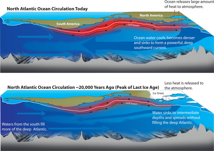
References
Ammann CM, Meehl GA, Washington WM, Zender CS (2003) A monthly and latitudinally varying volcanic forcing dataset in simulations of 20th century climate. Geophys Res Lett 30(12):1657. doi:10.1029/2003GL016875
Andrews T, Gregory JM, Webb MJ, Taylor KE (2012) Forcing, feedbacks and climate sensitivity in CMIP5 coupled atmosphere-ocean climate models. Geophys Res Lett 39(9). doi:10.1029/2012gl051607
Andronova NG, Schlesinger ME (2000) Causes of global temperature changes during the 19th and 20th centuries. Geophys Res Lett 27(14):2137–2140. doi:10.1029/2000GL006109
Ballantyne AP, Alden CB, Miller JB, Tans PP, White JWC (2012) Increase in observed net carbon dioxide uptake by land and oceans during the past 50 years. Nature 488(7409):70–72
Balmaseda MA, Trenberth KE, Källén E (2013) Distinctive climate signals in reanalysis of global ocean heat content. Geophys Res Lett 40(9):1754–1759. doi:10.1002/grl.50382
Bellenger H, Guilyardi E, Leloup J, Lengaigne M, Vialard J (2014) ENSO representation in climate models: from CMIP3 to CMIP5. Clim Dyn 42(7):1999–2018. doi:10.1007/s00382-013-1783-z
Bond TC, Doherty SJ, Fahey DW, Forster PM, Berntsen T, DeAngelo BJ, Flanner MG, Ghan S, Kärcher B, Koch D, Kinne S, Kondo Y, Quinn PK, Sarofim MC, Schultz MG, Schulz M, Venkataraman C, Zhang H, Zhang S, Bellouin N, Guttikunda SK, Hopke PK, Jacobson MZ, Kaiser JW, Klimont Z, Lohmann U, Schwarz JP, Shindell D, Storelvmo T, Warren SG, Zender CS (2013) Bounding the role of black carbon in the climate system: a scientific assessment. J Geophys Res Atmos 118(11):5380–5552. doi:10.1002/jgrd.50171
Bony S, Colman R, Kattsov VM, Allan RP, Bretherton CS, Dufresne J-L, Hall A, Hallegatte S, Holland MM, Ingram W, Randall DA, Doden BJ, Tselioudis G, Webb MJ (2006) How well do we understand and evaluate climate change feedback processes? J Clim 19:3445–3482. doi:10.1029/2005GL023851
Cai W, van Rensch P, Cowan T, Hendon HH (2011) Teleconnection pathways of ENSO and the IOD and the mechanisms for impacts on Australian rainfall. J Clim 24(15):3910–3923. doi:10.1175/2011JCLI4129.1
Canty T, Mascioli NR, Smarte MD, Salawitch RJ (2013) An empirical model of global climate—Part 1: A critical evaluation of volcanic cooling. Atmos Chem Phys 13(8):3997–4031. doi:10.5194/acp-13-3997-2013
Carton JA, Giese BS (2008) A reanalysis of ocean climate using simple ocean data assimilation (SODA). Mon Weather Rev 136(8):2999–3017. doi:10.1175/2007MWR1978.1
Carton JA, Santorelli A (2008) Global decadal upper-ocean heat content as viewed in nine analyses. J Clim 21(22):6015–6035. doi:10.1175/2008jcli2489.1
Chavez FP, Ryan J, Lluch-Cota SE, Niquen CM (2003) From anchovies to sardines and back: multidecadal change in the Pacific Ocean. Science 299(5604):217–221. doi:10.1126/science.1075880
Church JA, White NJ, Konikow LF, Domingues CM, Cogley JG, Rignot E, Gregory JM, van den Broeke MR, Monaghan AJ, Velicogna I (2011) Revisiting the Earth’s sea-level and energy budgets from 1961 to 2008. Geophys Res Lett 38(18):L18601. doi:10.1029/2011GL048794
Chylek P, Klett JD, Lesins G, Dubey MK, Hengartner N (2014) The Atlantic Multidecadal Oscillation as a dominant factor of oceanic influence on climate. Geophys Res Lett 41. doi:10.1002/2014GL059274
Coddington O, Lean JL, Pilewskie P, Snow M, Lindholm D (2016) A solar irradiance climate data record. Bull Am Meteorol Soc. doi:10.1175/BAMS-D-14-00265.1
Cowtan K, Way RG (2014) Coverage bias in the HadCRUT4 temperature series and its impact on recent temperature trends. Q J R Meteorol Soc 140(683):1935–1944. doi:10.1002/qj.2297
DelSole T, Tippett MK, Shukla J (2011) A significant component of unforced multidecadal variability in the recent acceleration of global warming. J Clim 24(3):909–926. doi:10.1175/2010jcli3659.1
Dessler AE (2010) A determination of the cloud feedback from climate variations over the past decade. Science 330(6010):1523–1527. doi:10.1126/science.1192546
Dlugokencky EJ, Bruhwiler L, White JWC, Emmons LK, Novelli PC, Montzka SA, Masarie KA, Lang PM, Crotwell AM, Miller JB, Gatti LV (2009) Observational constraints on recent increases in the atmospheric CH4 burden. Geophys Res Lett 36(18):L18803. doi:10.1029/2009GL039780
Douglass DH, Knox RS (2005) Climate forcing by the volcanic eruption of Mount Pinatubo. Geophys Res Lett 32(5):L05710. doi:10.1029/2004GL022119
Duchez A, Hirschi JJ-M, Cunningham SA, Blaker AT, Bryden HL, de Cuevas B, Atkinson CP, McCarthy GD, Frajka-Williams E, Rayner D, Smeed D, Mizielinski MS (2014) A new index for the Atlantic Meridional Overturning Circulation at 26°N. J Clim 27(17):6439–6455. doi:10.1175/JCLI-D-13-00052.1
England MH, McGregor S, Spence P, Meehl GA, Timmermann A, Cai W, Gupta AS, McPhaden MJ, Purich A, Santoso A (2014) Recent intensification of wind-driven circulation in the Pacific and the ongoing warming hiatus. Nat Clim Chang 4(3):222–227. doi:10.1038/nclimate2106
Etheridge DM, Steele LP, Francey RJ, Langenfelds RL (1998) Atmospheric methane between 1000 A.D. and present: Evidence of anthropogenic emissions and climatic variability. J Geophys Res Atmos 103(D13):15979–15993. doi:10.1029/98JD00923
Foster G, Rahmstorf S (2011) Global temperature evolution 1979–2010. Environ Res Lett 6(4):044022. doi:10.1088/1748-9326/6/4/044022
Fromm M, Kablick G, Nedoluha G, Carboni E, Grainger R, Campbell J, Lewis J (2014) Correcting the record of volcanic stratospheric aerosol impact: Nabro and Sarychev Peak. J Geophys Res Atmos 119(17):10,343–310,364. doi:10.1002/2014JD021507
Giese BS, Chepurin GA, Carton JA, Boyer TP, Seidel HF (2011) Impact of bathythermograph temperature bias models on an ocean reanalysis. J Clim 24(1):84–93. doi:10.1175/2010jcli3534.1
Gillett NP, Arora VK, Matthews D, Allen MR (2013) Constraining the ratio of global warming to cumulative CO2 emissions using CMIP5 simulations. J Clim 26(18):6844–6858. doi:10.1175/JCLI-D-12-00476.1
Gouretski V, Reseghetti F (2010) On depth and temperature biases in bathythermograph data: development of a new correction scheme based on analysis of a global ocean database. Deep-Sea Res I Oceanogr Res Pap 57(6):812–833. doi:10.1016/j.dsr.2010.03.011
Hansen JE, Ruedy R, Sato M, Lo K (2010) Global surface temperature change. Rev Geophys 48(4). doi:10.1029/2010rg000345
Hansen JE, Sato M, Kharecha P, von Schuckmann K (2011) Earth’s energy imbalance and implications. Atmos Chem Phys 11(24):13421–13449. doi:10.5194/acp-11-13421-2011
Houghton JT (2015) Global warming: the complete briefing, 5th edn. Cambridge University Press, Cambridge
IPCC (2001) Climate change 2001: the scientific basis. Contribution of working group I to the third assessment report of the intergovernmental panel on climate change. Cambridge, UK and New York, NY, USA
IPCC (2007) Climate change 2007: the physical science basis. Contribution of working group I to the fourth assessment report of the intergovernmental panel on climate change. Cambridge, UK and New York, NY, USA
IPCC (2013) Climate change 2013: The physical science basis. Contribution of working group I to the fifth assessment report of the intergovernmental panel on climate change. Cambridge, UK and New York, NY, USA
Ishii M, Kimoto M (2009) Reevaluation of historical ocean heat content variations with time-varying XBT and MBT depth bias corrections. J Oceanogr 65(3):287–299, doi: 10.1007/s10872-009-0027-7
Jones PD, Lister DH, Osborn TJ, Harpham C, Salmon M, Morice CP (2012) Hemispheric and large-scale land-surface air temperature variations: an extensive revision and an update to 2010. J Geophys Res 117(D5):D05127. doi:10.1029/2011jd017139
Kahn RA (2012) Reducing the uncertainties in direct aerosol radiative forcing. Surv Geophys 33(3):701–721. doi:10.1007/s10712-011-9153-z
Karl TR, Arguez A, Huang B, Lawrimore JH, McMahon JR, Menne MJ, Peterson TC, Vose RS, Zhang H-M (2015) Possible artifacts of data biases in the recent global surface warming hiatus. Science 348(6242):1469–1472. doi:10.1126/science.aaa5632
Kavvada A, Ruiz-Barradas A, Nigam S (2013) AMO’s structure and climate footprint in observations and IPCC AR5 climate simulations. Clim Dyn 41(5-6):1345–1364. doi:10.1007/s00382-013-1712-1
Kennedy JJ, Rayner NA, Smith RO, Parker DE, Saunby M (2011a) Reassessing biases and other uncertainties in sea-surface temperature observations measured in situ since 1850, Part 1: Measurement and sampling uncertainties. J Geophys Res 116:D14103. doi:10.1029/2010JD015218
Kennedy JJ, Rayner NA, Smith RO, Parker DE, Saunby M (2011b) Reassessing biases and other uncertainties in sea-surface temperature observations measured in situ since 1850, Part 2: Biases and homogenisation. J Geophys Res 116:D14104. doi:10.1029/2010JD015220
Kiehl JT (2007) Twentieth century climate model response and climate sensitivity. Geophys Res Lett 34(22):L22710. doi:10.1029/2007GL031383
Knight JR, Allan RJ, Folland CK, Vellinga M, Mann ME (2005) A signature of persistent natural thermohaline circulation cycles in observed climate. Geophys Res Lett 32(20):L20708. doi:10.1029/2005GL024233
Kosaka Y, Xie SP (2013) Recent global-warming hiatus tied to equatorial Pacific surface cooling. Nature 501(7467):403–407. doi:10.1038/nature12534
Lean JL (2000) Evolution of the Sun’s spectral irradiance since the maunder minimum. Geophys Res Lett 27(16):2425–2428. doi:10.1029/2000GL000043
Lean JL, Rind DH (2008) How natural and anthropogenic influences alter global and regional surface temperatures: 1889 to 2006. Geophys Res Lett 35(18):L18701. doi:10.1029/2008GL034864
Lean JL, Rind DH (2009) How will Earth’s surface temperature change in future decades? Geophys Res Lett 36(15):L15708. doi:10.1029/2009GL038932
Levitus S, Antonov JI, Boyer TP, Baranova OK, Garcia HE, Locarnini RA, Mishonov AV, Reagan JR, Seidov D, Yarosh ES, Zweng MM (2012) World ocean heat content and thermosteric sea level change (0–2000 m), 1955–2010. Geophys Res Lett 39(10):L10603. doi:10.1029/2012GL051106
Lynas M (2008) Six degrees: our future on a hotter planet. National Geographic, Washington, DC
Masters T (2014) Observational estimate of climate sensitivity from changes in the rate of ocean heat uptake and comparison to CMIP5 models. Clim Dyn 42(7):2173–2181. doi:10.1007/s00382-013-1770-4
Masui T, Matsumoto K, Hijioka Y, Kinoshita T, Nozawa T, Ishiwatari S, Kato E, Shukla PR, Yamagata Y, Kainuma M (2011) An emission pathway for stabilization at 6 W m−2 radiative forcing. Clim Chang 109(1–2):59–76. doi:10.1007/s10584-011-0150-5
Medhaug I, Furevik T (2011) North Atlantic 20th century multidecadal variability in coupled climate models: sea surface temperature and ocean overturning circulation. Ocean Sci 7(3):389–404. doi:10.5194/os-7-389-2011
Meehl GA, Arblaster JM, Fasullo JT, Hu A, Trenberth KE (2011) Model-based evidence of deep-ocean heat uptake during surface-temperature hiatus periods. Nat Clim Chang 1(7):360–364. doi:10.1038/nclimate1229
Meinshausen M, Smith SJ, Calvin K, Daniel JS, Kainuma MLT, Lamarque JF, Matsumoto K, Montzka SA, Raper SCB, Riahi K, Thomson A, Velders GJM, Vuuren DPP (2011) The RCP greenhouse gas concentrations and their extensions from 1765 to 2300. Clim Chang 109(1–2):213–241. doi:10.1007/s10584-011-0156-z
Montzka SA, Dlugokencky EJ, Butler JH (2011) Non-CO2 greenhouse gases and climate change. Nature 476(7358):43–50
Morgan MG, Adams PJ, Keith DW (2006) Elicitation of expert judgments of aerosol forcing. Clim Chang 75(1–2):195–214. doi:10.1007/s10584-005-9025-y
Myhre G, Highwood EJ, Shine KP, Stordal F (1998) New estimates of radiative forcing due to well mixed greenhouse gases. Geophys Res Lett 25:2715–2718. doi:10.1029/98GL01908
Norris JR, Allen RJ, Evan AT, Zelinka MD, O’Dell CW, Klein SA (2016) Evidence for climate change in the satellite cloud record. Nature 536:72–75. doi:10.1038/nature18273
Otto A, Otto FEL, Boucher O, Church J, Hegerl G, Forster PM, Gillett NP, Gregory J, Johnson GC, Knutti R, Lewis N, Lohmann U, Marotzke J, Myhre G, Shindell D, Stevens B, Allen MR (2013) Energy budget constraints on climate response. Nat Geosci 6(6):415–416. doi:10.1038/ngeo1836
Peng J, Li Z, Zhang H, Liu J, Cribb M (2016) Systematic changes in cloud radiative forcing with aerosol loading for deep clouds in the tropics. J Atmos Sci 73(1):231–249. doi:10.1175/JAS-D-15-0080.1
Randall DA (2012) Atmosphere, clouds, and climate. Princeton primers in climate. Princeton University Press, Princeton
Raper SCB, Gregory JM, Stouffer RJ (2002) The role of climate sensitivity and ocean heat uptake on AOGCM transient temperature response. J Clim 15:124–130. doi:10.1175/1520-0442(2002)015<0124:TROCSA>2.0.CO;2
Riahi K, Rao S, Krey V, Cho C, Chirkov V, Fischer G, Kindermann G, Nakicenovic N, Rafaj P (2011) RCP 8.5—a scenario of comparatively high greenhouse gas emissions. Clim Chang 109(1–2):33–57. doi:10.1007/s10584-011-0149-y
Rieger LA, Bourassa AE, Degenstein DA (2015) Merging the OSIRIS and SAGE II stratospheric aerosol records. J Geophys Res Atmos 120(17):8890–8904. doi:10.1002/2015JD023133
Riser SC, Freeland HJ, Roemmich D, Wijffels S, Troisi A, Belbeoch M, Gilbert D, Xu J, Pouliquen S, Thresher A, Le Traon P-Y, Maze G, Klein B, Ravichandran M, Grant F, Poulain P-M, Suga T, Lim B, Sterl A, Sutton P, Mork K-A, Velez-Belchi PJ, Ansorge I, King B, Turton J, Baringer M, Jayne SR (2016) Fifteen years of ocean observations with the global Argo array. Nat Clim Change 6(2):145–153. doi:10.1038/nclimate2872
Rogelj J, den Elzen M, Höhne N, Fransen T, Fekete H, Winkler H, Schaeffer R, Sha F, Riahi K, Meinshausen M (2016) Paris Agreement climate proposals need a boost to keep warming well below 2 °C. Nature 534(7609):631–639. doi:10.1038/nature18307, http://www.nature.com/nature/journal/v534/n7609/abs/nature18307.html#supplementary-information
Rypdal K (2015) Attribution in the presence of a long-memory climate response. Earth Syst Dyn 6(2):719–730. doi:10.5194/esd-6-719-2015
Saji HH, Goswami BN, Vinayachandran PH, Yamagata T (1999) A dipole mode in the tropical Indian Ocean. Nature 401:360–363. doi:10.1038/43854
Santer BD, Painter JF, Bonfils C, Mears CA, Solomon S, Wigley TM, Gleckler PJ, Schmidt GA, Doutriaux C, Gillett NP, Taylor KE, Thorne PW, Wentz FJ (2013a) Human and natural influences on the changing thermal structure of the atmosphere. Proc Natl Acad Sci U S A 110(43):17235–17240. doi:10.1073/pnas.1305332110
Santer BD, Painter JF, Mears CA, Doutriaux C, Caldwell P, Arblaster JM, Cameron-Smith PJ, Gillett NP, Gleckler PJ, Lanzante J, Perlwitz J, Solomon S, Stott PA, Taylor KE, Terray L, Thorne PW, Wehner MF, Wentz FJ, Wigley TM, Wilcox LJ, Zou CZ (2013b) Identifying human influences on atmospheric temperature. Proc Natl Acad Sci U S A 110(1):26–33. doi:10.1073/pnas.1210514109
Santer BD, Bonfils C, Painter JF, Zelinka MD, Mears CA, Solomon S, Schmidt GA, Fyfe JC, Cole JNS, Nazarenko L, Taylor KE, Wentz FJ (2014) Volcanic contribution to decadal changes in tropospheric temperature. Nat Geosci 7(3):185–189. doi:10.1038/ngeo2098
Saravanan R, McWilliams JC (1998) Advective ocean–atmosphere interaction: an analytical stochastic model with implications for decadal variability. J Clim 11:165–188
Sato M, Hansen JE, McCormick MP, Pollack JB (1993) Stratospheric aerosol optical depths, 1850−1990. J Geophys Res 98:22987–22994. doi:10.1029/93JD02553
Schlesinger ME, Ramankutty N (1994) An oscillation in the global climate system of period 65–70 years. Nature 367(6465):723–726. doi:10.1038/367723a0
Schmidt GA, Shindell DT, Tsigaridis K (2014) Reconciling warming trends. Nat Geosci 7(3):158–160. doi:10.1038/ngeo2105
Schwartz SE (2012) Determination of earth’s transient and equilibrium climate sensitivities from observations over the twentieth century: strong dependence on assumed forcing. Surv Geophys 33(3-4):745–777. doi:10.1007/s10712-012-9180-4
Shindell DT, Lamarque JF, Schulz M, Flanner M, Jiao C, Chin M, Young PJ, Lee YH, Rotstayn L, Mahowald N, Milly G, Faluvegi G, Balkanski Y, Collins WJ, Conley AJ, Dalsoren S, Easter R, Ghan S, Horowitz L, Liu X, Myhre G, Nagashima T, Naik V, Rumbold ST, Skeie R, Sudo K, Szopa S, Takemura T, Voulgarakis A, Yoon JH, Lo F (2013) Radiative forcing in the ACCMIP historical and future climate simulations. Atmos Chem Phys 13(6):2939–2974. doi:10.5194/acp-13-2939-2013
Silver N (2012) The signal and the noise: why so many predictions fail—but some don't. Penguin Press, New York
Smith SJ, Bond TC (2014) Two hundred fifty years of aerosols and climate: the end of the age of aerosols. Atmos Chem Phys 14(2):537–549. doi:10.5194/acp-14-537-2014
Smith SJ, van Aardenne J, Klimont Z, Andres RJ, Volke A, Delgado Arias S (2011) Anthropogenic sulfur dioxide emissions: 1850–2005. Atmos Chem Phys 11(3):1101–1116. doi:10.5194/acp-11-1101-2011
Solomon S, Daniel JS, Neely RR III, Vernier JP, Dutton EG, Thomason LW (2011) The persistently variable “background” stratospheric aerosol layer and global climate change. Science 333(6044):866–870. doi:10.1126/science.1206027
Solomon S, Ivy DJ, Kinnison D, Mills MJ, Neely RR, Schmidt A (2016) Emergence of healing in the Antarctic ozone layer. Science 353(6296):269–274. doi:10.1126/science.aae0061
Srokosz MA, Bryden HL (2015) Observing the Atlantic Meridional Overturning Circulation yields a decade of inevitable surprises. Science 348(6241):1255575. doi:10.1126/science.1255575
Stern DI (2006a) An atmosphere-ocean time series model of global climate change. Comput Stat Data Anal 51(2):1330–1346. doi:10.1016/j.csda.2005.09.016
Stern DI (2006b) Reversal of the trend in global anthropogenic sulfur emissions. Glob Environ Chang 16(2):207–220. doi:10.1016/j.gloenvcha.2006.01.001
Stern DI, Kaufmann RK (2014) Anthropogenic and natural causes of climate change. Clim Chang 122(1):257–269. doi:10.1007/s10584-013-1007-x
Storelvmo T, Lohmann U, Bennartz R (2009) What governs the spread in shortwave forcings in the transient IPCC AR4 models? Geophys Res Lett 36(1):L01806. doi:10.1029/2008GL036069
Stott P, Good P, Jones G, Gillett N, Hawkins E (2013) The upper end of climate model temperature projections is inconsistent with past warming. Environ Res Lett 8(1):014024
Stouffer RJ, Yin J, Gregory JM, Dixon KW, Spelman MJ, Hurlin W, Weaver AJ, Eby M, Flato GM, Hasumi H, Hu A, Jungclaus JH, Kamenkovich IV, Levermann A, Montoya M, Murakami S, Nawrath S, Oka A, Peltier WR, Robitaille DY, Sokolov A, Vettoretti G, Webber SL (2006) Investigating the causes of the response of the thermohaline circulation to past and future climate changes. J Clim 19:1365–1387. doi:10.1175/JCLI3689.1
Taylor JR (1982) An introduction to error analysis: the study of uncertainties in physical measurements. A series of books in physics. University Science Books, Mill Valley, CA
Taylor KE, Stouffer RJ, Meehl GA (2012) An overview of CMIP5 and the experiment design. Bull Am Meteorol Soc 93(4):485–498. doi:10.1175/bams-d-11-00094.1
Thompson DWJ, Wallace JM, Jones PD, Kennedy JJ (2009) Identifying signatures of natural climate variability in time series of global-mean surface temperature: methodology and insights. J Clim 22(22):6120–6141. doi:10.1175/2009jcli3089.1
Thomson AM, Calvin KV, Smith SJ, Kyle GP, Volke A, Patel P, Delgado-Arias S, Bond-Lamberty B, Wise MA, Clarke LE, Edmonds JA (2011) RCP4.5: a pathway for stabilization of radiative forcing by 2100. Clim Chang 109(1–2):77–94. doi:10.1007/s10584-011-0151-4
Trenberth KE, Fasullo JT (2013) An apparent hiatus in global warming? Earth’s Future 1(1):19–32. doi:10.1002/2013EF000165
van Vuuren DP, Stehfest E, Elzen MGJ, Kram T, Vliet J, Deetman S, Isaac M, Klein Goldewijk K, Hof A, Mendoza Beltran A, Oostenrijk R, Ruijven B (2011a) RCP2.6: exploring the possibility to keep global mean temperature increase below 2 °C. Clim Chang 109(1–2):95–116. doi:10.1007/s10584-011-0152-3
van Vuuren DP, Edmonds J, Kainuma M, Riahi K, Thomson A, Hibbard K, Hurtt GC, Kram T, Krey V, Lamarque J-F, Masui T, Meinshausen M, Nakicenovic N, Smith SJ, Rose SK (2011b) The representative concentration pathways: an overview. Clim Chang 109(1–2):5–31. doi:10.1007/s10584-011-0148-z
Vial J, Dufresne J-L, Bony S (2013) On the interpretation of inter-model spread in CMIP5 climate sensitivity estimates. Clim Dyn 41(11–12):3339–3362. doi:10.1007/s00382-013-1725-9
Vincze M, Jánosi IM (2011) Is the Atlantic Multidecadal Oscillation (AMO) a statistical phantom? Nonlinear Process Geophys 18(4):469–475. doi:10.5194/npg-18-469-2011
Wang YM, Lean JL, Sheeley NR Jr (2005) Modeling the Sun’s magnetic field and irradiance since 1713. Astrophys J 625:522–538. doi:10.1086/429689
Weaver C, Herman J, Labow G, Larko D, Huang L-K (2015) Shortwave TOA cloud radiative forcing derived from a long-term (1980–present) record of satellite UV reflectivity and CERES measurements. J Clim 28(23):9473–9488. doi:10.1175/JCLI-D-14-00551.1
Webb MJ, Andrews T, Bodas-Salcedo A, Bony S, Bretherton CS, Chadwick R, Chepfer H, Douville H, Good P, Kay JE, Klein SA, Marchand R, Medeiros B, Siebesma AP, Skinner CB, Stevens B, Tselioudis G, Tsushima Y, Watanabe M (2016) The Cloud Feedback Model Intercomparison Project (CFMIP) contribution to CMIP6. Geosci Model Dev Discuss 2016:1–27. doi:10.5194/gmd-2016-70
Willis JK (2010) Can in situ floats and satellite altimeters detect long-term changes in Atlantic Ocean overturning? Geophys Res Lett 37(6):L06602. doi:10.1029/2010GL042372
Wu L, Liu Z (2003) Decadal variability in the North Pacific: the Eastern North Pacific mode. J Clim 16:3111–3131
Zelinka MD, Klein SA, Taylor KE, Andrews T, Webb MJ, Gregory JM, Forster PM (2013) Contributions of different cloud types to feedbacks and rapid adjustments in CMIP5. J Clim 26(14):5007–5027. doi:10.1175/jcli-d-12-00555.1
Zhang Y, Wallace JM, Battisti DS (1997) ENSO-like interdecadal variability: 1900–93. J Clim 10:1004–1020
Zhang R, Delworth TL, Held IM (2007) Can the Atlantic Ocean drive the observed multidecadal variability in Northern Hemisphere mean temperature? Geophys Res Lett 34(2):L02709. doi:10.1029/2006GL028683
Zhou J, Tung K-K (2013) Deducing multidecadal anthropogenic global warming trends using multiple regression analysis. J Atmos Sci 70(1):3–8. doi:10.1175/jas-d-12-0208.1
Zhou C, Zelinka MD, Dessler AE, Klein SA (2015) The relationship between interannual and long-term cloud feedbacks. Geophys Res Lett 42(23):10,463–410,469. doi:10.1002/2015GL066698
Author information
Authors and Affiliations
Rights and permissions
This chapter is distributed under the terms of the Creative Commons Attribution 4.0 International License (http://creativecommons.org/licenses/by/4.0/), which permits use, duplication, adaptation, distribution and reproduction in any medium or format, as long as you give appropriate credit to the original author(s) and the source, a link is provided to the Creative Commons license and any changes made are indicated.
The images or other third party material in this chapter are included in the work’s Creative Commons license, unless indicated otherwise in the credit line; if such material is not included in the work’s Creative Commons license and the respective action is not permitted by statutory regulation, users will need to obtain permission from the license holder to duplicate, adapt or reproduce the material.
Copyright information
© 2017 The Author(s)
About this chapter
Cite this chapter
Hope, A.P., Canty, T.P., Salawitch, R.J., Tribett, W.R., Bennett, B.F. (2017). Forecasting Global Warming. In: Paris Climate Agreement: Beacon of Hope. Springer Climate. Springer, Cham. https://doi.org/10.1007/978-3-319-46939-3_2
Download citation
DOI: https://doi.org/10.1007/978-3-319-46939-3_2
Published:
Publisher Name: Springer, Cham
Print ISBN: 978-3-319-46938-6
Online ISBN: 978-3-319-46939-3
eBook Packages: Earth and Environmental ScienceEarth and Environmental Science (R0)