Abstract
Originating from Wuhan, China, COVID-19 is spreading rapidly throughout the world. The transmission rate is reported to be high for this novel strain of coronavirus, called severe acute respiratory syndrome coronavirus 2 (SARS-CoV-2), as compared to its predecessors. Major strategies in terms of clinical trials of medicines and vaccines, social distancing, use of personal protective equipment (PPE), and so on are being implemented in order to control the spread. The current study concentrates on lockdown and social distancing policy followed by the Indian Government and evaluates its effectiveness using Bayesian probability model (BPM). The change point analysis (CPA) done through the above approach suggests that the states which implemented the lockdown before the exponential rise of cases are able to control the spread of the disease in a much better and efficient way. The analysis has been done for states of Maharashtra, Gujarat, Madhya Pradesh, Rajasthan, Tamil Nadu, West Bengal, Uttar Pradesh, and Delhi as union territory. The highest value of Δ (delta) is reported for Gujarat and Madhya Pradesh with a value of 9.6 weeks, while the lowest value is 4.7, evidently for Maharashtra which is the worst affected. All of the states indicate a significant correlation (p < 0.05, tstat > tcritical) for Δ, i.e., the difference in the time period of CPA and lockdown with cases per population (CPP) and cases per unit area (CPUA), while weak correlation (p < 0.1 and tstat < tcritical) is exhibited by delta and cases per unit population density (CPD). For both CPP and CPUA, tstat > tcritical indicating a significant correlation, while Pearson’s correlation indicates the direction to be negative. Further analysis in terms of identification of high-risk areas has been studied from the Voronoi approach of GIS based on the inputs from BPM. All the states follow the above pattern of high population, high case scenario, and the boundaries of risk zones can be identified by Thiessen polygon (TP) constructed therein. The findings of the study help draw strategic and policy-driven response for India, toward tackling COVID-19 pandemic.
1 Introduction
By the end of December 2019, the novel coronavirus known as severe acute respiratory syndrome coronavirus 2 (SARS-CoV-2) was found to originate from Wuhan, Hubei Province, China (Huang et al. 2020; Bherwani et al. 2020). Similar to severe acute respiratory syndrome coronavirus (SARS-CoV) and the Middle East respiratory syndrome coronavirus (MERS-CoV), coronavirus disease-19 (COVID-19) caused by novel coronavirus has been recognized from the zoonotic origin and usually causes respiratory disease as an onset symptom (Guo et al. 2020). As of June 11, 2020, COVID-19 has rapidly spread worldwide in the majority of countries and has affected 7,539,402 individuals (Worldometer). On January 31, 2020, the World Health Organization (WHO) sounded an international concern on COVID-19. On March 23, 2020, WHO reported that from the first confirmed case it took 67 days to reach 100,000 cases, 11 days to second 100,000 cases, and 4 days for the third 100,000 cases, showing that the epidemic is accelerating (WHO 2020a).
The contact among people of the different populations determines the aspect that characterizes the rate of transmission pattern in civic places and families, and this virus exhibited more than usual transmission rate (Guo et al. 2020; Sarkodie & Owusu 2020). Transmission of coronavirus is divided into four genera, α (alpha)–β (beta)–γ (gamma)−δ (delta) CoV, where α and β are able to infect vertebrate, γ and δ are able to infect birds (Guo et al. 2020; Adnan Shereen et al. 2020; Roy and Milton 2004). The main point of attack of COVID-19 damage is the respiratory system and alveoli therein (Gautam 2020a; Asadi et al. 2020). The virus enters into the blood, after the lung infection, accrues in the kidney, and can cause damage to resident renal cells (Cheng et al. 2020; Fan et al. 2020; He et al. 2006). The inhalation of transmittable aerosols is the substantial mode of transmission of COVID-19. Nearly 3–14 days is the incubation period for COVID-19 (Kannan et al. 2020). Severe acute respiratory syndrome (SARS) and Middle East respiratory syndrome (MERS) cause acute cardiac injury and myocardial damage caused by virus infection, and this increases the difficulty and complication for the treatment of patients (Zheng et al. 2020; Alhogbani 2016). Excluding Antarctica, SARS-CoV-2 has now spread to all islands; Italy suffered the largest brunt of this epidemic outside Asia (Porcheddu et al. 2020).
It has been observed that medical features have some similarities between SARS and MERS virus. The mortality rate due to the failure of the respirational tract for MERS is much higher than SARS, and the older age people are likely to have more mortality rate (Du et al. 2020; Rothan and Byrareddy 2020; Hui et al. 2014). The fatality rate of SARS-CoV-2 is around 2 and 3% (Jain et al. 2020). The SARS-CoV-2 is causing more deaths than its ancestors because of more COVID-19 cases (Guarner 2020). The reproductive number represents the average expected number of people that an infected person could spread the virus. It is used to estimate the potential for epidemic spread in a susceptible population (Inglesby 2020). WHO estimated the reproductive number (R0) of novel coronavirus between 2 and 2.5, which is higher than SARS (1.7–1.9) and MERS (< 1) (Petrosillo et al. 2020; Liu et al. 2020a, b).
The COVID-19 has caused a great threat to the social well-being and safety of people all over the world (Chakraborty & Ghosh 2020). Densely populated countries as well as states are more likely to be infected with novel coronavirus because of arriving and outbound flights and other means of transports (Liu et al. 2020a). On January 30, 2020, India reported the first confirmed case of COVID-19 from Kerala State. The first outbreak of virus transmission in India took place from China, from a person who had a travel history. Many countries that have infected cases can be traced back to Wuhan. The dynamics of transmission were understood from the relative number of closed systems, screening data from publicly reported cases and where public health responses were implemented and identified (Tindale et al. 2020). Various countries had initiated lockdown as a measure to reduce the transmission of the virus (Gautam & Hens 2020).
The cases in India rose to 287,155 on June 10, 2020, which saw the biggest single-day breach. Maharashtra was the state to record the highest (149) number COVID-19 cases related to deaths on that day. As of June 10, 2020, a total of 7745 deaths were reported in India (WHO 2020b). With the growing number of confirmed cases, the Ministry of Health and Family Welfare had issued a guideline for domestic travel via air, train, interstate bus travel on May 24, 2020. As of now, Maharashtra has the highest number of confirmed COVID-19 cases. Sikkim State has the least number of COVID-19 cases.
For India, the rise in the number of cases in different weeks for select states from March 16 to June 1, 2020, is presented in Table 1. The states are selected on the basis of the availability of detailed data required for further analysis and rate and magnitude of COVID-19 penetration within those states. The states considered are Maharashtra, Gujarat, Madhya Pradesh, West Bengal, Rajasthan, Tamil Nadu, Uttar Pradesh, and union territory Delhi. The study area is depicted in Fig. 1.

Geographical location of study area
It is evident from the above understanding of transmission and fatalities that urgent action was needed to curtail the spread of the virus. In order to reduce the effect of spreading coronavirus, many countries had implemented lockdowns (Gautam 2020b). India also started a nationwide lockdown on March 25, 2020. The novelty of the present study is that it utilizes the Bayesian probability model (BPM) to understand the changing aspects of COVID-19 penetration within the states. There is limited literature available indicating the use of such a method for understanding the COVID-19 dynamics. Further, GIS-based Voronoi diagram (VD) or Thiessen polygon (TP) is drawn to understand the linkage between COVID-19 cases and population density of the region. The research opens a new paradigm of the utilization of probabilistic modeling and GIS-based tools to understand the situation of COVID-19.
2 Methodology
Change point analysis (CPA) is performed for eight different states of India in order to understand the spread of the virus, the role of the outbreak, and the different strategies adopted for selected states. Data are collected on the number of cases for selected states in India using the COVID-19 tracker (COVID-19 tracker). CPA is performed on the data which are shown in Table 1, to determine the point of inflection for the cases of COVID-19 in each respective state. For CPA, Bayesian change point detection analysis is performed in programming language Python v3.7.6 (Texier et al. 2016). The package of PyMC3 is used for Bayesian modeling. Bayesian inference is constructed on the number of sampling points (Yang et al 2007; Carvajal et al. 2017). PyMC3 is a new open-source probabilistic programming (PP) package in python and fits best for Bayesian statistical models (Salvatier et al. 2016; Kass-Hout et al. 2012).
Delta (Δ) is calculated by noting the first case reporting data for the state and the lockdown date vis-à-vis change point for the respective state. Delta is a factor which indicates how soon the action was taken by states for curbing the spread of the virus. By the time lockdown was implemented, many states had already witnessed an increased rate of spread of disease (Jribi et al. 2020; Tomar and Gupta 2020). Δ helps in understanding the time before which the spread becomes comparatively rampant. The population, population density, and area are used as factors for further analysis in comparison with the delta. Cases per unit population (CPP), cases per unit population density (CPD), and cases per unit area (CPUA) are calculated and compared with delta using linear Pearson’s correlation (Nagai et al. 2011), and the significance of the correlation is proven using t tests (Wetzels & Wagenmakers 2012). Two-sample t test is used as a statistical tool for hypothesis testing to compare the means of two independent parameters, in this case, delta and CPP, CPD, CPUA. This parametric test method helps establish the mean difference in the between test groups equal to 0 as the null hypothesis (vs ≠ 0 as an alternate hypothesis) under the assumption of normality of dataset and equality of variance. The test is performed at a 95% confidence interval for the significance of the tested parameters. The kurtosis and skewness values are noted to observe the normality of distribution (Ho & Yu 2014). The above statistical analysis between population-related factors and Δ gives an idea of the underlying factors resulting in the transmission of the virus.
Establishing the correlation using the above approach, VD or TP is constructed for the analyzed states in order to understand the zones of interference among the regions. The polygon, so to say, provides the hot spots for the COVID-19 cases. TP is a basic method of analyzing proximity and neighborhoods. TPs are created from a set of sampling points, so each polygon specifies an effect area around its sampling point (Wheeler et al. 2010). TPs are used to assign space to the nearest point (Dubois 2000; Schulman et al. 2007). The approach is similar to many phenomena observed in nature (plant cells, colliding with soap bubbles) and many events in geology that have many applications. These polygons are usually used to create soil maps based on irregularly distributed sampling points. TPs are used extensively in many different fields including, but not limited to, archaeology, astrology, cartography, computational geometry, ecology, geography, geology, marketing, meteorology, physics, and urban and regional planning (Yamada 2016; Mu 2004). Here, the utilization of the polygons is to understand the probable safe zones and hot spots of the area. TP can be created in ArcGIS using the tool available within the software. The data are entered for each point in the tool along with its location. The location governs the shape of the polygon, while the color represents the intensity or magnitude of the data. The color-coding across the states has been kept the same for better understanding. TP is prepared for population and COVID-19 cases for each state.
3 Results and discussion
CPA is done for each of the eight states, analyzed as per the methodology explained above. Figure 2a–h shows the change point of each state. It is worthwhile to note that a faint band is also visible in the images of states. The band indicates that there was a gradual change during that time period; however, the point of change is given by the dark vertical line.

Results for each selected state: a Maharashtra, b Tamil Nadu, c Delhi, d Gujarat, e Rajasthan, f Uttar Pradesh, g Madhya Pradesh, h West Bengal
From the above graphs, the change point is extracted and Δ is calculated using the values of first case reporting date and lockdown date. Δ shows the difference in weeks of cases before lockdown and the change point week of the states. Table 2 gives the values of the delta which is an indirect measure of promptness of reply by each state with respect to change of pace of growth of respective states’ COVID-19 cases.
From Table 2, Δ values seem to be the lowest for Maharashtra, which is one of the worst affected states. On the other hand, West Bengal has the lowest cases as on June 1, 2020, and indicates a relatively high value of Δ. The outcomes from CPA signify the approaches engaged by each state in mitigating COVID-19. The population of states also has a significant impact on the number of COVID-19 cases. The analysis is further carried out by collecting the population and geographical area-related data for each state. Table 3 shows the comparative analysis of COVID-19 cases with population, density, and area.
Table 3 shows the complete data required for analysis. Pearson’s correlation (r) is analyzed for the above states and factors to understand the linear relations of the above factors. Delhi is exempted from linear analysis because of being a union territory and for having a comparatively smaller area which might skew the dataset. Rest of the states are analyzed for linear correlation. Table 4 gives the ‘r’ value for each of the factors. It can be seen from Table 4 that there is evidently an inverse correlation of delta with CPP, CPUA, and CPD. Although the value of r varies between − 0.35 and − 0.55, signifying weak linear correlation, all parameters are inversely related. This indicates that the more the value of Δ, the lesser the CPP, CPD, or CPUA. Hence, the earlier would have been the action, the lower would have been the cases and the rate of progression.
Since the value of Pearson’s correlation, indicating linear interaction, is not strong but unidirectional,t tests are performed for delta and CPP, CPD, and CPUA. The kurtosis and skewness values are within the range of ± 2 for all the parameters except for CPD and considering CPUA without Delhi given the above reasons. The descriptive statistics are given in ‘Appendix 1.’ The t test results are shown in Table 5.
From Table 5, it can be seen that a significant correlation exists between Δ with CPP and Δ with CPUA. The p values are less than 0.05 and tstat > tcritical both for one-tail and for two-tail. The relation between delta and CPD shows a weak correlation with only p value near to 0.05 for one-tail. Thus, it can be safely concluded that cases per unit population or area would have been controlled if delta would have been higher.
Given the above results, states could be analyzed for their potential hot spots and safe zones using TP as explained. The area is an inherent factor of TP which gets decided based on point values. Hence, TP is prepared for population and COVID-19 cases of each state to understand the significance of correlation. The population and COVID-19 data for each considered city are given as supplementary data SD01. The discussion is added state-wise below.
-
1.
Maharashtra: It can be seen from Fig. 3 that western Maharashtra has a high population and has a high number of COVID-19 cases which are presented on a log scale. The south region of Maharashtra has a low population and evidently low COVID-19 cases, while the eastern Maharashtra or Vidarbha region has a medium range of both. It is interesting to see that COVID-19 is already creeping in toward the eastern side which is a sign of distress.
Fig. 3 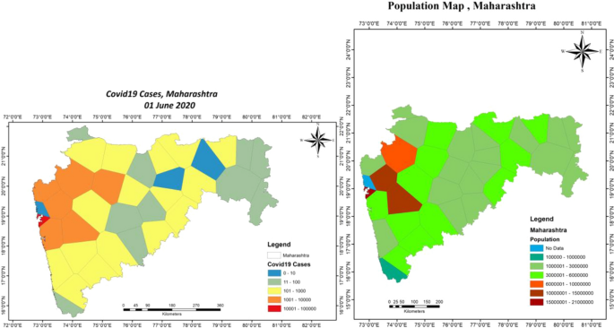
Thiessen polygon of COVID-19 cases and population for Maharashtra
-
2.
Tamil Nadu: Fig. 4 represents the TP map of Tamil Nadu state. The eastern part of Tamil Nadu is badly affected by COVID-19 and has a high population. The results are consistent as stated above. Western part with a medium population has lower cases.
Fig. 4 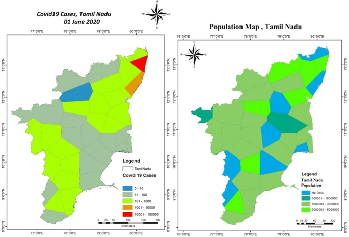
Thiessen polygon of COVID-19 cases and population for Tamil Nadu
-
3.
Delhi: Delhi has its peculiar features due to its compact and landlocked geographical location. Figure 5 shows the TP maps for Delhi. While western Delhi still shows a similar trend as other states, the central and eastern area does not seem to share a similarity. This might be because of the reasons stated above related to space and population density. Moreover, Delhi being a commercial place has seen a lot of inbound flights from foreign and native population movements which might have resulted in obscured data. However, it is important to note that TP can still be used to rank the places inside Delhi for identifying the strategic movement of people in the areas.
Fig. 5 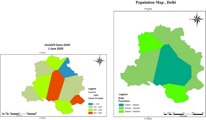
Thiessen polygon of COVID-19 cases and population for Delhi
-
4.
Gujarat: COVID-19 TP map of the Gujarat State seems to be a copy map as TP map of the population. The central part of Gujarat seems to be the most populous and hence witnessing most COVID-19 cases. The boundaries of TP also follow a similar trend. Figure 6 shows the TP map of Gujarat.
Fig. 6 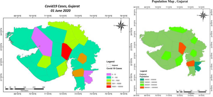
Thiessen polygon of COVID-19 cases and population for Gujarat
-
5.
Rajasthan: Rajasthan maps show that the central area is averagely affected and has a moderate to high population. The boundaries also correlate well with the population in the area. Figure 7 depicts TP maps for Rajasthan.
Fig. 7 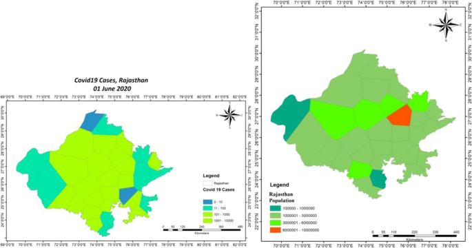
Thiessen polygon of COVID-19 cases and population for Rajasthan
-
6.
Uttar Pradesh: Uttar Pradesh TP maps of COVID-19 and population also seem to be an image of each other. Given that there is a uniform distribution of population in the state with a central area having a high population, the cases are also high to medium in the central area. Figure 8 shows the maps of Uttar Pradesh.
Fig. 8 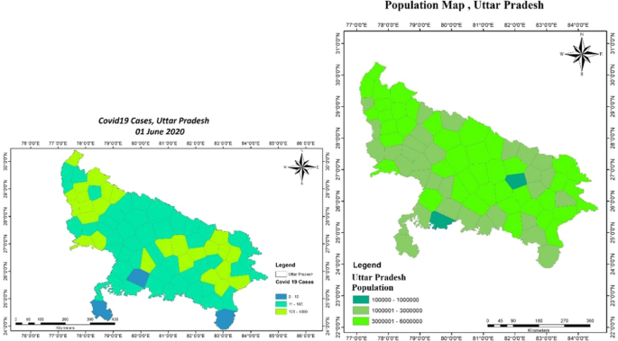
Thiessen polygon of COVID-19 cases and population for Uttar Pradesh
-
7.
Madhya Pradesh: Madhya Pradesh also has a fairly average distribution of population and so are the COVID cases from low to medium. It is interesting to note the one polygon, which indicates a high population, observes high COVID-19 cases as well. Figure 9 shows TP maps of Madhya Pradesh State.
Fig. 9 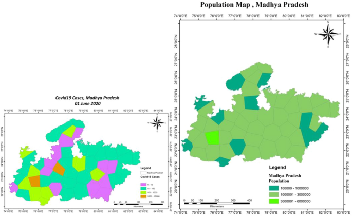
Thiessen polygon of COVID-19 cases and population for Madhya Pradesh
-
8.
West Bengal: West Bengal follows a disheveled pattern. With population mostly concentrated in the southern region of the state (see relatively high COVID-19 cases), however, there are some exceptions. The north portion shows low population and low COVID-19 cases though.


Summing up, it can be evidently stated that there is a significant relationship between population and COVID-19 cases of areas of multiple states. Thus, the social distancing factor was and still is one of the crucial ways to control the spread of the disease. The above analysis done using modeling and ArcGIS gives indications related to the above facts. The BPM and statistical modeling using python prove that the factors related to population and its distribution are inversely and significantly correlated with the spread of cases and time required to take action in terms of social distancing. VD further indicates that the zones which are critically affected tend to have a high population as well (Fig. 10).

Thiessen polygon of COVID-19 cases and population for West Bengal
4 Conclusion
COVID-19 is a global pandemic, spreading and taking casualties along the way like a wildfire. Countries are struggling hard to fight with this microorganism which is alive only when it is inside the host cell. There have been many strategies implemented by multiple countries to fight this virus (Xiao and Torok 2020). Some of them are very useful, such as social distancing and regular hygiene maintenance, while some are still in trial phases, such as vaccines and medicines.
The research paper analyzes in detail the reasons behind the lockdowns and their efficacy in controlling the spread of the virus and hence the disease itself. BPM has been solved using Python to understand the point of inflection for eight states of India, i.e., to comprehend the point from where the rate of spread of the disease significantly changed. This change point is compared with the weeks which went by before the first case arrived in the state and the nationwide lockdown by government. The Δ factor is proven to be significantly correlated with CPP and CPUA, as proven by t test, i.e., tstat > tcritical and p < 0.05. However, the relationship is inversely proportional as shown by Pearson’s ‘r’. This indicates that not only the social distancing is important but also the earlier it starts, the lesser are the casualties.
The intricate relation between cases and population is further explored using VD or TP. Almost all states indicate that there is a significant relationship between the two factors, and hence social distancing is the key to keep the disease at bay. The outcome of BPM and TP maps can be used for inferring details, as indicated below, which may lay the foundation for key policy decisions for controlling the spread of this virus.
-
1.
BPM can be applied to understand the spread of COVID-19 cases. The same can be used by other countries, states, and cities to understand their dynamics.
-
2.
CPP and CPUA play a significant role in the transmission of disease. This is evident from the fact that although almost all states of India went into lockdown on the same date of March 25, 2020, the response of each state toward the spread and penetration of disease was different, as indicated by BPM. The underlying factors related to population are exposed through this analysis. Modeling results also indicate that the delayed action of some states, with respect to the day of first case reporting, has proved to be calamitous for them.
-
3.
VD indicated that it can be used as a guiding tool for declaration of high-, medium-, and low-risk zones based on the polygons. The zones are to be defined on the basis of the spread of COVID-19 cases and the corresponding population of the region.
-
4.
The polygons can be used to define the containment zones in the area. The TP indicates the range of cases in an area that can be compared with the population of the region. This will help in understanding the most susceptible zone in the state/city/ward.
-
5.
In the absence of clear guidelines, the method can be adopted for taking policy decisions. The decisions can be based on the basis of TP shape, size, and color intensity and in comparison with the TP map of the population. The above factors will indicate the time for the opening of the regions and/or help in deciding the strategy for phased opening.
-
6.
In continuation, the phased opening can also use the polygons to define green zones (no to low risk), orange zones (medium risk), and red zones (high risk). This will help in checking the movement of the citizens and can form a good strategy in curbing the spread of the virus. This can be one of the ways by which the above models and systems can be used for mitigating the spread of the virus.
-
7.
Ranking of areas can be carried out using the above methods which will add a layer in decision making of the phased opening of the regions, further easing the process.
Given the above discussion, the approaches discussed in the paper give a unique angle to look at the problem of COVID-19 which is overwhelming for the whole world as of now. These unique approaches seem to be useful in adding a deeper layer to understand this pandemic. Given the above points, the approaches used in the paper deliver the results which can directly feed into the strategic and policy-driven response of the country toward this pandemic. Moreover, the world is busy predicting the number of cases for varied countries, which is also absolutely important, but there is a need to comprehend the geographical spread of the virus as well and the approaches stated above discuses that using one of the methods. There can be other methods also which can be used to discuss on similar lines. Further research can also be carried out in unifying these numbers and topographical spread prediction models for a holistic understanding of the problem at hand.
Abbreviations
- BPM:
-
Bayesian probability model
- C:
-
Cases
- CI:
-
CPA week of inflection
- COVID-19:
-
Coronavirus disease 2019
- CPA:
-
Change point analysis
- CPD:
-
Case per unit population density
- CPP:
-
Cases per population
- CPUA:
-
Cases per unit area
- Dl:
-
Date of lockdown
- Dr:
-
Date of first reported case
- MERS:
-
Middle East respiratory syndrome
- MERS-CoV:
-
Middle East respiratory syndrome coronavirus
- P:
-
Population
- PD:
-
Population density
- PP:
-
Probabilistic programming
- PPE:
-
Personal protective equipment
- SARS:
-
Severe acute respiratory syndrome
- SARS-CoV:
-
Severe acute respiratory syndrome coronavirus
- SARS-CoV-2:
-
Severe acute respiratory syndrome coronavirus 2
- TP:
-
Thiessen polygon
- VD:
-
Voronoi diagram
- WHO:
-
World Health Organization
- Wl:
-
Week of lockdown
- Δ:
-
Delta
References
Adnan Shereen, M., Khan, S., Kazmi, A., Bashir, N., & Siddique, R. (2020). COVID-19 infection: origin, transmission, and characteristics of human coronaviruses. Journal of Advanced Research. https://doi.org/10.1016/j.jare.2020.03.005.
Alhogbani, T. (2016). Acute myocarditis associated with novel middle east respiratory syndrome corornavirus. Annals of Saudi Medicine. https://doi.org/10.5144/0256-4947.2016.78.
Asadi, S., Bouvier, N., Wexler, A. S., & Ristenpart, W. D. (2020). The coronavirus pandemic and aerosols: Does COVID-19 transmit via expiratory particles? Aerosol Science and Technology. https://doi.org/10.1080/02786826.2020.1749229.
Bherwani, H., Nair, M., Musugu, K., et al. (2020). Valuation of air pollution externalities: comparative assessment of economic damage and emission reduction under COVID-19 lockdown. Air Quality, Atmosphere and Health. https://doi.org/10.1007/s11869-020-00845-3.
Carvajal, G., Roser, D. J., Sisson, S. A., Keegan, A., & Khan, S. J. (2017). Bayesian belief network modelling of chlorine disinfection for human pathogenic viruses in municipal wastewater. Water Research. https://doi.org/10.1016/j.watres.2016.11.008.
Chakraborty, T., & Ghosh, I. (2020). Real-time forecasts and risk assessment of novel coronavirus (COVID-19) cases: A data-driven analysis. Chaos, Solitons and Fractals,. https://doi.org/10.1016/j.chaos.2020.109850.
Cheng, Y., Luo, R., Wang, K., Zhang, M., Wang, Z., Dong, L., et al. (2020). Kidney disease is associated with in-hospital death of patients with COVID-19. Kidney International. https://doi.org/10.1016/j.kint.2020.03.005.
COVID-19 Tracker. Retrived 11 June 2020 from https://www.covid19india.org/.
COVID-19, Confirmed Cases and Deaths by Country, Territory, or Conveyance. Worldometer. Retrieved 5 June 2020 from https://www.worldometers.info/coronavirus/#countries.
Du, R.-H., Liang, L.-R., Yang, C.-Q., Wang, W., Cao, T.-Z., Li, M., et al. (2020). Predictors of mortality for patients with COVID-19 pneumonia caused by SARS-CoV-2: A prospective cohort study. European Respiratory Journal. https://doi.org/10.1183/13993003.00524-2020.
Dubois, G. (2000). How representative are samples in a sampling network? Journal of Geographic Information and Decision Analysis, 4(1), 1–10.
Fan, C., Lei, Di, Fang, C., Li, C., Wang, M., Liu, Y., et al. (2020). Perinatal transmission of COVID-19 associated SARS-CoV-2: Should we worry? Clinical Infectious Diseases. https://doi.org/10.1093/cid/ciaa226.
Gautam, S. (2020a). COVID-19: air pollution remains low as people stay at home. Air Quality, Atmosphere & Health,. https://doi.org/10.1007/s11869-020-00842-6.
Gautam, S. (2020b). The Influence of COVID-19 on air quality in India: A boon or inutile. Bulletin of Environmental Contamination and Toxicology. https://doi.org/10.1007/s00128-020-02877-y.
Gautam, S., & Hens, L. (2020). SARS-CoV-2 pandemic in India: what might we expect? Environment, Development and Sustainability,. https://doi.org/10.1007/s10668-020-00739-5.
Guarner, J. (2020). Three emerging coronaviruses in two decades: The story of SARS, MERS, and now COVID-19. American Journal of Clinical Pathology. https://doi.org/10.1093/ajcp/aqaa029.
Guo, Y.-R., Cao, Q.-D., Hong, Z.-S., Tan, Y.-Y., Chen, S.-D., Jin, H.-J., et al. (2020). The origin, transmission and clinical therapies on coronavirus disease 2019 (COVID-19) outbreak—an update on the status. Military Medical Research. https://doi.org/10.1186/s40779-020-00240-0.
He, L., Ding, Y., Zhang, Q., Che, X., He, Y., Shen, H., et al. (2006). Expression of elevated levels of pro-inflammatory cytokines in SARS-CoV-infected ACE2+cells in SARS patients: relation to the acute lung injury and pathogenesis of SARS. The Journal of Pathology. https://doi.org/10.1002/path.2067.
Ho, A. D., & Yu, C. C. (2014). Descriptive statistics for modern test score distributions. Educational and Psychological Measurement. https://doi.org/10.1177/0013164414548576.
Huang, C., Wang, Y., Li, X., Ren, L., Zhao, J., Hu, Y., et al. (2020). Clinical features of patients infected with 2019 novel coronavirus in Wuhan, China. The Lancet. https://doi.org/10.1016/s0140-6736(20)30183-5.
Hui, D. S., Memish, Z. A., & Zumla, A. (2014). Severe acute respiratory syndrome vs. the Middle East respiratory syndrome. Current Opinion in Pulmonary, 20(3), 233–241.
Inglesby, T. V. (2020). Public health measures and the reproduction number of SARS-CoV-2. JAMA. https://doi.org/10.1001/jama.2020.7878.
Jain, N., Choudhury, A., Sharma, J., Kumar, V., De, D., & Tiwari, R. (2020). A review of novel coronavirus infection (Coronavirus Disease-19). Global Journal of Transfusion Medicine, 5(1), 22–26.
Jribi, S., Ben Ismail, H., Doggui, D., & Debbabi, H. (2020). COVID-19 virus outbreak lockdown: What impacts on household food wastage? Environment, Development and Sustainability,. https://doi.org/10.1007/s10668-020-00740-y.
Kannan, S., Ali, P. S. S., Sheensza, A., & Hemalatha, K. (2020). COVID-19 (Novel Coronavirus 2019). European Review For Medical and Pharmacological Sciences, 24, 2006–2201.
Kass-Hout, T. A., Xu, Z., McMurray, P., Park, S., Buckeridge, D. L., Brownstein, J. S., et al. (2012). Application of change point analysis to daily influenza-like illness emergency department visits. Journal of the American Medical Informatics Association. https://doi.org/10.1136/amiajnl-2011-000793.
Liu, Y., Gayle, A. A., Wilder-Smith, A., & Rocklov, J. (2020a). The reproductive number of COVID-19 is higher compared to SARS coronavirus. Journal of Travel Medicine. https://doi.org/10.1093/jtm/taaa021.
Liu, Y., Gu, Z., Xia, S., Shi, B., Zhou, X.-N., Shi, Y., et al. (2020b). What are the underlying transmission patterns of COVID-19 outbreak?—An age-specific social contact characterization. EClinicalMedicine. https://doi.org/10.1016/j.eclinm.2020.100354.
Mu, L. (2004). Polygon characterization with the multiplicatively weighted Voronoi diagram. The Professional Geographer. https://doi.org/10.1111/j.0033-0124.2004.05602007.x.
Nagai, M., Hoshide, S., Ishikawa, J., Shimada, K., & Kario, K. (2011). Visit-to-visit blood pressure variations: New independent determinants for carotid artery measures in the elderly at high risk of cardiovascular disease. Journal of the American Society of Hypertension. https://doi.org/10.1016/j.jash.2011.03.001.
Petrosillo, N., Viceconte, G., Ergonul, O., Ippolito, G., & Petersen, E. (2020). COVID-19, SARS and MERS: Are they closely related? Clinical Microbiology and Infection. https://doi.org/10.1016/j.cmi.2020.03.026.
Porcheddu, R., Serra, C., Kelvin, D., Kelvin, N., & Rubino, S. (2020). Similarity in case fatality rates (CFR) of COVID-19/SARS-COV-2 in Italy and China. Journal of Infection in Developing Countries. https://doi.org/10.3855/jidc.12600.
Rothan, H. A., & Byrareddy, S. N. (2020). The epidemiology and pathogenesis of coronavirus disease (COVID-19) outbreak. Journal of Autoimmunity. https://doi.org/10.1016/j.jaut.2020.102433.
Roy, C. J., & Milton, D. K. (2004). Airborne transmission of communicable infection–the elusive pathway. The New England of Journal Medicine, 350, 1710–1712.
Salvatier, J., Wiecki, T. V., & Fonnesbeck, C. (2016). Probabilistic programming in Python using PyMC3. PeerJ. https://doi.org/10.7287/peerj.preprints.1686v1.
Sarkodie, S. A., & Owusu, P. A. (2020). Global assessment of environment, health and economic impact of the novel coronavirus (COVID-19). Environment, Development and Sustainability,. https://doi.org/10.1007/s10668-020-00801-2.
Schulman, L., Toivonen, T., & Ruokolainen, K. (2007). Analysing botanical collecting effort in Amazonia and correcting for it in species range estimation. Journal of Biogeography. https://doi.org/10.1111/j.1365-2699.2007.01716.x.
Texier, G., Farouh, M., Pellegrin, L., Jackson, M. L., Meynard, J.-B., Deparis, X., et al. (2016). Outbreak definition by change point analysis: A tool for public health decision? BMC Medical Informatics and Decision Making. https://doi.org/10.1186/s12911-016-0271-x.
Tindale, L., Coombe, M., Stockdale, J. E., Garlock, E., Lau, W. Y. V., Saraswat, M., et al. (2020). Transmission interval estimates suggest pre-symptomatic spread of COVID-19. MedRxiv. https://doi.org/10.1101/2020.03.03.20029983.
Tomar, A., & Gupta, N. (2020). Prediction for the spread of COVID-19 in India and effectiveness of preventive measures. Science of The Total Environment. https://doi.org/10.1016/j.scitotenv.2020.138762.
Wetzels, R., & Wagenmakers, E. (2012). A default Bayesian hypothesis test for correlations and partial correlations. Psychonomic Bulletin and Review. https://doi.org/10.3758/s13423-012-0295-x.
Wheeler, D. C., Waller, L. A., & Biek, R. (2010). Spatial analysis of feline immunodeficiency virus infection in cougars. Spatial and Spatio-Temporal Epidemiology. https://doi.org/10.1016/j.sste.2010.03.009.
WHO. (2020a). Directors General’s Opening Remark. Retrieved June 8, 2020 from https://www.who.int/dg/speeches/detail/who-director-general-s-opening-remarks-at-the-media-briefing-on-covid-19---23-march-2020
WHO. (2020b). – Situation Report—142. Retrieved June 11, 2020 from https://www.who.int/docs/default-source/coronaviruse/situation-reports/20200610-covid-19-sitrep-142.pdf?sfvrsn=180898cd_6
Xiao, Y., & Torok, M. E. (2020). Taking the right measures to control COVID-19. The Lancet Infectious Diseases. https://doi.org/10.1016/S1473-3099(20)30152-3.
Yamada, I. (2016). Thiessen polygons. International Encyclopedia of Geography: People, the Earth, Environment and Technology. https://doi.org/10.1002/9781118786352.wbieg0157.
Yang, J., Reichert, P., & Abbaspour, K. C. (2007). Bayesian uncertainty analysis in distributed hydrologic modeling: A case study in the Thur river basin (Switzerland). Water Resources Research. https://doi.org/10.1029/2006wr005497.
Zheng, Y.-Y., Ma, Y.-T., Zhang, J.-Y., & Xie, X. (2020). COVID-19 and the cardiovascular system. Nature Reviews Cardiology. https://doi.org/10.1038/s41569-020-0360-5.
Author information
Authors and Affiliations
Corresponding author
Additional information
Publisher's Note
Springer Nature remains neutral with regard to jurisdictional claims in published maps and institutional affiliations.
Electronic supplementary material
Below is the link to the electronic supplementary material.
Appendix 1
Appendix 1
Delta (Δ) | CPP | CPD | CPUA | CPUA without Delhi | |
|---|---|---|---|---|---|
Mean | 7.3875 | 0.00025625 | 47.97625 | 1.834985928 | 0.090191026 |
Standard error | 0.653407962 | 8.57517E-05 | 21.7046561 | 1.744978688 | 0.029243225 |
Median | 7.55 | 0.000175 | 36.635 | 0.076383886 | 0.065035154 |
Mode | 7.2 | #N/A | #N/A | #N/A | #N/A |
Standard deviation | 1.848116802 | 0.000242542 | 61.39003803 | 4.935545054 | 0.0773703 |
Sample variance | 3.415535714 | 5.88268E-08 | 3768.73677 | 24.35960498 | 0.005986163 |
Kurtosis | − 0.826843607 | − 0.081719296 | 5.672207796 | 7.994936307 | 0.147484981 |
Skewness | − 0.385955104 | 1.134902129 | 2.259974773 | 2.827239275 | 1.146854008 |
Range | 4.9 | 0.00065 | 189.98 | 14.02196063 | 0.200937343 |
Minimum | 4.7 | 0.00004 | 1.84 | 0.026589606 | 0.026589606 |
Maximum | 9.6 | 0.00069 | 191.82 | 14.04855024 | 0.227526949 |
Sum | 59.1 | 0.00205 | 383.81 | 14.67988742 | 0.631337184 |
Count | 8 | 8 | 8 | 8 | 7 |
Rights and permissions
About this article

Cite this article
Bherwani, H., Anjum, S., Kumar, S. et al. Understanding COVID-19 transmission through Bayesian probabilistic modeling and GIS-based Voronoi approach: a policy perspective. Environ Dev Sustain 23, 5846–5864 (2021). https://doi.org/10.1007/s10668-020-00849-0
Received:
Accepted:
Published:
Issue Date:
DOI: https://doi.org/10.1007/s10668-020-00849-0