
Abstract
In the past few years flat user interface design has become the predominating visual style of operating systems, websites and mobile apps. Although flat design has been widely criticized by HCI and usability experts, empirical research on flat design is still scarce. We present the results of an experimental comparative study of visual search effectiveness on traditional and flat designs. The following types of visual search tasks were examined: (1) search for a target word in text; (2) search for a target icon in a matrix of icons; (3) search for clickable objects on webpages. Time and accuracy parameters of the visual search, as well as oculomotor activity, were measured. The results show that a search in flat text mode (compared with the traditional mode) is associated with higher cognitive load. A search for flat icons takes twice as long as for realistic icons and is also characterized by higher cognitive load. Identifying clickable objects on flat web pages requires more time and is characterised by a significantly greater number of errors. Our results suggest replacing the flat style user interfaces with interfaces based on the design principles developed over decades of research and practice of HCI and usability engineering.
You have full access to this open access chapter, Download conference paper PDF
1 Introduction
In 2012–2014 the design of user interfaces for the operating systems (OS) of desktop computers, mobile OS and mobile applications, as well as for websites, saw cardinal changes relating to the appearance of so-called flat user interface design. The first flat design appeared in the mobile OS Windows Phone 7 in 2010. It came to prominence two years later with the OS Windows 8 for personal computers. This new approach to the design of user interfaces was enthusiastically received by the graphic design community as well as by many users, as a result of which it was adopted by two other leading software vendors, Apple and Google.
The basic flat design principle means that the computer screen represents a self-contained two-dimensional digital environment in which there is no place for anything replicating three-dimensional objects of the real world [2]. The user interface elements are simplified: abstract graphic forms are used and spaces are filled with bold colours. Text and font are especially important in flat design. In particular, this leads to a wide use of condensed, light and ultralight variations of typefaces. The density of screen information is often extraordinarily low [10].
Shortly after its introduction, flat design became subject to criticism by HCI and usability experts [3, 6, 10–12, 18]. The main criticism was that flat design ignores the three-dimensional nature of the human brain, which is extremely sensitive to visual cues linking interfaces to the real world. The removal of affordances from interactive interface objects means that users regularly perceive interactive elements as non-interactive, and non-interactive elements as interactive.
Despite these limitations flat design is becoming more and more common, and criticism of experts in HCI and usability is generally ignored by the software industry and graphic designers. Unlike these expert assessments (from 2012 onwards) the results of empirical research into flat design are still not numerous, so it is important to conduct more comparative experimental studies of flat and traditional design.
2 Background and Related Work
Recent empirical research has mostly considered a quantitative comparison of the performance measures by users of both traditional and flat style interfaces, and users’ emotional reactions and preferences for realistic and flat icons.
A comparative usability study of Windows 8 (flat interface) and its predecessor Windows 7 (traditional interface) showed that Windows 7 was superior to Windows 8 in each of three aspects of usability: effectiveness, efficiency and satisfaction [15].
In research carried out by Idler [8] 100 web professionals completed tasks relating to the clickability of objects on four flat websites, and also assessed the advantages and disadvantages of flat design. The results showed that the number of ‘false alarm’ errors when working on flat sites varied from 16 % to 38 % (average 29 %). The authors concluded that despite the apparent clarity and simplicity of flat design, achieving an acceptable level of website usability is not easy.
Comparative research of the aesthetic perception by users of pairs of realistic and flat icons of applications for desktop computers and mobile devices indicated that the users preferred realistic icons to flat icons by a proportion of 75:25 [7]. In another study, flat icons scored higher on semantic scales such as “timeliness” and “simplicity”, but they fared worse than realistic icons in “identity”, “interest” and “familiarity” aspects [9]. A semiotic inspection of icons of standard applications for iOS 6 (realistic icons) and iOS 7 (flat icons) showed that the unsuccessful transformation from realistic to flat icons is often related to the loss of semantically important attributes during the “simplification” process inherent to flat design [16].
3 Method
As can be seen from the above-mentioned studies, an empirical analysis of flat design is still at an early stage. In our experiment we tried both to build on previous research, but also to include in our analysis several new aspects. In order to conduct an accurate comparative study of traditional and flat interfaces we chose the following design elements: fonts, icons and webpages. In addition to the classical performance measures like time on task and number of errors, we also included an analysis of oculomotor indicators of cognitive load.
The experiment consisted of two series: traditional and flat. In each series of the experiment participants carried out three types of task:
-
(1)
A search for a target word on a page comprising three paragraphs, all typed using the same font (Fig. 1).
Fig. 1. 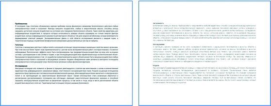
Examples of traditional and flat text stimuli

For the traditional series we used three similar typefaces: Helvetica Neue, Arial and Tahoma (these are fonts used in older versions of OS Windows and pre-flat era websites); for flat series we used three variations of Helvetica Neue font: Condensed Normal, Light and UltraLight (condensed fonts are popular on modern websites, while Helvetica UltraLight and Light were system fonts in iOS 7, beta and final versions respectively) (Table 1). The target word (e.g. “structure”) was placed randomly in the first, second or third paragraph. The participants were instructed to click the target word.
-
(2)
A search for an icon depicting a specific object (e.g. “ice-cream”) in a matrix of 9 × 9 icons presented on the screen (Fig. 2). The position of the target icon was randomly distributed between the nine quadrants of the matrix. The participants were instructed to click the target icon.
Fig. 2. 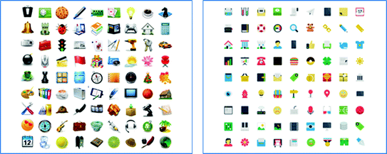
Examples of realistic and flat icons stimuli
-
(3)
A search for clickable objects (i.e. objects which change something on the screen after a click) on screenshots of existing websites (Fig. 3). The participants were instructed to click all screen objects that look clickable (buttons, links, menus, images, banners etc.).
Fig. 3. 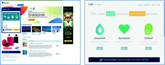
Examples of traditional and flat web page stimuli


In each series of the experiment the participant was given 9 slides with text, 9 slides with icons and 9 webpage screenshots. The order of tasks in each series was the following: first the participant was given one text search task (each of the typesets appeared three times within a series), then one icon search task, then one screenshot search task. This pattern was then repeated until all 27 tasks had been completed. The order of the different series of the experiment (first traditional, then flat – or the other way round) was counterbalanced. Before the experiment began, the participants were given instruction and training.
The stimuli were presented on a 19 inch LCD monitor with 4:3 aspect ratio. To measure the participant’s eye movements an EyeLink 1000 eye-tracker was used. All screen events and mouse movements were recorded using the TechSmith Morae 3.2 data logging application.
For the search of target words and icons the performance time was measured. For the screenshot task we measured the average time taken to click all clickable objects on a slide, and also registered the number of ‘miss’ and ‘false alarm’ errors.
For each task type the mean eye-tracking indicators were analysed, including fixation and saccade parameters. These parameters are considered in the literature as indicators of the cognitive load and show the following dynamics when the cognitive load increases: an increase in fixation duration [4, 14], a decrease in saccadic amplitude [13, 19], and a decrease in saccadic peak velocity [1, 5].
Participants were: 19 female and 1 male university student from Moscow, aged 18–28 (mean – 21.2), experienced web, smartphone and tablet users. The experimental sessions were conducted in November 2014. By that time flat style already predominated on desktops and mobiles, and so was familiar to all the participants.
4 Results and Discussion
Fonts.
Mean values of performance time and oculomotor measures for the text search task are shown in Table 2.
Statistical analysis did not reveal any significant difference in performance time. At the same time, oculomotor indicators of increased cognitive load – increase in fixation duration, decrease in saccadic amplitude and saccadic peak velocity – showed statistically significant differences in the traditional and flat series. This type of combination of measures (long fixations and short saccades) is characteristic of focal visual information processing: i.e. a conscious analysis of information, precise identification of objects and events, which are implemented when the visual search tasks increase in complexity [17]. In the text search with traditional fonts, subjects had more opportunities to switch to “semi-automatic” information processing associated with a lower cognitive load (which is indicated by shorter fixations and longer saccades). Also the lower values of saccadic peak velocity provide evidence in favour of associating the text search in the flat series with a higher cognitive load.
Icons.
Mean values of performance time and oculomotor measures for the icon search task are shown in Table 3.
A significant difference was found in the mean values of the icon search time: almost twice as high for flat as for realistic icons. Unlike in the previous task, a comparison of oculomotor activity in the graphic objects search did not reveal any significant difference in mean fixation duration. Nevertheless, a difference in mean saccadic amplitude and saccadic peak velocity remained, just as in the text search task. Values were less in the flat series, which may indicate the higher complexity of the task and a higher cognitive load in the flat icon search.
Monitoring the performance process of this task allowed us to assume that many participants in the flat series could not find the target icon during the initial “fast” slide scanning. Later in the search these participants tended to show more care in scanning the images, enabling them to find the target object. This, however, led to a significant increase in search time.
Websites.
Mean values of performance time and oculomotor measures, as well as rates of ‘miss’ and ‘false alarm’ errors are shown in Table 4.
As expected, total task performance time on traditional sites was higher, as information density on the screen was considerably higher than on flat screenshots. On traditional sites there were 110 clickable and 64 unclickable screen areas (total: 174), while on flat sites there were 78 clickable and 54 unclickable screen areas (total: 132). For this reason, the mean performance time for a single screen area was calculated (for both traditional and flat sites). The results demonstrated that the average processing time for a screen area (including making a decision on the objects’ clickability and clicking the clickable objects) was significantly higher for flat websites.
An analysis of ‘miss’ and ‘false alarm’ error types revealed a significant difference between traditional and flat sites: errors of both types were significantly more frequent on flat sites. It is noteworthy that the percentage of false alarms on flat sites in our experiment (28 %) almost exactly corresponds with the figure for false alarms (29 %) in the research conducted by Idler [8].
It should be noted that in the web search task oculomotor effects were revealed, which were the reverse of those found in the text and icon searches: a search for clickable objects on the page with flat design was characterized by a higher saccadic amplitude and saccadic peak velocity. However, we are not inclined to interpret these results as evidence in favour of a higher cognitive load when working with traditional sites. In our opinion, a key role here is played by the difference in the characteristics of the stimulus material. These effects may be associated with fundamental differences in the design of traditional and flat sites, which force subjects to use different scanning strategies. Thus, in our experiment on sites with traditional design the number and density of graphic objects was higher and interface control tools were more distinct. After initial orientation this allowed the user to develop a systematic search strategy – seen in the combination of longer fixations and shorter saccadic duration. By contrast, the flat design sites initially contained less graphic and text information, which normally facilitate the search for interface control tools. This made subjects repeatedly perform search activity and return to viewing certain areas of web pages several times, shown by a decrease in fixation duration and increase in the amplitude and velocity characteristics of saccades. Thus, the search on flat sites was more “chaotic”, which had a negative impact on time and accuracy parameters of task performance.
5 Conclusions
Our study has shown that flat design is inferior to traditional design in most of the aspects we analysed. Text search, where fonts popular in flat design were used, leads to higher cognitive load than search in texts with traditional fonts, although there was no significant difference in the objective measure – search time. A flat icons search is performed almost twice as slowly as a realistic icons search, and is characterized by a higher cognitive load. Analysis and processing of user interface objects on webpages with flat design takes more time than on traditional websites (calculated per screen area), and is accompanied by a significantly higher error rate; the difference in oculomotor activity reflects the specificity of traditional and flat webpage design.
Our experimental study supports the opinion expressed by many HCI and usability experts that flat design is a harmful tendency in area of user interfaces, and should be replaced by interfaces based on the design principles developed over decades of research and practice of HCI and usability engineering.
The research was supported by a grant from the Russian Foundation for Basic Research (14-06-00371).
References
App, E., Debus, G.: Saccadic velocity and activation: development of a diagnostic tool for assessing energy regulation. Ergonomics 41, 689–697 (1998)
Banga, C., Weinhold, J.: Essential Mobile Interaction Design: Perfecting Interface Design in Mobile Apps. Addison-Wesley, Upper Saddle River (2014)
Belveal, R.: Where Have All the Affordances Gone? (2013). http://belveal.net/2013/03/19/where-have-all-the-affordances-gone
Crosby, M.E., Iding, M.K., Chin, D.N.: Visual search and background complexity: does the forest hide the trees? In: Bauer, M., Gmytrasiewicz, P.J., Vassileva, J. (eds.) UM 2001. LNCS (LNAI), vol. 2109, pp. 225–227. Springer, Heidelberg (2001)
Di Stasi, L.L., Antolí, A., Cañas, J.J.: Main sequence: an index for detecting mental workload variation in complex tasks. Appl. Ergon. 42, 807–813 (2011)
Enders, J.: Flat UI and Forms (2013). http://alistapart.com/article/flat-ui-and-forms
Hou, K.-C., Ho, C.-H.: A preliminary study on aesthetic of apps icon design. In: 5th International Congress of the International Association of Societies of Design Research 2013 (2013). http://design-cu.jp/iasdr2013/papers/1811-1b.pdf
Idler, S.: Flat Web Design Is Here to Stay. Usabilla, Amsterdam (2013)
Li, C., Shi, H., Huang, J., Chen, L.: Two Typical Symbols in Human-Machine Interactive Interface. Appl. Mech. Mater. 635–637, 1659–1665 (2014)
Nielsen, J.: Windows 8 – Disappointing Usability for Both Novice and Power Users (2012). http://nngroup.com/articles/windows-8-disappointing-usability
Noessel, C.: Your Flat Design Is Convenient for Exactly One of Us (2014). http://cooper.com/journal/2014/01/your-flat-design-is-convenient-for-exactly-one-of-us
Page, T.: Skeuomorphism or flat design: future directions in mobile device user interface (UI) design education. Int. J. Mob. Learn. Organisat. 8, 130–142 (2014)
Pomplun, M., Reingold, E.M., Shen, J.: Investigating the visual span in comparative search: the effects of task difficulty and divided attention. Cognit. 81, B57–B67 (2001)
Renshaw, J.A., Finlay, J.E., Tyfa, D., Ward, R.D.: Designing for visual influence: an eye tracking study of the usability of graphical management information. In: INTERACT 2003, pp. 144–151. IOS Press, Amsterdam (2003)
Schneidermeier, T., Hertlein, F., Wolff, C.: Changing paradigm – changing experience? In: Marcus, A. (ed.) DUXU 2014, Part I. LNCS, vol. 8517, pp. 371–382. Springer, Heidelberg (2014)
Stickel, C., Pohl, H.-M., Milde, J.-T.: Cutting edge design or a beginner’s mistake? – a semiotic inspection of iOS7 icon design changes. In: Marcus, A. (ed.) DUXU 2014, Part II. LNCS, vol. 8518, pp. 358–369. Springer, Heidelberg (2014)
Velichkovsky, B.M.: Heterarchy of cognition: the depths and the highs of a framework for memory research. Memory 10, 405–419 (2002)
Walker, R.: The ABCs of Website User Experience (2013). http://adpearance.com/blog/the-abcs-of-user-experience
Zelinsky, G.J., Sheinberg, D.L.: Eye movements during parallel-serial visual search. J. Exp. Psychol. Hum. Percept. Perform. 23, 244–262 (1997)
Author information
Authors and Affiliations
Corresponding author
Editor information
Editors and Affiliations
Rights and permissions
Copyright information
© 2015 IFIP International Federation for Information Processing
About this paper
Cite this paper
Burmistrov, I., Zlokazova, T., Izmalkova, A., Leonova, A. (2015). Flat Design vs Traditional Design: Comparative Experimental Study. In: Abascal, J., Barbosa, S., Fetter, M., Gross, T., Palanque, P., Winckler, M. (eds) Human-Computer Interaction – INTERACT 2015. INTERACT 2015. Lecture Notes in Computer Science(), vol 9297. Springer, Cham. https://doi.org/10.1007/978-3-319-22668-2_10
Download citation
DOI: https://doi.org/10.1007/978-3-319-22668-2_10
Published:
Publisher Name: Springer, Cham
Print ISBN: 978-3-319-22667-5
Online ISBN: 978-3-319-22668-2
eBook Packages: Computer ScienceComputer Science (R0)