
Abstract
This chapter covers one of the most valuable tools for people analytics professionals: linear regression. Concepts, assumptions, and step-by-step implementations are presented for both simple and multiple linear regression as well as methods for testing more complex moderated and mediated relationships.
You have full access to this open access chapter, Download chapter PDF
Regression is perhaps the most important statistical learning technique for people analytics. If you have taken a statistics course at the undergraduate or graduate levels, you have surely already encountered it. Let us first develop an intuitive understanding of the mechanics of regression.
Imagine we are sitting at a large public park in New York City on a nice fall afternoon. If asked to estimate the annual compensation of the next person to walk by, how would you estimate this in the absence of any additional information? Most would likely estimate the average annual compensation of everyone capable of walking by. Since this would include both residents and visitors, this would be a very large population of people! The obvious limitation with this approach is that among the large group of people capable of walking by, there is likely a significant range of annual compensation values. Many walking by may be children, unemployed, or retirees who earn no annual compensation, while others may be highly compensated senior executives at the pinnacle of their careers. Since the range of annual compensation could be zero to millions of dollars, estimating the average of such a large population is likely going to be highly inaccurate without more information.
Let us consider that we are sitting outside on a weekday afternoon. Should this influence our annual compensation estimate? It is likely that we can eliminate a large segment of those likely to walk by, as we would expect most children to be in school on a typical fall weekday afternoon. It is also less likely that those who are employed and not on vacation will walk by on a fall weekday afternoon. Therefore, factoring in that it is a weekday should limit the size of the population which in turn may reduce the range of annual compensation values for our population of passersby.
Let us now consider that the park is open only to invited guests for a symposium on people analytics. Though it may be difficult to believe, a relatively small subset of the population is likely interested in attending such a symposium, so this information will likely be quite helpful in reducing the size of the population who could walk by. This should further reduce the range of annual compensation since we probably have a good idea of the profile of those most likely to attend. This probably also lessens (or altogether eliminates) the importance of the weekday factor in explaining why people vary in the amount of compensation they earn each year. That an important variable may become unimportant in the presence of another variable is a key feature of regression.
In addition, let us consider that only those who reside in NYC and Boise, Idaho were invited, and that the next person to walk by resides in Boise. Most companies apply a cost of living multiplier to the compensation for those in high-cost locations such as NYC, resulting in a significant difference in compensation relative to those residing in a lower-cost location like Boise—all else being equal. Therefore, if we can partition attendees into two groups based on their geography, this should significantly limit the range of annual compensation within each—making the average compensation in each group a more nuanced and reasonable estimate.
What if we also learn the specific zip code in which the next passerby from Boise resides? The important information is likely captured at the larger city level (NYC vs. Boise), as the compensation for the specific zip codes within each city are unlikely to vary to a meaningful degree. Assuming this is true, it probably would not make sense to consider both the city name and zip code since they are effectively redundant pieces of information with regard to explaining the variance in annual compensation.
What if we learn that the next person to walk by will be wearing a blue shirt? Does this influence your estimate? Unless there is research to suggest shirt color and earnings are related, this information will probably not contribute any significant information to our understanding of why people vary in the amount of compensation they earn and should, therefore, not be considered.
You can probably think of many relevant variables that would help further narrow the range of annual compensation. These may include job, level, years of experience, education, among other factors. The main thing to understand is that for each group of observations with the same characteristics—such as senior analysts with a graduate degree who reside in NYC—there is a distribution of annual compensation. This distribution reflects unexplained variance. That is, we do not have information to explain why the compensation for each and every person is not the same and in social science contexts, it simply is not practical to explain 100% of the variance in outcomes. For example, two people may be similar on dozens of factors (experience, education, skills) but one was a more effective negotiator when offered the same role and commanded a higher salary. It is likely we do not have data on salary negotiation ability so this information would leave us with unexplained variance in compensation. The goal is to identify the variables that provide the most information in helping us tighten the distribution so that estimating the expected (average) value will generally be an accurate estimate for those in the larger population with the same characteristics.
While we can generally improve our estimates with more relevant information (not shirt color or residential zip code in this case), it is important to understand that samples which are too small (n < 30) lend to anomalies; modeling noise in sparse data can result in models that are unlikely to generalize beyond the sample data. For example, if the only people from Boise to attend the people analytics symposium happen to be two ultra wealthy tech entrepreneurs who earn millions each year, it would not be appropriate to use this as the basis for our estimates of all future attendees from Boise.
This is the essence of linear regression modeling: find a limited number of variables which independently and/or jointly provide significant information that helps explain (by reducing) variance around the average value. As illustrated in this example, adding additional variables (information) can impact the importance of other variables or may offer no incremental information at all. In this chapter, we will cover how to identify which variables are important and how to quantify the effect they have on an outcome.
Assumptions and Diagnostics
As we learned in the context of power analysis in chapter “Statistical Inference”, the sample size needs to be large enough to model and detect significant associations of one or more predictors with the response variable. In practice, people analytics practitioners are often constrained by the data at hand, which is to say that one generally has little control over the amount of data that can be collected. For example, despite the most earnest participation campaigns, only a subset of invited employees are likely to complete a survey, so collecting additional data to achieve a larger sample is likely not a viable option. It is important to establish a minimum—and realistic—n-count threshold during the planning stage of a project based on the research objectives and variables that need to be factored into the analysis.
Consistent with the assumptions of parametric tests covered in chapter “Analysis of Differences”, there are several assumptions that need to be validated to determine if a linear model is appropriate for understanding relationships in the data. These assumptions largely relate to the residuals (\(\hat {y} - y\)):
-
1.
Independence: Residuals are independent of each other; consecutive residuals in time series data are unrelated.
-
2.
Homoscedasticity: Variance of residuals is constant across values of X.
-
3.
Normality: Residuals must be normally distributed (with mean of 0) across values of X.
-
4.
Linearity: Relationship between X and Y is linear.
Beyond these core assumptions for linear models, additional diagnostics are important to incorporate into the early data screening stage:
-
1.
High Leverage Observations: Influential data that significantly changes the model fit.
-
2.
Collinearity: Independent variables that are highly correlated (these should be independent).
Sample Size
While a general rule-of-thumb for regression analysis is a minimum of a 20:1 ratio of observations to IV, chapter “Statistical Inference” covered a more rigorous approach for calculating the sample size needed to observe significant effects.
For linear regression, power analysis involves a comparison of model fit between a model with a full set of predictors relative to one with only a subset of the full model’s predictors. The function from the pwr library to call is pwr.f2.test(u = , v = , f2 = , sig.level = , power = ), where u and v are the numerator and denominator degrees of freedom, respectively, and f2 is defined as:
where \(R^2_{AB}\) represents the variance accounted for by a full model with all predictors, and \(R^2_A\) represents the variance accounted for by a model containing only a subset of the full model’s predictors. Power analysis can be leveraged in determining the sample size needed for detecting the incremental main effects for a set of predictors beyond the variance accounted for by a set of controls.
Simple Linear Regression
Simple linear regression is a simple technique for estimating the value of a quantitative DV, denoted as Y , on the basis of a single IV, denoted as X. It is assumed that there is an approximately linear relationship between X and Y . Often, this relationship is expressed as regressing Y onto X and is defined mathematically as:
where β0 is the expected value of Y when X = 0 (the intercept), and β1 represents the average change in Y for a one-unit increase in X (the slope). β0 and β1 are unknown parameters or coefficients. The error term, 𝜖, acknowledges that there is variation in Y not accounted for by this simple linear model—unexplained variance. In other words, it is highly unlikely that there is a perfectly linear relationship between X and Y , as additional variables not included in the model are likely to also influence Y .
Once we estimate the unknown model coefficients, β0 and β1, we can estimate Y for a particular value of X by calculating:
where \(\hat {y}\) represents an estimate of Y for the i-ith value of X = x. The hat \(\,\hat { }\) symbol is used to denote an estimated value of an unknown coefficient, parameter, or outcome.
The earliest form of linear regression is the least squares method, which was developed at the beginning of the nineteenth century and applied to astronomy problems (James et al., 2013). While there are several approaches to fitting a linear regression model, ordinary least squares (OLS) is the most common. OLS selects coefficients for \(\hat {\beta }_0\) and \(\hat {\beta }_1\) that minimize the residual sum of squares (RSS) defined by:
For each value of X, OLS fits a model for which the squared difference between the predicted (\(\hat {\beta }_0 + \hat {\beta }_1x_i\)) and actual (yi) values are as small as possible. Figure 1 illustrates the result of minimizing RSS using OLS. The minimizers for the least squares coefficient estimates are defined by:
where \(\bar {x}\) and \(\bar {y}\) are sample means.

Minimizing RSS with Ordinary Least Squares (OLS) fit
It is important to understand the role sample size plays in achieving accurate estimates of Y . Figure 2 illustrates the impact of fitting a model to too few observations. With n = 2, it would be easy to fit a perfect model to the data; that is, one representing a line that connects the two data points. However, it is highly unlikely that these data points represent the best model for a larger sample, as there would likely be some distribution of Y for each value of X.

Left: Least squares regression model fit to n = 2 observations. Right: Least squares regression model fit to n = 20 observations
In R, we can build (or fit) a simple linear regression model using the lm() function. The syntax is lm(Y ~ X, dataset):

In practice, linear assumptions are rarely—if ever—perfectly met, but there must be evidence that the assumptions are generally satisfied.
Before performing model diagnostics, it is important to note the following:
-
1.
Collinearity diagnostics are only applicable in the context of multiple regression, as simple linear models have only one IV (this will be covered later in the chapter).
-
2.
Outliers are not always an issue, as we discussed in chapter “Data Preparation”. Figure 3 illustrates differences between an outlier that does not influence the model fit (left) relative to one which has significant leverage on the model fit (right).
Fig. 3 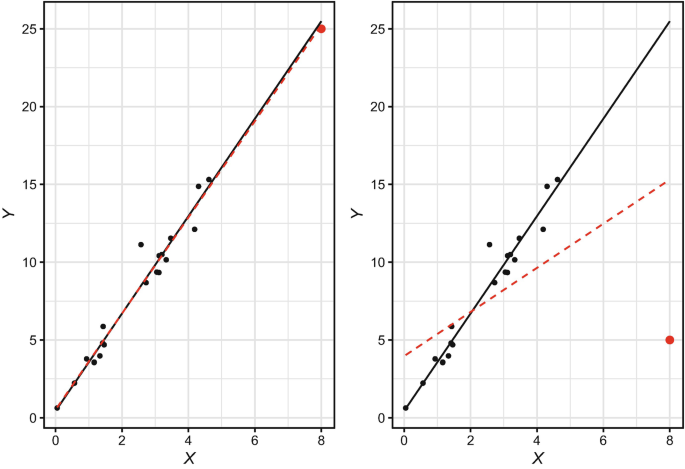
Left: Model fit with non-influential outlier. Right: Model fit with high leverage outlier. Outlier shown in red. Black solid line represents model fit without outliers. Red dashed line represents model fit with outliers

We can conveniently perform linear model diagnostics using the plot() function in conjunction with the object holding linear model results (slm.fit). This produces the following standard plots shown in Fig. 4:
-
Residuals vs Fitted: Shows how residuals (y-axis) vary across the range of fitted values (x-axis)
-
Normal Q-Q: Compares two probability distributions by plotting their quantiles (data partitioned into equal-sized groups) against each other
-
Scale-Location: Shows how standardized residuals (y-axis) vary across the range of fitted values (x-axis)
-
Residuals vs Leverage: Shows the leverage of each data point (x-axis) against their standardized residuals (y-axis)

Simple linear regression model diagnostics
The Residuals vs Fitted and Scale-Location plots help evaluate assumptions of homoscedasticity, linearity, and normality—which are intricately linked. Data are heteroscedastic if there is flaring or funnel patterning about the residuals across the range of fitted values. That is, there must be constant variance with respect to the residual errors in order for the assumption of homoscedasticity to be met. This occurs when there is a linear relationship between X and Y , in which case residuals will be normally distributed around a mean of 0. While the spread of residuals is greater for larger fitted values in this model, resulting in the lower standardized residual error for smaller fitted values indicated in the Scale-Location plot, the slope of the line in the Residuals vs Fitted plot is effectively flat which indicates that the model does not perform significantly better for certain fitted values relative to others.
Cook’s distance, shown in the Residuals vs Leverage plot, provides a measure of how much our model estimates for all observations change if high leverage observations are removed from the data. Higher numbers indicate stronger influence. R conveniently labels the three observations with the highest leverage, though the degree of leverage is only problematic for observations beyond the dashed Cook’s distance line. In this case, there are no observations with enough leverage for the dashed Cook’s distance line to show on the plot, so no action is warranted.
In addition to the visual inspection, we can perform the Breusch-Pagan test using the bptest() function from the lmtest library to test the null hypothesis that the data are homoscedastic. If p < 0.05 for the test statistic, we reject the null hypothesis and conclude that there is evidence of heteroscedasticity in the data.

## ## studentized Breusch-Pagan test ## ## data: slm.fit ## BP = 0.07603, df = 1, p-value = 0.7828
Since p >= 0.05, we fail to reject the null hypothesis of homoscedasticity; therefore, this assumption is satisfied. If this was not the case, a common approach to addressing heteroscedasticity is transforming the response variable by taking the natural logarithm (log()) or square root (sqrt()) of Y . While transformations may be correct for violations of linear model assumptions, they also result in a less intuitive interpretation of model output relative to the raw untransformed data.
Let us illustrate how to transform the response variable:

The Normal Q-Q Plot in Fig. 4 is used to test the assumption of normally distributed model residuals. A perfectly normal distribution of residuals will result in data lying along the line situated at 45∘ from the x-axis. Based on a visual inspection, our residuals appear to be normally distributed, as there are only a small number of minor departures in the upper and lower ends of the quantile range.
We can also visualize the distribution of model residuals using a histogram. In the majority of cases, the residual should be 0; this indicates the model correctly estimates YTD leads, resulting in no difference between estimated and observed values (\(\hat {y} - y = 0\)) (Fig. 5).

Distribution of model residuals

Based on both the Normal Q-Q Plot and histogram, the residuals conform to the assumption of normality. We can confirm using the Shapiro-Wilk test, in which a non-significant test statistic (p >= 0.05) is sufficient evidence of normality:

## ## Shapiro-Wilk normality test ## ## data: slm.fit$residuals ## W = 0.99339, p-value = 0.07029
Next, let us display our simple linear model results:

## ## Call: ## lm(formula = ytd_leads ~ engagement, data = data) ## ## Residuals: ## Min 1Q Median 3Q Max ## -14.8236 -3.7591 0.1118 3.1764 13.1764 ## ## Coefficients: ## Estimate Std. Error t value Pr(>|t|) ## (Intercept) 1.6301 0.9970 1.635 0.103 ## engagement 20.0645 0.3571 56.193 <2e-16 ∗∗∗ ## --- ## Signif. codes: 0 '∗∗∗' 0.001 '∗∗' 0.01 '∗' 0.05 '.' 0.1 ' ' 1 ## ## Residual standard error: 5.095 on 407 degrees of freedom ## Multiple R-squared: 0.8858, Adjusted R-squared: 0.8855 ## F-statistic: 3158 on 1 and 407 DF, p-value: < 2.2e-16
There are several important pieces of information in this output:
-
Estimate: Unstandardized Beta coefficient associated with the predictor
-
Std. Error: Average distance between the observed and estimated values per the fitted regression line
-
t value: Test statistic calculated by Estimate / Standard Error. Larger values provide more evidence for a non-zero coefficient (relationship) for the respective predictor in the population.
-
Pr(>|t|): p-value for evaluating whether there is sufficient evidence in the sample that the coefficient (relationship) between the respective predictor and response variable is not 0 in the population (i.e., x has a relationship with y)
-
Intercept: Mean value of the response variable when all predictors are equal to 0. Note that the interpretation of the intercept is often nonsensical since many predictors cannot have 0 values (e.g., age, day, month, quarter, year).
-
Signif. codes: Symbols to quickly ascertain whether predictors are significant at key levels, such as p < 0.001 (***), p < 0.01 (**), or p < 0.05 (*).
-
Residual standard error: Measure of model fit which reflects the standard deviation of the residuals (\(\sqrt {\sum (y-\hat {y})^2 / df}\))
-
Degrees of freedom: n − p, where n is the number of observations and p is the number of predictors
-
Multiple R-squared: Percent of variance in y (when multiplied by 100) explained by the predictors in the model. This is also known as the Coefficient of Determination. For simple linear regression, this is simply the squared value of Pearson’s r for the bivariate relationship between the predictor and response (execute cor(data$engagement, data$ytd_leads)^2 to validate).
-
Adjusted R-squared: Modified version of R2 that adjusts the estimate for non-significant predictors. A large delta between R2 and Adjusted R2 coefficients generally indicates a model containing a larger number of non-significant predictors.
-
F-statistic: Statistic used in conjunction with the p-value for testing differences between the specified model and an intercept-only model (a model with no predictors). This test helps us evaluate whether our predictors are helpful in explaining variance in y.
The output of this simple linear regression model indicates that for each one-unit increase in engagement, the average increase in YTD leads is about 20 (β = 20.1, t(407) = 56.2, p < 0.001). Had we transformed the response variable from its original unit of measurement, the interpretation would be expressed in the transformed units (e.g., β is the square root or natural log of the average change in leads for a one-level increase in engagement).
With these normally distributed residuals, we can draw upon the properties of the CLT and conclude that the true relationship between engagement and YTD leads in the population is statistically unlikely to be 0 since the 95% CI (β ± 2SE) does not include 0.
While it may be tempting to conclude that employee engagement has a significant influence on leads based on the model output, we know that bivariate relationships may be spurious; that is, engagement may be correlated with another variable that is actually influencing leads. In practice, a simple linear model is rarely sufficient for explaining a meaningful percent of variance in a response variable—especially in a social science context. Additional predictors are usually needed to capture the complex and nuanced relationships characteristic of people analytics problems.
The R2 value indicates that 8.9% of the variance in leads can be explained by the variation in engagement levels. Put differently, this simple model does not account for 91.1% of variation in leads. Since a large portion of the variance in leads is unexplained, we need signal from additional predictors to understand the other dimensions along which leads vary.
Figure 6 illustrates how the regression equation for this simple linear model (y = 20.1x + 1.6) fits the data points for sales employees. The distribution of leads at each engagement level indicates that there are other factors that explain variance in leads that need to be accounted for in the regression equation to achieve more accurate estimates. The reduction in the spread of leads for a combination of significant predictor values increases R2 (explained variance in YTD leads).

Simple linear model fit line for y = 20.1x + 1.6
Multiple Linear Regression
Multiple linear regression extends the simple linear model to one with two or more predictor variables. Assuming the multiple predictors add meaningful information, multiple regression models generally explain more variance in the response relative to simple linear models and are defined by:
Once we estimate the unknown model coefficients, β0 through βp, we can estimate Y for a particular combination of values for X1 through Xp by calculating:
Collinearity Diagnostics
In addition to the assumptions we tested in the context of the simple linear model, multiple linear regression warrants collinearity diagnostics. Collinearity refers to situations in which predictors that are related to the response variable also have strong associations with one another. In practice, there is usually some level of collinearity between variables, so the goal of collinearity diagnostics is to identify and address problematic levels of collinearity.
Models should be built with predictors that have a strong association with the outcome but not with one another. If predictors are highly correlated with each other, it indicates that they are redundant and do not provide unique information. A large amount of collinearity can cause serious issues with the underlying calculus of a regression model, which can manifest in the form of effects of significant predictors being masked or suppressed or a negative sign/effect showing in the output when a positive association between the predictor and the response actually exists (or vice versa). As a result, it would be premature to fit a linear model before running collinearity diagnostics, as there may be false negatives—predictors that appear unimportant but are actually statistical drivers of the response. If problematic collinearity is not addressed, false conclusions may be drawn from the model output which may lead to bad business decisions.
Kuhn & Johnson (2013) recommend the simple procedure outlined below to identify and address problematic collinearity:
-
1.
Determine the two predictors associated with the largest absolute pairwise correlation (whether they are positively or negatively related does not matter)—call them predictors A and B.
-
2.
Determine the average absolute correlation between predictor A and the other variables. Do the same for predictor B.
-
3.
If predictor A has a larger average absolute correlation, remove it; otherwise, remove predictor B. The exception to this rule is when predictors A and B have similar average absolute correlations with all other predictors but the predictor with the slightly higher correlation is a key variable that, if dropped, will prevent you from addressing one or more stated objectives or hypotheses.
-
4.
Repeat steps 1–3 until |r| < 0.7 for each pair of predictors.
Let us demonstrate the procedures and mechanics for multiple linear regression by estimating YTD sales using multiple predictor variables. While not appropriate in practice, we will select a subset of the available predictors from data to simplify this example. In chapter “Predictive Modeling”, we will discuss the use of machine learning (ML) models for more efficient and comprehensive variable selection.
We can leverage the ggpairs() function from the GGally library introduced in chapter “Descriptive Statistics” to efficiently compute bivariate correlations and visualize relationships (Fig. 7).

GGpairs bivariate correlations and data distributions
Based on the correlations, org_tenure is highly correlated with job_tenure, mgr_tenure, and work_exp. These relationships indicate that job and manager changes for those in sales roles have been infrequent since joining the organization, and that a large portion of their work experience has been with this organization. Since org_tenure has the strongest relationship with our response, ytd_sales, we will drop job_tenure, mgr_tenure, and work_exp.
Since |r| < 0.7 for all pairwise relationships, let us fit the more parsimonious multiple regression model using the resulting subset of predictors. We can chain together multiple predictors in the model using the + symbol in the lm() function:

While Kuhn and Johnson’s procedure is a good first step, this may not eliminate what is known as multicollinearity, which is collinearity among three or more predictors. It is possible for collinearity to exist between three or more variables, even in the absence of a strong correlation for a pair of variables. We can evaluate the Variance Inflation Factor (VIF) for the predictors that remain following the bivariate correlation review to ensure multicollinearity is not present. V IF is defined by:
where the denominator, \(R^2_{X_j|X_{-j}}\), is the R2 from regressing Xj onto all other predictors. The smallest value of V IF is 1, which indicates a complete absence of collinearity. Problematic collinearity exists if V IF for any variable exceeds 5.
We can produce V IF for each variable using the vif() function from the car library:

## engagement job_lvl stock_opt_lvl org_tenure ## 1.001459 1.407192 1.009435 1.395797
Based on the output, V IF < 5 for each predictor, which indicates that multicollinearity is not an issue.
Next, let us evaluate the linear model assumptions (Fig. 8) to validate that fitting a linear model to these data is appropriate. Based on these visuals, there are obvious violations of linear model assumptions that need to first be addressed.

Multiple linear regression model diagnostics
First, given the long right tail for the ytd_sales distribution shown in Fig. 8, let us apply a square root transformation to the response variable:

Additionally, the diagnostic plots indicate that there are data points with high leverage on the fit. Let us address using Cook’s distance as the criterion:

Now we can produce a refreshed set of diagnostic plots to evaluate the impact of transforming the response variable and removing high leverage observations (Figs. 9 and 10). There is a clear improvement towards satisfying linear model assumptions.

Multiple linear regression model diagnostics (post-transformation)

Distribution of model residuals
Let us perform the Breusch-Pagan test to validate that the assumption of homoscedasticity is met:

## ## studentized Breusch-Pagan test ## ## data: mlm.fit ## BP = 2.2111, df = 4, p-value = 0.697
Next, let us ensure residuals are normally distributed around 0:


## ## Shapiro-Wilk normality test ## ## data: mlm.fit$residuals ## W = 0.99342, p-value = 0.07202
Based on the diagnostic plots and statistical tests, our data satisfy the requirements for building a multiple linear regression model.
Variable Selection
Next, we need to reduce our model to the subset of predictors with statistically significant relationships with the response variable. Backward Stepwise Selection is a common and simple variable selection procedure, and the steps are outlined below:
-
1.
Remove the predictor with the highest p-value greater than the critical value (α = 0.05).
-
2.
Refit the model, and repeat step 1.
-
3.
Stop when all p-values are less than the critical value.
Each predictor in our model has a statistically significant relationship with ytd_sales—indicating that the slope of the relationships with the response is unlikely 0 in the population—so further variable reduction is not required.
## ## Call: ## lm(formula = sqrt(ytd_sales) ~ engagement + job_lvl + stock_opt_lvl + ## org_tenure, data = data, weights = as.numeric(w)) ## ## Weighted Residuals: ## Min 1Q Median 3Q Max ## -66.31 -16.01 0.00 16.72 78.50 ## ## Coefficients: ## Estimate Std. Error t value Pr(>|t|) ## (Intercept) 125.9807 6.9032 18.250 < 2e-16 ∗∗∗ ## engagement 10.1046 1.9742 5.118 4.93e-07 ∗∗∗ ## job_lvl 33.7679 2.4254 13.922 < 2e-16 ∗∗∗ ## stock_opt_lvl 5.1662 1.6211 3.187 0.00156 ∗∗ ## org_tenure 6.8118 0.3414 19.952 < 2e-16 ∗∗∗ ## --- ## Signif. codes: 0 '∗∗∗' 0.001 '∗∗' 0.01 '∗' 0.05 '.' 0.1 ' ' 1 ## ## Residual standard error: 26.15 on 375 degrees of freedom ## Multiple R-squared: 0.7783, Adjusted R-squared: 0.7759 ## F-statistic: 329.1 on 4 and 375 DF, p-value: < 2.2e-16
Based on the model output, the combination of predictors explains about 78% of the variance in YTD sales (R2 = 0.778). In people analytics settings, it is rare to explain three-quarters of the variance for an outcome given people data are especially noisy.
By default, the coefficients on the predictors are unstandardized; that is, they represent the average change in the square root transformed response for each one-unit increase for the respective predictor. Since the predictors have different units of measurement, such as stock_opt_lvl ranging from 0 to 3 and org_tenure ranging from 0 to 40, the unstandardized coefficients cannot be compared to determine which variable has the largest effect on YTD sales. We must standardize these coefficients and adjust for differences in the units of measurement for an apples-to-apples comparison.
We can scale variables by subtracting the variable’s mean from x and dividing the difference into the variable’s standard deviation:
We can leverage the scale() function to standardize the predictors’ units of measurement and determine which has the largest effect on ytd_sales:
## ## Call: ## lm(formula = ytd_sales ~ engagement + job_lvl + stock_opt_lvl + ## org_tenure, data = data_std) ## ## Residuals: ## Min 1Q Median 3Q Max ## -1.47125 -0.28770 -0.04054 0.30025 2.26587 ## ## Coefficients: ## Estimate Std. Error t value Pr(>|t|) ## (Intercept) -3.313e-18 2.606e-02 0.000 1.00000 ## engagement 1.247e-01 2.611e-02 4.777 2.49e-06 ∗∗∗ ## job_lvl 3.845e-01 3.095e-02 12.423 < 2e-16 ∗∗∗ ## stock_opt_lvl 6.788e-02 2.622e-02 2.589 0.00997 ∗∗ ## org_tenure 5.637e-01 3.083e-02 18.285 < 2e-16 ∗∗∗ ## --- ## Signif. codes: 0 '∗∗∗' 0.001 '∗∗' 0.01 '∗' 0.05 '.' 0.1 ' ' 1 ## ## Residual standard error: 0.527 on 404 degrees of freedom ## Multiple R-squared: 0.7249, Adjusted R-squared: 0.7222 ## F-statistic: 266.2 on 4 and 404 DF, p-value: < 2.2e-16
Based on the standardized coefficients in the regression output, org_tenure has the largest effect (β = 0.56, t(404) = 18.29, p < 0.001) and job_lvl has the second largest effect (β = 0.39, t(404) = 12.42, p < 0.001).
Moderation
As discussed in chapter “Measurement and Sampling”, a moderating variable is a third variable which amplifies (strengthens) or attenuates (weakens) the relationship between an IV and the response. Accounting for a moderating variable in a linear model requires an interaction term, which is the product of the two variables (X1 * X2).
Let us examine whether org_tenure influences the strength of the relationship between job_lvl and sqrt(ytd_sales). We would generally expect sales to increase as the job level of salespeople increases, and longer tenure may amplify the strength of this association. Step one is testing whether the interaction term is statistically significant, and step two is determining the nature of any observed statistical interaction. Including the interaction term in the model (job_lvl * org_tenure) will add the predictors independently and jointly:
## ## Call: ## lm(formula = sqrt(ytd_sales) ~ job_lvl ∗ org_tenure, data = data) ## ## Residuals: ## Min 1Q Median 3Q Max ## -89.090 -16.918 -0.589 17.490 107.461 ## ## Coefficients: ## Estimate Std. Error t value Pr(>|t|) ## (Intercept) 123.8354 6.2497 19.815 < 2e-16 ∗∗∗ ## job_lvl 50.5727 3.0119 16.791 < 2e-16 ∗∗∗ ## org_tenure 12.4813 0.8653 14.425 < 2e-16 ∗∗∗ ## job_lvl:org_tenure -2.5142 0.2996 -8.393 8.01e-16 ∗∗∗ ## --- ## Signif. codes: 0 '∗∗∗' 0.001 '∗∗' 0.01 '∗' 0.05 '.' 0.1 ' ' 1 ## ## Residual standard error: 29.4 on 405 degrees of freedom ## Multiple R-squared: 0.7412, Adjusted R-squared: 0.7393 ## F-statistic: 386.6 on 3 and 405 DF, p-value: < 2.2e-16
The results show that both the main and interaction effects are statistically significant (p < 0.001).
Since interaction terms can be highly correlated with independent predictors, it is good to check for collinearity:

## job_lvl org_tenure job_lvl:org_tenure ## 2.189565 9.246489 12.308142
V IF is greater than 5 for both org_tenure and the interaction term; therefore, there is a problematic level of collinearity between these variables.
A common method of addressing collinearity in the context of interaction testing is variable centering, in which each value of the predictor is subtracted from its mean (\(x - \bar {x}\)). Unlike other transformations we have explored, centering does not impact the interpretation of model coefficients. Coefficients continue to represent the average change in the response for a one-unit change in a predictor, as the range of values for centered variables is consistent with the range for untransformed variables. However, the coefficients on centered variables may be considerably different relative to the model with untransformed variables due to the effects of high collinearity.
## ## Call: ## lm(formula = sqrt(ytd_sales) ~ job_lvl_cntrd ∗ org_tenure_cntrd, ## data = data) ## ## Residuals: ## Min 1Q Median 3Q Max ## -89.090 -16.918 -0.589 17.490 107.461 ## ## Coefficients: ## Estimate Std. Error t value Pr(>|t|) ## (Intercept) 276.5606 1.5653 176.680 < 2e-16 ∗∗∗ ## job_lvl_cntrd 34.0427 2.4065 14.146 < 2e-16 ∗∗∗ ## org_tenure_cntrd 7.2623 0.3789 19.165 < 2e-16 ∗∗∗ ## job_lvl_cntrd:org_tenure_cntrd -2.5142 0.2996 -8.393 8.01e-16 ∗∗∗ ## --- ## Signif. codes: 0 '∗∗∗' 0.001 '∗∗' 0.01 '∗' 0.05 '.' 0.1 ' ' 1 ## ## Residual standard error: 29.4 on 405 degrees of freedom ## Multiple R-squared: 0.7412, Adjusted R-squared: 0.7393 ## F-statistic: 386.6 on 3 and 405 DF, p-value: < 2.2e-16

## job_lvl_cntrd org_tenure_cntrd ## 1.397803 1.773279 ## job_lvl_cntrd:org_tenure_cntrd ## 1.337702
After centering the variables, V IF is well beneath the threshold of 5.
Comparing the regression output with centered predictors to the output with untransformed predictors, we can observe that the main effects for job_lvl and org_tenure are inflated—and population parameter estimates less precise (larger SE)—when high collinearity is present.
To better understand the nature of the interaction effect (β = −2.51, t(405) = −8.39, p < 0.001), two equations can be built to evaluate changes in the slope of the relationship with high (\(\bar {x} + 1s\)) and low (\(\bar {x} - 1s\)) organization tenure:
-
High organization tenure: Y = −2.51(6.57 + 5.12)X + 276.56
-
Low organization tenure: Y = −2.51(6.57 − 5.12)X + 276.56,
where 6.57 is mean(data$org_tenure), 5.12 is sd(data$org_tenure), X is a vector of values for job_lvl, and 276.56 is the y-intercept.
As shown in Fig. 11, the slope of both regression lines is negative. However, the drop in sales is much more significant as job level increases for those with high (\(\bar {x} + 1s\)) organization tenure relative to those with low (\(\bar {x} - 1s\)) organization tenure. Perhaps those with longer tenure in the organization gain additional responsibilities beyond selling (e.g., mentoring junior salespeople) as they are promoted into higher job levels.

Regression of square root transformed YTD sales onto job level × organization tenure interaction term. High organization tenure (red line): Y = −2.51(6.57 + 5.12)X + 276.56. Low organization tenure (blue line): Y = −2.51(6.57 − 5.12)X + 276.56
Mediation
As discussed in chapter “Measurement and Sampling”, mediating variables may fully or partially mediate the relationship between a predictor and response. Full mediation indicates that the mediator fully explains the effect; in other words, without the mediator in the model, there is no relationship between an IV and DV. Partial mediation indicates that the mediator partially explains the effect; that is, there is still a relationship between an IV and DV without the mediator in the model.
Baron and Kenny’s (1986) four-step approach involves several regression analyses to examine paths a, b, and c shown in Fig. 12.
-
Step 1: Fit a simple linear regression model with X predicting Y (path c), Y = β0 + β1X + 𝜖.
-
Step 2: Fit a simple linear regression model with X predicting M (path a), M = β0 + β1X + 𝜖.
-
Step 3: Fit a simple linear regression model with M predicting Y (path b), Y = β0 + β1M + 𝜖.
-
Step 4: Fit a multiple linear regression model with X and M predicting Y (paths b and c), Y = β0 + β1X + β2M + 𝜖.

Paths for mediation analysis
The purpose of Steps 1–3 is to determine if zero-order relationships exist. If one or more of these relationships is non-significant, mediation is unlikely—though not impossible. Mediation exists if the relationship between M and Y (path b) remains significant after controlling for X in Step 4. If X is no longer significant in Step 4, support for full mediation exists; if X remains significant, support for partial mediation exists.
Let us illustrate the implementation of this approach in R by testing the following hypothesis: Job level mediates the relationship between education level and YTD sales. Stated differently, the relationship between job level and YTD sales exists because those with more education tend to have higher job levels, and those in higher job levels tend to have stronger sales performance.
## ## Call: ## lm(formula = sqrt(ytd_sales) ~ ed_lvl, data = data) ## ## Residuals: ## Min 1Q Median 3Q Max ## -138.34 -36.55 0.50 34.72 249.05 ## ## Coefficients: ## Estimate Std. Error t value Pr(>|t|) ## (Intercept) 245.229 8.472 28.945 < 2e-16 ∗∗∗ ## ed_lvl 9.072 2.740 3.311 0.00101 ∗∗ ## --- ## Signif. codes: 0 '∗∗∗' 0.001 '∗∗' 0.01 '∗' 0.05 '.' 0.1 ' ' 1 ## ## Residual standard error: 56.89 on 407 degrees of freedom ## Multiple R-squared: 0.02623, Adjusted R-squared: 0.02384 ## F-statistic: 10.96 on 1 and 407 DF, p-value: 0.001012
## ## Call: ## lm(formula = job_lvl ~ ed_lvl, data = data) ## ## Residuals: ## Min 1Q Median 3Q Max ## -1.19782 -0.19782 -0.08516 0.14016 2.14016 ## ## Coefficients: ## Estimate Std. Error t value Pr(>|t|) ## (Intercept) 1.74717 0.10522 16.605 < 2e-16 ∗∗∗ ## ed_lvl 0.11266 0.03403 3.311 0.00101 ∗∗ ## --- ## Signif. codes: 0 '∗∗∗' 0.001 '∗∗' 0.01 '∗' 0.05 '.' 0.1 ' ' 1 ## ## Residual standard error: 0.7065 on 407 degrees of freedom ## Multiple R-squared: 0.02623, Adjusted R-squared: 0.02384 ## F-statistic: 10.96 on 1 and 407 DF, p-value: 0.001012
## ## Call: ## lm(formula = sqrt(ytd_sales) ~ job_lvl, data = data) ## ## Residuals: ## Min 1Q Median 3Q Max ## -85.572 -28.593 -2.794 25.059 148.629 ## ## Coefficients: ## Estimate Std. Error t value Pr(>|t|) ## (Intercept) 152.761 6.156 24.81 <2e-16 ∗∗∗ ## job_lvl 57.294 2.804 20.43 <2e-16 ∗∗∗ ## --- ## Signif. codes: 0 '∗∗∗' 0.001 '∗∗' 0.01 '∗' 0.05 '.' 0.1 ' ' 1 ## ## Residual standard error: 40.51 on 407 degrees of freedom ## Multiple R-squared: 0.5063, Adjusted R-squared: 0.5051 ## F-statistic: 417.4 on 1 and 407 DF, p-value: < 2.2e-16
## ## Call: ## lm(formula = sqrt(ytd_sales) ~ ed_lvl + job_lvl, data = data) ## ## Residuals: ## Min 1Q Median 3Q Max ## -87.177 -29.481 -3.048 23.932 146.922 ## ## Coefficients: ## Estimate Std. Error t value Pr(>|t|) ## (Intercept) 146.220 7.805 18.734 <2e-16 ∗∗∗ ## ed_lvl 2.688 1.975 1.361 0.174 ## job_lvl 56.668 2.839 19.961 <2e-16 ∗∗∗ ## --- ## Signif. codes: 0 '∗∗∗' 0.001 '∗∗' 0.01 '∗' 0.05 '.' 0.1 ' ' 1 ## ## Residual standard error: 40.47 on 406 degrees of freedom ## Multiple R-squared: 0.5085, Adjusted R-squared: 0.5061 ## F-statistic: 210 on 2 and 406 DF, p-value: < 2.2e-16
Output from these models show significant paths for Steps 1–3 but when adding both ed_lvl and job_lvl in the multiple regression model in Step 4, ed_lvl is no longer significant. Therefore, support for full mediation exists.
Review Questions
-
1.
What is Ordinary Least Squares (OLS) regression, and how does it work?
-
2.
What assumptions must be satisfied to fit a linear model?
-
3.
What does a statistically significant result for the Breusch-Pagan test indicate about linear model assumptions?
-
4.
What does a statistically significant result for the Shapiro-Wilk test indicate about linear model assumptions?
-
5.
In what ways can high collinearity among predictors impact the quality of model results?
-
6.
When are outliers problematic for fitting a regression model?
-
7.
How is unstandardized β interpreted in the output of a linear model?
-
8.
How does the delta between R2 and Adjusted R2 change as additional non-significant variables are included in a model?
-
9.
How does the backward stepwise variable selection procedure work?
-
10.
What is the purpose of interaction effects in a regression model?
Bibliography
Baron, R. M., & Kenny, D. A. (1986). The moderator–mediator variable distinction in social psychological research: Conceptual, strategic, and statistical considerations. Journal of Personality and Social Psychology, 51(6), 1173–1182.
James, G., Witten, D., Hastie, T., & Tibshirani, R. (2013). An introduction to statistical learning: with applications in R. New York: Springer.
Kuhn, M., & Johnson, K. (2013). Applied predictive modeling. New York: Springer.
Author information
Authors and Affiliations
Corresponding author
Rights and permissions
Open Access This chapter is licensed under the terms of the Creative Commons Attribution 4.0 International License (http://creativecommons.org/licenses/by/4.0/), which permits use, sharing, adaptation, distribution and reproduction in any medium or format, as long as you give appropriate credit to the original author(s) and the source, provide a link to the Creative Commons license and indicate if changes were made.
The images or other third party material in this chapter are included in the chapter's Creative Commons license, unless indicated otherwise in a credit line to the material. If material is not included in the chapter's Creative Commons license and your intended use is not permitted by statutory regulation or exceeds the permitted use, you will need to obtain permission directly from the copyright holder.
Copyright information
© 2023 The Author(s)
About this chapter

Cite this chapter
Starbuck, C. (2023). Linear Regression. In: The Fundamentals of People Analytics. Springer, Cham. https://doi.org/10.1007/978-3-031-28674-2_10
Download citation
DOI: https://doi.org/10.1007/978-3-031-28674-2_10
Published:
Publisher Name: Springer, Cham
Print ISBN: 978-3-031-28673-5
Online ISBN: 978-3-031-28674-2
eBook Packages: Mathematics and StatisticsMathematics and Statistics (R0)