
Abstract
We can divide the methodology into six parts. One is to construct a wish compass. This is a meditative, philosophical exercise. The second is the collection and analysis of data. The third is to represent the whole of the data on the compass. The fourth is to use the compass and data table to make policy recommendations. We can do this based on one compass, but it is more interesting and more informative if we have several. In the fifth part, we make the exercise more participative. We invite members of the institution or people affected by the institution to suggest data or help with the analysis. The last part is to declare one’s ideological orientation. This last step is important for several reasons. We shall discuss them in due course.
You have full access to this open access chapter, Download chapter PDF
1 Introduction
We can divide the methodology into six parts. One is to construct a wish compass. This is a meditative, philosophical exercise. The second is the collection and analysis of data. The third is to represent the whole of the data on the compass. The fourth is to use the compass and data table to make policy recommendations. We can do this based on one compass, but it is more interesting and more informative if we have several. In the fifth part, we make the exercise more participative. We invite members of the institution or people affected by the institution to suggest data or help with the analysis. The last part is to declare one’s ideological orientation. This last step is important for several reasons. We shall discuss them in due course.
Once a compass has been constructed, we can up-date the compass reading as we become aware of changes in the data. So, we can watch how a policy decision changes an institution over time. Policy failure is indicated by the final arrow of the compass moving away from the wish spot. Policy success is indicated when the compass arrow moves towards or is situated in the wish spot. This simple reading is warranted provided the surrounding context is relatively stable, or changes are reasonably anticipated. Compasses comparing institutions help us to choose between competing institutions, or competing policies. We can use the compass to model future scenarios, to anticipate how the data will change, and how the compass reading will change with different policies.
Of course, there might be outside factors that change the data too. For this reason, we should not judge the success or failure of a policy decision without taking into account the changing context of the institution. We might also want to compare similar institutions to each other. If they, too, are changing because of a changing outside context, then we have a better explanation as to why it is that policy is not working – it is not working because the outside context is changing. For example, there might be political upheaval, an earthquake, a drought, the spread of a contagious disease through the surrounding population. Each of these might lie outside the immediate influence of the institution and affect the placement of the actual arrow, despite policy. This helps us to re-adjust policy expectations.
The enriching philosophical questions that arise during compass construction become sharpened when we look at extensions and adaptations of the compass to fit particular ideological orientations. Another sort of adaptation is to operationalise the compass. That is, to align policy making with the areas over which an institution has direct control. We shall explore extensions and adaptations in part III, after going through the three stages of the basic construction methodology.
2 Constructing a Compass with a Wish Spot
We now have enough information to construct a compass with a “wish spot”. See Fig. 5.1. The wish spot is an oval we draw on the compass. This sets a norm for the institution in terms of the compass. The oval marks the place on the compass where we would like the institution to be. We make a wish spot before we look for data. We simply look at the mandate for the institution, or ask the head of the institution, or the decision makers in the institution, and study the impressions we receive in terms of the three qualities. This is an impressionistic exercise. The goal of policy is to ensure that the actual arrow ends somewhere in the wish spot.

A wish compass
When we construct an “actual” compass, we do so on the basis of real data. A constructed compass gives a description of where an institution actually is given the data. In our initial analysis for making policy recommendations, we compare the final arrow in the actual compass to the wish spot. This is how we guide policy using the compass. We look to the data to work out which data points will help the final arrow of the actual compass to shift towards the wish spot. If it is already there, then we are vigilant to ensure that it stays. Or we could change our norm, become more ambitious for the institution. These choices are important and worth making explicit when making policy decisions.
Choosing a wish spot is a philosophical exercise. It is a good one for introducing an audience to the three qualities and acquainting them with the representation. It is a meditative exercise. We ask not only about the qualities themselves, but also about what differences in degree mean. What does it mean for an institution to be in excitement towards discipline, for example. We should discuss all of these nuances as an exercise in learning about the three qualities and our institution.
The wish spot might sit squarely within one sector, or it might overlap with another or all three – so being placed somewhere in the centre of the circle. All of these wishes are possible.
The wish spot has a size. A larger wish spot is less policy-ambitious. We are content with falling vaguely in this qualitative area. A small wish spot is more specific and ambitious. We really want a particular quality to predominate – where that particular quality might not be one of the three words as such, but might be identified with another word. For example, some institutions strive towards excellence, and we glean this by reading the mandate of the institution. If the institution is after excellence, then the wish spot will be somewhere in excitement. It will probably also be more towards discipline, since there will be competition and strife to achieve excellence. If this is the attitude that clearly predominates, then the wish spot can be quite small.
A wish spot far away from the centre of the circle indicates that we are not after balance between the qualities. With a few exceptions, achieving such wish will make the institution less stable. On the other hand, according to the Ancient traditions, a perfect balance between the qualities is interpreted as complete stagnation of an institution. There is no movement. This might be good in some traditions since it might indicate enlightenment. A slight imbalance in the qualities makes a perturbation. The perturbation is enough to bring change. The further away the wish spot is from the centre the more unstable and the institution becomes. Again, there might be exceptional reasons for wishing for such instability. The wish spot should be considered carefully for these reasons.
3 Collection and Analysis of Data, the Indicator Arrows
The final actual arrow of the compass is the result of aggregating statistical data. It represents the totality of the data in terms of the three qualities. Before making the aggregation, each data point is also represented on the compass, that is, in terms of its general quality, its tendency towards another quality and the strength with which it shows this quality. Each data point is represented by what we shall call “indicator arrows” because data points are indicators of some aspect of an institution. We shall see the mathematical method of aggregation in the next section. For now, let us concentrate on the statistical data. We have several initial steps.
As per any policy decision, we want to choose data that is available, accurate (recent, representative and sufficient) and which we can safely assume will be available in the future (if we are interested in comparing the success of the policy of institution over time) or is available for comparative institutions (if we want to compare institutions to each other). Thus,
-
Step 1: Our first task is to find some quantitative data on the institution.
-
Step 2: Verify that the quality of the data is reasonably high.
There are two types of quantitative data: cardinal and ordinal. Cardinal data is an absolute measure, such as “$US 30,000 were spent on equipment last year”. Ordinal data is relative, for example, “factory x used twice as much water as factory y”, or “sub-region x has the highest unemployment in the larger region”. Both give us information, and each shows its importance with respect to the context of the institution. The first is sensitive to absolute limits, the second to comparison and competition.
Finding data and verifying the accuracy are not meant to be controversial, at least in the ‘Western’/‘Northern’ world, but might be much more challenging to carry out in some communities or for some institutions. The ease of data collection depends on the formality and context of the institution. That is, more casual, impromptu “institutions” will have less data, or the quantities might not be known. A spontaneous protest movement, a sports celebration or the loss of a tradition are ethereal. They do not last long, and there is usually not much in the way of a formal record. A more stable and formal institution, such as a government, a well-established industry or a university will all have relatively high-quality data available for analysis. In making a note concerning the quality of data, we add another dimension to our analysis.
-
Claim 11: High quality data with sensitive analysis makes for a more objective indicator arrow.
“Objectivity” is meant in the sense of accuracy. And this is why sensitivity is important. If we are unsure about the accuracy-quality, then part of our policy might be to address the quality. We allot some funds or energy towards gathering better data.
4 Data Analysis
Data analysis takes thought and discussion. We determine what the data means. It is a philosophical endeavour. We classify data according to the three qualities, but then we decide on a degree within the quality and a length. Each data point receives careful analysis. Because of the degree and length, each data point can be represented as an indicator arrow on a circle.
4.1 Classifying Data in Terms of the General Qualities
-
Step 3aFootnote 1: Classify the data in terms of the three general qualities.
This third step is not all that mysterious, but there are some complications to be seen soon. Starting with the banality of the step: when someone informs us of a statistic, he, or she, does so to indicate a general quality to which we are supposed to react emotionally. The person might elicit the general sensation: that by-and-large everything is running smoothly and ‘normally’ (harmony), or that we should be on our guard, feel angry, frustrated or want to take political action (discipline) or that we should feel excited, proud/jealous or passionate (excitement). A borderline feeling such as ‘alarm’ might be thought of as part of discipline and tend more-or-less towards excitement. Data is sorted as representing one of the three qualities.Footnote 2
This reflection on the qualitative and emotional reaction to the data draws a normative and culturally sensitive aspect to the analysis. This is deliberate, and is considered to be another strength of the analysis: that we can now be quite explicit as to where and in what sense our policy is normative, and that different cultures might react in different ways to the ‘same’ statistic, and might change their reaction over time. For example, what were felt to be alarming rates of death by motor car accident forty years ago are not felt to be as alarming today. We very quickly adapt to new unpleasant situations by “normalising” them. We should be aware of this. Part of the compass construction exercise is sociological and psychological in this sense. This does not quite mean that the arrow is subjective. We can be objective about the particular psychology by measuring the degree to which an emotion is shared by a culture. Culture specific is not the same as subjective since there is an objective description of a culture in the sense that we can measure, by questionnaire or behaviour, the percentage of reactions of people belonging to a culture. For example, “x percent of the population use the public transportation system at least eight times a week.” We can then assume that “at least x percent of the population endorse the public transportation system.” More might endorse it, even if they do not use it, since it means less traffic, easier parking and so on.
There is the danger of a further confusion. The “same” statistic is counter balanced by itself expressed negatively. For example, say we are concerned about employment. The number of employed in the relevant part of the population eligible for employment is the inverse of the number of unemployed in the relevant part of the population eligible for employment.
For psychological reasons of choosing a baseline, it is worth thinking of the two side-by-side. For example, we might think of the statistic: “population of malnourished humans in the world is 11%”. This is the same as the “population of properly or well-nourished humans in the world is 89%”. Psychologically, we could be forgiven for being alarmed by the first, but thinking of the second as quite a success story. After all, the human population on the Earth is quite high. It took the green revolution, an efficient transportation system and some degree of world peace and refugee management to feed so many people. The latter is the result of new (industrial) agricultural practices, transportation technology, logistical organisation, infrastructure, moral intolerance of famine better distribution of money and food, careful politics and a more global free market. The qualifications should be added to the data table. They can help us with policy recommendations, especially since all of these considerations should also figure in the table of data as separate indicators. So, we re-express the 11% in different terms. For example, “20% of farmers in country x suffer from malnutrition.” Or, “5% fewer people than last year living under the poverty threshold suffer from malnutrition.” We want to be sensitive about our emotional reaction to statistics, and correct for it by reading the inverses and becoming aware of our reactions. Of course, we do not add both, since this would be double-counting. It is in the consideration of the one statistic, represented in inverse ways that we chose one and enter the data once.
Deciding on the general quality, and eventually the degree within the quality sector, should not be done by one person. It should be a democratic matter. Different people have different reactions to the same statistic. This is normal. Again, it is a strength of the compass construction that such disagreements are aired and recognised. Indeed, if there is too much disagreement in a group of people about which general quality a statistic belongs to, then either drop that statistic and look for another, or split it into two statistics by adding and stating the key details that make it clear which general quality it exemplifies for whom.
For example, we might have to be explicit about the perspective from which a statistic is viewed: from this perspective the statistic exhibits discipline, but from that perspective it indicates excitement. We now have two indicators. The sub-culture sensitivity is then made explicit. This serves as a warning that one part of the population might take offense if the situation is exacerbated by policy.
Let us look at more examples. National statistics are fairly accurate and available (now, in the future and in several nations). Statistics that indicate harmony in a nation might include: literacy rate over ninety percent, over sixty percent participation in an electoral process, life expectancy of the population is seventy or higher. Statistics that numerically positively indicate the emotionally negative quality of discipline might include: percentage of people in prison, a significant financial gap, more than one cubic meter of waste per person per week. Statistics that indicate excitement might include: twenty percent of the population or more have a graduate university degree, four or more Olympic medals won by a country, at least one Nobel prize won every twenty years, the country includes at least three UNESCO sites, and at least three “natural wonders”, and so on. Which statistics fall under which general quality varies with cultures and sub-cultures. More details can be found in Sect. 5.4.2 where economic, social and environmental data are discussed in terms of the three qualities.
Nevertheless, let me offer more guidance here. Economic data can be sorted as follows: fixed fees, prices, steady costs, maintenance – anything that repeats itself more-or-less from one economic period to another is classified as belonging to harmony. Financial failure, bankruptcy, debt, are all classified as belonging to discipline. Investments, new money, new expenses, unstable money flows are classified in excitement. Environmental indicators can also be easily classified, although we might have reasons to deviate from the recommendations here. Natural spaces, or spaces lightly managed, or better, managed or kept by indigenous people, are classified as belonging to harmony. Discipline in nature is indicated by extinction of species – loss of bio-diversity, pollution, since it stresses the environment, invasive species (not intentionally introduced by humans), soil erosion, the loss of the planet’s stock of low entropy – the extraction of oil for fuel, of minerals in mines, the spread of disease, the covering of soil with buildings, roads, the blocking of river flows by building hydro-electrical dams, the extraction of water for irrigation are all part of discipline. Any time we show our dominance over nature we classify this as excitement. Our dominance includes agriculture, aquaculture, hunting, fishing and gathering, new species, specialised breeds of animals, hybrid plants, clones, genetically modified plants and animals, the introducing of a new species of insect to an area to curtail the population of an existing species, the moving of fertile soil and so one.
Socio-political and cultural indicators are a little messier. Let us consider three types: health, education/ culture and security. Health-harmony indicators concern what is normal in a human population: birth rates, fertility, longevity, general fitness and stable, healthy diet, knowledge about health… Health-discipline indicators include disease, impairments to functioning normally, such as loss of hearing or loss of a limb, and we should include mental illness such as depression. Health-excitement include new medical practices or procedures, new drugs, improvements in health infrastructure or distribution, gadgets that improve health and so on.
Education and culture indicators that fall under harmony include: primary school education, the smooth functioning of society, politeness, consideration, modesty, in dress, for example. Those that fall under discipline include school failures, or percentages of illiterate or innumerate population, loss of a language or way of life, loss of cultural knowledge, failed attempts to promote education or culture, maybe a shift towards violence in a culture. Those that fall under excitement include: festivals, art performances, large celebrations, higher education statistics, education prizes, competitive sporting achievements and so on.
Security-harmony indicators include: safety in transportation, feeling safe, being able to go out alone, protection from natural disasters such as earthquakes, or protection from human based disasters such as wars or the spread of human-transmitted disease. Security-discipline include: death or injury due to human attack, sub-cultures that physically attack other parts of the population, war, death or injury due to natural disasters such as flooding, earthquakes, fires and so on. Security-excitement include new techniques or technologies to ensure security or protection, either against other humans or from nature.
It is a skill, developed by experience, to classify data in terms of the predominant quality. For emotional or psychological reasons, many statistics that are cited in the media, and so are readily available, are more naturally placed in the excitement and discipline sectors. That is because we pay attention to them because excitement and discipline elicit higher emotions than harmony. Since media is created to draw attention, we tend to only find high emotion statistics in the media, and leave out the “boring” harmony ones. This includes a lot of data that is available on the internet, since people who contribute information to the internet want a readership. Moreover, increasingly, the different media institutions are run as a business for profit; they cannot ‘sell’ the media without eliciting strong emotional reactions. More systemically, as ‘consumers’ of media, we have been conditioned to expect to have an emotional reaction when reading the newspaper, watching the news on the television and so on. Under the “media as business” model, media has become confused with entertainment. And that has become our (not very good) reason for purchasing that form of media. For this reason, finding harmony data can only be carried out if we look beyond the media, at serious reports. As noted above, many formal institutions have a suite of internal data. There are, of course, good sources of data gathered by reputable scientific or government agencies.
The insistence here on three qualities prevents us from falling into the trap of only considering data that elicits the emotion “good” or the emotion “bad”. This is a serious error committed by some analysts, who, for example, might only look at the discipline data. For example, Raworth (2017, 295–299) represents data according to limits: shortfall in the socio-economic sphere and overshoot in the eco-sphere.Footnote 3 It is a trap because we cannot have a balanced conception of the whole situation if we only consider such data. The data of harmony is as important as the discipline and excitement data. See Fig. 5.2.

Raworth’s representation of doughnut economics
To summarise, we counter-balance the stronger emotions associated with discipline or excitement by citing the less publicised (because emotionally boring) statistics that indicate harmony. Institutional memos and records are the source of harmony statistics. Moreover, paying attention to the emotional quality of a statistic is part of the exercise. We are aware that the emotional quality varies with culture, individual psychology and individual past history, including being recently psychologically ‘primed’. Finding statistics that indicate harmony might be more difficult.
Let us examine the cultural element more closely. How we react emotionally to some statistics, depends on our culture. Thus, one culture might view a statistic as indicative of the general quality of harmony while another might view it as discipline. Take for example, the number of peaceful protests in a given city. Say we locate this in excitement because they are political but peaceful. The degree will be close to discipline, since protests are indicators of confrontation. Now, say the number is low compared to other similar cities. Prima facie, this should indicate that the arrow is closer to harmony and is short. But, in a country, where the president has given the police the right to shoot protestors with impunity (Lambert, p. 8),Footnote 4 we might want to indicate it with a long arrow and classify it as discipline, closer to harmony, since there is “order” on the streets due to brutality or the threat of brutality. Better yet, we could class countries in terms of their laws concerning protests – no tolerance, low tolerance, high tolerance. We then think of the statistic for that country compared to the other counties with the same tolerance measure. This is what I mean by being “sensitive”. It also means being creative or thoughtful about the meaning, significance or importance of the statistic. There is no need to ignore important information when constructing a compass.
Therefore, the proffered name for the statistic is not always enough to tell us which third the statistic belongs to or what degree it should have. It’s significance (that the number is low or high) and its context are also important. Which general quality the low number of protests indicates has to do with a wider context and general cultural values.
If we still encounter difficulty here, we can do two things. One option is to drop the statistic. The latter is less helpful for the compass construction for reasons of accuracy, and therefore, robustness of the final arrow.Footnote 5 The alternative is to be more specific about the name for the statistic, splitting it into two or more, to reflect the different contexts or ways of thinking about the statistic. We qualify the name, or give it a longer more nuanced name. So, we might call it, for example, “number of protests where the police are given important powers of suppression” is different from the statistic: “number of protests in a city where the police are given little power to act against protesters.” Re-naming adds to what I have called ‘depth’ of analysis, and regional specificity. The compass reading gains in accuracy and comprehensiveness. This will play into the justification for, and longevity of, policy decisions made on the basis of the compass.
Taking seriously these complications is what adds depth to our policies . Remember, we use the final arrow to make new policies, adapt or change policies, analyse or criticise policies or justify policies. And remember that we can do all of these things in a more or less superficial manner. But remember claim 1: The deeper the analysis, ceteris paribus, the greater the longevity of the policy.
-
Summarising: this aspect of the analysis is delicate but also adds sensitivity and depth.
Continuing with the method, we want to represent each statistic as an indicator arrow on the circle. The first step is sufficient for us to draw arrows at all. The second step ensures reliability. The third step situates each indicator arrow in one of the sectors. We draw a table with one column for general quality, a second column for the name and any qualifiers. What of direction and length? See Table 5.1.
4.2 The Degree Within the General Quality Sector
We now have to be even more sensitive to culture and pay close attention to the nuance surrounding the qualitative measure of the indicator arrow. Some statistics will fall in the middle of the third, and some will tend towards one of the other thirds, in limit cases an indicator arrow might sit right on the border between two qualities. In such a case, I recommend that we choose another statistic, for reasons concerning the aggregation formula in Sect. 5.5.1.
The degree, or direction of the indicator arrow within the third, will be represented by degree. If a statistic by-an-large indicates harmony, it is located in the harmony sector. But the arrow does not have to be placed in the middle of the sector. It might tend towards excitement or towards discipline. As we wrote before, a harmony indicator can tend towards discipline if it is boring, since boring can slip into dull and insensitive, or the harmony might be too light and ethereal, so tend towards excitement.
Similarly, excitement can tend towards harmony or discipline. It will tend towards harmony if it is pleasant and easy – a striking melody played on light wind instruments and at the right speed, might be exciting towards harmony. It could become oppressive if played very loudly with pounding drums. Then it is classed as exciting, but tend towards discipline. Excitement is associated with new things, as they become normalised, they rotate into harmony.
Discipline indicators can tend towards harmony or excitement. A certain brutal architecture might become normalised enough that it is expected, so closer to harmony. Or, it could be seen as very avant-garde and modern, and so be considered to be exciting. An invasive species will be classified as falling under discipline for the environment, since it is disruptive and indicates a vacuum. But eventually, it will be integrated. When it becomes integrated into the new eco-system (the population of the invasive species stabilises), the presence of the species becomes a harmony indicator.
Now we turn to a discussion about protocol to determine the degree. The importance of this step is that it allows the data analysis to be partly inclusive of the wider population.
-
Step 4: Assign a precise degree to each indicator arrow.
One easy protocol is to use visual feedback with a group of people representing the population affected by the institution. We display an indicator arrow on the circle that is half the radius (to make the length neutral) and see how people feel it represents what they think about the quality of the indicator. We move it around, change its length, discuss the changes until we reach consensus.Footnote 6 It is surprising how quickly this can be done, and how easy it actually is. The inconvenience is to bring the people together to voice their opinions.
An alternative protocol is to vote. Say, a large group decides on an indicator arrow for the discipline third. We then vote on whether the arrow should then swing towards harmony or excitement. If 20% would swing the arrow towards harmony, and 80% would swing it towards excitement, then since degrees are ordered clockwise, and start with 0 at the top, and there are 120 degrees allotted to discipline sector, the arrow will be 96° towards excitement, within that sector, so have a degree of 120 + 96 = 216.
We might want to do something more sophisticated than straight voting, and have weighted votes, so people say whether they feel strongly, medium or lightly about their choice. Or we might accord different weights to votes by different people: people more or less affected by the institution, or people with greater knowledge, for example. These are all parameters worth discussing and considering carefully, since they indirectly answer to claims 1, 5 and 7. Eliciting these discussions is a deliberate part of the exercise of constructing the compass. These questions are political, philosophical and important. But they also answer to robustness considerations which we shall see shortly.
Another exercise that is related is to consider adjectives other than “harmony”, “discipline” and “excitement”, such as: “plush”, “regal”, “boring”, “useful”, “challenging” and so on, and decide on a sector for each and a specific degree within the sector. See Fig. 5.3. What degree we decide upon and which adjective belongs next to which is sensitive work, but not impossible. A good linguist and a bit of trial and error or linguistic analysis should make the task of degree assignment easier.

A compass with adjectives assigned to degrees
This exercise is useful, but might be time consuming. It is quite possible to make a mistake in degree assignment. For example, when designing questionnaires, we might offer a suite of adjectives and ask respondents to choose one or several. We then still have to decide on a separate protocol to work out what to do when the adjective is not unanimous, but this is not too difficult, if 20% choose the adjective given the degree 30, and 10% choose the adjective given the degree 90, 40% choose the adjective with degree 40 and so on, then we have interesting information. First, we check on our assignment of degrees to adjectives, there should either be a bell-curve or a wave. See Fig. 5.3. If not, then we have probably not made a very judicious assignment, and might want to re-assign degrees to the adjectives to make smoother curves or start again. If we have several peaks, then this indicates that we need to split the indicator, while noting the different sizes of the peaks. Once we have a single curve, we choose the top of the curve as the degree for the indicator arrow (Fig. 5.4).

Bell curve and dis-joint curve for adjectives on the compass: what happens if we get the order of adjectives wrong
When making policies, based on statistical findings, it is highly relevant and important to have discussions about what it is that a statistic indicates in general, and not be afraid to change the name to reflect further subtleties. Such discussion might be long and frustrating for some people, but it will save time in the long run, due to the stability of the policy. The stability is promoted by understanding how others see the statistic. We incorporate public insights and reactions to help to design policy that anticipates future disagreement. Robustness will be further promoted by the sheer number, and variety of types of people consulted. At the end of the day, the degree of the arrow is the most subjective, culturally sensitive and changeable aspect of the construction. We should not fear or ignore this, but acknowledge it to understand it.
4.3 Length of Indicator Arrows
-
Step 5: Assign a length to each indicator arrow.
This is just as important as degree, but in some sense, it is less subjective and volatile. Length of arrow is a numerical measure that is used for comparison of that statistic with others of the same sort. It is a matter of deciding upon the “normal” parameters within which the statistic lies. “Normal” is our “baseline”. If the statistic falls in “normal”, then the length of the indicator arrow should be half the radius of the circle. If the statistic is above normal then it should be more than half the radius. If it is below the threshold of normal then is it less than half of the radius. How much more or how much less depends on the maximum and the minimum.
Length will be nothing more mysterious than a function of scale, what we think are reasonable parameters and where other comparable statistics lie. Think of our usual representation of statistics. We start by stating a fact. For example: the average longevity of the population is seventy years. This bald statement will elicit no emotional reaction without some context which might be known already or which might need to be articulated. Say that this is the statistic today, and that it was higher twenty years ago, when average longevity was seventy-six. To represent the relationship between the two statistics we draw a graph with a bottom line labelled with a progression from left to right to indicate time, and another vertical line at the left labelled bottom to top to indicate measures of longevity. We usually will miss out the possibility that longevity of a population on average is equal to 0–15 years. The maximum would be, say, 90 years. The dates will not start with the beginning of mankind, but might track longevity over the last 50 years. We then plot the two measures on the graph. See Fig. 5.5. Experts decide on the scale and parameters of representation almost without thinking.

A graph with properly chosen parameters along the vertical axis
Deciding on the length of an indicator arrow for the compass is similar, although we shall be asked to think. In fact, this was already more-or-less implicit in the name given to the statistics in Table 5.1. We decided that a number indicates harmony provided it is between certain parameters. The parameters are part of the name. If we are really developing indicators, then it is important to be aware of this background activity and the presuppositions that determine the final representation.
There is a subtlety we should address immediately. We should not confuse (a) the exercise of fitting the representation aesthetically on a graph with (b) our gerrymandering the representation in such a way as to elicit or increase/decrease an emotional reaction to the representation. Whether the representation elicits alarm or not will depend on choice of scale. See Fig. 5.5. On the left side, we have a small scale of zero to six, and the differences between the lines looks large. Had we chosen a scale of minus twenty to fifty, the three graph lines would flatten out and look much the same. Now consider the aesthetics: that (a) we have to make the representation on a page of a book, article or screen (so this determines something of the parameters of possible scales fitted to a page) and we might think of future or past measures of longevity, not bothering with longevity below 15, since this is ‘unimaginable’. These are features of representation with which we work every day. And this is just how we determine scale and length of indicator arrow.
In the case of our indicator arrow on the circle, its length is then determined in the same way but adapted to a circle. Ab initio, the maximum length is the radius of the circle for an individual indicator arrow. For just one indicator arrow, we would fix the parameters according to what is reasonably imaginable. In other words, the vertical axis on the graph of Fig. 5.5 corresponds to the radius of the circle; the mean being half the radius. The statistic is then very high if the number reaches the edge of the circle (top of the graph) but is low if it is close to the centre (at the bottom of the graph).
(b) We might want to work backwards and ‘down-play’ the emotion elicited. We then change the scale. This is not recommended for reasons of robustness, or objectivity, which in turn depends on honesty in representation and affects longevity of policy.
-
Claim 12: The representation of statistics can be objective if we sensibly decide on a baseline and the extremes, or it can be political.
Now note: say longevity of a population belongs in harmony. A high longevity is more harmonious, say, than a low longevity, subject to considerations about what it is that is influencing the statistic. For example, it might be high for discipline-related reasons (no laws allowing people to terminate their lives, so the quality of life is very low at the end of life) or for exciting reasons (the quality of health is very good even at the end of life). To re-enforce the quality of harmony, the arrow will be longer. A longer average longevity brings the arrow closer to the edge of the circle.
-
Step 6: Enter the statistics on a table with four columns: the general quality, the name and any qualifiers, the degree and the length.
Having chosen and developed the indicator arrows, we enter these in a table. Each arrow has a general quality, a name, a degree and a length. See Table 5.1.
-
Step 7: Normalise the length for the purposes of aggregation.
Note that in Table 5.1 there are three indicator arrows for each sector, except for excitement that has four. This is a very small number, and we would want more for reasons of objectivity, having an idea from different points of view (data points) of the quality of the institution. Examples of real tables are given in Sects. 11.6 and 13.3.
Eventually, we are going to add the indicator arrows together to form “sector arrows”, one for each general quality. If we just add them, as they are entered on the table, then we might encounter several problems with the representation. The sector arrows could well outstrip the circumference of the circle. This would make the representation aesthetically unpleasing and unintuitive to interpret. This is the same as when we read a normal graph where the lines go beyond the vertical scale. See Fig. 5.6. The likelihood of this decreases with a lot of short arrows, but increases with more arrows in a sector. Therefore, for reasons of final arrow representation which mathematically ties together the three sector arrows, we have to adjust the length of the indicator arrows. So, before we add them, we make a mechanical normalisation on the length of each indicator arrow in two steps.

A graph where the curve is “off the graph”
The first step is to accommodate the fact that we might be grasping at straws in an effort to include as much data as possible, in an effort to be as accurate as possible and objective as possible. Prima facie more data is more accurate than a little data, but we can go too far, and include insignificant data.
Not all data is as important as all other data, just from a fairly objective point of view. Later we shall add a more explicitly normative aspect to this, but we should consider one thing at a time.
Since some data is not so important – as shown by a short length. We cross out data that has an indicator arrow shorter than one third the radius. The number one third is a bit arbitrary. We could have chosen one fifth or a quarter, and so on, but it will not matter, provided we treat all of the data on the table in the same way, and that we still have enough data to start making meaningful calculations that eventually stabilise the sector arrows.Footnote 7 Because the length of an insignificant indicator arrow might change, we only cross it out. We keep an eye on it, if we suspect it might change and become important. At that point we remove the crossing out, and it is added to the sector arrow. Sometimes, a small number statistic turns out to be important politically or environmentally because it triggers a shift in the larger system. The system has reached a tipping point, and the change is unexpected and looks dramatic. The snarling dog “suddenly” attacks.
We learn from ThomFootnote 8 that what looks sudden can be re-described, mathematically, as inevitable. For us, the lesson is that if we do not have a good balanced picture, because we are missing information, then we will be surprised by some changes. If we have enough information, then we will be aware that, say, a group of people is being pushed to their limit, or an eco-system is on the brink of collapse. Even with a lot of information, it is impossible to know exactly when the “surprise” will come, but we can be vigilant or try to appease the situation in anticipation of noticeable change. It is a question of having enough information, and knowing how to interpret it. Several insignificant indicators together show volatility. For this reason, it might make sense to look at the crossed-out data, or sections of the crossed-out data together, and combine them into one arrow (that, now is significant enough, not to be crossed out). This will take experience and foresight. The advantage is that we anticipate changes that would otherwise look sudden or dramatic, since we knew all along that the social or ecological system was approaching the edge of change.
The second normalisation step is to allow for a different number of statistics in each quality-sector, and to prevent the sector arrows from going beyond the circumference of the circle. To meet these two requirements, we divide the length of each not-crossed-out indicator arrow by the number of not-crossed out indicators in that sector. This is the second step in the mechanical, or descriptive, normalisation calculation. We enter the normalised length in a new column.
To summarise the mechanical normalisation: the reason for making the correction is this. We want a nice representation for our final arrow. We recognise that, on the one hand, more data is more accurate than less, but on the other hand, not all data is equally important. The shorter indicators weight less for our institution, and might be added for reasons of robustness or because we think that they might change significantly because of, or independent of, policy. These should not carry much weight in the compass reading. So, we disregard the short arrows for the purpose of construction. But we keep them in the table. We just cross them out. To accommodate the possibility of there being different numbers of arrows in the sectors, and to ensure that one sector is not over-emphasised, we divide each length by the number of arrows in that sector. If we want to be very sophisticated, we could also cluster similar arrows, that in conjunction with each other turn out to be significant. The two-step normalisation ensures an intuitively readable final compass representation of the data table.
The normalisation also contributes to robustness of the reading. When we find that adding more arrows or indicators, does not change the overall sector arrow we have meta-convergence, and so stability in that sector. This is one of our robustness or “objectivity” checks.
We now have our table of data, analysed in a qualitative and quantitative way – in terms of length and degree (quantities) to represent qualities of an institution. We shall look back at the data table to guide policy decisions, once the data is mathematically aggregated, because it is in terms of the representation of the mathematically aggregated data that we want to make policy decisions, not in terms of individual data points.
This is what is missing in existing multi-criteria decision aides: the formal comparison of the particular to the whole. Experts using multi-criteria decision aides make the comparison informally, after the representation of the data separately has been constructed, such as in Fig. 5.7. In their analysis of such a diagram, they bring in a lot of informal (missing from the diagram) considerations to bear. They might consider the history of the institution, common or external factors that influence the particular data points. They bring the data together in an analysis by telling a story that ties the data. The story telling takes skill, knowledge and experience. The experts deserve our full respect.

Data represented in a multi-criteria decision aide
In contrast, the compass asks us to make a more holistic analysis in terms of general qualities, relying less on skill, knowledge and experience. The compass makes the policy more intuitively understandable, and therefore, the construction and resulting policy can be done in a participative manner.
5 The Mathematics for Aggregating the Indicator Arrows
We aggregate the arrows in the sense of adding them up and tying them together. This gives us an overall idea of the data table. We do the aggregation on the compass-representation. The compass represents the data in an intuitive way.
The mathematical aggregation has eight steps: numbers 8–15. We go through it in detail in order to convince the reader that the mathematics used makes sense. That is, it fits the purpose of the exercise of representing a collection of data. A computer application will be developed that will carry out these steps.
Before we start, a little vocabulary should be introduced. We have four sorts of arrow on the compass: indicator arrows, sector arrows, final institutional arrows and sphere arrows. Indicator arrows each belong to a data point on a data table. The length is the “corrected length” or mechanically normalised length. Sector arrows are made by adding the indicators arrows in a sector. There are three sectors: harmony, discipline and excitement. A final institutional arrow is made by aggregating the sector arrows and re-normalising in a simple institutional compass or by adding the sphere arrows in an ecological economics compass or any compass composed by superimposing spheres. We shall see these in Sect. 7.3 on the ecological economics compass. Further ideological manipulations are explored in Sect. 8.2.
Let us now construct a final arrow for an institutional compass based upon a data table using the compass aggregation formula.
5.1 The Aggregation Formula
The formula is presented as a recipe or algorithm. It is part of the methodology.
-
Step 8: Plot each not-crossed out indicator arrow in its particular sector with the corrected/mechanically normalised length. Plot them head to tail. The first has its tail at the centre of the circle. The second has its tail at the head of the first and so on. The order does not matter. See Fig. 5.8.
Fig. 5.8 
Indicator arrows plotted tail to head within each sector

-
Step 9: Within each sector, draw a ‘sector arrow’ from the centre of the circle to the head of the last arrow in that sector. A sector arrow gives us an overall-reading of that general quality for the institution. See Fig. 5.9.
Fig. 5.9 
Sector arrows

Sector arrows are important for policy analysis. It is also important to ensure robustness of sector arrows as much as possible. Robustness means that the arrows do not change anymore. They are only re-enforced by adding information. The robustness is necessary for the policies to stand up under scrutiny and for them to be effective over time. There are two independent robustness checks.
-
(a)
One way to ensure robustness, is re-examine our choices of indicators add more statistics, and make the length correction. Assuming that good statistics are available, or that the poor quality of the data will be overcome by adding more, we can continue to add statistics, until we discover that the length and direction of the sector arrows stabilise. They will do so under the corrected length, provided they are independent of each other.
This is a meta-statistical step in the method, and is inspired by the notion of convergence in Bayesian statistics. Assuming the luxury of reliable and somewhat independent statistics, we should find relative stability in the sector arrows after the corrections in length to the indicator arrows have been made. Independence of data is only relative. What we find as we add more statistics is that they start to re-enforce each other. They give us the “same” qualitative message, after we have included all of the “outliers”, that is, the unusual statistics. The relative stability is what brings robustness to policy in a very real mathematical and statistical sense. Stability indicates objectivity. Moreover, this is another reason for adding the arrows not all together, but adding the indicator arrows within each third separately. We thereby treat each general quality independently of the others. An advantage of thinking in terms of convergence and stability is that we can stop collecting statistics in a sector when we have stability. When we have stability in a sector arrow, we have a good statistical reason to think that we have collected enough statistics to show the degree of the general quality as it is manifested by the institution. This is also an assurance of weak objectivity: “(weak) objectivity … is weakened or re-enforced through cross-checking or interaction…” (Molinini 2–3). “Cross-checking” is the idea that we find independent confirmation – the “same” idea in “different” discourses [Friend, ch. 9, 151–174]. What this means is that it is not an objectivity that stands on its own and is internally justified.Footnote 9 It is something for which we seek independent confirmation, and this adds further increments of objectivity to it. When we say that a sector arrow has weak objectivity, we mean that we have enough confirmation of the degree and intensity of the sector arrow by means of the several indicator arrows, which represent various data that fall within that sector.
-
Claim 13: When we have stability in a sector arrow in terms of length and degree, we have weak objectivity. This is desired and “best possible” because this is a qualitative and culturally sensitive analysis.
We should be careful here about the word “stability”. “Stability” does not mean fixed over time. As already mentioned, institutions change, both for internal reasons and because of the changes in the surrounding context. We can up-date the statistics individually, and watch the sector (and final) arrow change. What is important is that before we do that, we have reached a stable/robust arrow at a given time. “Robustness” means that it does not fluctuate much with added contemporaryFootnote 10 information. This stability implies an objectivity with respect to how the sectors of society think of the suite of statistics in general with respect to the institution in question.
We have to be careful for another reason. There might be something that we overlooked, that would de-stabilise the arrow, i.e., pull the sector arrow significantly in direction or alter its length. To fend from overlooking something important in our table of statistics, we have a second robustness check.
-
(b)
The second way to ensure robustness is to consult a wider audience to decide on the sector, degree and length of the indicator arrows and to solicit for new data and indicators. Thus, we consult not only people in the administration of an institution, but also others involved in the institution, or those affected by the institution. This might force us to re-consider the naming of the statistic, and might require that we make two or more indicator arrows out of one. This careful work increases the stability and strengthens the weak-objectivity of a sector arrow.
If we meet the two robustness checks, this will ensure longevity of policy in the sense of having fewer surprises. There is always the possibility of error. All we can do is reasonably minimize it. But there is another benefit, in the form of a feed-back loop.
Consider the political aspect of consulting widely. If they have the time, and if they care about an institution or its effects, then people like to be consulted in the policy decision process. They feel then that their voice has been heard, and that their opinion counts. Having had their say, and by witnessing the concerns of others, they will understand and accept the final policy better.
-
Claim 14: Consultation, inclusiveness and participation increase the objectivity of the compass and longevity of policy based on the compass.
We have our three weakly objective sector arrows. We now need to see how they relate to each other.
-
Step 10: Draw a triangle linking the three heads of the sector arrows as in Fig. 5.10.
Fig. 5.10 
Triangle tying the heads of the sector arrows

This ties the three sectors together by straight lines – the tightest tie.
-
Step 11: Erase the sector arrows. See Fig. 5.11.
Fig. 5.11 
The triangle without sector arrows

-
Step 12: Find the centroid of the triangle. See Fig. 5.12.
Fig. 5.12 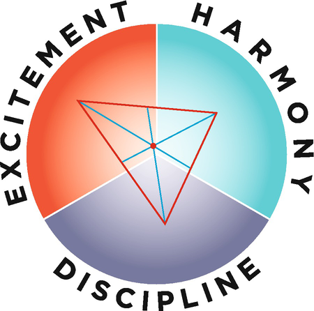
Finding the centroid of the triangle

In Euclidean geometry, there are four different centres of triangles. The relevant one for us is the centroid, the one that picks out the average of the mean vertices in the triangle. To find this, draw a line from the mid-point of each line to its opposite angle. The centre is where the three lines intersect.
The choice of the centroid-centre of triangle is meaningful. The triangle ties the three sector arrows together in the tightest way – by straight lines, i.e., the shortest distance between the points. The idea of finding the point that gives the average of the three vertices within the triangle, represents the placement and weight of this triangular shape. In more mechanical, or engineering, terms, the centroid, of the triangle is also the centre of balance, or gravity, of the triangle. That is, if one were to cut out a triangle made of uniform, flat material, and not too thick, and one were to balance the triangle on a spike using this centre as the point of contact of the triangle and the spike, it would remain in equilibrium, and could even spin on the top of the spike, in a locally uniform gravitational field. See Fig. 5.13.

A triangle balanced on its centroid
Choosing the centroid over the circumcentre (Fig. 5.14), the orthocentre (Fig. 5.15) or the incentre (Fig. 5.16) makes sense. Let us look at the other choices to see why.

Two circumcentres of triangles

Two orthocentres of triangles

The incentre of a triangle
The circumcentre is found by drawing a circle whose circumference intersects each point of the triangle. We then find the centre of that circle, and that is the circumcentre of the triangle. This is not a good choice of centre of triangle for us because the circumcentre might lie outside the triangle. It really represents the centre of another circle, not of the triangle directly (the circle is constructed on the basis of the triangle). The circle is a different way of tying the three points that are the tips of the sector arrows. Because it bulges out, being a circle, it represents something more than the qualities of the institution. Since we are trying to represent where the institution finds itself with respect to the data collected and analysed with respect to the three qualities, if we were to find a “centre” outside the triangle, this would not make sense for what we are trying to do. That is, the step of drawing yet another circle is not meaningful for amalgamating data. However, we shall see a re-consideration of this point in step 15.
The orthocentre is found by drawing a line from each point of the triangle to its opposite edge such that it intersects the edge, or extension of the edge, at a right angle. The three lines will intersect. That point of intersection is the orthocentre of the triangle. The insistence on the right angle is to give the height of the triangle with each edge as a base. It is the meeting of the three heights. In an obtuse triangle, the orthocentre might lie outside the triangle. Again, this is disingenuous with respect to the task here. The concept of the height of the triangle is not relevant to the three qualities and their resolution, given the data.
The incentre is found by drawing a circle within the triangle such that the circumference meets the edges of the triangle (as opposed to the points, as we did for the circumcentre). This incentre point is always within the triangle. But, again, it is not a suitable centre because of the added construction of a circle. The new circle represents, at best, the tying of the relation between the three qualities – tying their edges, not the end points. It is not clear to me that anything of significance is added by the circle inside the triangle with respect to the three qualities or the data; it makes the “centre” of the triangle indirect, since dependent on the circle and triangle construction. Nevertheless, it is preferable to the circumcentre and the orthocentre because the point will always lie within the triangle. However, the weakness of this choice lies in justifying, or making sense of this inner circle, and explaining what it is that it represents. The other drawback of choosing the incentre is that if we then draw as our final arrow an arrow from the centre of the compass circle to the incentre, it will always be very short, unless the institution only has two of the qualities, because there is no data on the third quality, and this will be quite rare.
It might be possible to justify this choice of centre of a triangle if we consider that the concept of inner circle and incentre corresponds to the “grass-transform” of the triangle. Under this conception, the centre point of the circle represents the meeting of similar waves issued from the centre to the triangle edges, as though we started a grass-fire in a field of grass at the centre and waited until they met the edges of the triangle. This might be an interesting conception, especially if we think that the three qualities are related to each other as waves, rather than as sections of a circle on a Euclidean plane. Or, if we think that data is wave-related to other data. It is not a conception I work with easily, but this is not to say that it is the wrong conception, and for some institutions it might be more suitable. I leave the choice between the centroid and the incentre up to the reader. What will be important prima facie will be to stay with one triangle centre when setting up comparisons between compasses.
The reason for the long lesson in geometry, is to stress that the mathematical construction has to make sense with respect to what it is that we are trying to do: to find out where an institution lies with respect to the three qualities. This is something that is missing in systems diagrams, where, for example all of the arrows between boxes are of the same size, or where it is not clear what it means for one arrow to be, say, twice as thick as another. What is missing is a sense of mathematical proportionality with respect to the purpose of the diagram that represents a system. In contrast, with weighted systems diagrams (Fig. 6.2), or better, with Sankey diagrams, we do have a good sense of proportionality. See Fig. 5.17.

A Sankey diagram
While proportionality is nicely represented in a Sanky diagram, what is diagrammatically implied is that we should concern ourselves with the thickest lines or that we concern ourselves with loops. The thick lines give a cardinal proportion, in this case of non-food and non-energy raw materials that enter Germany, leave Germany or come from within Germany through mining, re-use or re-cycling. The diagram is limited because restricted to materials. We cannot combine the energy Sankey diagram, with the material Sankey diagram because the units of measure are different. How to weight energy use against material use, or air polluting versus water polluting cannot simply be a matter of looking at the thickest lines. The units are not comparible.
-
Step 13: Draw an arrow from the centre of the circle to the centroid of the triangle. See Fig. 5.18.
Fig. 5.18 
Arrow from centre of the circle to the centroid of the triangle

-
Step 14aFootnote 11: Erase the lines used to find the centroid of the triangle. See Fig. 5.19.
Fig. 5.19 
Arrow from centre of the circle to the centroid of the triangle, erasing the triangle

-
Step 15: Normalise the arrow by adding 1/3 the radius to the arrow. See Fig. 5.20. This gives us our final arrow.
Fig. 5.20 
Normalise to give the final arrow

Why make this second normalisation-correction? Because the arrow would reach the edge of the circle only under the extreme conditions that every indicator arrow in two of the sectors has no, or negligible, length, and all of the indicator arrows in the remaining sector have maximal length. While this is a logical and mathematical possibility it has an extremely low probability for the sorts of institution for which the compass is designed. Such a case would be a strong meta-indicator that the identity conditions of the institution are oddly chosen, and it is inappropriate to construct a compass for that institution. For example, if one were to choose an institution with only one indicator arrow. That is, we stretch the notion of “institution” beyond the intended use of the concept here. For “institutions” that could plausibly display an extreme compass without the further correction I can suggest: the strength of an explosion (excitement), a massacre (discipline), a small drifting cloud (harmony). But these are not “institutions” of the sort we are usually concerned with when making policy, and we would have to be ignoring the context: the effect of the explosion, the reasons for the massacre and its effects, the reason behind there being only one cloud (since a cloud by itself is quite rare, Wordsworth notwithstanding). That is, for the overwhelming majority of institutions, the arrow from the previous step will be very short because the sector arrows balance each other. This is partly an artifact that arises from the choice of the centroid of the triangle as an insistence on the centre being located within the triangle.
To correct for the artificiality, I propose the following. Add the length of one third of the radius of the circle to the arrow. The reason I decided to make this further correction has to do with statistics and their representation as a tool of communication. As a tool of communication, the final arrow has to make an aesthetic and psychological impression. In constructing institutional compasses, my students and I used to stop at the previous stage. We were finding that, almost always, the arrows at the previous stage were very short. In fact, sometimes I would cheat and just lengthen the arrow myself more-or-less by a third of the radius, without giving a reason. But there was a reason for my instinctive reaction.
A short arrow indicates that the institution is well balanced between the three qualities, and that it does not hold the general quality with very much strength so it is easy to pull it into another sector, to overall display another quality. This does not make sense of our experience of institutions and it will not make too much sense for policy decision making either. Prisons will resemble primary schools and major international sports teams – because they will all be in balance between the three qualities, marginally favouring one over the others. It cannot be the case that almost all institutions are well balanced between the three qualities. Most show a quality significantly. If we compare a primary school to a prison and find that they are both quite well-balanced, then there is something wrong with the method.
As mentioned in Sect. 2.2 in Ancient thinking, a perfect balance between the qualities is interpreted as death or complete stagnation, maybe complete enlightenment of a person. The imbalance is what we find here on Earth, in our struggles, in our imperfections and it is these that give movement, dynamism and change.
Moreover, the representation of the data on the circle is meant to be used to give an overall intuitive impression, for comparative purposes and for communication. It cannot fulfil either function if the arrows for most institutions look almost the same – very short. I realised that we had cut the arrow short artificially with respect to the compass radius when I noticed that under the previous construction, before correcting the length of the then-final arrow, compass arrows were all short. The second step for correcting the length of the arrow leads to our final arrow, the one used for making decisions, for critiquing policy and for communicating policy. The policy changes, critique and communication still rest on the data entered in the tables. So, there is no danger of erring in our policy decisions because of the representation.
However, there might be reasons to make this representational correction differently, especially if our wish spot is close to the centre of the circle, since by adding a third to the arrow, it will be impossible for the actual arrow to be within the wish spot. Alternative corrections can also be considered, such as a logarithmic scale normalisation, or by choosing to use the incentre over the centroid of the triangle. So, there is a relationship between the position of the wish spot (as close to, or away from, the centre of the circle) and the choice of the centre of the triangle.
I suggest the following: if the wish spot does not include the centre point of the circle, then use the final normalisation above. In contrast, if the wish spot includes all three sectors – favouring a balance between the qualities, then do not make a final correction of length. Comparing institutions with different final normalisations will be delicate, but a solid understanding of the construction will help with the comparison which will include a discussion about the choice of wish spot – the attitude towards the qualities. See Sects. 4.2 and 5.2.
Figure 5.20 shows us the final arrow given the particular indicators we chose, together with the direction and length we thought represented that indicator. It is a compass reading, giving us an orientation in terms of the three general qualities. This is the end of the compass construction, the formula and eventual algorithm. The arrow represents what quality the institution most displays. We then use this final arrow to make an analysis. For policy recommendations we make an analysis, based on the compass.
6 Interpreting the Final Arrow: Making an Analysis of the Compass for Policy Decisions
To interpret the final arrow, we remark on three features: the sector it occupies, the degree within the sector and the length of the arrow. In the example of Fig. 5.20, we see that the institution in question is in the excitement sector. In particular, we can find other adjectives that more accurately mark the angle. See Fig. 5.3. The arrow has a good length, so the institution is quite exciting. We might be quite satisfied with this result, depending on our culture, the mandate of the institution and its context. In other words, we implicitly compare the final arrow to where we would like the arrow to be. Recall the “wish spot”? Put the compass with the final arrow next to the compass with the wish spot. These are what we are comparing. See Fig. 5.21.

Comparing the actual compass to the wish compass
We can now make new policies based on the final arrow, change existing policies, criticise policies and justify policies. We make the new policies, changes, criticisms and justifications based upon the discrepancy between the final arrow and the wish spot by recovering the story we told in developing the indicator arrows. We return to the data table.
Say we are satisfied. The final arrow for the institutional compass falls within the wish spot. Then we should not change policy. We might want to keep an eye on the context of the institution, since it might need to adapt to changing circumstances. We can try to anticipate these. But in general, we do not change policy, in fact we have a perfect justification to stay with present policy. Or, we could decide to be more ambitious, and reduce our wish spot by making it smaller. Is the arrow still inside the wish spot? If so, change nothing. If not, then we need to change policy.
When the final arrow lies outside the wish spot, as in Fig. 5.21, we can use policy to pull the arrow to the right place. We return to the data table in order to see which indicators are “pulling” the final arrow in the right direction, the ones closest to, or within, the wish spot, and see if we can promote and enforce these through policy. We also look at the arrows that are “pulling” the final arrow away from the wish spot. We think of policies to decrease these.
More precisely, we can look at indicators in the table whose degree encompasses the wish spot, and maybe lies within ten degrees of the wish spot. These are, roughly, the “good” indicator arrows that we encourage and celebrate. We want to elongate these. We then look at the “bad” arrows that pull directly away, with a margin of roughly forty degrees. These are the arrows we want to discourage and reduce in length. Working at these two extremes is enough to flip an arrow to its opposite direction. The concentration on these indicator arrows is relevant especially when the actual compass reading is more-or-less diametrically opposed, in direction, to the wish spot. These are the policy recommendations on which we focus more attention, but we do not stop here.
Now consider the other indicator arrows. These are ones we want to rotate – change the quality, if this is reasonable, or increase or decrease depending on the general direction. For a small rotation, encourage the arrows on the for side of the wish spot. Sometimes we look here for more creative solutions. See, for example the recommendations made in Sect. 13.2 concerning planting hedgerows and more ditches around fields in Hauts-de-France. We had no indicator arrows about hedgerows or about ditches, but the recommendation was to indirectly bring a solution to problems about loss of insect and bird population, flooding, water pollution, soil erosion and quality of soil. These sorts of solution are particularly relevant when the actual final arrow is not diametrically opposed to the wish spot, but rather is to the side somewhere. In this case we prioritise these solutions over the former ones discussed in the last paragraph.
As was remarked in Sect. 3.5, we can make a superficial policy analysis and recommendations or we can make a deeper analysis and recommendations.
To make a very superficial policy analysis, one where we do not really want to change anything, we gerrymander the indicator arrows . We can do this directly or indirectly. To do it directly, we change the definitions or the degree and length measurements. For example, if literacy is too low, then the very superficial recommendation is to change the definition as to what counts as literacy, so a higher percentage of people pass, and then you change that indicator arrow. Alternatively, we change the baseline, what we take to be “normal”. This will shrink or elongate particular indicator arrows. This strategy is best accompanied by an education campaign to ensure that people affected by the institution agree with the baseline; we work out how to change ours and other people’s perceptions of the particular indicators. We put a spin on the “good indicators” and the “bad indicators” so that the people affected by those indicators perceive the good ones as even better, and the bad ones as not so bad. For example, say that literacy is deemed to be too low. As a compass expert, you then recommend that we convince the population that literacy is over-rated, and is not very important. We see this in some countries where people of a certain class, minority or gender are discouraged from going to school.
The problem with the very superficial analysis and recommendation is that presumably, the definition of what was to be counted as literate, was thought through with some end in mind. That end will no longer be reached with the new definition. The weakness of the gerrymandering of the indicator arrow is that it is constant work to influence people’s perceptions. We also cannot control perception in the general public, we can only try to influence it, so that sooner or later, more genuine perceptions will resurface. We cannot predict when that will be. Lastly, we are vulnerable to criticism. Nothing prevents a journalist or opposing group to construct their own compass regarding your institution. If their data analysis is very different then this will come out in the open, and the gerrymandering exposed.
A less superficial analysis leaves the lengths and degrees of the indicator arrows alone. Instead, one focuses on a suite of particular indicators, the “good” ones and the “bad” ones, where “good” and “bad” refer to the wish spot. We match policy recommendations to the indicators directly. If literacy is too low, then we find a way of making a higher percentage of the population literate.
A good and deep analysis will look at underlying causes for the good and bad statistics, and will target the underlying causes. For example, if the reason for the high level of illiteracy is the lack of schools for children in remote areas, then more schools need to be built, more schooling material made available in the more remote areas, more teachers trained, increased incentives for teachers to teach in the remote areas and a campaign to convince the population of the importance of schooling and literacy together with relief for the families who send their children to school, if they would otherwise work at home. Maybe two free healthy meals at school gives relief to families who otherwise find it hard to feed their children well.
So far, we have analysed the data and constructed the compass as “experts”. As noted, the compass becomes more robust if we consult widely. We can use the recommendations as only that – to be put on the table for negotiation. There are three points of discussion: the location of the wish spot, the included or neglected data, and the degree and length of data arrows. Therefore, the recommendations are also an invitation for others to contribute to the analysis of the data points, or interact with the analysis, in the sense that they might disagree. They might disagree with the weighted significance of a data point that is included, because their intuitive baseline is different, i.e., what they consider to be “normal” is different. In such a case, they think that the length ought to be modified. This draws out a discussion about the baseline – what is normal statistically, what is reasonable to expect. We can split data points if agreement is impossible.
Alternatively, there might be disagreement about the degree of the included datapoint. In this case we return to the protocol used to determine the degree. Maybe another protocol should be chosen, the interaction should lead to either adopting a different protocol, and so, possibly changing the degree of the indicator arrow representing the data point, and therefore, also changing the final arrow, and it should deepen the analysis by justifying the protocols that were chosen. Another possibility is that in such an engagement or interaction we omitted a data point. In this case it should be introduced in the table, and analysed in terms of length and degree. Because of the notion of “corrected length” we can add data points without distorting the integrity of the final arrow. This is an important point that lies in contrast to existing multi-criteria decision aides where we cannot just add any data we choose. The reason for disallowing this is a very good one at face value, but it is based on a conceptual error, now that we have the compass.
6.1 The Point About Adding Data Points
Existing multi-criteria decision aides select particular data points in advance. See, for example, the labels for the spokes on the wheel in Fig. 5.7. This is thought to be important for making an objective comparison between competing options. But it is also a way of silencing or obscuring other data points that might be thought to be very important in a community or particular region. For democratic purposes it is important that voices be heard and that people who want to participate in the decision making process should be allowed to do so meaningfully. In so doing when making a compass, we do not lose the objectivity of comparison between competing options. Our common measure is not the particular data points but the qualities. This is an important point, so I’m going to repeat myself.
By including relevant data, we gain in accuracy with respect to the institution we are analysing with the compass. The accuracy is a type of objectivity. We find a common measure of comparison in the three qualities , not in choice of data points. It is general qualities that we compare, not particular facts. It is for this reason that we do not have a list of data types given in advance. It is for this reason that we insist on the weak objectivity of the sector arrows.
The compass is not a certification system, where we tick off the boxes, in the same way as being stamped “organic” or “in compliance” with such and such rules or recommendations. Instead, the compass orients us with respect to general qualities, and it remains flexible as to how those qualities are instantiated. Interaction, and disagreement over the qualities is important for objectivity, integrity and holism of the final arrow, and it is important as part of the democratic effort of constructing a compass. The compass, or rather the data table, is used for mediation and explanation, but here it is inclusive mediation, in the sense that we can add new information.
For mediating, we note the fact that different stakeholders or different actors might not share the same attitude towards the final compass reading or towards the analysis of particular data. In this case, we would explain to what extent and how their points of view were taken into account in the data analysis, or we change the analysis. In accordance with their views, we modify the length and/or degree of the controversial indicator arrows, or split existing data points into two. This makes explicit the political power play of the institution. It is important for various groups to be aware of this in case they want to preserve the existing power structure or change it. In power-structure debates it is important for all parties to understand what people’s perceptions really are in terms of qualities and what is to count as “normal”.
In other words, we return to the construction. This means that compass construction is not a finished exercise. There are feed-back loops, especially when there is major conflict. By returning to the data and refining it, we use a feedback loop to increase the objectivity of the final arrow in the form of convergence (we all finally agree, or we include disagreement by splitting data). We also implicitly use the construction exercise as a mediation exercise. This step is important if we anticipate disagreement. It will help disagreeing parties to become aware of the other’s point of view, and help to somewhat dispel the disagreement by showing how, and to what extent, stakeholders and actors have participated. It is also important for reasons of using the compass honestly. It prevents superficial use of the compass, where compass constructors gerrymander the analysis of the data on the table (in terms of length and degree) in order to make the final reading align with the desires of a particular interest group – the wish spot they like. If the mediation is carefully and honestly done, then some consensus should be reached.
One more step can be made to increase objectivity of the exercise.
As an institutional economist, Söderbaum is candid about his own ideological orientation, that is, a set of ethical principles or preferences that guide his research. His candidness is far from being a weakness in the analysis. It is a strength. It gives students of his writing the ability to conceptually compensate for his preferences, when they do not share them, and gives them the ability to become aware of the preferences that they share with Söderbaum, and where they disagree with him. Awareness of our own values, or ideological orientation, is part of the science, where ‘science’ is not understood in the naïve way of making calculations, but in a more sophisticated way that allows for complexity, indeterminism and feed-back loops: where science is about trying to understand processes, phenomena and underlying mechanisms in an objective, honest and transparent manner. The institutional compass is meant to help with policy decisions in a complex setting, where there is indeterminism, tipping points and feed-back loops, and this, without ignoring values. We still need a common measure, to manage our efforts and resources. The common measure in the compass are the three general qualities. The values of the community are made explicit, and the values of the scientist who assists with constructing a compass are also made explicit. They might include a strong sense of democracy, and therefore, a subsuming of his, or her, own personal values in order to reflect those of the larger community.
As part of the institutional analysis, it is proper to be explicit about what aspects of one’s own ideological orientation have influenced one’s research. To summarise: this is important for three reasons. One is so that others reading the research can “correct” for the ideological bias. A second is that it calls on the reader to become aware of his or her own ideological orientation, and this will be important for democratic decision making. Third, it is important to be aware that carrying out research is not done from an unbiased standpoint. As scientists, we each have some sort of ideological orientation. It influences what we are sensitive to and what we ignore. Furthermore, in carrying out research, in the better cases, the research changes us. That is, we are implicated in the research. Being aware of this adds depth and tolerance for the unavoidable subjectivity and error that is included in scientific research.
Objectivity is a concern for any scientist. “Objectivity” means different things, as does subjectivity. Moreover, in this sort of scientific project, it is a relative term. What we can do is try to be as objective as possible. The lesson to retain is that objectivity comes in degrees. It is not an absolute in a dichotomous sense of “objective or subjective tour court”. As we saw there are several moments in the methodology of constructing the compass where we can increase objectivity, which I sometimes call robustness, and is reflected by stability in sector arrows. Being aware of our own ideological orientation is one of the steps towards increased objectivity. As we shall see, the compass construction can be adapted to answer to a particular ideology, and we shall see examples of several such adaptations in Chaps. 7 and 8. It is only when we are aware of our own ideological orientation that we can even begin to correct for it, negotiate openly with others who hold a different ideology and make policy decisions that are sensitive to the ideologies of people affected by our institution.
6.2 My Ideological Orientation
I should practice what I preach and declare my own ideological orientation. It is as follows, at the time of writing. I have to mention the time because ideological orientations change, and the very act of writing this book has probably confirmed the orientation, but cannot entrench it. It will probably change as I learn, and develop my understanding of the world we live in. It will change with the changes in the world too.
For the purposes of what is being discussed here, I am most influenced by my father Anthony Friend, a statistician, ecological economist and philosopher. In this work, I am also influenced by: Söderbaum, Kumar, Rapport and Shmelev. From Söderbaum I learned institutional economics combined with ecological economics. Kumar’s book taught me about the three gunas . Rapport taught me and my father about eco-system health and Shmelev taught me about multi-criteria decision aides. Ideologically, I think it is correct to say that I am ecological economist and an institutional economist. Following Söderbaum, I also have a strong leaning towards participative democracy. Following some of the indigenous cultures, I think in terms of seven generations into the past and into the future. The latter grounds my precautionary leanings.
Let me flesh this out in less technical language and in more detail. As an ecological economist, I believe that the health of the economy is dependent on society and that society is dependent on the natural environment. I also think that at the timescale that concerns me – three hundred years in both directions, the space-scale of the whole planet and the size-scale of: the planet down to nano-chemicals that penetrate natural biological cell membranes; we are subject to at least the first two laws of thermodynamics: that there is a fixed amount of energy in the universe and that the availability of the energy for doing work diminishes. More specifically, on Earth, we can distinguish between our fund of low entropy and the natural flows. The former includes all of the “non-renewable resources”: oil, coal and gas, chemical potential energy, the nuclear energy found in Plutonium and Uranium. The latter are the natural flows of: heat, air, water, nutrient cycles, life and death cycles and migratory cycles. In the age of the Anthropocene, we burn off the fund of low entropy and we disrupt the natural flows.
The ideological orientation that I hold with respect to these scientific descriptive facts is that we ought to use up our fund of low entropy as slowly as possible and respect the natural flows as much as possible. “Possible” here is subject to cultural boundaries of acceptability. Mayumi (2001, 45) puts it nicely. He says that we ought to find a “culturally acceptable rate of entropy production”. I add to this that we also want to influence the culture, as and when we can, to continue to reduce what is deemed acceptable. So, as members of institutions and as agents who can influence institutions, we try to influence people in the ambient culture to use less, especially less oil, coal and gas. Boulding (1949) writes that the role of government is to try to reduce production and consumption, whereas business tries to increase it to make profits. I roughly share this view, although the separation of government and business is not so clear today. Thus, rather than make this distinction, I prefer to think in terms of two norms that are in tension: produce and consume less, produce and consume more. Wisdom on this matter consists in resolving the tension – resisting the message of private company’s advertising that tries to convince us that we are inadequate if we lack some good on the market, and that we shall be happier if we purchase it. Friend (A. Friend, 124) adds to Mayumi’s formulation that government ought to measure efficiency in terms of a “culturally acceptable rate of entropy production per unit of consumption”. Friend’s ideological orientation is that it is important to keep track of the rate of entropy production, and that government should be held accountable to ensure that we respect the culturally acceptable rate that is decided upon. Moreover, we shall be better off if we increase the entropic efficiency of production.
As an ecological economist I also think that collectively, we should look after the environment first, then society, then the economy. By ‘collectively’ I mean at the level of international coordination and treaties at the several levels of government, and also at the level of informal communities and households. There are many tribal communities who look after the land and the ecosystem, and I take them to set the highest standard for what would count as living sustainably by the precepts of an ecological economist. They have a long tradition of living in harmony with the ecosystem that surrounds them. They live with nature, not against it or apart from it.
I am particularly influenced by two of their teachings. One comes from the story of the tribes’ first coming to the north American continent. The story is that each tribe, as it travelled in search of a place to settle, would stop from time to time and ask nature around them – the eco-system – if they were permitted to settle there. The eco-system would either send them on or let them stay. If they were permitted to stay, then they asked nature: how do we live here? What is our responsibility to the eco-system? (Marchand et al. pp. 20–21). This is what allowed them to survive in a largely self-sufficient way for a very long time. Like all humans, and all species, they did modify the eco-systems they lived in. They planted food crops and harvested from them, but also left some of the harvest for the surrounding animals, insects and plant-life. They live in better harmony with the natural flows than we do in the modern world.
The second teaching concerns the fox character or trickster. The fox is a bit disruptive, plays jokes and gets into trouble; but the character teaches us that few situations are black or white, good or bad tout court. There is a bit of both. He teaches us subtlety and nuance. This is why I thought it a nice idea to have three general non-scalar qualities, and not two. The two would naturally be ‘good’ and ‘bad’. But, as part of my ideological orientation, I do not believe that things, people, institutions, systems or situations are good or bad, as such. Rather they are good in some respects and bad in others, like the fox. Analysing data in terms of the three qualities of harmony, discipline and excitement shifts us away from the dichotomy of good and bad. It takes a little extra mental effort. The effort has the advantage of giving us a bit of emotional distance and provides a fresh perspective. Both of these contribute to objectivity in the analysis.
We can learn from ancient thinking how to live in better harmony with the environment. If we are looking after the environment well, then we concern ourselves with society, and we do this along four clusters of concern: health, security, education and culture. To promote these, we pay attention to informational and material infrastructure. When society is doing well according to indicators in the clusters, then we look after the economy. Of course, thinking like the fox, it is not as though we complete one level of concern and then cleanly start the next. Rather, in temporal terms we do all three at the same time. The three areas of collective responsibility (environment, society and economy) share a dependence relationship, and our collective efforts should align with that dependence.
As an institutional economist, following Söderbaum (2000, 2016) and Vatn (2005), I believe that institutions influence our decisions. This is not to say that we always make decisions that agree with institutions, since we can disagree and go against an institution. Doing so incurs a risk of penalty in the case of formal institutions. I also think that we can change institutions. We can do so from within and from the outside. Individuals and institutions influence each other. Moreover, we cannot escape being so influenced or of influencing them in turn. When we obey or fall in alignment with the rules or precepts of an institution, we comfort and confirm those rules and precepts. When we disobey or break rules, we challenge them and sometimes start the process of changing them.
With Söderbaum, I share a commitment to democracy. By this I do not mean a system of voting. I do mean collective decisions making and taking into account the opinions and desires of people at all levels in an institution. For example, I think that the cleaning staff at a university should be consulted even for very “high up” decisions about education and merit. Why not ask them, if they are interested in the questions. That is, everyone involved in an institution should be consulted for the purposes of making policy decisions. A university does not only pay the cleaners, it should serve them. Moreover, democracy carries outside the institutional boundaries. People affected by an institution should also be consulted. This is just common sense. It is also prudential. It is only by asking people outside an institution that we can anticipate conformity or resistance. Of course, questionnaires take a lot of effort. Instead of asking people directly, we can either invite them to contribute as they wish, or observe their behaviour - as an imperfect indicator of preferences.
By studying institutions, we learn how to change them. To use the vocabulary introduced by Söderbaum, we are not homo economicai, but rather, “political economic persons” (Söderbaum, 2000, 33–6). This means that we all have a set of values. We are aware of them to varying degrees. We are made more aware of them when our values clash with those of others around us. We then are called to examine our own values. This makes us see more clearly ourselves and others since we gain a wider perspective. It is important to be aware of our values, even when we think we are, or when we are trying to be, as objective as possible. It is good scientific practice to be aware of our values. They both enlighten and hamper our sight. They make us keenly sensitive towards certain things, and help us ignore or forget other things.
I also have a strong commitment to objectivity, insofar as it can be had, and to the degree to which it can be had. In compass construction projects, we cannot have complete or absolute objectivity. Molinini distinguishes strong objectivity from weak objectivity. Strong objectivity in information for policy decisions is impossible. But weak objectivity (Molinini 2019) is possible and appropriate. It is not the same as inter-subjectivity, or group-think, because it is not primarily a social phenomenon. Weak objectivity of an idea or fact comes in degrees. It is increased by being re-deployed or being found to be true (or correct) in another area of knowledge (cross-checking). It is related to Wright’s (1992) concept of “wide cosmological role” of an idea or fact. An idea or fact is objective in respect of playing a wide cosmological role, that is, it pops up in various discourses that are more or less independent of each other. This is unexpected, and can take time to notice. The popping up of the same idea, independently, confirms the truth of the idea and adds objectivity. Grosso modo, while I am committed to objectivity in science, I am not naïve about the concept of objectivity, especially in the more social sciences. We hold ourselves to the appropriate standard for objectivity, not to an absolute standard.
Lastly, with respect to this work, my ideological orientation includes an embracing of philosophical questions. Rather than thinking of them as messy and hopeless, I think that they are very important. The exercise of constructing a compass is philosophical, as well as scientific and political. It is appropriate to engage in this exercise philosophically, scientifically and politically when we are confronted with difficult questions – ones that cannot be easily solved, where we cannot please everyone and where we try to weigh incompatible and incomparable variables. I work here to offer methods for preventing tensions. My training in philosophy also allows me to always be able to find a perspective from which I see the same thing differently with a different emotion. It is a sort-of mental gymnastics exercise that philosophers practice. I think that it adds to our own objectivity when we are adept at the exercise.
Notes
- 1.
The reason we call it 3a is that there will be a step 3b in Sect. 8.2 when we construct a more elaborate compass.
- 2.
There lurks a possible source of confusion. To construct the compass, we want to develop indicators or consider statistics that each positively indicate one of the three general qualities. By ‘positively’ I mean that the statistic indicates the presence of the general quality, not its absence. This is a bit confusing with discipline, since it is often thought to be a ‘negative quality’. The confusion lies in our attributing a meta-attitude to a quality that is not good or bad in and of itself.
To dispel the confusion, distinguish between the numerical conception of ‘positive’ and the emotional or normative conception of ‘positive’. For the indicator arrows we choose statistics that numerically positively represent discipline. If they very strongly represent discipline then they will have greater length. For example, negative (in our feeling) national statistics that will positively (in the numerical sense) show discipline is the number of: suicides, fatal accidents, crime, natural disasters or percentage of prisoners. If these are small, negligible or not alarming, then we still place the indicator in discipline, but we shorten the length of the arrow that represents the statistic on our compass.
- 3.
For a critical comparison of the compass to doughnut economics see Abdin & Friend, forthcoming.
- 4.
The example is Rio de Janeiro in May 2020, under the presidency of Bolsonaro.
- 5.
Robustness will be addressed when we have constructed our sector arrow in the next section.
- 6.
If consensus is impossible, this shows us that there are two or more very different reactions to the statistic. This means we should split it up, and make several data entries on the table – each specifying either a perspective or a sub-culture. Do not worry about small splinter groups. We assign a weighting later.
- 7.
What we mean by this is that if we have enough data, the sector arrow length and degree should converge, in the same way as a statistic converges as we gather more data – provided it is representative.
- 8.
René Thom was the founder of the catastrophe theory – a mathematical rationalisation of sudden change. He is responsible for concepts such as tipping point and attractors. Thom is one of the most brilliant mathematicians of the twentieth century.
- 9.
Strongly objective truths are stand-alone truths – that do not require further justification, such as “The planet Mars is identical to the planet Mars”. Weakly objective truths are re-enforced through cross-checking, that is, by being verified independently. The indicator arrows are independent of each other prima facie – although some pairs might have a common cause. They have different degrees and different lengths. The addition of them together eventually stabilises the sector arrow. This means that we have not missed anything out in that sector that is significant.
- 10.
“Contemporary” is not meant in the sense of “at present” but in the sense of contemporary to – at the same time as – the other statistics.
- 11.
The reason for numbering this 14a, is that 14b will appear in Sect. 8.3.
References
Abdin, A. Y., & Friend, M. (Forthcoming). Doughnuts and compasses: How to decide.
Boulding, K. (1949). Income or wealth. Review of Economic Studies, 17, 77–86.
Mayumi, K. (2001). The origins of ecological economics; The biomechanics of Georgescu-Roegen. Routledge.
Molinini, D. (2019). The weak objectivity of mathematics and its reasonable effectiveness in science. In Axiomathes; Where science meets philosophy. Springer.
Raworth, K. (2017). Doughnut economics: Seven ways to think like a 21st-century economist. Random House.
Söderbaum, P. (2000). Ecological economics. Earthscan Publications.
Söderbaum, P. (2016). Economics, ideological oreintation and democracy for sustainable development (2nd ed.). World Economics Association, Bristol, UK.
Vatn, A. (2005). Institutions and the environment. Edward Elgar.
Wright, C. (1992). Truth and objectivity. Harvard University Press.
Author information
Authors and Affiliations
Rights and permissions
Open Access This chapter is licensed under the terms of the Creative Commons Attribution 4.0 International License (http://creativecommons.org/licenses/by/4.0/), which permits use, sharing, adaptation, distribution and reproduction in any medium or format, as long as you give appropriate credit to the original author(s) and the source, provide a link to the Creative Commons license and indicate if changes were made.
The images or other third party material in this chapter are included in the chapter's Creative Commons license, unless indicated otherwise in a credit line to the material. If material is not included in the chapter's Creative Commons license and your intended use is not permitted by statutory regulation or exceeds the permitted use, you will need to obtain permission directly from the copyright holder.
Copyright information
© 2022 The Author(s)
About this chapter

Cite this chapter
Friend, M.I. (2022). Constructing an Institutional Compass: Methodology. In: The Institutional Compass: Method, Use and Scope. Methodos Series, vol 18. Springer, Cham. https://doi.org/10.1007/978-3-031-05453-2_5
Download citation
DOI: https://doi.org/10.1007/978-3-031-05453-2_5
Published:
Publisher Name: Springer, Cham
Print ISBN: 978-3-031-05452-5
Online ISBN: 978-3-031-05453-2
eBook Packages: Social SciencesSocial Sciences (R0)