
Abstract
In previous chapters, we demonstrated various analytic techniques focusing on the spatial aspects of the built environment. In this chapter, we discuss various methods and techniques for collecting qualitative and quantitative data dealing with human behaviour and how to connect such data to the results from various space syntax analyses. This chapter provides a brief introduction to these methods to stimulate ideas for connecting an array of spatial and socio-economic data to space syntax. At the end of this chapter, we provide an exercise, references, and further readings.
You have full access to this open access chapter, Download chapter PDF
Keywords
- Quantitative data
- Qualitative data
- Primary and secondary data
- Observation techniques
- Data collection
- Combination and correlation of data
Key Concepts
- Data collection
- Data analysis
- Combination and correlation of data
- Data aggregation
- Primary and secondary data
After studying this chapter you will be able to:
-
collect quantitative data for pedestrian movement and stationary activity;
-
collect qualitative data in the form of interviews, existing documents, and reports;
-
analyse the data, connect them to space syntax results, and interpret these results, and
-
reflect on and critically discuss the space–society relationship based on a given data set and statistical testing.
5.1 Linking Space Syntax Analyses to Empirical Data on Human Activities
In previous chapters, we presented various methods for analysing the built environment’s spatial properties. However, quantifying, calculating, and visualising spatial relationships becomes particularly useful when comparing these results with empirical data on socio-economic activities. Connecting the results from space syntax analyses with primary and secondary data of human activities provides new knowledge about the society–space relationship.
Until recently, urban designers have shown little interest in evidence-based analysis of the socio-economic impacts of their design proposals. They come up with very precise spatial solutions on vague presumptions of how these new urban areas should work after they are built. In the education of architects and urban designers, there has been so far a lack of focus on elementary research methodology skills with the purpose of understanding the space–society relationship. In general, most writings on urban design tend to take a normative approach (Hillier and Hanson 1984, p. x) to create liveable urban areas based on weak or controversial empirical support. Conversely, urban sociologists, urban planners and urban geographers generally apply a set of well-established qualitative and quantitative research methods. Their research focus is mainly on past and present conditions, however, and thus urban sociologists and urban geographers are not able to propose precise solutions on how to create well-functioning built environments.
Gaining knowledge on the space–society relationship relies on well-defined spatial concepts, having operational and objective spatial analysis tools, and the ability to link spatial analytical results with various socio-economic data (Hillier and Hanson 1984, p. 90). Data collection and statistical testing is a discipline in its own right and is often an independent, but integrated, research and teaching field in geography and urban planning. Thus, this chapter gives a glance at quantitative and qualitative data collection and how to correlate different data sets. We have chosen the most common methods connected to space syntax. However, a new tradition is being established, namely analytical design, which bridges urban planning and urban design.
In general, the research questions not only define the applied methods, but also what kinds of data are collected or are selected from other sources. In other cases, the available data and experiments with the data can lead to refined research questions for further data gathering.
In the field of quantitative research, the focus is on establishing facts, and the reality is objective and unchangeable. In the methodological approach, the data come from measurements. The data analyses are performed through numerical comparisons and statistical deductions, and the results are presented as statistical analyses. The data can be gathered fromfield work, online research, cross-sectional research, and experimental research.
In qualitative research, the focus is on answering the research questions on the basis of, among other things, interpretations, experiences, and meanings. Here the reality is interpretative and dynamic. Qualitative data are derived from documents, literature reviews, and observations and are analysed by means of inductive or deductive codes, and the results are represented by word descriptions. The data consist mostly of literature reviews, interviews, focus groups, field observations, analyses of written documents, discourse analyses, and policy analyses. In comparison with a quantitative approach, where the focus is on probability, predictability, replication, correlations, and control, a qualitative approach is complex, context-dependent, and subjective and deals with understandings and meanings.
In recent years, a mixed methods approach combining qualitative and quantitative data has gained prominence in urban planning. In social sciences , triangulation is the application and combination of several research methods used to study the same phenomenon. Triangulation is a way of validating the research by combining multiple observation methods, theories, and empirical materials. The purpose of triangulation is to overcome intrinsic biases and to make robust generalisations and theories. According to Kadushin et al. (2008), the difference between triangulation and mixed methods in research design is as follows. Triangulation describes statistical tests of correlation between alternative quantitative measurements and is employed to test the accuracy of those measurements, while the broader concept of mixed methods describes the integration of diverse qualitative and quantitative approaches and is employed to gain general understandings or to build theory. Both concepts are developed to study complex phenomena.
Both quantitative and qualitative data can be connected to the results of space syntax analyses. A quantitative approach includes the correlation of space syntax numerical values with place-bounded quantitative data. These can include pedestrian flow rates, numbers of people in the streets, numbers of criminal incidents, shopping and spending capacities, property prices, building density, or population density. In order to connect the qualitative data to space syntax results, various statistical tests can be applied. In particular, scatterplots as mathematical diagrams for displaying and correlating two variables for a set of data are useful.
A qualitative approach visualises human activity superimposed onto visual space syntax analysis results or links qualitative interpretations of impressions of particular places to the space syntax results. The same can be done with quotations from in-depth interviews. Other qualitative materials include written histories of places, people’s shared memories, or the perceptions of people about a place. Furthermore, we are also dealing with the intangible qualities of the place itself, in other words, the sphere of the place, the place’s character, and the senses of the place such as smells, sounds, and textures. Qualitative aspects of the built environment also include building functions, aesthetic aspects, building types, architectural styles, and urban art such as graffiti or sculptures. Qualitative data can be translated into quantitative data, for example, by counting the number of certain building types within a neighbourhood or recording the amount of graffiti along a wall.
In general, we operate with primary data represented by empirically collected data by the researchers themselves and secondary data from other sources. Examples of secondary data include traffic census data from the government, data collected from other researchers or organisations, registers, data from central bureaus of statistics, crime data from the police, etc. In the following, we explore empirical quantitative and qualitative data collection for the acquisition of a basic set of data of the type that is mostly applied in the arena of space syntax research and practice, and this is referred to as the ‘space syntax observations method’. We complete this by presenting methods that have gained prominence in recent years. This is followed by a brief discussion about using secondary data. At the end, we shortly discuss how GIS can be used as a platform for aggregating the results from various space syntax analyses with each another and with results from Spacematrix and MXI analyses (discussed in Chap. 1).
5.2 Observation Techniques
On-site observations have several advantages. First of all, you get to know the study area very well from a spatial as well as from a social perspective. Secondly, both quantitative and qualitative data can be acquired through on-site observations. Finally, you get raw data (primary data) that is unfiltered where you as a researcher can select relevant data for further analyses.
5.2.1 Pedestrian, Car, and Bicycle Movement Flows: Gate Counts
Counting the flow of human movement gives quantitative data for comparison with various spatial integration values. This method has been applied to provide evidence that highly integrated streets consist of high flow rates of human movement, while highly segregated streets have low number of people frequenting them (Hillier et al. 1998, p. 59ff, 2007; Hillier and Iida 2005). Gate counts allow the recording of observations of pedestrian and vehicular movement flows in an urban area, and gate count data tend to correlate well with normalised angular choice analysis. If a low correlation is identified, this often indicates spatial conditions that need to be investigated. The collected data can be represented graphically and statistically in a variety of ways (Grajewski 2001), and the data collection must be conducted consistently and with a controlled procedure for all cases. The registration of pedestrian, bicycle, or car movement is as follows:
-
(1)
The boundary of the area under scrutiny is defined on a map. This should cover a range of well-used to moderately to poorly used spaces in and around the area of study.
-
(2)
Select a number of gate positions. It works well to indicate the gates on the map manually when walking through the area. You can also choose the gates in line with the results of space syntax analyses. Grajewski (2001) suggests a minimum of 25 gates per area, and the more the better. The denser the gate network, the more accurate the pattern of movement that is obtained. For each gate position, pedestrian or vehicle movement flows are registered. The number of gates one observer can cover in an hour should not exceed 10 gates. This allows the observer to register 5-min long periods of pedestrian or vehicular movement per gate. The remaining time is allocated to walking to the next gate. Thus, within an hour the movements are recorded for all 10 gates.
-
(3)
The observer starts at a certain gate where they draw an imaginary line across the street including the sidewalk (see Fig. 5.1). Only people or cars that have crossed the street are counted and registered (see Fig. 5.2). Always note the starting and ending time of the observation recordings so that errors can be avoided when later converted to rates per hour. For lightly used streets, one observer can cover the whole street and register pedestrian movement on both sides of the sidewalk, and can record pedestrian and vehicular movement simultaneously. For busy streets, three strategies for registration of pedestrian and vehicular movement can be carried out—(1) The pedestrian and vehicular movement counts can be divided into, for example, 2.5 minutes registering pedestrian movement immediately followed by 2.5 min registering vehicular movement, (2) one observer can cover pedestrian movement for both sidewalks while the other observer covers vehicular movement, or (3) both sidewalks can be covered by separate observers for pedestrian movement while a third observer covers vehicular movement.
Fig. 5.1 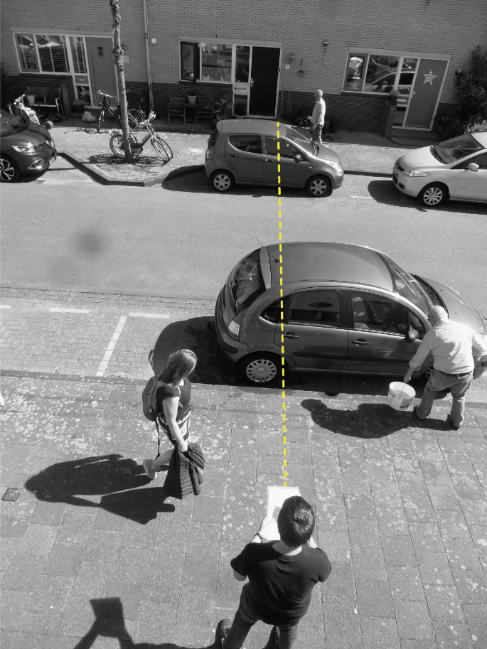
A gate with its imaginary line (coloured in yellow)
Fig. 5.2 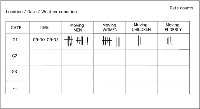
Table for a tally count of pedestrian movement
-
(4)
After completing an observation sequence from gate 1 to 10, the observation route should be repeated from gate 10 to 1. A minimum of two observation rounds should be done for each time period. This means that for each gate at least two rounds of data collection per defined time period should be carried out.


This observation registration should be repeated for at least two weekdays and two weekend days. Furthermore, observations should include peak hours and off-peak hours. Several rounds of observations should be conducted over the course of a day, and at least five different time slots over a day should be chosen for observations, for example, 8–10 a.m., 10 a.m.–12 p.m., 12–2 p.m., 2–4 p.m., and 4–6 p.m. Ideally, the observations will also include early morning and late evening time slots. The more time slots the better. However, the time slots may vary in different cultures due to different daily routines. It is also important to note the date and weather conditions, including temperature, because these influence pedestrian and vehicular movement flows. The advice is to choose a day with an ‘average weather’ for each particular case, which means that you need to check the weather forecast before you start the registrations.
For the observed categories, the type of area is important. Whereas in a business area ‘suits’ or ‘white collars’ are included, in a family-oriented neighbourhood the category of ‘children’ might be divided into ‘girls’ and ‘boys’ and furthermore include mothers with children, for example, when pushing a pram. The individualised list is usually built upon the following categories for pedestrians: moving adults, moving men, moving women, moving teenagers, moving children, and moving working people (or ‘suits’). For vehicles, the following categories can be feasible: cars, buses, trucks, motorbikes, and bicycles. In general, the list should be tailored to the nature of the study and to the knowledge gap that is to be filled. Each observed pedestrian or vehicle is registered with a tally count in a prepared Table (Fig. 5.2).
In order to avoid errors in the data collection, it is best if several observers carry out the observation registrations. This will give greater accuracy because a single person might make repetitive errors. Working as a team is also more fun because different observers will have different gate rounds throughout the fieldwork. In addition, for more complex routes, it might be better that the same observer undertakes all gate rounds for one route (Grajewski 2001). In the following, we illustrate how the results from the gate method can be visualised using Geographic Information System (GIS). Figure 5.3 illustrates the results from the gate method for weekday pedestrian flows for Woolwich Squares in London (Space Syntax Ltd. London 2008). The pedestrian flow is represented in numbers as well as with colour codes. The colour codes give in one glance where the largest flows of pedestrians take place.

Weekday pedestrian flows for Woolwich Squares in London visualised using GIS (Space Syntax Ltd. London 2008)
The results from the gate counting method correspond with the results from the various axial and segment line analyses discussed in Chap. 2. The empirical data results give indications as to the pattern of necessary activities—such as going to work, to school, or to do shopping—in a built environment.
5.2.2 Stationary Activities: Snapshots
The static snapshots method is an effective observation technique for the registration of various people’s stationary activities, moving activities, and social interactions in public squares and parks. This method records the use pattern of a public space from specific moments throughout the day.
This method is carried out in the following way. The observer makes a mental snapshot of the public space and registers on a map where people sit, stand, walk, or socially interact like chatting with each other (Fig. 5.4) when walking through the study area. This registration is done in a given moment and repeated, for example, every two hours throughout the day from the same location the observer chose in the first place. If a number of public spaces are under scrutiny, the observer decides upfront on a route for the observations. Later, all collected data can be plotted on one map. This map gives an overview of which areas of a public square, park, or housing estate are most or least used. The software used for digital registrations for the snapshots are GIS, Vector Works, Auto Cad, Adobe Illustrator, or any kind of software that allows one to create vector images and use layers.

Static snapshots from a certain moment of people interacting in a group (left) and individual people sitting and standing (right)
The results from static snapshots can be presented qualitatively and quantitatively. Figure 5.5 depicts a qualitative representation of observation data gained with the snapshots method for one moment (left) and throughout the whole day (right) for park X. Here a differentiation is made between men, women, and children and between moving and standing. In addition, registrations on whether people are moving alone or within a group can also be recorded. When adding all layers for each time slot on top of each other, a behaviour pattern of the public spaces can be seen. Here we see that in the middle of the park, there is a balance of the presence of gender, whereas behind obstacles, we see a concentration of only children. At the edges, the spaces are dominated by men, often standing in groups.

Movement traces and static snapshots data for park X with one layer for one time slot (left) and all layers throughout a day (right)
The registration of human behaviour can now be combined and correlated with results from the space syntax agent-based model, visual graph analysis (VGA), and all-line analysis. These registrations can be used qualitatively as well as quantitatively and give indications on social, necessary, and optional activities in urban space.
Figure 5.6 shows a more advanced static snapshot registration map of Oosterwei in Gouda. This neighbourhood has a high number of low-income inhabitants consisting of Dutch and Moroccan inhabitants. The research question was to determine the social composition of the residents’ behaviours and use of urban space in this spatially segregated neighbourhood. In the registration, a distinction was made between native Dutch and Moroccan, between men and women, and between teenage boys and girls. All registrations are compared with the results from the all-line analysis. In the most integrated areas, there is a balance between gender and ethnic background. In the segregated areas, the spaces are mostly dominated by men. For a detailed view, Fig. 5.7 shows a separation of the registrations based on gender. Here we can see that Dutch and Moroccan women are mostly close to their homes, whereas the Moroccan men and teenage boys dominate the segregated streets. Teenage Moroccan girls are hardly present in the registrations. These registrations were carried out on a weekday and a weekend day (Rueb and van Nes 2009).

Registrations of human behaviour over an entire day (right) and an all-line analysis (left) of the Oosterwei neighbourhood in Gouda, the Netherlands

Separation of the snapshot results of Gouda based on gender, with the registrations of all female behaviour (left) and male behaviour (right) of the Oosterwei neighbourhood in Gouda, the Netherlands
There are several possibilities for presenting the data from the static snapshots registrations quantitatively and qualitatively. You can use the results to show how children use public space differently from adults, where people tend to gather in groups, where people are standing or sitting, etc. The options are many. What categories you choose depends on the research question at issue. The same applies to the time slots used.
For example, in a research project on sexual harassment against women (Miranda and van Nes 2020), the static snapshots registration was useful for correlating the degree of sexual harassment risk with the number of women present in the streets in comparison with men. For every street segment, the numbers of women and men were counted separately and put into an Excel file for comparison with the spatial variables from the micro and macro-scale analyses and the recorded numbers of various types of criminal incidents.
5.2.3 Pedestrian Routes (Traces): Pedestrian Following
The pedestrian-following technique allows the collection of qualitative data by observing pedestrian movement that disperses from specific, strategic locations. Grajewski (2001, p.10) explains that this technique allows the investigation of three specific issues, namely the patterns of movement from a specific location, the relationship of a route to other routes in the area, and the average distance that people walk from the specific location, which can help determine the pedestrian catchment area of a retail facility or public square. This type of observation is useful for understanding how people use a specific public space. Overlaying all registrations on top of each other provides us with an image of pedestrian movement throughout an area under scrutiny. This observation technique can also be combined with space syntax normalised angular choice results to understand how the built environment works for people in the context of the natural movement theory and function-driven movement. In the following, we explain how to register pedestrian routes manually:
-
(1)
For the fieldwork, a map of the area under scrutiny is prepared that indicates the survey area’s boundary, the specific locations for starting the pedestrian following, so-called entry/exit points, and the site itself (Fig. 5.8). We suggest printing several copies of the maps for the observers in an A3 format. This paper format allows them to conduct fieldwork without being hindered by a huge plan, whereas an A4 map is too small for an urban area to register traces in detail.
Fig. 5.8 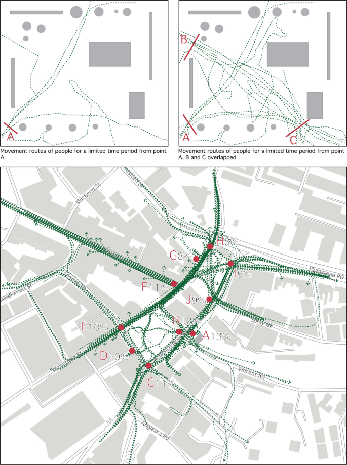
Top: Pedestrian routes from starting point A (left) and the overlay of all registrations of starting points A, B, and C (right). Below: Overlay of all registrations of one day in Woolwich Squares in London visualised using GIS (image below – original: Space Syntax Ltd. London 2008; redrawn by authors)
-
(2)
The observers record the movement routes on chosen dates. It is useful to note the weather condition for the fieldwork on the map. Each trace is indicated with a waterproof pencil on the map. Often the traces are registered during a whole day from 8 a.m. to 8 p.m. For recording traces, it is important to select individuals randomly from the chosen entry point into the area for a specific time period per entry point. Pedestrians’ traces are registered until they leave the observation area or stop for any activity that lasts more than two minutes. Following people and recording their movements has to be done discreetly. This means keeping an appropriate distance from the person that is followed. However, cultural differences can appear. For example, in London, the observer can have less distance to people when following compared to Izmir, Turkey, where the distance has to be greater between people and observer. The ‘good’ distance will be found during the people following and recording process.
-
(3)
After a pedestrian has been followed and their movement route registered, the observer returns to the same entry/exit point and randomly selects another individual who is followed. Grajewski (2001) suggests collecting 20–25 traces per entry point. In striving for objectivity, it is important to have a distribution between different types of people in terms of age and gender. Several observers starting from different entry points allows for different routes to be followed and different route sequences to be identified. In Fig. 5.8, Observer 1 has the route A to C; observer 2 has the route C to A; and observer 3 has the route B to A. Thus, the data reflecting movement patterns throughout the whole day will be more complete.

Figure 5.8 shows the movement routes from one starting point and the registrations of all movements recorded during one day from all gates. Already in our example of park X, it is possible to see a pattern of where the largest flow of movement takes place.
After all traces are collected, it is useful to register them digitally in GIS, Excel, Auto Cad, or any kind of software that uses layers for further processing and spatial analysis. For pedestrian routes, Global Positioning System (GPS) tracking can be useful because the observer can use an application on a mobile phone or tablet or a GPS tracker when following people. This will also allow the observer to save and export all traces in a GIS file format. However, this will mean that the observer has to exactly imitate the movement route of the followed person.
During a research study in 2019 (Bolset and Kampenhøy 2019), bicycle routes in Bergen, Norway, were investigated. The motivation for the project was that until then no data on cyclists’ route choices existed for Bergen. There are eight roads leading into Bergen centre, and this made it easy to define the entry points. The researchers followed randomly chosen cyclists heading towards the centre from eight different points. They used a GPS watch to record the movement trails for each cyclist. As soon as each cyclist had reached their destination or left the city centre, the recording was stopped. All registrations were saved, imported into GIS, and plotted on a map. Figure 5.9 shows the procedures the researchers followed, and Fig. 5.10 shows the results of all the registrations. These primary data on cyclists’ route choice through the urban area contributed to the following information: mainly cyclists followed the most spatially integrated main routes through the city centre while at the same time avoiding steep hills and traffic lights (Fig. 5.10).

GPS registration procedure of bicycle routes in Bergen, Norway (Bolset and Kampenhøy 2019)

Cyclist trailing results for Bergen, Norway, superimposed onto a topographic map (Bolset and Kampenhøy 2019)

The walking with video approach juxtaposed with space syntax results and human perceptions about mobility safety (Hidayati et al. 2019)

Registrations of vandalism on buildings and street fixtures in the town of Bergen, Norway (Berge 2019)

Map-based survey using Maptionnaire to understand how locals perceive a neighbourhood in Paris
5.2.4 General Movement Traces
The people-following method records the precise movement routes of people when moving through a space and allows the registration of collective movement flows through a predefined area. The routes of people from all directions are registered. This distinguishes the movement traces method from the people-following method, where people are followed from predefined entry points into an area (see Fig. 5.8). This analysis correlates well with results from space syntax agent-based models.
For this method of registering general movement traces, the observer tracks and maps all movement traces in all directions from a chosen location with a maximised view of the area. From this fixed position, the observer records the movement traces for a time period of five minutes, repeating it several times throughout the day. A downside of this method is that it is restricted to a smaller area that one observer can cover and register pedestrian movement. Here, printed maps of the area under scrutiny allow manual recording of the traces.
Moreover, GPS tracking is a useful tool for an exact tracing of people’s movement through a city (Hardner et al. 2012). A number of applications that track movement can be installed on a mobile device such as a smartphone. In this case, a chosen number of participants agree to take part in a project. Often, the collected data have to be anonymised because sometimes participants forget to turn off the device or app before entering their home. This technique allows the collection of data for a whole city. When involving locals, daily routines, shopping, and leisure activities in connection to movement routes are explored. When involving strangers and they are asked to randomly move around in the city, the focus is more on navigation and orientation linked to the visibility of different neighbourhoods in a city. Another method involves gaining knowledge of people’s locations through their mobile phone activities. General mobile phone data can provide an understanding of where and when large amounts of people move or stay in various urban areas. These data are provided by telephone service providers. The disadvantage of this method is that the time when the mobile phone is used can be irregular.
In general, all empirical observation data can be further processed quantitatively and qualitatively. The quality of the data and the size of the data set decide the way in which these data are processed.
5.2.5 Ethnographic Observations: The Walking with Video Approach
The essential core of ethnography is concerned with the meaning of actions and events, and participant observation is the central data collection technique in ethnography (Punch 2014). Herein, the ‘walking with video approach’ (Pink 2007) allows the recording of sensory elements within the context of a certain built environment. Videos are taken while walking through a public space, and this method supports an understanding of the qualitative issues of the public realm.
There are two ways to conduct walking with the video approach. In the first method, the observer takes part in the life of a public space in a discreet way and becomes a participant observer, while in the second method, the observer walks with participants through a public space and also records their experiences and expresses emotions and comments. In addition, sketches about the place and notes about smells, sounds, and events can add to the richness of this approach. The observer collects as much detail about the public space as possible.
The walking with the participant through the public space approach provides the added value of recording mobility experiences compared to the conventional method of installing a video camera in a static place to record pedestrian and vehicular movement (Guo et al. 2012; Van der Horst et al. 2014; Hidayati et al. 2019, 2020). This observation technique is open-ended as it is guided by the observation itself. It might take 15 min, or it might take 2 hours or the whole day. Pink (2007) concludes that walking with video is a method that can produce an empathetic and sensory embodied and emplaced understanding of another’s experiences. It is itself productive of place in any one moment in time. A number of computer software programmes are available that are tailored to analyse videos. These kinds of data are qualitative (which also can be quantified) and their results can be juxtaposed and discussed against the space syntax results for describing spatial properties on where and how certain types of human behaviour take place in the context of the built environment (Fig.5.11).
5.2.6 Phenotypological Registration on Site
We can register everything that we immediately see on a site. A phenotypological registration refers to the appearance of the built environment, and a variety of data can be collected. For example, to understand the relationship between the spatial setup of a neighbourhood and vandalism or anti-social behaviour, the location of all graffiti, broken windows, or other broken items can be registered. Space syntax analysis describes the spatial properties of the locations where certain activities take place.
There are many types of place-bounded data that can be registered manually, such as the degree of building maintenance, types of vehicles parked in the streets, types of surnames on doorbells, types of advertisements, etc. All of these kinds of data can be correlated quantitatively and juxtaposed qualitatively with the results from the space syntax analyses. A quantitative approach is to count the numbers of each registration on the street segment level, whereas a qualitative approach describes the spatial features for certain socio-economic activities.
Figure 5.12 shows registrations of vandalism on buildings and street fixtures taken by walking through a neighbourhood at a given moment (Berge 2019). Here space syntax is useful for describing the spatial features on where such things take place.
5.3 Map-Based Surveying
Surveying is the process of collecting data through a questionnaire that asks a range of individuals the same questions related to their characteristics, attributes, how they live, or their opinions (O’Leary 2014, p. 202). At present, face-to-face surveys or self-administered online surveys can be conducted using mobile devices such as smartphones and tablets that allow the collection of qualitative and quantitative data as well as geographic data. The respondent provides the surveyor with their answers, which are entered as data into a user-friendly GIS-based web platform (Fig. 5.13). A variety of computer and mobile applications exist online, for example, the online tool ‘Maptionnaire’ (https://maptionnaire.com).
The data are stored in a GIS format. These applications are mainly designed to collect quantitative and qualitative data on a personal computer or mobile device. Soares et al. (2019) suggest the use of online map-based questionnaires with user-friendly interfaces providing the users with multiple possibilities to report geographically referenced and map-based information. When entered into a geographical database, the data can be used for a variety of spatial analyses, spatial queries, and statistics.
In contrast to online surveys, face-to-face surveys have the advantage of a good response rate and allow rapport and trust to be established. This can motivate respondents and allows for immediate clarification and the reading of non-verbal cues.
However, a misfit is that, face-to-face survey’s geographical range is limited and such a method does not allow anonymity or confidentiality. Further, face-to-face surveys require surveyor training. In contrast, self-administered online surveys offer confidentiality and anonymity, allow a wide geographic coverage, and give the respondents the opportunity to answer in their own time. A downside is that the response rate can be very low.
In general, a questionnaire is composed of closed and open questions. Open-ended questions provide qualitative information (McLafferty 2012), whereas closed or fixed-response questions provide quantitative information. O’Leary (2014, p. 206) provides a few basic rules for developing a questionnaire.
-
Operationalization of concepts: This involves going from abstract concepts to variables that can be measured/assessed through the survey.
-
Exploring existing possibilities: There is no need to reinvent the wheel. If an existing survey instrument has addressed variables that are interesting for the research/project, it can be helpful to adopt, adapt, and modify it.
-
Drafting questions: New questions have to be drafted as clearly as possible; here McLafferty (2012) keeping the questions simple and clear, and the simplest possible wording should be used.
-
Decision on response categories: One must consider both the effect of the response categories on the responses themselves and how various response categories translate into different data types that demand quite distinct statistical treatments.
-
Review: Each question and response choice has to be read carefully and thought through to determine if the questions might be considered ambiguous, leading, confrontational, offensive, based on unwarranted assumptions, double-barrelled, or pretentious. This step has to be repeated as many times as necessary to get each question as right as possible.
-
Ordering questions: For the survey, the questions have to be in an order that will be logical and easy for the respondents.
-
Writing instructions: These have to be as clear and unambiguous as possible.
-
Writing a cover letter/introductory statement: This generally includes information on the surveyor, the project’s aims and objectives, assurances of confidentiality/anonymity, and whether results will be available to participants and asks for the consent of the participant.
If no internet or mobile device is available, questionnaire data can always be collected using printed papers. Sometimes questionnaires can be more feasible and efficient than in-depth interviews.
For a research project in Bergen on the relationship between urban micro-scale parameters, three researchers investigated how people perceive streets in their own neighbourhood. The researchers went in front of the local food shop in six different neighbourhoods. For each area, they had a large aerial photo of the neighbourhood on a poster and asked 200 respondents the following questions: “Are there any streets where you feel unsafe? If so, can you point them out on this map?” One researcher was asking the questions, and the other two were marking the results for each respondent on a separate map. This had the purpose that other respondents would not be influenced by already given answers from others. All of the results were put on a map and superimposed with the results from the various spatial analyses, and the combined analysis showed that segregated and un-constituted streets are perceived to be the least safe (Rønneberg Nordhov et al. 2019).
Street interviews were also conducted for identifying the locals’ perceptions of safety in the Pendrecht neighbourhood in Rotterdam. Figure 5.14 shows images of how this was conducted with a large aerial photo of the neighbourhood where the various people could point out and describe the perceived safe and unsafe areas.

Images from the street interview where locals were asked to point out streets they perceive as safe and unsafe on an aerial photo of their neighbourhood (van Nes and Rooij 2015)

Impression from an in-depth interview conducted in an informal settlement in Jakarta, Indonesia, about mobility inequality (Hidayati et al. 2019)
5.4 In-Depth Interviews
Often there are differences in what people do—their behaviours—and what they think and feel. The latter, what they think and feel, can be captured through in-depth interviews. These are ‘knowledge-producing’ conversations (Nagy Hesse-Biber 2006, p.128) often involving a one-to-one conversation between the interviewer and interviewee in which the interviewer is interested in gaining insight into a specific topic. Valentine (2005) highlights that the aim of in-depth interviews is to produce a deeper knowledge and that it also relies on words and meanings in its analytical approach rather than on statistics. Thus, the analysis of the transcriptions from the interviews requires a hermeneutic approach in which the purpose is to interpret human meanings and intentions.
An in-depth interview is conducted when it is of interest to understand how people make decisions, people’s own beliefs and perceptions, the motivation for certain behaviours, the meanings people attach to experiences, people’s feelings and emotions, the personal story or biography of a participant, in-depth information on sensitive issues, or the context surrounding people’s lives (Hutter et al. 2011, p. 110). Qualitative data are collected with this method, and the sample set is small. One of the criticisms of positivists is that the interviewers bias the interviewees. However, the counter argument is often that in social sciences there is no such thing as objectivism (Valentine 2005).
For conducting an in-depth interview, an interview guide has to be developed. The interview guide follows a certain format that eases the conduct of the interview. It is structured as follows (Hutter et al. 2011; O’Leary 2014):
-
(1)
Introduction: The introduction explains briefly and in simple words the aims and objectives of the research project. It explains why the in-depth interview is being conducted and includes information about the interviewer, assurances of confidentiality/anonymity, and permission for audio-recording and consent from the interviewee.
-
(2)
Background information: Herein the number of the interview, age of the interviewee, if they are an urban or rural residents, education, nationality, and other information is collected. This allows the collected information to be contextualised.
-
(3)
Opening questions: These ease the interviewer’s way into the main questions and themes. Opening questions should also build trust and rapport between the interviewer and the interviewee. Rapport allows the interviewee to freely share their thoughts, experiences, and opinions connected to the topic under scrutiny.
-
(4)
Key questions: This is the central part of an interview, and with the key questions the core information is collected. The interviewer normally uses many probing questions during this phase so as to gain detailed information and to understand nuances with regard to what is being shared by the interviewee. It is necessary to allow sufficient time for these questions.
-
(5)
Closing questions: By establishing rapport, the interviewer and the interviewee are connected, and the closing questions allow the interviewer and interviewee to re-establish a distance between them before the interview ends. This ‘fade out’ phase is generally conducted through more general questions where the interviewee can add additional thoughts or issues they might like to further briefly discuss. This phase is, especially important for sensitive emotional topics, where the interviewee might be in a vulnerable place.
It is important to offer something back to the interviewees. This can be done by letting the interviewee know how things are progressing or the interviewer can send a thank you note. Furthermore, results can be made available to the interviewee. Figure 5.15 is an impression from an in-depth interview in an informal settlement in Jakarta, Indonesia about research on mobility inequality.
Interviewing in different cultures can be challenging. In some cultures, conducting interviews requires more sensitivity to complex power relations between interviewer and interviewee and to local behavioural codes and local values (Valentine 2005). Furthermore, in some cultures, it can be challenging to talk to people about sensitive topics because they are considered taboo. Sometimes it is handy to bring a second person along who takes additional notes in case the recorder has technical problems during the interview. Transcription of the interview can be done using freely available software online.
In some countries, there are requirements to apply for permission to conduct interviews. Often one of the requirements is to submit the interview guide or the set of questions before permission is given. Therefore, these issues need to be clarified before approaching potential interview objects.
In summary, collecting primary data is connected to a present context. It is mostly used when other data are not available, not up to date, or secondary data are questionable with regard to their quality.
5.5 Secondary Data
The management, planning, and provisioning of complex societies gives rise to data needs, while in certain cases government agencies wish to gain insights into the lives of citizens for reasons of control. These exercises produce secondary data that once collected for one purpose may be used for another (White 2012, p. 62 ff). At present, a wide range of detailed secondary data are available for free online. White (2012) adds further that the secondary data can inform projects about what evidence has to be collected by other means or must be used in a primary form of information and then subjected to analysis of varying degrees of sophistication. For example, sources for secondary data can be governmental data, data from local archives, data from other research projects, or data from the Internet. It has to be noted that the quality of secondary data varies significantly.
In the following, we will give some examples of commonly used types of data that might be useful for space syntax research. It is meant as an inspiration for finding secondary data for connecting and correlating with the results from the various spatial analyses. We discuss examples of land use values, income, social media, and others.
In research on land use values, published lists, for example, the Globalisation and World Cities Study Group and Network (GaWc) from Loughborough University in the UK, can be used. Here you can identify the largest firms of each sector in advertising, accountancy, insurance, finance, law, and business management. Often, the location pattern of these firms tends to be along streets with the highest spatial integration values on a city or regional scale. Moreover, the various land values can be found at rental offices and property sales agents. The availability of the data varies from country to country. In some countries, the data are publicly available from the national bureau of statistics, whereas in other countries, the announced sales prices from estate agents can be used. Recently, most of these data are easily available on the Internet. The various rent and sales prices on available estates can function as a spot test for the prices in various areas in a built environment at any given moment. Herein, also various income or rent registrations can be used when studying the spatial setup regarding where different types of people prefer to live or are forced to live. In many cases, these data are available on the Internet as well as from the bureau of statistics (Rocco and van Nes 2005).
Recently, various countries have begun to offer free bicycle rentals through registration with mobile phones. The movement traces of the users are then GPS tracked. The degree of availability of these data depends on the degree of willingness of the private companies to share the data with you.
Social media tags and the locations of people’s photos posted on Google Maps can also be useful sources for gathering place-bound data. In some countries, there are various mobile apps where people can report certain place-bound social activities. One example is the sexual harassment reporting app for women in Egypt (Mohammed and van Nes 2017).
In other cases, local archives or written documents can provide secondary data. Space syntax research dealing with past built environments relies on old sources that are often not digitally available. Examples of old place-bound data can be address books, old phone books, and old registrations on maps from events in the past. Likewise, membership lists from churches and other religious communities can be used to plot home addresses of various religious or ethnic groups in different time periods. Through registrations from various data sources, such as archives and research from other disciplines, useful and precise sociological and economic data about human life and where it took place can be gained for correlations with the spatial configurative analyses.
In research on space and the distribution of criminal activities, police registers are an important source of information. The degree of access to these crime registers depends on each police office’s degree of willingness to share these data with you. If you are lucky, you might get registrations on street-resolution level with street names and house numbers, instead of just on the postcode or neighbourhood level. The most detailed registered criminal activity is burglaries of homes because an exact street address is given in the police registers due to requirements from the insurance companies. Some countries operate with georeferenced data or x and y coordinates. However, x and y coordinates are often not as precise as postal addresses.
Further, in many countries, burglaries of homes are registered in terms of point of entry and modus operandi. This information is useful for precise registrations from which street or back-path a home was intruded by a burglar. Theft from cars and vandalism are in some countries also registered in detail. The exact location of the car when it was broken into must be registered in detail because the degree of visibility from buildings to parking lots can vary between street addresses. In many cases, the registrations and aggregations need to be presented in such a way that the intruded homes cannot be identified due to privacy reasons.
Results from other research projects can be useful. In the Netherlands, regular investigations are carried out to measure the degree of liveability over the whole country. The inhabitants receive a questionnaire asking how they feel about and how they experience life in their neighbourhood. The project is named ‘Leefbarometer’ (liveability barometer) and is updated yearly. Issues such as perception of safety, occurrence of violence and harassment, experience of the quality of public spaces, provision of services and facilities, and the quality of recreation possibilities are taken up in the inquiry. The results are, however, not presented on street-resolution level, but on the postcode level. Figure 5.16 depicts a visualisation from the Leefbarometer results for Rotterdam. Herein, a quantitative approach is to take the average values from all the streets inside each postcode area from the space syntax analyses and to correlate them with the values from the liveability analyses. A qualitative approach is to use space syntax for describing the spatial features of each postcode area.

Visualisation of the Leefbarometer results for Rotterdam (data source Ministry of Internal Affairs and Kingdom Relationships 2018; visualisation authors)
When applying space syntax in the field of archaeology for excavated towns, registrations of artefacts are useful. For Pompeii, Hans and Liselotte Eschebach carefully registered artefacts found inside buildings. They registered every excavated building and drew their walls and openings carefully on maps. Through the items found in buildings, their various functions could be identified and something could be said about the social status of the dwellers (Eschebach 1973). It is easy to recognise bakeries, public baths, temples, taverns, wool workshops, smiths, inns, drinking places, and brothels. Shops, however, are difficult to identify because items found inside buildings could be used for private use as well as for exchange. Here space syntax is useful for testing out these presumptions (van Nes 2011).
Further, empirical data from other research projects can be a useful source. In a research project on space and panic in Banda Aceh, Indonesia (Fakhrurrazi and van Nes 2012), empirical data from research reports from the 2004 tsunami disaster were used. Shortly after the 2004 tsunami, a group of researchers from Japan conducted a survey in Banda Aceh and its surrounding areas (Iemura et al. 2006). They collected data from people affected by the tsunami on what happened and what was expected by the people to be safe for future tsunamis. The survey is focused on these survivors’ locations, how they managed to survive, and the location of the tsunami border in the city.
Connected to the space syntax research, Fig. 5.17 shows a map of Banda Aceh’s street network’s level of integration superimposed with mortality rates. The extent of the tsunami is indicated with a black dotted line. Mortality rates marked with a large circle represent the high mortality numbers, with the small circles representing the lowest death rate. Each circle presents the number of deaths for each local neighbourhood (‘kampung’). The highest mortality rates occurred in the most segregated, fragmented parts of the street network . Five kampungs located close to the black dotted line were investigated in detail (such as conducting interviews with tsunami victims). This study revealed that a high number of segregated streets reduced the degree of people’s orientability in a panic situation. This spatial condition resulted in the highest death rate.

Map showing mortality rates per kampung (neighbourhood) from the 2004 tsunami in Banda Aceh, juxtaposed with global integration data. The black dotted line shows the extent of the tsunami waves, and the size of the circles with numbers shows the mortality rates for each kampong (Fakhrurrazi and van Nes 2012)
For strengthening the understanding of space and panic, for this research project, in-depth interviews with 15 surviving families from the most affected neighbourhoods were carried out. As revealed in the interviews of tsunami survivors, people fled in the same direction of the tsunami and they followed the direction of the crowd. The survivors expressed that in the panic situation the visual orientation mattered and rational thinking in wayfinding was reduced (Fakhrurrazi and van Nes 2004). This research contributed to an understanding of how the spatial structure of the built environment matters for visual orientation in panic situations. The entire investigation had a qualitative approach.
5.6 Coding: Analysing Qualitative Data
Coding is central for analysing qualitative data. Punch (2014, p.173) explains that codes are tags, names, or labels, and coding is therefore the process of putting tags, names, or labels on pieces of the data. The pieces may be individual words or small or large chunks of the data. Coding not only allows one to index the data, but also in a more advanced way to cluster themes and to identify patterns.
Two main coding approaches are inductive coding and deductive coding. Thomas (2006) explains that inductive coding is an approach that primarily makes use of detailed readings of raw data to derive concepts, themes, or a model through interpretations made from the raw data. It allows the findings to emerge from the data without the restraints imposed by a structured methodology. In contrast, deductive coding tests whether the data are consistent with prior assumptions, theories, or hypotheses identified or constructed by an investigator. For analysing qualitative data, both approaches can be combined. Table 5.1 depicts a coding example of interviews conducted in Kuala Lumpur on transport policies and mobility inequality (Hidayati et al. 2021).
Connected to space syntax research about mobility inequality in Jakarta, Indonesia and Kuala Lumpur, Malaysia (Hidayati et al. 2019, 2020, 2021), Table 5.1 shows an extraction of expert interviews and Fig. 5.18 the mapping and frequencies of codes of primary qualitative data. This provides an understanding of how often which kind of code—represented by a specific word—was used in the interviews. All codes are connected to the topic of private vehicle dependence. The results from this qualitative data analysis were connected to space syntax results for the city of Jakarta.

Mapping and frequencies of codes (Hidayati et al. 2019)

Syntactic space syntax measures for the city of Izmir, Turkey, from the 1700s to 2010 (Can et al. 2015). For each year the mean values of the various space syntax variables are presented in the table
5.7 Statistics: Analysing Quantitative Data
This subchapter is written for those who do not have any knowledge about statistics. In most architectural and urban design education programmes, elementary statistics courses are not offered. Therefore, we provide some of the elementary statistical techniques that are commonly used in space syntax research.
Before undertaking a statistical analysis, it is important to have the ability to collect raw quantitative data and to manage these efficiently to build a full database. Further, variables have to be defined from the data in relation to both cause and effect and measurable scales (O’Leary 2014). O’Leary (2014, p. 280) explains that measurement scales refer to the nature of the differences you are trying to capture within a particular variable. There are four basic measurement scales: (1) nominal, (2) ordinal, (3) interval, and (4) ratio.
-
(1)
A nominal level measurement assigns numbers arbitrarily to categories. Here we use an example from space and burglary research, for example, 1 = homes intruded through the front door, 2 = homes intruded through the back door, 3 = homes intruded through the side door, 4 = unknown point of entry, 5 = other points of entry. This allows one to tally responses with regard to different types of incidents or population distributions. A nominal measurement scale does not allow mathematical calculations; for example, average values cannot be calculated from nominal data.
-
(2)
An ordinal level of measurement is more structured because it can be named, grouped, and ranked. This so-called scale-rank order provides an understanding of magnitudes and differences and allows a degree of opinion to be measured. The ‘Likert-scale’ (Likert 1932) is an ordinal measurement scale. For example, in a study, respondents were asked about their mobility experience with regard to safety in unplanned settlements in Jakarta, Indonesia (Hidayati et al. 2019). The respondents had the following possibility for feedback: 1 = very negative, 2 = negative, 3 = neutral, 4 = positive, and 5 = very positive. This is a linear measure that assumes a continuum from very negative to very positive or from strongly disagree to strongly agree.
Often in space syntax research, a challenge is to correlate various spatial characteristics with one another that have different numbering systems and with both qualitative and quantitative properties. In the social sciences there exist several techniques for quantifying qualitative aspects. For example, in questionnaires, people are frequently asked to rank on a scale from 1 to 5 or 1 to 10 the quality of their experience of a particular topic.
For a study on “liveability” in Rotterdam, inhabitants were asked to rank their impressions on topics like safety issues, provision of services, the degree of possibilities for social contact, etc. in their own neighbourhood. In the research project on the spatial properties of all 43 neighbourhoods, a grading system was used ranging from 1 to 5. A precise description was used for each grade and for each spatial property. One of the spatial parameters concerned a description of the position of the neighbourhood in relation to the position of the main routes in the city, and the grading system for that specific case was as follows:
Grade 1: Very low, which means that the main routes are segregated and are not connected at all to the neighbourhood.
Grade 2: Low, which means that the main routes are integrated and go around the neighbourhood.
Grade 3: Average, which means that the main routes have average values and partly go through the neighbourhood.
Grade 4: High, which means that the main routes are slightly integrated and go through the neighbourhood.
Grade 5: Very high, which means that the main routes are highly integrated and go through the neighbourhood.
-
(3)
An interval level measurement scale can quantify the differences between values. It allows the assignment of a numerical value to any arbitrary assessment. O’Leary (2014, p. 281) explains the interval measurement as a scale that uses equidistant units to measure differences. For interval scales, the order and the exact differences are known between values. These can be measured by mode, median, or mean.
A standard deviation from the interval level can also be calculated. For example, an interval measurement might be the measurement of quality of life in a neighbourhood between the score 20 and 21 or 40 and 41. Both intervals are the same. Another popular example is temperature. The distance between 24 and 26 °C is the same as for 30 and 32 °C. However, this does not indicate that the temperature feels the same. The interval scale allows the calculation of the means and medians of variables. This scale does not have an absolute zero.
-
(4)
A ratio or scale level of measurement is similar to an interval scale with the difference that it includes a zero. Each point on the ratio scale is equidistant. For example, height, age, income are ratio data. Because ratio data are real numbers or numerical values, all mathematical operations can be conducted. In space syntax research, property and rental prices are one example of ratio data.
For the ratio or scale-level data, various mean, median, and mode values can be calculated. Consider a group of 8 shopping streets with the following number of shops: 10, 11, 11, 11, 11, 13, 14, and 20. Thus, the number of cases is N = 8.
Calculating mean or average values is the most commonly used method in statistics for describing central tendencies. The method is to add up all the values and divide by the number of values. Thus, the mean number of shops of these 8 shopping streets is (10 + 11 + 11 + 11 + 11 + 13 + 14 + 20)/8 = 12.625 shops per street. Following this, the median is the score that is exactly in the middle of the set of values. Score numbers 4 and 5 are in the middle of the range of values, thus 11 is the median. If the two middle scores are different, you would have to interpolate them to determine the median. The mode is the most frequently occurring value in the set of scores. In our above-mentioned example, 11 is the most frequently reported score.
Dispersion refers to the spread of values around the central tendency. The most common measures are the range and standard deviation. The range is to take the highest value minus the lowest value, here in our case 20–10 = 10. The standard deviation is more accurate than the range because an outlier can make the range large. Therefore, the standard deviation shows how the scores deviate from the average value. Here in our case, we have to calculate the distance between each value and the mean. Hence, the difference from the mean is calculated as follows:
10–12.625 = −2.625.
11–12.625 = −1.625.
11–12.625 = −1.625.
11–12.625 = −1.625.
11–12.625 = −1.625.
13–12.625 = 0.375.
14–12.625 = 1.375.
20–12.625 = 7.375.
Then we square each discrepancy:
−2.625 × −2.625 = 6.890625.
−1.625 × −1.625 = 2.640625.
−1.625 × −1.625 = 2.640625.
−1.625 × −1.625 = 2.640625.
−1.625 × −1.625 = 2.640625.
0.375 × 0.375 = 0.140625.
1.375 × 1.375 = 1.890625.
7.375 × 7.375 = 54.390625.
The next step is to sum up all the square values, which is 83.40625. Then we divide this sum by the number of streets minus 1. Here the result is 83.40625/7 = 11.9151786. This number is known as the variance. The standard deviation is calculated by taking the square root of the variance, which in this case yields a standard deviation of 3.45183699. In summary, the standard deviation is the sum of the squared deviations from the mean divided by the number of scores minus one.
However, there exist several software programmes where these values can easily be calculated. In particular, when analysing built environments with a high number of streets, the formulas are programmed into various software such as Excel, R, and SPSS.
5.7.1 Descriptive and Inferential Statistics
Descriptive statistics describe what is or what the data show. Such methods summarize data and allow the presentation of data in a simple, understandable form. Often, descriptive statistics provide measures of central tendencies using mean values or measures of dispersion in the form of ranges, or they describe the shape of data by, for example, their normal distribution, such as a ‘bell-shaped’ curve.
In inferential statistics, the aim is to reach conclusions beyond just the immediate data. Whereas in descriptive statistics, we describe the data, in inferential statistics we aggregate and make interferences with the data for gaining more general conclusions about a phenomenon. Simply speaking, we use the information of a representative sample set to make a generalization about a certain phenomenon. In particular, correlating the various numerical values from the space syntax analyses with various socio-economic data can contribute to new knowledge on the space–society relationship. Figure 5.19 shows the change of syntactic values for Izmir in Turkey from 1700 to 2010 (Can et al. 2015).
5.7.2 Pie Graph, Bar Graph, and Line Graph
A pie graph is a circular graph that shows nominal data in relative sizes such as percentages. It is drawn as a circle with 100% for 360° for a whole population. Figure 5.20 shows a pie graph for the percentage of gender (top) and gender combined with ethnic background (bottom) of the people registered in the public space of the Oosterwei neighbourhood in Gouda. As can be seen from the top figure, 62% of the registered people are men. When taking the ethnic background into account, most of the streets are dominated by Moroccan men (44%), followed by Dutch men (18%). Dutch teenage boys, Moroccan and Dutch teenage girls are hardly visible in public space (1%).

Two pie graphs of the percentages of gender (left) and the percentages of gender and ethnicity (right) using the public spaces in Oosterwei in Gouda
A bar graph shows the number of counts, thus depicting discrete values. Figure 5.21 shows a multiple variable bar graph that categorises the variables of energy use for transport (y-axis) and aggregated angular choice values with both a high and a low metric radius (x-axis). Herein, a clustered bar graph allows the juxtaposition of differences for nominal data.

The juxtaposing between aggregated angular choice (combination of choice with a high and low metric radius) and energy use for transport for Zürich (de Koning et al. 2019)
Figure 5.21 shows the juxtaposing between aggregated angular choice data (combination of choice with a high and low metric radius) and energy use data for transport in Zürich, Switzerland. Here the purpose is to show what kinds of spatial features of the street and road network generate low or high energy use for vehicle transport (de Koning and van Nes 2019). The aggregated angular choice values are ordinal data because these original scale-based data are clustered into high, medium, and low values. As can be seen from the bar graph, streets with the highest value on the angular choice with both a high and low metric radius generate low energy use for transport. Urban areas with these kinds of spatial arrangements seem to enhance a high degree of walkability. Conversely, streets with the lowest values on the angular choice with both a high and low metric radius generate private car dependency. In contrast to a bar graph, a line graph is more suitable for depicting changes over time. Figure 5.22 shows a line graph with the changes of mean NAIN and mean NACH over time in Izmir from 1700 to 2010 (Can et al. 2015).

NACH values over time in Izmir, Turkey
Line graph with the change of the NAIN and

Scatterplots showing correlations between global and local integration in Amsterdam, The Hague, Rotterdam, and Rijnland

Scatterplot showing how the burglary risk decreases with the increase in the number of dwellings per street segment in Alkmaar and Gouda (López and van Nes 2007)

Scatterplots correlating various spatial measurements with the dispersal of burglaries in dwellings in Alkmaar and Gouda. Left: The higher the topological depth from the main routes, the higher the burglary risk. Middle: The more a street is constituted, the lower the burglary risk. Right: The higher the local integration of the street network, the lower the burglary risk (López and van Nes 2007)
5.7.3 Scatterplot and Correlation Coefficient
A scatterplot explores the relationship between two quantitative variables, thus providing evidence of association. Each individual piece of information appears as a data point on the graph. For the scatterplot, the overall pattern is important. This overall pattern can be described through the direction, form, and strength of the relationship. So-called ‘outliers’ might appear, which are individual data points that fall outside the overall graph pattern. For the direction of the pattern, a positive association is indicated when above-average values of one variable cluster with above-average values of the other variable. A negative association is indicated when above-average values of one variable cluster with below-average values of the other variable. In terms of form, linear and curvilinear relationships exist (Moore et al. 2013a, b). The strength of an association is often measured by the correlation coefficient r (also written as R). The range for r is as follows (Moore et al. 2013a, b): r < 0.3 no or very weak, 0.3 < r < 0.5 weak, 0.5 < r < 0.7 moderate, r > 0.7 strong. Outliers strongly impact the correlation coefficient.
Values from the spatial calculations can be correlated with one another. From the axial analyses in space syntax, the most commonly used are the correlation between connectivity and global integration, the correlation between local and global integration (Fig. 5.23), and the correlation between local and global choice. These kinds of measurements show a built environment’s degree of intelligibility. This cannot be shown on a map, but only on a scatterplot. Where there is a strong correlation between local and global integration, the area is known to have a high degree of intelligibility. This means that the area is easy to orientate through and is vital. When there is a weak correlation between local and global integration, the area is segregated in comparison with the rest of the city. In most cases, the main routes are at the edge of the area and the area itself has a broken-up street network. It thus has a low degree of intelligibility.
For space syntax, scatterplots with a linear relationship are the most commonly used statistical tests. Recently, correlations have also been made between NACH with a high metric radius and NACH with a low metric radius. Where there are strong correlations between these two variables, the main routes are going through the neighbourhood and are well connected to the local streets. Conversely, where there are weak correlations between these two variables, the main routes are placed outside the neighbourhood and are poorly connected to the local streets.
A risk band analysis consists of comparing street segments with the same number of dwellings with one another together with integration variables. The data are aggregated by focusing on the number of targets per street segment. Segments with only one dwelling can be compared with one another, those with two dwellings with one another, those with three dwellings with one another, etc. In order to ensure that the number of analysed parts is not too small, the various units are unified into risk bands. These risk bands need to be comparable. In the analyses of Alkmaar and Gouda, nine categories were made, which included street segments with 1 and 2 dwellings, 3 and 4 dwellings, 5 and 6 dwellings, 7 and 8 dwellings, 9 and 10 dwellings, 11–15 dwellings, 16–20 dwellings, 21–40 dwellings, and more than 40 dwellings (López and van Nes 2007).
In order to illustrate this kind of data aggregation, the following experiment with three different street segments is presented. One segment has one dwelling, one has two dwellings and one has three dwellings. A burglary risk of 10% for all three street segments is used. By a normal dispersal of risk, the street segment with one dwelling will have a risk of 10% to be visited by burglars. Thus, it has a burglary risk of 100%, and in 90% of the cases, it will show a burglary risk of 0%. In the street segment with two dwellings with a burglary risk of 10%, the chance will be 81% that the dwellings will be safe from burglaries, 18% that only one dwelling will be burgled, and 1% that both dwellings will be burgled. In a street segment with three dwellings with a burglary risk of 10%, the chance will be that 73% that the dwellings will be safe from burglaries, and 0.1% that all three dwellings will be burgled. If we have a constant burglary risk for a whole area, the burglary risk for each segment decreases logarithmically as the number of targets increases. This implies the need to divide the number of incidents by the number of targets before correlating the results with the spatial properties of each segment (van Nes and López 2010).
There is a difference between crime rates and crime risk. When registering only burglary rates in a scatterplot, the burglary rates will increase steadily with the number of dwellings or targets in a street segment. In this way, cul-de-sacs and post-war housing areas tend to be the safest streets against burglaries. Conversely, when dividing the number of incidents by the number of dwellings, the burglary risk decreases the greater the number of targets there are in a street. The scatterplot in Fig. 5.24 shows a logarithmic correlation between the crime risk and the number of households for the Dutch towns of Alkmaar and Gouda. The higher the number of dwellings in streets, the lower the burglary risk. Figure 5.25 shows some statistical correlations between various space syntax results and burglary risk in the Dutch towns Alkmaar and Gouda.
Statistics are useful means for correlating flows of human movement through urban streets using spatial analyses and provide precise data for theory building on how built environments function. Vehicle traffic and pedestrian movement can be studied separately to determine how they correlate with various integration values on a global as well as a local scale. As research has shown, correlations are found between global integration and car traffic flow rates and between local integration and pedestrian flow rates (Hillier et al. 1998, 1993, p. 31 and 61).
What the spatial analyses do not show, for example, in studies on crime in built environments, is the number of targets located along the axial and segment lines. Some streets have no homes, while others have several. In this respect, statistical means are helpful for demonstrating precise correlations between the various spatial measurements, the distribution of crime, and number of targets.
Statistical means are beneficial because exact numerical evidence can be used for hypothesis testing. However, there are some crucial traps to be aware of. One of them is not to correlate the number of incidents with the number of targets before correlating the social data with the results from the spatial analyses in studies on space and crime. Often such a trap can give an inverse picture of reality. Therefore, it is important to be aware of what to correlate and to think critically. Often it is recommended to take some elementary statistics courses because, in most architectural and urbanism studies, statistics is lacking in the education curriculum.
5.8 Aggregations and Additive Weighted Combinations of Space Syntax Results with Other Methods Through GIS
Aggregating the results from space syntax analyses with other spatial methods contributes to comprehensive knowledge on how cities are physically built up and on the interrelationship between the various physical objects and spaces between them. During the last decade, software development and computer capacities have allowed the aggregation of large amounts of place-bound socio-economic data and spatial data with one another. GIS has so far been a good platform to connect and aggregate the results from space syntax analyses with various quantitative morphological data from other methods such as MXI and Spacematrix (discussed in Chap. 1).
We show some principles on how data can be aggregated with the help of GIS. For conducting these analyses, you need some basic GIS skills. This chapter is meant for inspiration on how you can use GIS to aggregate various georeferenced data with the results from the space syntax analyses. The condition is that your axial or segment map is drawn in GIS and is georeferenced. It is possible to export a *.mif file (map info file) from the DepthmapX software and import it into GIS. The *.mif file contains a property table with all space syntax results connected to the individual street segment. Because GIS is able to aggregate, correlate, and visualise socio-economic data, maps can be made for correlating, for example, population density with spatial parameters, degree of accessibility by public transport, travel time with spatial parameters, etc.
In GIS, space syntax data can be transformed using the following three methods and spatial operations: (1) the raster method, (2) the polygon method, and (3) the buffer-line method. Each of them has various challenges to overcome, and the applicability of these three methods depends on the type of research question being asked. Figure 5.26 shows the three different methods for transforming the space syntax results from each axial line or street segment into planar georeferenced data.

Methods for combining street network data with urban block data
-
(1)
The raster method seeks to find the most optimal resolution to catch the street and the adjacent block within one cell. The more fine-grained the raster, the more accurate the results. But a too fine-grained raster means that many cells cannot cover both the vector data and the polygon data. Some researchers have used a raster of 150 m × 150 m and others a raster based on 200 m × 200 m. The degree of fineness of the raster depends on the type of built environment at issue. Old cities have a more fine-grained street network with shorter urban blocks than modern cities. When analysing built environments with a variation of old and new urban areas, then the 200 m × 200 m grid is appropriate. The rule for each cell is that the line with the highest integration value decides the value of the cell.
-
(2)
The polygon method consists of converting the results from the vector data into the adjacent blocks. For those blocks that are surrounded by several lines, the rule is that the line with the highest value determines the value for the block. From there on, the various space syntax data can be correlated with block data, such as floor space index (FSI), ground space index (GSI), MXI (discussed in Chap. 1), and property and rental prices. The advantage of this model is that the accessibility potentials of the various urban plots can be visualised. The disadvantage is that large urban blocks of large plots can distort the results.
-
(3)
The buffer-line method consists of making a 35 m buffer from all road centre lines. The aim is to “catch” the buildings adjacent to the roads. Often there are several buildings on a plot, and the contents of the buildings adjacent to the street or road can be affected by the spatial integration values from the space syntax analyses. The values from the various plots can then be assigned to the buffer line. The advantage of the buffer-line model is that it shows the potentials of the adjacent plots next to the street and road network. For transport planners, the buffer-line models show that a street is more than just a street, and the degree of integration of the street affects the potentials of the land use next to it. Moreover, the buffer-line method is also useful for connecting the results from the urban micro-scale analyses into the model and correlating the results with the macro-scale analyses.
For combining results from different spatial analyses, an additive operation can be carried out. For each layer, each cell, polygon, or buffer-line has to have a numerical value. The next step is to make a new layer where the sum of all layers is added for each cell, polygon, or buffer-line. Figure 5.27 shows some principles for how to sum up the values from different layers.

Adding values from different layers for the raster model (a), the polygon or plot model (b), and the buffer-line model (c)
The values of the attributes for each layer are determined by the natural break method, where all the values are grouped into low, middle, and high values. Thus, here the scale data from the various space syntax, Spacematrix, and MXI analyses are transformed into ordinal data.
When aggregating various spatial data with one another, the type of method needs to be chosen first. Afterwards, a decision needs to be taken on what to aggregate with what. In some cases, various space syntax variables can be aggregated with one another, and in other cases results from different spatial analyses methods can be correlated with one another.
These aggregations of the numeric data from various methods have contributed to new classifications of different types of urban areas based on the spatial, functional, and physical properties of built environments. Moreover, this aggregation approach can contribute to various spatial diagnoses of urban areas for developing suitable urban design or planning strategies.
For illustrating how the aggregation of various spatial data can be used, Fig. 5.28 shows a diagram of what kinds of implications to expect from the results when correlating the results from the space syntax analyses with MXI and Spacematrix. Where all the values are high, the area is highly urban with high building density, a high degree of multi-functionality, and a highly integrated street network. Conversely, where all the values are low the area is mono-functional, has low building density, and has a segregated street network.

Diagram on how to aggregate the results from the Spacematrix and MXI methods through the natural break method with the results from the space syntax method (image A). The diagram gives a rough initial classification of various types of urban areas (image B)
The most interesting cases are the unbalanced areas. Where the street network integration is high and building density is low, there are densification potentials. Conversely, where the building density is high and the street network integration is low, the accessibility of the street network needs improvement. Often several diagrams need to be made. First, you need to make one to correlate the local and global values from the various space syntax analyses. Then you need to make one diagram to correlate the MXI data with the Spacematrix data. Then you correlate all the space syntax data with the combination of the MXI and Spacematrix data.
In Rotterdam, an application and aggregation of space syntax, Spacematrix, and the Function Mix model data was done through GIS with the purpose of identifying the potentials for improvements in Rotterdam. Rotterdam municipality made strategic plans in 2011, for improving the southern part of the city. The area has a high number of problem neighbourhoods populated with low-income inhabitants. The core of this research project was to bridge the gap between space syntax, Spacematrix, and the Function Mix model and to make a tool in GIS to provide evidence-based operational tools for strategic planning. The location of public transport stations and the social index could also be used in the analyses through the use of GIS. A complete GIS file with socio-economic data (such as density, income, functions, distances, etc.) connected to all attributes was provided. The challenge in such work is to aggregate these various place-bound data with the results from the spatial analyses.
Figure 5.29 shows how the results from the angular segment analyses with a high metric radius can be represented in a raster. The line with the highest value determines the colour or value of each cell. Figure 5.30 shows a correlation of the results from the space syntax analyses with the FSI data. The dark blue cells show where there are potentials to densify, whereas the light blue cells show the areas where the street network integration is low and the build mass is high. The areas inside the dark blue cells have high values on the angular choice analyses with both high and low metric radius, but the areas have a low density of buildings.

The angular choice analyses with both low and high metric radius (through movement potentials) of Rotterdam represented in a raster model (van Nes et al. 2012)

The overlapped results from the space syntax analyses and the FSI of Rotterdam (van Nes et al. 2012)
As observed in the Rotterdam case, where there is a balance between the FSI and GSI, the various local integration values are high. These streets tend to be vital. Moreover, the mix of dwellings, workplaces, and leisure/shopping activities tend to also be high in these areas. In most cases, these spatial features can be found in traditional urban areas with closed urban blocks with quiet back gardens, and the buildings have on average 4 floors. Conversely, areas with a poor balance between FSI and GSI tend to be mono-functional and to have low local integration values for their street networks (van Nes et al. 2012).
Therefore, the combination of the various spatial analyses tools can show where there are potentials for densification with chances for lively urban areas and areas where it is not worth putting in resources for improvements because they will not have any significant effects. In some places, the focus is on improving the physical structure, while in others the improvements must be on the social level. Moreover, the tools in this example were used to test the possible effects of new metro stations and a new bridge (van Nes et al. 2012). The next challenge is to make these tools applicable in the testing of various other proposals in strategic urban planning.
The aggregation and correlation of space syntax, Spacematrix, and MXI was further developed through a comparison of new and old towns in China and the Netherlands. In the first instance, the raster method was applied in three Dutch new towns and one Chinese new town and in one Dutch old town and one Chinese old town (Ye and van Nes 2014). Later on, the block method was applied (Ye and van Nes 2016). From both methods, a spatial description of various types of urban areas was made based on the correlation of space syntax, Spacematrix, and MXI. These ranged from ‘highly urban’ areas to ‘highly suburban’ areas, and the unbalanced areas were classified as ‘transformation potential’ areas (Ye and van Nes 2016).
Table 5.2 shows how the aggregation and weighting of the spatial parameters from the space syntax, spacematrix, and MXI analyses. This weighting is carried out with the average mean of each ‘layer’ of low, medium, and high values which are a defined range. In the next step, all ‘layers’ are added to arrive at a syntactical and aggregated value. This model was applied to six Dutch and two Chinese towns using the values from the raster and polygon models. This modelling approach allows for the classification of the following types of urban areas: highly urban areas, to urban, suburban, and highly suburban. This approach further indicates the potential for densification and the need to transform the street pattern.
The polygon and the buffer-line model were applied in a research project in Bergen in Norway. The polygon model is useful for indicating the type of approach for various densification strategies, whereas the buffer-line model is useful for correlating spatial data with energy use for transport data. Figure 5.31 shows two different examples where all the space syntax measurements are aggregated and superimposed (de Koning et al. 2017).

Example of a polygon (left) and a buffer-line (right) representation of all space syntax analyses for the same area in Bergen (de Koning et al. 2017)

Correlation scheme
GIS is both a useful source, as well as a tool for aggregating, superimposing, and correlating big data sets and results from various spatial analyses. Some countries or cities can give access to useful files containing various place-bound socio-economic data such as income, social index of residents, location of functions, building density, average travel speed for cars on streets, building years of various artefacts, etc. At present, the possibilities of using GIS in space syntax research are growing. Current examples of computer applications, plug-ins, and toolboxes are the Place Syntax tool (Ståhle et al. 2005), the MIT Urban Network Analysis toolbox for ArcGIS (Svetsuk 2010), DepthmapX for QGIS (Gil et al. 2015), and Form Syntax (Ye and van Nes 2016).
5.9 Conclusions
For data collection and the presentation of the results of the various analyses with socio-economic registrations, there are some ethical issues to be aware of. In particular, it is important to anonymise and aggregate quantitative data so that individual persons or home addresses cannot be traced. In particular, for sensitive data such as crime data the victims and the intruded homes’ addresses shall be presented in such a way that they cannot be recognisable and traceable. The same applies to qualitative data gathered from interviews. Herein, the interviewer has to explain to the interviewee how anonymity and ethical standards are applied and how the collected data will be used. Always ask permission for the usage of the data, whether it is gathered through interviews, from secondary sources, or from registrations conducted by other researchers. Remember to credit the persons from whom you use data or materials.
Convincing people to participate in an in-depth interview can be challenging, especially when the interview is related to sensitive, personal, or taboo topics. Therefore, reserve enough time for finding participants. Further, it is important to be aware that applying statistical methods to quantitative data and applying coding to qualitative data also has its pitfalls, and the results can differ from reality. You have to critically reflect upon the applied methods and the obtained results.
In general, the type of data being collecting depends on the research questions and the research approach. Some of the quantitative data are connected to causal explanation models where a positivistic approach is needed. This scientific approach is rooted in the natural sciences. Here, the focus is to explain the relation between cause and effect on the physical aspects of the built environment. Human intentions and meanings are mostly not considered. To some extent, where human intentions are unambiguous, it is possible to apply a causal explanatory model. Examples of unambiguous intentions are market rationality and travel time efficiency, where the purpose is profit maximising and cost savings.
Research and projects focusing on human intentions instead require a hermeneutic approach connected to qualitative data. Here the focus is on intentional explanatory models. The hermeneutic approach is rooted in human and social sciences, and the focus is to understand the intentions behind an action within a certain context. In addition, it is important to be aware that cause-effect explanations cannot be derived from these kinds of data, only understandings. These aspects are demonstrated in Chap. 6.
Finally, conducting data collection and data management and making statistic correlations, the following ethical standards must apply: honesty, accuracy, mutual respect, efficiency, objectivity, legality, and integrity. For further readings on ethical issues related to our discipline, we suggest Wachs (1989) and Resnik (1998).
5.10 Exercises
For the first 4 exercises, you need to reserve at least one whole day.
Exercise 1
Choose an urban square you know well. You can use the area you analysed in Chap. 3. Randomly choose 30 people with the largest variation of age and gender and track their movement routes. Choose to follow each person for 5 min. Trace their movement routes on a map. Correlate the results with an all-line and VGA analysis. Describe what you see.
Exercise 2
Make a gate counting of all the streets or roads leading into the square. Compare the results with the all-line and VGA analyses. Walk at least six times to all gates.
Exercise 3
Make static snapshots for every 15 min of the square. Make at least six different maps. Overlay the data and describe what you see. Correlate the data with the results from your space syntax analyses.
Exercise 4
Conduct a quantitative interview with 30 people to find out where the most and least preferred place to stay is on the square. Register the findings on the map and correlate the results with your space syntax analyses.
Exercise 5
Make a pie and a bar graph from the data you used in the registrations from the static snapshots. What are the percentages of the different types of people using the public space?
Exercise 6
Make a scatterplot where you correlate the data from the gate counting with the integration values from the space syntax analyses. What is the correlation coefficient between the flow of people and the integration values of your square?
Exercise 7
Conduct quantitative interviews with four persons about the perceived quality of the town or city centre you have analysed in Chaps. 2, 3, Chaps. 2, 3, or 4. Compare the results from the interviews with the space syntax analyses and make a qualitative description of the results.
Exercise 8
If possible, search for some new and old photographs of the main streets from the city you analysed in Chap. 2. Describe qualitatively the degree of street vitality from the present as well as the past situation.
Exercise 9
Imagine you have access to the following data for a whole region for each metro and railway station:
-
Frequency of trains/metro lines
-
Number of public transport modes (train, bus, tram, metro)
-
Data for land use (dwellings, workplaces, shops, and amenities) for the whole region
-
Data on FSI and GSI of the urban blocks
-
A georeferenced and processed space syntax map.
Make a couple of correlation schemes based on the model in Fig. 5.32. Describe what you might expect in the ‘balanced’ fields and in the ‘unbalanced’ fields.
References
Berge, E.I. 2019. The interaction between spatial and social segregation in districts and neighbourhoods in Bergen. Master thesis, Department of civil engineering, Western Norway University of Applied Sciences.
Bolset, O.M., and A. Kampenhøy. 2019. The city’s natural bicycle network: A specific analysis of the bicycle population in Bergen’s route choices and priorities. Master thesis, Department of civil engineering, Western Norway University of Applied Sciences.
Can I, I. Ince, and C. Yamu. 2015. The rationale behind growth patterns: Socio-spatial configuration of Izmir, Turkey 1700s–2010. In 10th international space syntax symposium, proceedings, 45:1–45:12.
Campbell, D.T., and D.W. Fiske. 1959. Convergent and discriminant validation by the multitrait multimethod matrix. PsychoIogical Bulletin 56: 81–105.
Clifford, N., S. French, and G. Valentine. 2010. Key methods in geography, second edition. Sage Publications Ltd.
Eschebach, H. 1973. Die Städtebauliche Entwiclung des Antiken Pompeji. Heidelberg: Die Baugeschichte der Stabianer Thermen. F.H Kerle Verlag.
Fakhurrazi, R, and A. van Nes. 2012. Space and panic. the application of space syntax to understand the relationship between mortality rates and spatial configuration in banda aceh during the tsunami 2004. In Proceedings space syntax. 8th international symposium, ed. M. Greene. Santiago de Chile.
Gil, J., T. Varoudis, K. Karimi, and A. Penn. 2015. The space syntax toolkit: Integrating depthmapX and exploratory spatial analysis workflows in QGIS. In Proceedings of the 10th international space syntax symposium. space syntax laboratory, The Bartlett School of Architecture eds. Karimi, K., L. Vaughan, K. Sailer, G. Palaiologou, and T. Bolton. London, UK: UCL (University College London).
Grajewski, T. 2001. Space syntax observation manual. Unpublished revised edition: L. Vaughan. London: UCL Bartlett and Space Syntax Ltd.
Guo, H., W. Wang, W. Guo, X. Jiang, H. Bubb. 2012. Reliability analysis of pedestrian safety crossing in urban traffic environment. Safety Science 50: 968–973.
Hardner, H., A. van Nes, A. Sorgenfri Jensen, K. Hegnre Reinau, M. Weber. 2012. Time use and movement behaviour of young people in cities. The application of GPS tracking in tracing movement pattern of young people for a week in Aalborg. In Proceedings space syntax. 8th international symposium, ed M. Greene. Santiago, Chile: Pontificia Universidad Católica de Chile.
Hidayati, I., C. Yamu, and W. Tan. 2019. The emergence of mobility inequality in greater Jakarta, Indonesia: A socio-spatial analysis of path dependencies in transport-land use policies. Sustainability, 11(5115): 18.
Hutter, I., M. Hennink, and A. Bailey. 2011. Qualitative research methods. Sage Publications Inc.
Hillier, B. 1996. Space is the machine: A configurational theory of architecture. Cambridge, UK: Cambridge University Press.
Hillier, B., A. Penn, D. Banister, J. Xu. 1998. Configurational modelling of urban movement network. Environment and Planning B: Planning and Design 25: 59–84.
Hillier, B., A. Penn, J. Hanson, et al. 1993. Natural movement: or, configuration and attraction in urban pedestrian movement. Environment and Planning B: Planning and Design 20: 29–66.
Hillier, B., and S. Iida. 2005. Network effects and psychological effects: a theory of urban movement. In Proceedings space syntax. 5th international symposium, ed A. van Nes. Delft
Hillier, B., A. Turner, T. Yang, and H.T. Park. 2007. Metric and topo-geometric properties of urban street networks. In Proceedings space syntax. 6th international symposium, ed. A.S. Kubat. Istanbul, 2007.
Hillier, B., and J. Hanson. 1984. The social logic of space. Cambridge, UK: Cambridge University Press.
van der Horst, R.A., M. de Goede, S. de Hair-Buijssen, and R. Methorst. 2014. Traffic conflicts on bicycle paths: A systematic observation of behaviour from video. Accident: Analysis and Prevention 62: 358–368.
Iemura, H., Y. Takahashi, M.H. Pradono. 2006. Earthquake and tsunami questionairies in Banda Aceh and surrounding areas. Disaster prevention and management, vol. 15, no. 1. Emerald Group Publishing Limited.
Hidayati, I., C. Yamu and W. Tan. 2020. Realised pedestrian accessibility of an informal settlement in Jakarta, Indonesia. Journal of Urbanism: International Research on Placemaking and Urban Sustainability, https://doi.org/10.1080/17549175.2020.181439110.1080/17549175.2020.1814391
Hidayati, I., C. Yamu and W. Tan. 2021. You have to drive: Impacts of planning policies on urban form and mobility behavior in Kuala Lumpur, Malaysia. Journal of Urban Management, 10(1), pp. 69–83, https://doi.org/10.1016/j.jum.2020.12.004
Kadushin, C., S. Hecht, T. Sasson, and L. Saxe. 2008. Triangulatin and mixed method designs: Practicing what we preach in the evaluation of an israel experience education program. Field Methods 20(1): 46–65.
de Koning, R.E., A. van Nes, Y. Ye, and H.J. Roald. 2017. Strategies for integrated densification with urban qualities. Combining Space Syntax with building density, land usage, public transport and property rights in Bergen city. In Proceedings of the 11th international space syntax symposium, eds. T. Heitor, M. Serra, J.P. Silva, M.B. Carreira, L.C. Da Silva, E. Bazaraite. Lisbon: University of Lisbon.
de Koning, R.E., A. van Nes. 2019. Urban space and energy usage. In Proceedings of the 12th international space syntax symposium, eds. S. Qiang, et al. Beijing: Beijing Jiao Tong University
Likert, R. 1932. A technique for the measurement of attitudes. Archives of Psychology 140: 1–55.
López, M., and A. van Nes. 2007. Space and crime in Dutch built environments. Macro and micro spatial conditions for residential burglaries and thefts from cars. In Proceedings space syntax. 6th international symposium, Istanbul, ed. A.S. Kubat.
McLafferty, S. 2012. Conducting questionnaire surveys. In Key methods in geography, 2nd edn, eds. N. Clifford, S. French, G. Valentine, 77–88. London: Sage.
Meinert, M., S.T. Thomassen, A. van Nes, H.J. Roald, and T.L. Skovsgaard. 2019, How children use urban space in two different neighbourhoods in Bergen, Norway. In Proceedings of the 12th international space syntax symposium, eds. S. Qiang et al. Beijing: Beijing Jiao Tong University
Ministry of internal affairs and kingdom relationships. https://www.leefbaarometer.nl/home.php.
Miranda, J., and A. van Nes. 2020. Sexual violence in the city. Space, gender and occurrence of sexual violence on street resolution level in Rotterdam’s neighbourhoods. Journal of Space Syntax (unpublished paper).
Mohammed, A., and A. van Nes. 2017. Towards safer greater Cairo. An investigation of space and sexual harassment. In Proceedings of the 11th international space syntax symposium, eds. T. Heitor, M. Serra, J.P. Silva, M.B. Carreira, L.C. Da Silva, E. Bazaraite. Lisbon: University of Lisbon.
Moore, D.S., W.I. Notz, and M.A. Flinger. 2013a. The basic practice of statistics, 6th ed. New York, NY: W. H. Freeman and Company.
Nagy Hesse-Biber, S., and P. Leavy. 2006. The practice of qualitative research. London: Sage.
van Nes, A. 2011. Measuring spatial visibility, adjacency, permeability and degrees of street life in excavated towns. Excavated towns viewed outside archaeology. In Rome, Ostia and Pompeii: Movement and space, eds. Ray Laurence and David J. Newsome. Oxford University Press, Oxford.
van Nes, A., M. Berghauser Pont, and B. Mashhoodi. 2012. Combination of Space syntax with spacematrix and the mixed use index: The Rotterdam South test case. In Proceedings of the 8th international space syntax symposium. Santiago de Chile: PUC.
van Nes, A., and M. López. 2010. Macro and micro scale spatial variables and the distribution of residential burglaries and theft from cars: an investigation of space and crime in the Dutch cities of Alkmaar and Gouda. Journal of Space Syntax 2.
O’Leary, Z. 2014. Doing your research project. Sage Publications Ltd.
Pink, S. 2007. Walking with video. Visual Studio 22: 240–252.
Punch, K. 2014. Introduction to social research. Quantitative and qualitative approaches, 3rd edn. London: Sage.
Resnik, D.B. 1998. Standards of ethical conduct in science. In The ethics of science, 53–73.
Rocco, R., and A. Van Nes. 2005. The Location of Advanced Producer Services and Urban Change: A Space Syntax Approach, In Proceedings Space Syntax. 5th International Symposium ed van Nes A, TU-Delft, Techne Press.
Rueb, L., and van Nes. 2009. Spatial behaviour in Dutch dwelling areas. how housing layouts affects its users’ behaviour. In Proceedings 7th international space syntax symposium, Stockholm, eds. D. Koch, L. Markus, and J. Steen.
Rønneberg Nordhov, N.A., P. Weebe Ritland, A. Larsen, and A. van Nes. 2019. The role of building entrances towards streets and the perception of safety in six neighbourhoods in Bergen. In Proceedings of the 12th international space syntax symposium, eds. S. Qiang, et al. Beijing: Beijing Jiao Tong University.
Soares, I., C. Yamu, G. Weitkamp. 2019. Space syntax and volunteered geographic information for university campus planning and design: Evidence from the Netherlands, Zernike Campus Groningen. In 12th international space syntax symposium, proceedings, 134:1–134:15
Space Syntax Ltd. 2008. London: Wolwich square.
Ståhle, A., L. Marcus, A. Karlström. 2005. Place syntax—geographic accessibility with axial lines in GIS. In Proceedings 5th international space syntax symposium, ed. A van Nes. Amsterdam: TU Delft. Techne Press.
Svetsuk, A. 2010. Path and place: A study of urban geometry and retail activity in cambridge and somerville, MA. Ph.D. dissertation in Urban Design and Planning, Massachusetts Institute of Technology.
Thomas, D.R. 2006. A general inductive approach for analyzing qualitative evaluation data. American Journal of Evaluation 27 (2): 237–246.
Valentine, G. 2005. Tell me about…: using interviews as a research methodology. In Methods in human geography. A guide for students doing a research project, 2nd edn, eds. R. Flowerdew, D. Martin, 110–126. Harlow: Pearson Education Ltd.
Van Nes, A., and L. de Rooij. 2015. The perceived safety and spatial behaviour in three different neighbourhoods in Rotterdam. In Proceedings of the 10th international space syntax symposium, eds. K. Karimi, L. Vaughan, K. Sailer, G. Palaiologou and T. Bolton, (pp. 139:1–139:19). London: Space Syntax Laboratory,The Bartlett School of Architecture, UCL.
Wachs, M. 1989. When planners lie with numbers. Journal of the Americal Planning Association 55 (4): 476–479.
White, P. 2012. Conducting questionnaire surveys. In Key methods in geography, 2nd edn, eds. N. Clifford, S. French, G. Valentine, 61–76. London: Sage
Ye, Y., and A. van Nes. 2016. Designing urban spatial vitality from morphological perspective—a study based on quantified urban morphology and activities’ testing. Urban Planning International 31(1).
Ye, Y., and A. van Nes. 2014. Quantitative tools in urban morphology: Combining space syntax, spacematrix and mixed-use index in a GIS framework. Urban Morphology 18 (2): 97–118.
Further Readings
Hillier, B., and J. Hanson. 1984. The social logic of space. Cambridge, UK: Cambridge University Press.
Hillier, B. 1996. Space is the machine: A configurational theory of architecture. Cambridge, UK: Cambridge University Press.
Hutter, I., M. Hennink, A. Bailey. 2011. Qualitative research methods. Sage Publications Inc.
Moore, D.S., W.I. Notz, and M.A. Flinger. 2013. The basic practice of statistics, 6th ed. New York, NY: W. H. Freeman and Company.
Resnik, D.B. 1998. Standards of ethical conduct in science. In The ethics of science. 53–73.
Wachs, M. 1989. When planners lie with numbers. Journal of the Americal Planning Association 55 (4): 476–479.
Author information
Authors and Affiliations
Rights and permissions
This chapter is distributed under the terms of the Creative Commons Attribution 4.0 International License (http://creativecommons.org/licenses/by/4.0/), which permits use, duplication, adaptation, distribution and reproduction in any medium or format, as long as you give appropriate credit to the original author(s) and the source, a link is provided to the Creative Commons license and any changes made are indicated.The images or other third party material in this chapter are included in the work's Creative Commons license, unless indicated otherwise in the credit line; if such material is not included in the work's Creative Commons license and the respective action is not permitted by statutory regulation, users will need to obtain permission from the license holder to duplicate, adapt or reproduce the material.
Copyright information
© 2021 The Author(s)
About this chapter

Cite this chapter
van Nes, A., Yamu, C. (2021). Empirical Data Collection and Analysis, and Connecting Data with Space Syntax. In: Introduction to Space Syntax in Urban Studies. Springer, Cham. https://doi.org/10.1007/978-3-030-59140-3_5
Download citation
DOI: https://doi.org/10.1007/978-3-030-59140-3_5
Published:
Publisher Name: Springer, Cham
Print ISBN: 978-3-030-59139-7
Online ISBN: 978-3-030-59140-3
eBook Packages: Earth and Environmental ScienceEarth and Environmental Science (R0)