
Abstract
Graphs are used to inspect and display patterns in data. Appropriately drawn graphs are, in our opinion, the best way to gain an understanding of what data have to say. In this chapter we present several of the types of graphs and plots we will be using throughout. We discuss the visual impact of the graphs and relate them to the tabular presentation of the same material.
This is a preview of subscription content, log in via an institution.
Buying options
Tax calculation will be finalised at checkout
Purchases are for personal use only
Learn about institutional subscriptionsReferences
P.K. Asabere, F.E. Huffman, Negative and positive impacts of golf course proximity on home prices. Apprais. J. 64(4), 351–355 (1996)
R.A. Becker, J.M. Chambers, A.R. Wilks, The S Language; A Programming Environment for Data Analysis and Graphics (Wadsworth & Brooks/Cole, Pacific Grove, 1988)
R.A. Becker, W.S. Cleveland, S-PLUS Trellis Graphics User’s Manual (1996a). URL: http://www.stat.purdue.edu/~wsc/papers/trellis.user.pdf
Becker, R.A., W.S. Cleveland, M.-J. Shyu, S.P. Kaluzny, A tour of trellis graphics (1996b). URL: http://www2.research.att.com/areas/stat/doc/95.12.color.ps
G.E.P. Box, D.R. Cox, An analysis of transformations. J. R. Stat. Soc. B 26, 211–252 (1964)
C. Brewer, Colorbrewer (2002). URL: http://colorbrewer.org
Data Archive, J. Stat. Educ. (1997). URL: http://www.amstat.org/publications/jse/jse_data_archive.html
R. Dougherty, A. Wade (2006).URL: http://vischeck.com
J.D. Emerson, M.A. Stoto, Transforming data, in Understanding Robust and Exploratory Data Analysis, ed. by D.C. Hoaglin, F. Mosteller, J.W. Tukey (Wiley, New York, 1983)
L.C. Hamilton, Saving water: a causal model of household conservation. Sociol. Perspect. 26(4), 355–374 (1983)
L.C. Hamilton, Regression with Graphics (Brooks-Cole, Belmont, 1992)
D.J. Hand, F. Daly, A.D. Lunn, K.J. McConway, E. Ostrowski, A Handbook of Small Data Sets (Chapman and Hall, London, 1994)
R. Ihaka, P. Murrell, K. Hornik, J.C. Fisher, A. Zeileis, Colorspace: Color Space Manipulation. R Package Version 1.2-4 (2013). URL: http://CRAN.R-project.org/package=colorspace
D. Meyer, A. Zeileis, K. Hornik, The strucplot framework: visualizing multi-way contingency tables with vcd. J. Stat. Softw. 17(3), 1–48 (2006). URL: http://www.jstatsoft.org/v17/i03/
D. Meyer, A. Zeileis, K. Hornik, vcd: Visualizing Categorical Data. R Package Version 1.2-13 (2012). URL: http://CRAN.R-project.org/package=vcd
P. Murrell, R Graphics, 2nd edn. (CRC, Boca Raton, 2011). URL: http://www.taylorandfrancis.com/books/details/9781439831762/
E. Neuwirth, RColorBrewer: ColorBrewer Palettes. R Package Version 1.0-5 (2011). URL: http://CRAN.R-project.org/package=RColorBrewer
R Core Team, R: A Language and Environment for Statistical Computing (R Foundation for Statistical Computing, Vienna, 2015). URL: http://www.R-project.org/
W. Rasband, Imagej 1.46t (2015). URL: http://rsb.info.nih.gov/ij
W.S. Robinson, Ecological correlations and the behavior of individuals. Am. Sociol. Rev. 15, 351–357 (1950)
A.J. Rossman, Televisions, physicians, and life expectancy. J. Stat. Educ. (1994). URL: http://www.amstat.org/publications/jse/archive.htm
D. Sarkar, Lattice: Multivariate Data Visualization with R (Springer, New York, 2008). URL: http://lmdvr.r-forge.r-project.org. ISBN 978-0-387-75968-5
D. Sarkar, lattice: Lattice Graphics. R Package Version 0.20-29 (2014). URL: http://CRAN.R-project.org/package=lattice
H.C. Selvin, Durkheim’s suicide: further thoughts on a methodological classic, in Émile Durkheim, ed. by R.A. Nisbet (Prentice Hall, Englewood Cliffs, NJ, 1965), pp. 113–136
R.R. Sokal, F.J. Rohlf, Biometry, 2nd edn. (W.H. Freeman, New York, 1981)
E.R. Tufte, The Visual Display of Quantitative Information, 2nd edn. (Graphics Press, Cheshire, 2001)
W. Vandaele, Participation in illegitimate activities: Erlich revisited, in Deterrence and Incapacitation, ed. by A. Blumstein, J. Cohen, D. Nagin (National Academy of Sciences, Washington, DC, 1978), pp. 270–335
H. Wickham, Ggplot2: Elegant Graphics for Data Analysis (Springer, New York, 2009). URL: http://had.co.nz/ggplot2/book
L. Wilkinson, The Grammar of Graphics (Springer, New York, 1999)
E.J. Williams, Regression Analysis (Wiley, New York, 1959)
Author information
Authors and Affiliations
Appendices
4.A Appendix: R Graphics
R has three major tool sets for graphics specification: base, lattice/trellis, and ggplot. R has a fourth tool set in the vcd package for Visualizing Categorical Data.
Base graphics, in the graphics package, is the oldest, going back to the beginning of S (Becker et al., 1988). It provides functions for drawing plots and components of plots directly on the graphics device (computer screen or paper).
Lattice graphics with the lattice package (Sarkar, 2008, 2014) dates back to the Trellis system (Becker et al., 1996a,b) of S and S-Plus. lattice functions construct R objects which represent the graph. The objects can be stored and updated with additional labeling or other annotation. When the objects are printed, they produce a visible plot on the graphics device.
Grammar of Graphics (Wilkinson, 1999), implemented in package ggplot2 (Wickham, 2009), is the newest system. While ggplot2 functions also construct R objects which represent the graph, they do so with a completely different partitioning of the components of a graph.
Packages lattice, ggplot2, and vcd have all been implemented in the grid package (R Core Team, 2015; Murrell, 2011).
Most graphics in this book were constructed using lattice. Many were drawn by direct use of the functions provided in the lattice package. Others were drawn by first constructing new functions, distributed in the HH package, and then using the new functions. The vcd graphics package (Meyer et al., 2012, 2006) is used for mosaic plots and related plots in Chapter 15
The R code for all graphs in this book is available in the HH package. To see the code for any chapter, say Chapter 7, enter at the R prompt the line:
HHscriptnames(7)
and discover the pathname for the script file. Open that file in your favorite R-aware editor. See Appendix B for more details on the R scripts distributed with the HH package.
4.1.1 4.A.1 Cartesian Products
A feature common to many of the displays in this book is the Cartesian product principle behind their construction.
The Cartesian product of two sets A and B is the set consisting of all possible ordered pairs (a, b) where a is a member of the set A and b is a member of the set B. Many of our graphs are formed as a rectangular set of panels, or subgraphs, where each panel is based on one pair from a Cartesian product. The sets defining the Cartesian product differ for each graph type. For example, a set can be a collection of variables, functions of a single variable, levels of a single factor, functions of a fitted model, different models, etc.
When constructing a graph that can be envisioned as a Cartesian product, it is necessary that the code writer be aware of the Cartesian product relationship. The lattice code for such a graph includes a command that explicitly states the Cartesian product.
4.1.2 4.A.2 Trellis Paradigm
Most of the graphs in this book have been constructed using the trellis paradigm as implemented in lattice. The trellis system of graphics is based on the paradigm of repeating the same graphical specifications for each element in a Cartesian product of levels of one or more factors.
The majority of the methods supplied in the R lattice package are based on a typical formula having the structure
where
and each panel, as defined by the Cartesian product of the levels of a and b, is a plot of y ~ x for the subset of the data with the stated values of a and b.
4.1.3 4.A.3 Implementation of Trellis Graphics
The concept of trellis plots can be implemented in any graphics system. In the S family of languages (S-Plus and R), selection of the set of panels, assignment of individual observations to one panel in the set, and coordinated scaling across all panels are automated in response to a formula specification in the user level.
The term trellis comes from gardening, where it describes an open structure used as a support for vines. In graphics, a trellis provides a framework in which related graphs can be placed. The term lattice has a similar meaning.
4.1.4 4.A.4 Coordinating Sets of Related Graphs
There are several graphical issues that needed attention in any multipanel graph. See Figure 10.8 for an example illustrating these issues.
- positioning: :
-
The panels containing marginal displays (if any) need to be clearly delineated as distinct from the panels containing data from just a single set of levels of the factors. We do this by placing extra space between the set of panels for the individual factor values and the panels containing marginal displays.
- scaling: :
-
All panels need to be on exactly the same scale to enhance the reader’s ability to compare the panels visually. We use the automatic scaling feature of trellis plots to scale simultaneously both the individual panels and the marginal panels.
- labeling: :
-
We indicate the marginal panels by use of the strip labels.
- shape of plotting characters: :
-
We used three distinct plotting characters for the three-level factor.
- color of plotting characters: :
-
We used three contrasting colors for the three-level factor. The choice to use both distinct plotting characters and distinct colors is redundant (reemphasizing the difference between levels), accessible (making the graph work for people with color vision deficiencies), and defensive (protecting the interpretability of the graph from black-and-white copying by a reader).
There are several packages in R that address color selection. The RColorBrewer package (Neuwirth, 2011), based on the ColorBrewer website (Brewer, 2002), gives a discussion on the principles of color choice and gives a series of palettes for distinguishing nominal sets of items or sequences of items. The colorspace package (Ihaka et al., 2013) provides qualitative, sequential, and diverging color palettes based on HCL colors.
4.1.5 4.A.5 Cartesian Product of Model Parameters
Figure 10.12 displays four different models of a response variable as a function of a factor and a continuous covariate. The model in the center row and right column is the same model shown in Figure 10.8. The models are shown as a Cartesian product of model parameters. The models in the columns of Figure 10.12 are distinguished by the absence or presence of a parameter for Type—forcing a common intercept in the left column and allowing different intercepts by Type in the right column. The three rows are distinguished by how the covariate Calories is handled: separate slopes by Type in the top row, constant slope for all Types in the middle row, or identically zero slope (horizontal line) in the bottom row.
Figure 10.12 is structured as a set of small multiples, a term introduced by Tufte Tufte (2001) to indicate repetition of the same graphical design structure. “Small multiples are economical: once viewers understand the design of one slice, they have immediate access to the data in all other slices. Thus, as the eye moves from one slice to the next, the constancy of the design allows the viewer to focus on changes in the data rather than on changes in graphical design (Tufte (2001), page 48).” Figure 10.12 may be interpreted as a four-way Cartesian product: slope (α vs α i ), intercept (β = 0, β, β j ), individual panels vs superpose, hotdog Type (Beef, Meat, Poultry) with a an ordinary two-way scatterplot with a fitted line inside each element of the four-way product.
4.1.6 4.A.6 Examples of Cartesian Products
-
1.
In the plots illustrating lack of homogeneity of variance (Figure 6.6), one of the sets in the Cartesian product is the function of the data represented (observed data, median-centered data, absolute value of the median-centered data). The other set is the levels of the catalyst factor. We discuss in Section 6.10 the Brown–Forsyth test for variance homogeneity.
-
2.
In the logistic regression plots (Figure 17.12) there are several sets used to define the Cartesian products. The rows of the array are functions of the fitted probability. The columns of the array are the levels of one of the factors (X-ray) with a marginal value of X-ray in the left-most column. The individual lines within the panels, as identified in the legend, are levels of the X.ray × stage × grade interaction. This is an ordinary xyplot of the predicted response variable displayed on three scales—the logit scale, the odds scale, and the probability scale—against one of the predictor variables acid.ph.
-
3.
In the ladder-of-power plots (Figure 4.17) the rows of the array are powers of y and the columns are powers of x. This plot is useful in a regression context for determining the optimal power transformations of both the response and predictor variables.
-
4.
Figure 4.21 shows the ability to control the position and color of boxplots. This simulated example shows the results of a clinical trial where the patients’ followup visits were scheduled with nonconstant intervals between visits. Here, the boxes for both treatment levels are grouped by week and the weeks are correctly spaced. The default positioning for bwplot places the boxes evenly spaced, honoring neither the week nor the treatment factor.
Fig. 4.21 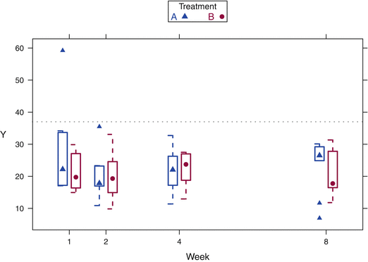
The response to treatments A and B was measured at weeks 1, 2, 4, and 8. The boxplots have been positioned at distances illustrating the time difference and with A and B adjacent at each time point.
-
5.
Mosaic plots (Figure 15.11 and other figures in Chapter 15) as constructed as Cartesian products of several factors.
-
6.
Diverging stacked bar charts as used in displays of Likert scale data (Figure 15.14 and others in Section 15.9 are a crossing of a set of questions (possibly nested in another factor) with a set of potential responses.

4.1.7 4.A.7 latticeExtra—Extra Graphical Utilities Based on Lattice
The latticeExtra provides many functions for combining independently constructed lattice plots and for controlling the size and placement of arrays of lattice plots. We use these functions in many of our graphs. The mmcplot (Figure 7.18 and elsewhere in the book) is built by constructing the two panels independently and then combining them with the latticeExtra:::c.trellis function. Many of our plots are constructed by overlaying two independently drawn graphs with the layer function or with the latticeExtra:::‘+.trellis‘ as illustrated in Figure 4.22.

Several ways to plot multiple variables simultaneously. The top row shows the "trellis" objects from three separate calls to the xyplot function. The second row shows two ways of combining the "trellis" objects in the top row. On the left they are overlaid into the same panel using the latticeExtra +.trellis function. On the right they are concatenated into a multi-panel "trellis" object by using the latticeExtra c.trellis function. The third row shows two ways of specifying similar displays with a single xyplot command. On the left there are three response variables in the model formula with the default setting that places them into the same panel. On the right the outer=TRUE argument places them into three adjacent panels. The bottom row shows placement of the points into separate panels by specifying the Cartesian product of the levels of the factors a and b in the conditioning section (following the “|” symbol) of the model formula. The code for these plots is included in the file identified by HHscriptnames(4).
4.B Appendix: Graphs Used in This Book
We emphasize throughout this book that graphical display is an integral part of data analysis. Superior data analysis almost always benefits from high-quality graphics. Appropriately drawn graphs are, in our opinion, the best way to gain an understanding of what data have to say, and also to convey results of the analysis to others, both other statisticians and persons with minimal training in statistics.
We illustrate many standard graphs. We also illustrate many graphical displays that are not currently standard and some of which are new. The software for our displays is included in the HH package.
Analysts occasionally require a graph unlike any readily available elsewhere. We recommend that serious data analysts invest time in becoming proficient in writing code rather than using the graphical user interface (GUI). Very few of the graphs in this book can be produced using a standard GUI. Some of them can be produced using the menus in our package RcmdrPlugin.HH. Users of a GUI are limited to the current capabilities of the GUI. While the design of GUIs will continually improve, their capabilities will always remain far behind what skilled programmers can produce. Even less-skilled analysts can take advantage of cutting-edge graphics by accessing libraries of graphing functions such as those included in the HH package and other packages available on CRAN.
4.2.1 4.B.1 Structured Sets of Graphs
Several of our examples extend the concept of a structured presentation of plots of different sets of variables, or of different parametric transformations of the same set of variables. Several of our examples extend the interpretation of the model formula, that is, the semantics of the formula, to allow easier exposition of standard statistical techniques.
In this appendix we list these displays in order to comment on their construction. We provide a reference to an example in the book for each type of display. Discussion of the interpretation of the graphs appears in the indicated chapters.
4.2.2 4.B.2 Combining Panels
-
1.
Scatterplot Matrices: splom A scatterplot matrix (splom) is a trellis display in which the panels are defined by a Cartesian product of variables. In the standard scatterplot matrix constructed by splom, Figure 4.5 for example, the same set of variables define both the rows and columns of the matrix.
A scatterplot matrix (splom) does not follow the semantic paradigm of Equation (4.4). It differs from the majority of trellis-based methods in two ways. First, each of the panels is a plot of a different set of variables. Second, each of the panels is based on the entire set of observations.
Subsections 4.4 and 4.7 contain extensive discussions of scatterplot matrices. We strongly recommend the use of a splom, sometimes conditioned on values of relevant categorical variables, as an initial step in analyzing a set of data.
-
2.
xyplot can be used to construct more general matrices of panels, for example with different of sets of variables for the rows and columns of the scatterplot matrix. Figure 4.4, for example, shows that xyplot can be used to specify a set of variables to define the columns of the matrix and subsets of the observations (specified as different levels of a factor) to define the rows. The formula is essentially
sprice ~ beds + drarea + kitarea | CondoHouse
Sets of xyplots with coordinated subsets of variables can be useful in situations where the number of variables under study is too large to produce a legible splom containing all variables on a single page. In such a circumstance we recommend the use of two or more pages of xyplots to display pairwise relationships among variables.
-
3.
Figure 4.22 shows several ways to combine multiple variables in one or more panels. The figure shows overlaying plots, concatenating plots, and conditioning panels on the levels of a factor.
4.2.3 4.B.3 Regression Diagnostics
In the regression diagnostics plots (Figure 11.6), the panels are defined by conditioning on a set of functions (one for each statistic). This plot displays all common regression diagnostics on a single page. Included are thresholds for flagging cases as unusual along with identification of such cases.
4.2.4 4.B.4 Graphs Requiring Multiple Calls to xyplot
When one of the sets in the Cartesian product is a set of functions, the easiest way to construct the product is to make several xyplot calls, one for each function in the set.
-
1.
Partial residual plots (Figure 9.10) — [functions of fitted values and residual] × [variables]. Response against predictors, residuals against predictors, partial residuals against predictors (partial residual plots), and partial residuals of Y against partial residuals of X (added variable plots). Each row of Figure 9.10 is a different function of fitted values or residual. Each column is either one of the predictor variables or a function of the predictor variables. See the discussion in Section 9.13
-
2.
Analysis of covariance plots (One example is in the set of Figures 10.6, 10.7, 10.8, and 10.9. Another example is in Figure 14.6) — [models] × [levels]. A key feature of this set of plots is its presentation of all points both superposed into one panel and also segregated into individual panels defined by the levels of a factor. In this framework, the superposition of all levels of the factor is itself considered a level.
-
3.
ODOFFNA plots (Figure 14.17) — [transformation power] × [factors] × [factors], a 3-dimensional Cartesian product. This is a series of interaction plots indexed by a third variable, the transformation power, all on a single page. Figure 14.17 is intended to find a satisfactory power transformation to achieve homogeneity of variance and then assess interaction among the two factors for the chosen power transformation.
4.2.5 4.B.5 Asymmetric Roles for the Row and Column Sets
-
1.
Interaction plots (Figure 12.1) — [factors] × [factors]. Each off-diagonal panel is a standard interaction plot. Panels in transpose positions interchange the trace- and x-factors. Rows are labeled by the trace factor. Columns are labeled by the x-factor. The main diagonal is used for boxplots of the main effects.
-
2.
ARIMA-trellis plots (Figure 18.8) — [number of AR parameters] × [number of MA parameters] × [type of display]. Each of the 3 × 3 displays contains diagnostic information about each of the 9 models indexed by the numbers of autoregressive and moving average parameters p and q. In addition we group several types of display on a single page. This plot displays most commonly used diagnostics for identifying the number of AR and MA parameters in time series models of the ARIMA class.
4.2.6 4.B.6 Rotated Plots
Mean–mean multiple comparisons plots (MMC plots) (Figure 7.19) — [means at levels] × [means at levels]. The plot is designed as a crossing of the means of a response variable at the levels of one factor with itself. It is then rotated 45∘ so the horizontal axis can be interpreted as the differences in mean levels and the vertical axis can be interpreted as the weighted averages of the means comprising each comparison. This class of plots is used to display the results of a multiple comparison procedure.
4.2.7 4.B.7 Squared Residual Plots
The fundamental concept of “least squares” is difficult to present to introductory classes. Here, we illustrate the squares. The sum of their areas is the “sum of squares” that is minimized according to the “least-squares” principle.
Illustrations of 2D and 3D least-squares fits (Figures 8.2 , 9.1, and 9.5)—[fitted models] × [methods of displaying residuals]. The rows of Figure 8.2 are ways of displaying residuals; the first row shows the residuals as vertical lines, the second as squares. The columns show different models: none, least-squares, and a too-shallow fit.
4.2.8 4.B.8 Adverse Events Dotplot
There are two primary panels in Figure 15.13 — [factor] × [functions of percents]. The first panel shows the observed percentages on the x-axis. The second panel shows the relative risk with its confidence interval on the x axis. Both panels have the same y axis showing the event names.
4.2.9 4.B.9 Microplots
Microplots (as in Table 13.2) are small plots embedded into a table of numbers. The plot often carries as much or more information as the numbers.
4.2.10 4.B.10 Alternate Presentations
We have alternate presentations of existing ideas.
-
1.
Transposed trellis plots are sometimes helpful. In Figure 13.13 we show a set of boxplots with the response variable on the vertical axis. The vertical orientation places the response variable in the vertical direction and accords with how we have been trained to think of functions—levels of the independent variable along the abscissa and the response variable along the ordinate. In Section 13.A we show in Figure 13.17 the same graphs with the response variable on the horizontal axis.
-
2.
Odds-ratio CI plot (Figure 15.10). The odds ratio
$$\displaystyle{\left (\frac{p_{1}} {q_{1}}\right )/\left (\frac{p_{2}} {q_{2}}\right )}$$does not, by construction, give information on both underlying p 1- and p 2-values. It is necessary to specify one of them to estimate the other. We backtransform the CI on the odds ratio to a CI on the probability scale and plot the CI of p 2 for all possible values of p 1. The two axes have the same (0, 1) probability scale.
Rights and permissions
Copyright information
© 2015 Springer Science+Business Media New York
About this chapter
Cite this chapter
Heiberger, R.M., Holland, B. (2015). Graphs. In: Statistical Analysis and Data Display. Springer Texts in Statistics. Springer, New York, NY. https://doi.org/10.1007/978-1-4939-2122-5_4
Download citation
DOI: https://doi.org/10.1007/978-1-4939-2122-5_4
Publisher Name: Springer, New York, NY
Print ISBN: 978-1-4939-2121-8
Online ISBN: 978-1-4939-2122-5
eBook Packages: Mathematics and StatisticsMathematics and Statistics (R0)