Abstract
An ‘architectural doughnut’ is a building with a plan consisting of two concentric circles. Two types are distinguished: the ‘ring doughnut’ where the central circle is a courtyard, and the ‘jam doughnut’ where some important central space (the ‘jam’) is surrounded by a ring of smaller spaces (the ‘dough’). The main emphasis is on the second type. A series of historical examples is discussed including locomotive roundhouses, Panopticon prisons, hospital wards, parking garages and offices. The ratio of the diameters of the circles is shown to be important for the functioning and even the feasibility of ‘jam doughnut’ plans, depending on the activity housed. In several of the case studies the doughnut shape results in serious inefficiencies in the use of space. Such plan types were soon abandoned. Geometrical data on all the examples are presented in a ‘morphospace’ or world of possible doughnut plans.
Introduction
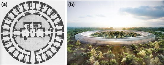
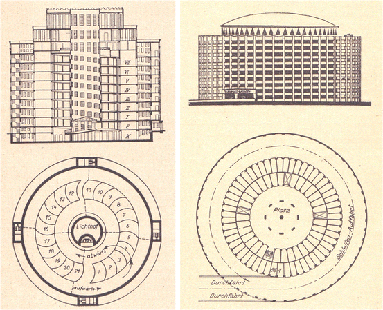
By an ‘architectural doughnut’ I mean a building with a circular plan shape. There are two types of architectural doughnut. The first type is the ‘ring doughnut’ (geometrically a torus) with a courtyard at the centre. Figure 1 shows two examples: the Narrenturm, an eighteenth-century hospital for the confinement of the mentally ill in Vienna, and offices for the Apple computer company, under construction in 2015 at Cupertino, California. The second type is the ‘jam doughnut’ (geometrically a cylinder) in which there is no central court. Instead the plan consists of some central space or function—the ‘jam’—surrounded by subsidiary spaces—the ‘dough’. An intermediate type has a central circular atrium rising the entire height of the building. The Italian architect Vittorio Bonadè Bottino built four hotels and hostels on this plan in the 1930s, with internal helical ramps giving access to the rooms (Bevilacqua 2015).
Two ‘ring doughnut’ buildings. The Narrenturm, Vienna 1784, a hospital for the confinement of the mentally ill, from Dieter Jetter, ‘Die psychiatrischen krankhaüser als Anstalten besonderer Art’, Confinia Psychiatrica 9 (1966), p. 208 (courtesy S Karger AG, Basel); and the Apple Inc office campus at Cupertino CA, architects Foster and Partners, under construction in 2015 (courtesy Foster and Partners)
One functional difference between the ‘ring doughnut’ and ‘jam doughnut’ types has to do with the available patterns of visibility in each case. If a circular building without a courtyard has a completely open plan, then all points in the interior are visible from all other points. This is a general property of convex shapes. Circular plans have appealed to some architects who have wanted many peripheral spaces or positions to be observable from a central vantage point, as we shall see. Annular buildings with open plans by contrast have the property that there is no position from which the whole of the interior is visible at once—assuming that one cannot see across the courtyard and through windows on the far side, which in practice one usually cannot. Ring-shaped corridors—as in the Narrenturm—can be disorienting since they present much the same view at every point in the circuit.
I propose to concentrate on the ‘jam doughnut’ type.Footnote 1 We can represent the generic plan schematically as two concentric circles, the central circle representing the ‘jam’, and the outer ring representing the ‘dough’ (Fig. 2). On any given floor, the ratio of the areas of the ‘jam’ and the ‘dough’ depend, obviously, on the diameters of the two circles. This ratio, and the absolute diameter values, can be important for the functioning of different building types having this type of plan, and can indeed decide whether a ‘doughnut’ plan is suitable or feasible in the first place. I discuss a series of examples below, for which diagrammatic plans are given to a standard scale in Table 3.
The present paper pays distant homage to some work done by Lionel March with Leslie Martin at Cambridge in the 1970s, in which they investigated the geometrical effects and relative merits of placing buildings around the peripheries of sites, compared with concentrating development at the centres of sites (Martin and March 1972). They made reference in this work to the configuration of the Fresnel lens in optics, which is made up of many concentric ring-shaped elements. Martin and March drew a Fresnel pattern as a set of concentric squares, not circles, each ring having the same area as the central square (Fig. 3). The pattern was used in the logo of the Centre for Land Use and Built Form Studies, set up in 1967 at the Cambridge University Department of Architecture, of which March was the first director. Here the area of the black ring on the left is equal to the area of the central black square on the right (Fig. 4). The research using the Fresnel principle was focused on the urban design scale. This present paper transfers similar considerations to the scale of the single building. Martin and March’s theoretical patterns were rectangular. My doughnuts are (mostly) circular—although I will make brief mention of a few rectangular doughnut buildings.
Fresnel pattern of concentric squares. The area of each ring is the same as the area of the central square. Image: from Leslie Martin ‘The grid as generator’ (Martin and March 1972: 19), reproduced by permission of Lionel March
Buildings with circular plans are relatively rare in the building stock. I have argued elsewhere that the majority of buildings show a predominantly rectangular geometry in plan, because of the great flexibility that this allows for packing together many spaces of different dimensions and proportions (Steadman 2006). Certain buildings escape these constraints of two-dimensional packing however, because they consist of just one large open space, or one large central space with some smaller spaces attached around the periphery. The examples of ‘jam doughnuts’ described here fall into those categories.
Circular-plan buildings without courts are found in a wide range of sizes. At the lower end of the scale are vernacular huts like the bories of the Vaucluse region of France, or the Italian trulli of Apulia, both of them typically two or three metres in diameter. Towards the upper end of the size range are the roundhouses that were built as railway engine sheds and maintenance depots in the nineteenth and twentieth centuries. The Camden Town roundhouse in London—now converted to an entertainment venue—has a diameter of 50 m.
The interiors of the small houses tend to be open and undivided. The plans of larger circular buildings can also be completely open—like the railway roundhouses. Where there are smaller spaces wrapped around in a ring, these are typically wedge-shaped, approximating to rectangles if their number is large. Even where peripheral spaces are not walled off, there may still be positions around the outer wall occupied by furniture, machines or equipment. In circular prisons there are positions for cells, in hospital wards for beds, in multi-storey garages for cars. In the railway roundhouses there are positions for locomotives.
Railway Roundhouses
The roundhouse provided parking spaces for railway engines under cover, where they could be maintained and prepared. There was a central turntable, which was used for moving the engines onto short lengths of track radiating out from the centre. The Camden Town roundhouse had a turntable with a diameter of 11 m, and 19.5 m lengths of track for parking the locomotives (Fig. 5). One engine was moved at a time, and the radial sections of track could be packed tightly around the edge of the turntable. Each had the standard British railway gauge of 1.435 m (4 ft 8½ in), allowing for twenty-four positions in the full circle, one of them the access track. (In other roundhouses there were separate tracks for entrance and exit.)
The length of a standard locomotive fixed the diameter of the turntable. This same dimension—with some extra allowance for track immediately adjoining the turntable—fixed the width of the outer ring. The space for each parked locomotive was wedge-shaped; but because locomotives are long and thin, not too much space was wasted. The diameter of the turntable determined the number of tracks—hence number of engines—that could be fitted in the ring. The length and width of the typical railway engine thus determined the dimensions of the entire plan.
In the twentieth century, roundhouses were largely abandoned in favour of rectangular engine sheds. I have not seen the reasons discussed in the somewhat sparse and specialised history of the type (for example Halberstadt and Halberstadt 1995). The Camden roundhouse fell out of use because locomotives were made longer. One might speculate about other causes. The number of engines accommodated around the ring could not be increased. Perhaps the single-track entry and exit slowed down operations, and rectangular sheds with many parallel tracks allowed for speedier and more flexible deployment of the engines.
The railway roundhouse thus provides a historical example of a ‘jam doughnut’ where the dimensions of both ‘jam’ and ‘dough’ were more or less fixed by the function. In other building types, these dimensions could be varied.
Panopticon Prisons
At the end of the eighteenth century the political philosopher and penal law reformer Jeremy Bentham and his brother Samuel conceived of a new kind of prison with a circular plan, the Panopticon (‘everything seen’) (Bentham 1791; Steadman 2007, 2014: Ch. 9). The Benthams wanted the governor and staff of the Panopticon to be able to watch the prisoners continuously, day and night. This implied a ring of cells whose fronts were barred (the ‘dough’), observed from the ‘inspector’s lodge’ at the centre (the ‘jam’).
Bentham’s initial plan of 1787 was for a four-storey cylindrical building with fifty cells on each floor (Fig. 6). The cells were narrow, intended for single prisoners, and had large windows so that the convicts’ movements would be clearly silhouetted against the light. In Michel Foucault’s words, the cells “…are like so many small theatres, in which each actor is alone, perfectly individualised and constantly visible” (Foucault 1977: 200). It is just possible that the Benthams drew some inspiration for the Panopticon from another contemporary type of cylindrical building whose purpose was to display large 360° panoramic paintings of landscapes, cityscapes or battle scenes (Comment 2000). Panoramas of this kind were patented by Robert Barker in the same year, 1787, in which Jeremy Bentham published his first prison design. In both cases the cylindrical geometry was determined by the basic desire to have observers completely surrounded by what was observed—prisoners in the one case, paintings in the other. Panoramas became a popular form of entertainment in the nineteenth century. It has to be said however that, although mocking commentators in the press referred to the Panopticon as a ‘penal panorama’, there is no mention of Barker’s invention anywhere in Jeremy Bentham’s writings on prisons.
1787 design for a Panopticon penitentiary by Jeremy Bentham. The drawing combines a half-plan, a half-section and a half-elevation. Image: (Bentham 1796: Plate I)
Measurements of Bentham’s 1787 drawings give a diameter for the whole plan of 25 m, and a depth for each cell of 4 m. This means that the ring of cells takes up roughly half of total floor area. The remaining space between cells and the inspector’s lodge has to be left completely empty, since any structures here would block the guards’ views. Clearly the design pays a high price in space used for nothing but looking.
The Bentham brothers’ second, further-developed scheme of 1791 was for a six-storey building with a ring of twenty-four cell positions, each measuring 4 m wide by 4.7 m deep (Fig. 7). These larger cells were intended for two, three or four prisoners rather than solitary confinement as in the 1787 design. Five of the cell positions are occupied by administrative functions, in what Jeremy calls—strangely—the ‘dead part’ of the building. The cell layout is comparable to that in the 1787 scheme, and the central hall still accounts for nearly half of total floor area. Jeremy and his architect Willey Reveley, perhaps realising this waste of space, decided to position several structures in the centre, including raked seating for those attending divine worship, and three ‘annular galleries’ around which the guards were to circulate, and from which they were to survey the cells. All this meant that the 1791 design was arguably not a true Panopticon: there was no longer a single central position from which all the cells could be observed. Jeremy never got his scheme built, despite 20 years of lobbying and much personal expense (Semple 1993). A few other Panoptical prisons were however constructed later, following the general lines of the Benthams’ designs, where the central halls were indeed left almost completely empty.
1791 design for a Panopticon penitentiary by Jeremy Bentham and Willey Reveley with Samuel Bentham. The drawing combines a half-plan, a half-section and a half-elevation. Image: (Bentham 1843: Plate II following p. 172)
The largest and best known of these is Stateville Penitentiary (today Stateville Correctional Center) near Joliet, Illinois, designed by the architectural firm of William Carbys Zimmermann and built between 1916 and 1924 (Fig. 8). Eight four-storey rotundas were planned, of which four were completed. The single-person cells were just 2 m wide, and there were sixty-four cells in the complete circle. At the centre was a small glazed guard tower, and nothing else. Alfred Hopkins in his book on Prisons and Prison Building described the Stateville hall as “…the most awful receptacle of gloom ever devised” (Hopkins 1930: 43). There was a further operational failing that was quite as serious as the waste of space. The guards at the centre could see all the convicts. But at the same time the convicts could see all the guards. There was no possibility of the guards approaching the cells by stealth and surprising the occupants in any wrongdoing. For these and other reasons, all but one of the Stateville rotundas have since been demolished.
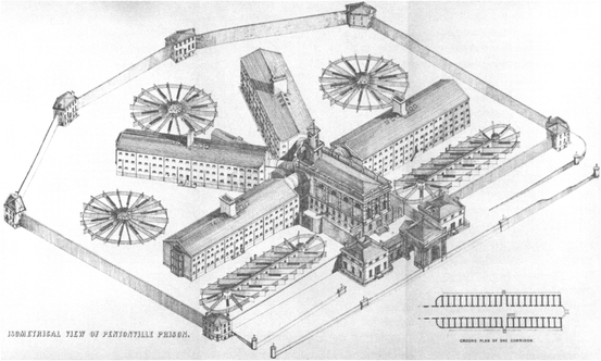
The Panopticon was thus a failure as a model for prison design. By contrast the type that succeeded it in the nineteenth century and came to be reproduced in large numbers around the world was the ‘radial prison’, of which the Eastern State Penitentiary in Philadelphia and Pentonville in London (Fig. 9) were the first examples. These buildings consisted of long straight cell blocks radiating out from central observatories to create starfish-shaped plans. Oversight was again absolutely key to the layout. However the radial prisons sacrificed Bentham’s goal of continuous supervision of the interiors of the cells, and put solid walls and closed doors with peepholes on the fronts of the cells. Now the guards could approach the cells in stealth and look in suddenly on the prisoners without warning. Meanwhile the huge circular hall of the Panopticon could be collapsed into a series of elongated rectangular halls. The whole of each hall could be watched from the observation point at the focus. Should the patrolling guards run into trouble, this could be seen from the centre, and reinforcements could be sent.
Pentonville Model Prison, north London, Joshua Jebb engineer, 1840–2; axonometric view. Image: (Jebb 1844: 133)
The Panopticon, in its various built and un-built versions, was thus an example of a ‘jam doughnut’ in which the width of the ring of cells (the ‘dough’) was variable only within narrow limits. Depending on the number of cells in the ring and their dimensions, this resulted in different areas for the ‘jam’ of the inspector’s lodge and the open space around it. I have made a series of theoretical designs of increasing size and number of cells, where the cell sizes are standardised throughout at 4 m wide by 4.7 m deep, as in the Benthams’ 1791 scheme. Table 1 gives dimensional statistics: the external radius of each building, the floor area of the central hall and observatory, the total floor area of the cells, and these areas as percentages of total floor area. The scheme with twenty-four cells approximates to the 1791 Panopticon. See how the cells make up 52 % of total area. With more cells this proportion reduces further.
Stateville had sixty-four cells in the ring, but these were only 2 m wide, so its plan is roughly comparable with the thirty-two-cell example in Table 1. However the cells were also shallow, with the result that collectively they represented just 26 % of total floor area. By comparison, at Pentonville the equivalent figure is 62 %. This was presumably a major consideration for the authorities at Stateville, when they replaced the demolished Panoptical rotundas with a rectangular cell block on the Pentonville model.
Circular Hospital Wards
Jeremy Bentham never mentions this issue of wasted space anywhere in his copious writings on the Panopticon. A similar question was however debated at length at conferences and in print in connection with hospital wards, and with the idea put forward by the surgeon John Marshall in the 1870s that circular plans might have several advantages over the elongated rectangular design of ward that was then standard. The ‘pavilion’ hospital of the second half of the nineteenth century was made up of rectangular ‘Nightingale wards’, whose measurements in plan were typically 9 by 40 m (Fig. 10). This allowed room for thirty-two beds. (The length was not absolutely fixed, and varied considerably in practice.) These wards were then spaced widely apart in order to provide the best possible natural ventilation, since the causes of many diseases were thought to lie in ‘miasma’ or polluted ‘hospital air’, which needed to be blown away (Steadman 2014: Ch. 3).
Marshall gave a paper to the Social Science Association ‘On a circular system of hospital wards’ (Marshall 1878). The fact that the pavilion ward block was set so far away from its neighbours meant that it did not strictly have to be rectangular to fit with other parts of the hospital, and for that reason was free to take different shapes. Marshall argued that a circular plan would free up the ward’s ‘frontage’. It would have no ‘blank ends’, and “… would receive light, air and wind from every direction.” It would also avoid angles and corners where dirt and stale air might be trapped.
Marshall provided a worked example, comparing a circular ward against a rectangular ward with the same number of beds and the same bed spacing. His calculation showed—as we might expect—that the circular design required much more floor area than the rectangular. Marshall however ignored the cost implication and saw the extra space as a benefit, offering amongst other things a greater volume of air per patient. He thought that nurses would find supervision easy; indeed one might have expected him to station them at the centre of the ward. Marshall however envisaged that the central point would be the place for the open fires and the (thermal) ventilation extract. Jeremy Taylor, who has written a history of these buildings, points out that strangely there is no mention of Panoptical surveillance in the entire published literature on circular wards (Taylor 1988).
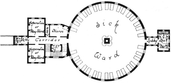
The circular plan was taken up enthusiastically in the early 1880s by a number of English hospital architects, who saw other merits besides those that attracted Marshall. Figure 11 shows a scheme for a thirty-two-bed ward for an infirmary by Henry Saxon Snell. The advantages included a supposed simplicity of construction, and the possibility that a flat roof could serve as a terrace for convalescents. Several designers were drawn by the aesthetic potential of the form, and published schemes with conical roofs suggestive of French chateaux, or with circular classical arcades. A number of built examples exploited the fact that a small round tower could be fitted into the corner of a tight site where an existing hospital was being extended.
However Saxon Snell, who was previously a supporter, changed his views and launched a counter-attack on Marshall in a paper to the Congress of the Sanitary Institute of Great Britain (Snell 1885). His main arguments were to do with the capital and running costs of the unused space at the centres of large circular wards. I have made some schematic designs to illustrate Snell’s general argument. I have laid out four circular wards with eight, twelve, sixteen, twenty-four and thirty-two beds (Fig. 12). The length of wall against which one bed is set is 2.4 m throughout, as in the standard Nightingale ward. The beds are 2 m long. Two extra ‘bed spaces’ are allowed for doors. Dimensional statistics for these alternatives are given in Table 2.
The expense of space in the twenty-four- and thirty-two-bed designs is very obvious. If we take the standard rectangular thirty-two -bed Nightingale ward and compute the floor area per bed, we obtain a value of 11 m2. The figure for my thirty-two-bed circular ward is 16.6 m2. The eight- and twelve-bed designs are more economical, but their plans illustrate different issues, to which Snell and other critics pointed. The feet of the beds are now very close together—nearly touching in the eight-bed case—and there is little room for manoeuvre between and around them. In most of the smaller circular wards that were actually constructed the beds were set further apart than this.
There were further potential problems with bigger circular ward plans, arising from their great depth in plan. Compared with the shallow 9 m depth of the standard rectangular ward, my twenty-four- and thirty-two-bed circular designs have diameters of 20 and 26 m. It would have been very difficult to achieve through-ventilation in a building of this depth, and the centre would have received little daylight. Conditions on the south side of the plan could have become uncomfortably hot in summer, something that the rectangular Nightingale ward generally avoided by orienting the window walls east and west. In any event the fashion for circular wards lasted barely two decades, and just nine small schemes were built. Here is another example, like the Panopticon, where the intrinsic waste of space in the centre of the plan—together with other defects—led to the type’s abandonment.
High-rise Car Parks
From the early 1920s a quite unprecedented new type of building began to appear in the major cities of the United States: the multi-storey parking garage. Here too architects and engineers imagined, at least initially, that circular or regular polygonal plans might be appropriate—the repeated spatial units now being the parking bays. Georg Müller, the German author of the first book on high-rise parking structures, reproduces drawings of two un-built schemes of the mid-1920s (Müller 1925). These are illustrated in Fig. 13. In both cases cars are to be driven up helical ramps and parked in bays alongside the ramps. Separate up and down ramps are needed. There is a minimum allowable curvature for the ramps, because of the turning circles of automobiles, which means that in these designs the ramps have to be wrapped around some central element. In the first design the two ramps are wound round a light well, with the parking spaces between the ramps. This is a ‘ring doughnut’ garage. In the second ‘jam doughnut’ plan there are again two ramps, around the outer perimeter. A platz (atrium) occupies the centre of the plan.
Two German schemes for circular-plan multi-storey garages of the mid-1920s. Images: (Müller 1925: Figs. 89 and 90, p. 51; Figs. 96 and 97, p. 53)
It is clear that, like the railway roundhouse, the dimensions of these buildings are determined by the size of the vehicles (or, more precisely, by the dimensions of the largest cars to be parked) and the sharpest allowable turning circle on the ramps. This latter constraint means that ramps cannot occupy the very centre of the plan—hence the central light well in the first plan, and the atrium in the second.
Parking garages are utilitarian structures in which two overriding goals in design are to minimise the cost of construction and to maximise the number of parking spaces on the given site area. The more cars that can be parked for a given area of access ramp and/or access aisle, the lower the capital costs, and (in commercially-run garages) the greater the profits—so long as a smooth flow of cars in and out can be maintained. Experience with several different types of ramp garage in the 1920s and 1930s proved to their designers, relatively quickly it appears, that one particular design was most efficient on these criteria: a layout with split-level floors and half-length straight ramps, creating helical entry and exit routes (Fig. 14). Dietrich Klose (1965), in his encyclopaedic study of Multi-Storey Car Parks and Garages, quotes figures of between 25 and 31 m2 gross area per car for such rectangular garages of the 1950s and early 1960s.
a Theoretical design for a multi-storey garage with split-level floors and half-length ‘D’Humy’ ramps, axonometric view. Drawing: Author. b An interior view of a garage of this type built by the Ramp Buildings Corporation in the early 1920s. Image: (Müller 1925: Fig. 48, p. 35)
By comparison the first of the circular German garage schemes has a gross floor area per car of 108 m2—in part because the parking bays are excessively large. For the second scheme, if we consider just the outer zone with the ramps and their car spaces, the figure is 115 m2. The main reason that these figures are so big is because in both cases ramps are positioned on the outside of the parking bays. The width of a ramp is fixed, and the greater the diameter, the greater the ramp’s area. It would have been more sensible to put the ramps inside the ring of car spaces.
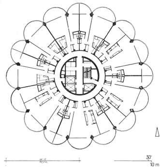
Indeed this was what was done in one of the very few cylindrical car parks ever built: Marina City in Chicago, completed in 1962, and designed by Bertrand Goldberg Associates (Fig. 15). Marina City has two sixty-five-storey circular-plan towers, of which fifteen storeys provide parking on a continuously sloped helical floor. The whole of this part of the structure is a ramp, and the cars are parked on the outer edge of the sloping floor. There are thirty-two car spaces around the periphery in each turn; up and down ramps in a middle ring; and at the centre a service core with elevators and stairs. Above these are forty storeys of apartments.
The overall diameter of the plan (32.5 m) is thus a compromise between the constraints on the dimensions of both the parking floors and the apartment floors, meaning that the apartment plans are rather deep (11.4 m not counting the balconies) and have internal kitchens and bathrooms (Fig. 16).Footnote 2 On the parking floors the gross area per car is 30.4 m2. (This counts the service core, which would be necessary even if there were no apartments.) Marina City thus comes close to the figures for gross area per car achieved by rectangular garages around this same period. Construction costs for the helical floor were on the other hand probably higher than for the flat floors and short straight ramps of standard split-level commercial garages.
‘Park at Your Desk’ Offices
This is a paper about circular buildings. But it is worth noting that similar issues about wrapping strips of accommodation around central cores can arise with square or near-square buildings. Staying with the car parking theme: in 1950 the architect Leroy L. Warner took high-rise garage design into new territory in the Cafritz office block in Washington DC, with the slogan ‘Park at Your Desk’ (Baker and Funaro 1958: 90–91). At the centre of this building is a multi-storey car park with helical ramps and parking places off the ramps, like a squared-up version of the German circular-plan garages (Fig. 17). Set around the car parking is a ring of relatively shallow day-lit offices. Workers can drive into the building, drive up to their floor, park, and walk the last few metres to their desks. (One wonders about air quality in the offices.)
The Cafritz office building, Washington DC, architect Leroy L. Warner, 1950; plan and cut-away perspective. The building was marketed with the slogan ‘Park at Your Desk’. Image: (Baker and Funaro 1958: 90–91)
Warner built another block of similar design, also in Washington, the Universal South Building of 1959. Both this and the Cafritz Building survive. Their example has not however been generally followed. I suspect two causes, both intrinsic to the basic geometrical strategy of wrapping the car parking around the ramps, and wrapping the offices round the parking. First, the small square plan of the garage produces a relatively high figure for the gross area per car (including ramps) of 34 m2. Second it is unlikely that there were enough parking spaces, even at the outset, to meet the building’s needs. The total gross area of office space on each floor is 2200 m2. Just for the sake of illustration let us assume a rough allocation of 15 m2 per occupant, a figure typical for middle management in the 1950s. This would imply some 150 people per floor, for just 29 car places. Office area and parking area were seriously mismatched. The Cafritz and Universal South Buildings are constrained by their downtown positions, but other contemporary American office buildings on larger sites which also combined parking with offices in the one structure tended to put the cars in a series of deep-plan podium floors (or perhaps below ground) with the offices in a shallow-plan block above.
Offices, Naturally Lit and Ventilated, or Air-conditioned
The tower housing the headquarters of Capitol Records in Los Angeles, completed in 1956, is claimed as the world’s first office building with a circular plan. The architects were Welton Becket and Associates, who based the design on sketches by a graduate student, Lou Naidorf, who had just joined the practice. The word ‘iconic’ is used lazily and indiscriminately today in connection with high-rise offices, but the Capitol Records building is truly iconic, its form resembling a stack of vinyl discs on the spindle of a 1950s record player. The tower comprises thirteen storeys and has an external diameter of 29.5 m.Footnote 3
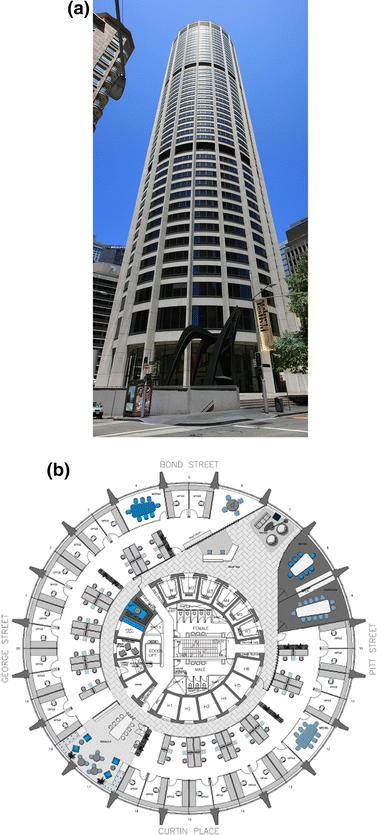
We can contrast Capitol Records with Australia’s first true skyscraper at Australia Square in Sydney, completed in 1967, which also has a circular plan (and which its owners inevitably describe as ‘iconic’) (Fig. 18). This building comprises fifty storeys and has an overall diameter of 44.5 m. The architects were Harry Seidler and Associates. Both these office towers, and others like them, are ‘doughnuts’ in which the ‘dough’ is a ring (or two rings) of offices, either cellular or open plan, and the ‘jam’ is the service core containing lifts, staircases and restrooms.
The size of the core is related to the height of the building, since this determines the number of lifts needed. Capitol Records has three lifts; the Australia Square tower has seventeen. The depth of the ring of offices is determined by methods of lighting and ventilation. In the late nineteenth and early twentieth centuries it was generally agreed that the effective limit of depth away from the window walls for offices to be lit and ventilated naturally was around 7.5 m (25 ft) (Corbett 1924). This figure is in part dependent on the ceiling height, which in day-lit offices of that period was typically 3–4 m. Modern methods for calculating the energy and environmental performance of offices have taken twice the ceiling height (i.e., typically 6 or 7 m) as the depth of this ‘passive zone’ around a building’s perimeter (Fig. 19). Space further away from the windows is assumed to require permanent artificial lighting and air conditioning (see Baker et al. n.d.)
The band devoted to office rooms in the Capitol Records building is 7.75 m deep, and so could in principle have been naturally lit throughout, and perhaps (just) ventilated naturally. But this would have required open planning, or one ring of elongated cellular offices: as actually laid out there are two concentric rings of offices. The inner ring is for clerical workers, and borrows light from the outer ring of professional offices. The Los Angeles sun is strong, the building is exposed, and air conditioning was thought necessary from the start. In other circumstances and a different location a building of this form but with a slightly shallower plan and one row of offices might have dispensed with air conditioning.
The Australia Square tower is also air-conditioned, and exploits this fact to lay out a band of offices, again two rooms deep, with a total depth of 12.1 m, well beyond the limit for natural lighting and ventilation. On a larger site, this dimension might have been increased yet further, allowing even more open-plan office area behind the peripheral ring of cellular offices.
The ratio of these dimensions of ‘dough’ and ‘jam’ results in different percentages of total floor area that is ‘lettable’ (i.e., excluding the area of core and circulation). This figure is of major economic concern to developers. In office buildings with circular plans, the ratio is controlled by two constraints, as we have seen. The first constraint is the diameter of the core, which increases with the height of the building. The second is the depth of the office ring, which cannot exceed 7 or 8 m if the building is to be naturally lit and ventilated, but can be increased where air conditioning is used.
For Capital Records, whose offices are of a depth that could be naturally lit and ventilated, lettable area is around 87 % of total area. In Australia Square the ring of air-conditioned offices is deeper; but the core is also deeper since the building is taller. As a result, lettable area is close to 78 % of total area. For comparison: measurements on a small sample of rectangular-plan office buildings of the 1950s and 1960s, of varying heights and sizes, give figures between 62 and 90 % for net useable or lettable area. The figure tends to fall as buildings get larger. There is no evidence therefore, at least on this basis, that circular office plans are more or less ‘efficient’ in these terms than rectangular plans.
Circular Plans in General
There are some generic issues arising in the planning of all circular buildings that do not occur with rectangular plans. The curved walls and non-orthogonal corners of any smaller spaces around the periphery present difficulties for the placing of rectangular furniture. The skyscraper at 30 St Mary Axe in London, designed by Foster and Partners, whose tapering vegetable profile has earned it the nickname of the Gherkin, might be expected from the exterior to have circular floors. In fact the floors have the shape of six-armed crosses, with triangular voids between the rectangular arms. The positioning of walls and placement of furniture can all be orthogonal, and the layout problems that beset truly circular plans are avoided.
A second general issue is that circular plans are difficult or impossible to extend at later dates. This criticism was made of the Benthams’ Panopticons. Jeremy’s solution was to propose larger prisons consisting of several rotundas (as was done at Stateville). But these would have had to be guarded and supervised separately, where the several long straight cell blocks of the radial prison could all be supervised from a single central observatory. Capacity could be increased in the radial plan—up to some limit—by adding more cell blocks around the same central point, and each block could be extended at its far end—as indeed has happened in many actual prisons.
Finally it seems likely that construction costs would tend to be higher in buildings with circular geometry, because of the need for many specialised components, and/or more complex formwork for poured concrete. Perhaps these characteristics of inflexibility, difficulty of internal planning, and additional cost have contributed to the relative rarity of circular buildings in architectural history.
A ‘Morphospace’ of Buildings with Circular Plans
We can bring together the separate buildings discussed above and present them in a ‘morphospace’ of possible and actual ‘jam doughnut’ plans. The word morphospace has gained currency in theoretical biology in recent decades, to describe mathematical/graphical methods for the definition of natural forms, either the forms of complete animals and plants, or else the forms of separate organs (Raup 1962; McGhee 2007). Some of these forms are actually found in nature; others are less probable; still others may be completely unviable. We can transpose the idea and method to the study of building plans (Steadman 2014: Ch. 6 and 12).
The morphospace is presented in Table 3. Possible values for the overall diameter of plans of the ‘jam doughnut’ type are shown on the y-axis. Possible values for the diameter of the internal core (the ‘jam’) are shown on the x-axis. The values are rounded to increments of 5 m. The values in the table itself give the percentage of total floor area represented by the outer ring (the ‘dough’). Readers can imagine that the same information might be presented as a single animated diagram. The values in the table in bold correspond to real buildings discussed earlier, indicated by abbreviated names. Note that because of the rounding of the dimensions to 5 m intervals, some of the percentages depart slightly from the more accurate figures given in the text.
Where the nature of the building’s function would tend to require the area of the ring to be maximised relative to the core, then ‘more efficient’ plans in these terms will be found at lower left, and ‘less efficient’ plans upwards and to the right. Thus the three ‘inefficient’ Panoptical prisons are close to the main diagonal, as is Saxon Snell’s circular ward design. By contrast the two office buildings have higher proportions of lettable floor area, and are found nearer the y-axis, as is the parking floor plan of Marina City. If more examples of ‘jam doughnut’ buildings of these types were collected, including residential towers, we might expect their plans for this reason to be clustered towards the left-hand side of the morphospace, leaving the right-hand side relatively empty.
These kinds of criteria do not apply to the Camden roundhouse, since the dimensions of turntable and engine bays are fixed. The plans of the two circular German car parks are not shown, since in both cases the core is an empty or unused space, and the critical parameter, as discussed, is the ratio of the ramp area to the total area of parking spaces. Also their plans are divided in effect into more than two concentric rings.
Conclusion
The device of the morphospace allows the architect and the building scientist to take a strategic view of the field of possibilities for plans under some generic geometrical definition—in this case two concentric circles. Variations in the performance of the plans on different criteria across the theoretical space can be measured with suitable numerical indicators. These values can guide designers’ choices, giving warnings of penalties in certain areas of the space, and benefits in others. I believe this kind of approach offers a rich field for future architectural research, to be conducted in the spirit that animated the work by Lionel March and collaborators on built form of the 1960s and 1970s.
Notes
The analogy with patisserie is not perfect. Sometimes the central ‘jam’ is the more important part of the plan, at other times the peripheral ‘dough’.
The parking floors in Marina City are cantilevered, and have an overall diameter of 32.5 m. The apartment floors have a diameter (not counting the balconies) of 30.4 m.
It is interesting to note that the overall diameter of Capitol Records (29.5 m) is very close to the diameter of the apartment floors at Marina City (30.4 m).
References
Baker, G. and B. Funaro. 1958. Parking. New York: Reinhold.
Baker, N., D. Hoch, and K. Steemers. n.d. The LT Method: Energy Design Tool for Non Domestic Buildings, Commission of the European Communities.
Bentham, J. 1791. Panopticon: or, the Inspection-House. Dublin: Thomas Byrne.
Bentham, J. 1796. Management of the Poor. Dublin: James Moore.
Bentham, J. 1843. Panopticon: Postscript. London: T. Payne.
Bevilacqua, M. G. 2015. The Helixes of Vittorio Bonadè Bottino: Symbolism, Geometry and Architectural Types. Nexus Network Journal 17(2): 487–506.
Comment, B. 2000. The Painted Panorama. New York: Harry N Abrams.
Corbett, H. W. 1924. The planning of office buildings. Architectural Forum 41(September): 89–93.
Foucault, M. 1977. Discipline and Punish: The Birth of the Prison. London: Allen Lane.
Halberstadt, H. and A. Halberstadt. 1995. The American Train Depot and Roundhouse. Osceola WI: Motorbooks International.
Hopkins, A. 1930. Prisons and Prison Building. New York: Architectural Book Publishing Co.
Jebb, J. 1844. Report of the Surveyor-General of Prisons. London: Her Majesty’s Stationery Office.
Klose, D. 1965. Multi-Storey Car Parks and Garages. London: Architectural Press.
Marshall, J. 1878. On a Circular System of Hospital Wards. London: Smith Elder.
Martin, L. and L. March. Eds. 1972. Urban Space and Structures. Cambridge: Cambridge University Press.
McGhee, G. R. 2007. The Geometry of Evolution: Adaptive Landscapes and Theoretical Morphospaces. Cambridge: Cambridge University Press.
Müller, G. 1925. Grosstadt-Garagen. Berlin: Deutsche Bauzeitung.
Raup, D. 1962. Computer as an aid in describing form in gastropod shells. Science 138: 150–152.
Semple, J. 1993. Bentham’s Prison: A Study of the Panopticon Penitentiary. Oxford: Clarendon Press.
Snell, H. S. 1881. Charitable and Parochial Establishments. London: Batsford.
Snell, H. S. 1885. Circular hospital wards. The Builder, 26th September, 443–45.
Steadman, P. 2006. Why are most buildings rectangular? Architectural Research Quarterly (arq) 6(3): 203–207.
Steadman, P. 2007. The contradictions of Jeremy Bentham’s Panopticon penitentiary. Journal of Bentham Studies 9: 1–31.
Steadman, P. 2014. Building Types and Built Forms. Leicestershire: Troubador.
Taylor, J. 1988. Circular hospital wards: Professor John Marshall’s concept and its exploration by the architectural profession in the 1880s. Medical History 32(4): 426–448.
Author information
Authors and Affiliations
Corresponding author
About this article
Cite this article
Steadman, P. Architectural Doughnuts: Circular-Plan Buildings, with and without Courtyards. Nexus Netw J 17, 759–783 (2015). https://doi.org/10.1007/s00004-015-0270-8
Published:
Issue Date:
DOI: https://doi.org/10.1007/s00004-015-0270-8


