Abstract
Nearly 200 governments rely on the Intergovernmental Panel on Climate Change (IPCC) for scientific assessments of climate change. IPCC figures are important for conveying key findings, but can be difficult for policymakers and practitioners to understand. Best practices in graph design, summarized in the IPCC’s visual style guide, recommend conducting interviews with members of the target audience before finalizing figures. Therefore, we interviewed 20 policy makers and practitioners from different countries about three figures drafted for the second order draft of the summary for policymakers associated with IPCC’s Working Group III Sixth Assessment Report. Half were frequent users and half were occasional users of climate science, but similar comments emerged from both groups. The figures received a median rating of 3, on a scale from 1 (= not easy at all to understand) to 5 (= very easy to understand). Showing the caption did not always improve these ratings. Overall, two types of recommendations emerged. First, participants suggested focusing each figure on one key message for policymakers, and removing irrelevant details. For IPCC authors, this involves making hard choices about what to show in the figure and what to leave for the text. Additionally, participants suggested straightforward fixes such as using clear titles, labels, and captions that support the key message. Based on our findings, we present recommendations for the design of climate change figures, and examples of revised figures. These recommendations should be useful for the next round of IPCC reports, and for other organizations that communicate about climate science with policymakers and practitioners.
1 Introduction
Curbing climate change involves making informed policy choices. The Intergovernmental Panel on Climate Change (IPCC) was created by the United Nations in 1988 to provide policymakers worldwide with scientific information about climate change. Secondary audiences of the IPCC include practitioners from the scientific, education, business and non-government organization sectors, as well as members of the media and the general public worldwide (Pearce & Lindemer 2022). IPCC reports have influenced global policy making, including the Paris Agreement, which aims to limit the rise in global temperature this century to below 2 degrees Celsius (Lynn 2018).
Every 6–7 years, the IPCC (2023a) releases reports about (I) the physical science basis of climate change, (II) climate change impacts and adaptation, and (III) climate change mitigation. Respectively, these reports are written by Working Groups I, II, and III, which consist of climate scientists and experts from other scientific disciplines (IPCC 2023a). Each report includes a summary for policymakers (SPM), which presents a high-level summary. The reports undergo three rounds of external review. The first round is open to experts, the second round is open to governments and experts, and the third round is open to governments only. Reviewers comment on the accuracy and completeness of the reports. Review editors ensure that each comment is considered by the author teams. Each summary for policymakers is approved line by line and figure by figure in a plenary session with delegates from IPCC member governments.
To highlight key messages, the IPCC’s summaries for policymakers include charts, maps, and diagrams (henceforth: figures). These figures tend to appear with a “caption” or explanatory text below it. Using clear figures is crucial for IPCC’s summaries for policymakers because the main text is often dense and complicated (Barkemeyer et al. 2015). Moreover, IPCC figures need to stand on their own, because they are shared without their captions in the media (O’Neill et al. 2015).
Key messages may be communicated more efficiently through figures than through main text, but not if figures are too complicated (Kim & Lombardino 2015). Unfortunately, some climate change figures may be too complicated for policymakers and practitioners (Bosetti et al. 2017; Fischer et al. 2020; Kause et al. 2020; Taylor et al. 2015). One of the most widely used IPCC figures, which shows global surface temperatures projected for the twenty-first century as simulated by climate models under various emission scenarios (see also Fig. 1A), follows climate scientists’ conventions for displaying uncertainty that may be confusing to policymakers and practitioners (McMahon et al. 2015).


Draft IPCC figures and captions, taken from the second order draft of the summary for policymakers associated with the IPCC’s Working Group III Sixth Assessment Report, showing (A) GHG emissions trends and projections, (B) feasibility challenges, (C) breakdown of average investment needs until 2030
To help IPCC authors design better figures for the IPCC’s Sixth Assessment (AR 6), Working Group I’s Technical Support Unit summarized best practices in graph design in a 24-page “IPCC visual style guide for authors” (IPCC 2018; see also Harold et al. 2017). This visual style guide was created as part of an interdisciplinary effort to improve Working Group I’s figures for the IPCC’s Sixth Assessment Report (Morelli et al. 2021). Among other things, best practices prescribe that figures should draw viewers’ attention to the key message by using salient colors, sizing, and spacing as well as by removing “visual clutter” that distracts from the main message (IPCC 2018; Tufte 1983). The title, labels, and caption should clearly state the key message, so that viewers can use that information to direct their attention and interpret the figure (IPCC 2018; Harold et al. 2016; Hegarty 2011). The figure and associated title, labels, and caption should be appropriate for the intended audience, building on their existing knowledge of the topic and familiarity with presented figures (IPCC 2018; Harold et al. 2016; Hegarty 2011).
The IPCC’s (2018) visual style guide was needed for at least three reasons. First, scientists often design figures that work well for communicating with colleagues, but that are hard to understand for audiences outside their scientific community (Franconeri et al. 2021). Second, interviews with IPCC authors have revealed a desire for figures to be accurate and complete, leading them to create figures that they themselves deem too dense with information (Harold et al. 2020). Third, interviews with climate scientists have found a lack of familiarity with best practices in graph design, and even some resistance to revising figures accordingly (Dasgupta et al. 2015). Perhaps as a result, the IPCC’s Fifth Assessment Report included a figure that violated the convention that higher bars should represent higher values (and instead had higher bars represent lower values), which may have confused policymakers and practitioners (Fisher et al. 2020).
The IPCC’s (2018) visual style guide also recommends conducting “user-testing interviews” about draft figures with members of the intended audience. Such user-testing interviews aim to assess whether draft figures address an audience’s needs and preferences. Such user-testing interviews involve asking policymakers and practitioners to review draft figures, interpret their key message, and provide suggestions for improvement (Kause et al. 2020; McMahon et al. 2015; Morelli et al. 2021). Findings from these interviews tend to be eye-opening to scientists, who are often not aware of the problems their audience members have with interpreting their communications (Bruine de Bruin and Bostrom 2013). User-testing interviews are especially important for IPCC figures, because best practices in graph design tend to be mostly based on findings about what works for students and members of the public, and these findings may not generalize to policymakers and practitioners (Franceroni et al. 2021). Indeed, climate graphs that are confusing to students and members of the public may be meaningful to expert audiences who have more experience with climate science and IPCC figures (Hegarty 2011).
Here, we therefore interviewed international policymakers and practitioners about three figures (Fig. 1A–C) that were drafted by IPCC authors for the second order draft of the Summary for Policymakers associated with Working Group III’s “Mitigation of Climate Change” report of the IPCC’s Sixth Assessment (IPCC 2023b). Interviews were conducted with support from the IPCC’s Working Group III Technical Support Unit. Our paper adds to the report of Working Group I’s approach (Morelli et al. 2021), in that we describe user-testing interviews in detail. We report on (1) participants’ comments about how well the key message was communicated by the presented figures, (2) participants’ suggestions for improving the presented figures, and (3) whether these comments and suggestions were provided by participants who used climate science frequently or only occasionally in their work. We used our findings to make recommendations about how to design climate change figures for policymakers and practitioners.
2 Method
2.1 Sample
Sixty-eight policymakers and practitioners from across the IPCC’s global regions received an emailed invitation through the international stakeholder networks of the IPCC and UN Foundation. Thirty-four agreed to participate. We interviewed the first 20 who scheduled an interview (Table 1). A sample of 20 tends to be sufficient for interviews that aim to identify which comments arise about the topic of concern. Typically, no new topics arise after 15–20 interviews, also referred to as “saturation” (Morgan et al. 2002). For this study, saturation was reached at the 15th interview (Section 2.4).
Sample characteristics appear in Table 1. Participants worked in 12 different countries, for governments, NGOs, academia and business. They all had college degrees, but not necessarily in climate science. Ten indicated using climate science in their work “very often” or “all the time” while the other 10 did so less often (henceforth: frequent vs. occasional users). Eight of the 10 frequent users and none of the 10 occasional users indicated being “very comfortable” or “completely comfortable” with climate science.
Participants viewed three figures drafted for the second order draft of the IPCC’s Working Group III Sixth Assessment Report’s Summary for Policymakers. The Second Order Draft Report and Final Report are available from the IPCC (2023b).
The three figures were chosen by the Communications Manager and Science Team at the Working Group III Technical Support Unit under the guidance of the Working Group III Co-Chairs and Bureau, because of concerns that they would be potentially too complex for policymakers and practitioners, difficult to create or agree on, or challenging to approve in plenary, while being representative of other IPCC figures. The first figure showed projected greenhouse gas emissions associated with current and alternative policies, as compared to global climate goals (Fig. 1A). The second figure had two panels showing the feasibility challenges associated with sectoral transitions and system-wide changes (Fig. 1B). The third figure also had two panels, entitled “Breakdown of average investment needs until 2030.” (Fig. 1C).
2.2 Interview procedure
Participants were interviewed over Zoom in March 2021. The interviewer showed each figure by sharing her screen. Each figure was first shown on its own, without the associated caption or text below it. When viewing the figure, participants were first asked to describe its key message. They then rated how easy the figure was to understand, on a scale from 1 (= not at all easy) to 5 (= very easy) and explained their rating. Next, participants viewed the figure with the associated caption below it. Again, they rated how easy it was to understand, and explained their rating. Participants were also asked to provide suggestions for improvement. All participants viewed the three figures in the same order.
At the end of the interview, participants provided information about their training and experience. They also indicated how comfortable they were with climate science, how often they used climate science in their work, and whether or not they reviewed IPCC figures before reading the full reports. No financial compensation was offered for participation.
2.3 Coding
Each interview was recorded and transcribed. We used a “thematic analysis” to systematically identify what participants said, following a previous project in which policymakers and practitioners commented on climate figures from the United Kingdom’s Met Office (Kause et al. 2020). Topics were identified through an “inductive coding” procedure. Specifically, two members of our team familiarized themselves with the interview transcripts to design a “coding scheme” that listed the topics participants raised. They then systematically identified which of these topics was raised by each participant in relation to each figure and its associated caption. Three transcripts were coded by both team members, showing 82% agreement. Cohen’s (1960) Kappa, which corrects for agreement by chance, was sufficient at 0.70. Disagreements were resolved through discussion. All coding was reviewed by the first author. By interview 15, we reached “saturation”, or the point at which no more new codes were needed to reflect what participants said. For Fig. 1A, saturation was reached by interview 15. For Fig. 1B, it was interview 8. For Fig. 1C it was interview 9. Finally, we examined overarching topics (or “themes”) that emerged across the codes.
2.4 Overview of analyses
Below, we first report preliminary analyses that examined how participants said they viewed IPCC figures when presented with an IPCC report (Section 3.1). We also present participants’ median ratings of how easy it was to understand each of the three presented IPCC figures, before and after seeing the associated caption.
Our main analyses focus on the topics participants raised while viewing each figure and associated caption (Section 3.2-3.4). We discuss comments participants gave while attempting to describe the key message, and suggestions they had for improvement. We focus on topics that were raised by at least two participants. Nearly all comments were made by at least one frequent user of climate science and at least one occasional user of climate science.
For each finding, we include example quotes from frequent users and occasional users. We report the number of participants in the overall sample who raised each topic. However, we caution that interviews are designed to provide qualitative insights about participants’ comments and are not designed for quantitative analyses of how often comments arise (Bruine de Bruin and Bostrom 2013). Additionally, the presented quotes are accompanied by recommendations for the design of IPCC figures. Table 2 provides an overview of the recommendations that emerged across the three figures, and the sections of the Results that provide relevant quotes.
3 Results
3.1 Preliminary analyses.
3.1.1 Review of IPCC figures
Twelve participants said that they reviewed figures before deciding what to read in the main text of an IPCC report. A frequent user of climate science (P16) said: “If it's right in line with a policy issue I'm trying to solve, I'll read [the entire report], the whole thing. But I will start with the executive summary and the figures.” An occasional user of climate science (P14) said: “I look around all [of the IPCC report] but very fast, and I stop on the figures to see and understand if I have some good information there.” A frequent user (P9) concluded: “I think it’s especially important for an IPCC summary for policymakers to have several, not just a couple, but a number of clear, compelling figures.” An occasional user (P4) therefore said about our study: “I’m so glad you’re doing this.” These comments underscore the positive and collaborative tone of the interviews.
3.1.2 Perceived ease of understanding
When participants were asked how easy it was to understand, each figure received a median rating of 3, at the midpoint of the scale from 1(= not easy at all) to 5 (= very easy). The median observation is the middle of the rank-ordered ratings. Hence, for each figure, the number of participants who found it easy to understand was similar to the number of participants who found it hard to understand. After reading the caption, the median ratings of Figs. 1A and 1B increased to 4, but the median rating stayed at 3 for Fig. 1C. However, these ratings do not necessarily reflect actual understanding. As indicated below (Section 3.2), participants who rated a figure as relatively easy to understand may nevertheless have experienced some confusion. Below, we discuss what participants said about each figure and its caption, and provide associated recommendations for improving figure design (Section 3.2). As noted, Table 2 summarizes the recommendations that emerged for the three figures.
3.2 Comments on Fig. 1A
3.2.1 Key message of Fig. 1A
Removing information from Fig. 1A would likely improve the communication of the key message (Recommendation 1, Table 2). Among participants who rated Fig. 1A as relatively hard to understand, the key message got lost in its complexity. A frequent user of climate science (P16) said: “My first impression is: Too much information.” An occasional user (P4) agreed: “Too much sort of crammed in. I'm not sure how [but] I would break it out into maybe two or three different graphs.” Another occasional user (P5) pointed to an alternative figure by the United Nations Environment Programme (UNEP, 2019, fig 3.1) that presented similar information in a less complicated way (see also Fig. 2A): “If I compare this [IPCC figure] to the UNEP graph, with which I'm very familiar, this doesn't feel as good as the UNEP graph sort of capturing very simply the issue.”


Some of the details and terminology were also confusing to participants who rated Fig. 1A as relatively easy to understand. A frequent user (P19) said: “I think it's quite clear and it is providing projections of greenhouse gas emissions until 2050 according to various scenarios. [My questions are] more about the details.” An occasional user (P13) said: “It is clear, but then again you really have to understand what those terms mean.”
The focus on policymakers could be improved (Recommendation 2, Table 2). A frequent user (P8) said: “Most probably the academic sector would understand, but not policymakers.” Another frequent user (P7) recommended changing the outcome measure on the y-axis to something that would be more relevant to policymakers: “The first recommendation that I would say to you is for policymakers… I mean everybody uses CO2 equivalents, right, which is really a weird measure. It would be much better because of the climate emergency if you can translate that to temperature abatement. When you need to [meet] with the President, […] they don’t understand gigaton CO2 equivalent. But they do understand they need to remain under 2 degrees. Or […] under 1.5.” (see also Recommendations 4 and 6, Table 2).
The caption of Fig. 1A did not clearly explain the figure (Recommendation 8, Table 2). After seeing the figure and caption together, a frequent user (P2) said: “It’s not matching. The text is not explaining what I see.” An occasional user (P11) elaborated: “You want to look at the figure and understand immediately what you're seeing [but] you really have to look back and look again.”
The caption should also avoid technical language (Recommendation 9, Table 2). A frequent user (P7) said: “It's just kind of in the jargon of the IPCC.” An occasional user (P4) agreed: “[It’s] sort of in IPCC speak.” Specific suggestions for improving the graph and caption appear below (Section 3.2.2).
3.2.2 Recommendations for Fig. 1A
Explain the error bars or make them consistent
In total, 14 participants commented on confusion they had about the error bars. Before seeing the caption, only two participants noticed that the figure presented inconsistent error bars that remained unexplained (Recommendation 4, Table 2). A frequent user (P17) said, while comparing the error bars in the insets to the error bars throughout the years: “I don't quite understand how the confidence interval here is actually bigger than it is here.” An occasional user (P1) agreed: “But I don’t know exactly why the error bars are so thin between the years, you see, like between 2020 and 2030, and between 2030 and 2050. […] After seeing the caption, this occasional user (P1) recognized that the error bars represented different percentile ranges and said: “I think I would put [it] in the legend somewhere [so] that even if I don’t have the text, I can understand it.”
However, the caption only implicitly mentioned the error bars. It mentioned “25th-75th percentiles” and “5th-95th percentiles” and assumed that readers would recognize that those terms referred to the error bars. Therefore, the caption could be perceived as missing a description of the error bars (Recommendations 8 and 9, Table 2). A frequent user (P15) asked: “I don’t understand the words but maybe it's my English, I’m not very good at English. It says median and 25th, 75th percentiles, I don’t understand what that means.” An occasional user (P14) asked, about the median and percentiles: “I don't know. Where is it?” Among participants who did recognize that the text about the percentiles referred to the error bars, the caption left questions about why the error bars were inconsistent. A frequent user (P9) asked: “So the pathways are 25th to 75th percentile; whereas the ranges in 2030 and 2050 are the 5th and 95th. I guess my question would be why the inconsistency?” An occasional user (P5) agreed: “I don't know why you've used 25th or 75th percentiles in some cases and 50 to 95th in others.”
Explain unconditional and conditional NDCs
Despite being familiar with Nationally Determined Contributions (NDCs), 12 participants missed a clear explanation of the features labeled unconditional NDCs and conditional NDCs (Recommendations 4 and 6, Table 2). While viewing the figure, a frequent user (P7) said: “I understand what they are [but] I guess I am a little confused about where they're placed.” An occasional user (P11) said: “I'm not sure why they're conditional and unconditional NDCs [but] I am familiar with NDCs.”
The associated caption also missed an explicit explanation of the features labeled unconditional NDCs and conditional NDCs and introduced unfamiliar technical language (Recommendations 8 and 9, Table 2). For example, a frequent user (P8) guessed: “So long-term mitigation pathways. Are these different than the NDCs? Because in the graph, there’s not long-term mitigation pathways. So if this is something different than the NDCs, it has to be explained somewhere.” An occasional user (P20) said: “I still don't have that clarity in terms of I know they're considering the conditional and unconditional NDCs.”
Remove or explain 2030 and 2050 insets
Eleven participants raised questions about the insets at 2030 and 2050. Despite recognizing the importance of those target years, the insets were perceived as creating visual clutter (Recommendation 1, Table 1). A frequent user (P7) noted “Those are obviously key years so I appreciate trying to highlight those [but] it kind of just breaks up the flow of the graph.” An occasional user (P10) agreed: “The zoom-in of the 2030 and the 2050 interrupted my thought of the curves. I like to follow lines, and that was confusing.” Therefore, participants recommended removing the insets from the figure. A frequent user (P8) said: “If you remove the frozen columns, there’s a perfect graph to be included in the summary for policymakers” (see also Recommendation 2, Table 2). An occasional user (P4) suggested that it might be better to remove the information about the target years and present it in a separate table: “I almost think that if you had a table [that] would be a better way to reinforce the importance of those dates rather than to try to sort of throw it all into this single graph.”
The associated caption did not explicitly address the insets at 2030 and 2050 (Recommendation 8, Table 2). A frequent user (P8) therefore recommended a revision: “The paragraph that starts with “the figure shows” and finishes in “full range”, this is the paragraph that should explain the frozen columns.” An occasional user agreed: “There must be some kind of explanation what those […] target years are all about.” (P13).
Explain presented scenarios
Eight participants expressed confusion about how the legend described the scenarios represented by the lines in the figure (Recommendation 4, Table 2). A frequent user (P19) said, about the legend: “Why do you [use NDCs] only for a few scenarios? That's unclear for me. […] I think among the biggest concerns for me is really to clearly understand the descriptions of the scenarios.” An occasional user said: “Why do we have [the temperatures] included in some and not in others?” (P20).
The legend also caused confusion because of its technical language (Recommendation 6, Table 2). A frequent user (P15) had trouble reading due to the terminology and the font size: “I don’t understand the blue line. Gradual strengthening before 2030? What is that? […] So one recommendation is do the numbers bigger because old people, we cannot see.” An occasional user (P14) also commented on the technical language: “I don’t know what exactly you mean with gradual strengthening before, and thereafter below 2 degrees from 2030.”
The associated caption did not explicitly define each scenario (Recommendations 8 and 9, Table 2). Therefore, a frequent user (P19) recommended: “I think it would facilitate if you would have bullets for each of the [scenarios], instead of only three.” An occasional user (P10) noted that the caption: “doesn't explain the reason why the two degrees Celsius scenario was chosen for [scenarios] number 3 and number 4.”
Use distinctive colors
Eight participants noted that the colors in the figure were too similar (Recommendation 5, Table 2). A frequent user (P16) said: “The colors are bothering me. [There’s] very similar coloring.” An occasional user (P5) agreed: “I find it pretty hard to distinguish the colors and what [colors in] the key refers to what lines.”
Explain or avoid technical terms and acronyms
Five participants expressed concern about the use of specific technical terms and acronyms in the figure and caption (Recommendations 6 and 9, Table 2). As noted above, participants commented on the technical terms gigaton CO2 equivalent (Section 3.2.1.), unconditional NDCs, and conditional NDCs, which appeared in the figure (Section 3.2.2.1), gradual strengthening, which appeared in the legend (Section 3.2.2.4) and long-term mitigation pathways, which appeared in the caption (Section 3.2.2.1). A frequent user (P2) additionally asked about the acronyms in the caption: “What’s the AR6? And the GWPs?” An occasional user (P4) also commented on the caption: “I sort of understand what overshoot means, but I don't know that that's widely understood as a concept.”
3.3 Comments on Fig. 1B
3.3.1 Key message of Fig. 1B
Among participants who rated Fig. 1B as relatively hard to understand, the presentation of two panels made it harder to find a key message (Recommendations 1 and 3, Table 2). A frequent user of climate science (P19) therefore recommended: “The right-hand figure does not help to understand the left-hand picture, and vice versa. [So I would not] put them close to each other.” An occasional user of climate science (P14) agreed: “I couldn’t find the link.” An occasional user (P4) recommended removing the right panel: “I think they could just say that in a sentence. I mean, I assume it's just making the very simple point that if you delay implementation of these control measures, the feasibility [challenge] increases some.” Yet, the key message in the left panel was perceived as the most difficult to find. A frequent user (P17) said: “On the left side, there's a lot more messages being muddled together than on the right side.” An occasional user (P14) agreed: “But the first [panel], it’s more complicated to me.”
Among participants who thought that Fig. 1B was relatively easy to understand, the lack of a descriptive title led to two different interpretations of the key message in the left panel (Recommendation 4, Table 2). A frequent user (P18) noticed both interpretations and said: “I guess there's two interpretations that maybe is possible in this matrix. [One is] the possible impact of – the feasibility and the transition and the impact on those criteria. And the other one is the feasibility based on these criteria.” An occasional user (P10) asked: “Are we looking at the impact of geophysical aspects on the energy systems or of the energy systems on the geophysical conditions of a city? Which way is the flow of the impact?” A frequent user (P17) therefore recommended: “The titling could be a little bit better because the point, I don't think, is about the feasibility challenges. It's about the impact of the enabling environment on the feasibility of system transitions. I think the title is a little bit misleading.” An occasional user (P10) agreed: “The title is super concise. Making the title a bit longer would make it a bit easier to understand.”
For the right panel, a better title might also have been helpful for communicating the key message (Recommendation 4, Table 2). A frequent user (P9) wondered: “Maybe I understand why immediate policy starts with more feasibility challenge, but maybe not.” An occasional user (P10) said: “The main message is the sooner we act, the easier it will be to implement the policies required. [But] I don’t know if that’s a correct reading.”
After viewing the figure with the caption, participants who rated it as hard to understand tended to miss a key message for policymakers (Recommendations 2 and 7, Table 2). A frequent user (P16) said: “I don't understand how I'm supposed to use this – either of these graphs to help me make policy decisions.” Another frequent user (P19) asked, after reading the description of the right panel: “So as a policymaker what is the message? So it doesn't matter whether I start early or not? It's not really clear.” An occasional user (P1) said: “I still don’t understand it. […] Maybe I’m tired.”
Additionally, the caption did not explain all aspects of the figure (Recommendation 8, Table 2). A frequent user (P6) said, about the left panel: “It doesn't explain every detail of the figure.” An occasional user (P10) said, about the description of the left panel: “I don’t think the text fully explains the figure.” Another occasional user (P3) noted that the caption did not explain the link between the two panels: “If there is a relation it would be nice for that to be [made] clear.”
As with Fig. 1A, there were complaints about technical language and acronyms presented with Fig. 1B (Recommendation 9, Table 2), which made it less appropriate for policymakers (Recommendation 2, Table 2). A frequent user (P9) said: “To me it reads [like] academic jargon […] This is not accessible to a policymaker.” An occasional user (P10) added: “I don't do climate modeling, so […] I wouldn't care that much about that part of the sentence. I got what the figures mean, so I wouldn't worry too much about the wording, and then maybe [it’s] for the scientists. They would care about it.” Specific suggestions for improving the figure and caption appear below (Section 3.3.2).
3.3.2 Recommendations for Fig. 1B
Explain level of confidence
Eleven participants needed more explanation of the stars in the left panel, which were labeled level of confidence (Recommendation 4, Table 2). Part of the confusion was due to the use of an unfamiliar technical term (Recommendation 6, Table 2). A frequent user (P7) said: “The dots are indicating the level of confidence from the evidence. [But] understanding that does not come very easily to me.” An occasional user (P3) agreed: “The level of confidence; I don’t know what exactly that means.”
After viewing the associated caption, the usefulness of presenting the levels of confidence remained unclear (Recommendation 8, Table 2). A frequent user (P9) said: “The confidence I think that doesn't say a lot because you always have three or four stars or sometimes five stars. But it's not really a big variation, so I'm wondering whether I can really use that.” An occasional user (P1) said: “I still don’t understand it. (…) I know that sometimes we need to have levels of confidence, but I don’t think that’s useful here.”
Explain levels of evidence
Ten participants needed more explanation of the labels positive, negative and mixed evidence, which described the colors in the left panel (Recommendation 4 and 6, Table 2). A frequent user (P18) said: “It is not clear what is the meaning of positive, mixed evidence, negative.” An occasional user (P3) said: “I see a lot of mixed evidence and I'm not sure what that means.”
This confusion was also due to a mismatch between the figure and the legend (Recommendation 4, Table 2). A frequent user (P9) said: “I'm not sure why there’s a negative box in the legend when there’s no negative in the actual matrix.” An occasional user (P10) agreed: “There's no negative or not applicable [in the matrix], which then begs the question as to why they're in the legend.”
The associated caption did not provide further clarification about how to interpret the levels of evidence (Recommendation 8, Table 2). After viewing the caption, a frequent user (P19) said: “So the key question for me is really to understand what is the positive impact compared to mixed and to negative and that I still don't understand.” An occasional user (P4) concluded: “I would definitely recommend getting rid of these figures. You know, I'm sure there's, like, a chapter on the building sector, and […] it will lay out all of these factors at the top – the economics, technology – and describe them all. And to me that's so much more useful than, you know, mixed evidence.” (see also Recommendation 1, Table 2).
Label the axes
Ten participants missed a label on the axes in at least one of the two panels in Fig. 1B (Recommendation 4, Table 2). A frequent user (P16) recommended, for the left panel: “It would be really helpful to have more labeling on this figure to figure out what these categories are.” An occasional user (P5) agreed: “What are the things on the vertical access? The thing on the horizontal access, what is it?” Similarly, about the vertical axis of the right panel, a frequent user (P7) said: “I don't really know what high, medium, and low is.” An occasional user (P1) agreed: “It’s only qualitative, and there’s only high, medium, and low. There isn’t much [information].”
After seeing the caption, participants repeated requests to clarify what the various axes represent (Recommendation 8, Table 2). A frequent user (P6) wanted an explanation of: “the metrics of the lines on the right and the metrics on the left.” An occasional user (P10) specified that the caption did not help because: “There's a bit of a mismatch of the wording for the left figure and what the left figure is saying.”
Explain or avoid technical terms and acronyms
Eleven participants mentioned the use of unfamiliar technical terms or acronyms. As noted above, participants needed a definition of the terms level of confidence (Section 3.3.2.1.), as well as positive, negative and mixed evidence (Section 3.3.2.2) which were used in the figure (Recommendation 6, Table 2). Referring to the figure, a frequent user (P16) also requested: “I’d like to see what cross-sectional is defined as.” Additionally, an occasional user (P4) said: “I assume AFOLU is land use, forestry and land use or something.”
The associated caption also used terms and acronyms that were unclear (Recommendation 9, Table 2). A frequent user (P7) said: “it's talking about an evolution of a composite indicator, so my first question is like what's that?” An occasional user (P13) noted: “We need to have some explanation on that, what the AR6 scenario is.”
3.4 Comments on Fig. 1C
3.4.1 Key message of Fig. 1C
Even among participants who rated Fig. 1C as relatively easy to understand, the presentation of three graphs was perceived as unnecessary and potentially confusing (Recommendation 1, Table 2). A frequent user (P19) said: “You can raise the question whether the pie chart is needed compared to the columns because I think the column has the same thing.” An occasional user (P5) agreed: “I don't know why you need the pie chart and the bar chart as it were. I think you could probably do away with the pie chart.”
Even for the participants who thought Fig. 1C was relatively easy to understand, the key message of the left panel could use more explanation (Recommendation 3, Table 2). Before seeing the associated caption, a frequent user (P19) said: “I understand that although I think it needs a little bit more clarification in the description. […] I think what you can see is about half of the investment needs is needed for agriculture, about one-third for power, and less than a quarter for energy efficiency and transport. That's what I'm reading here.” An occasional user (P3) stated: “Well, I imagine this [left] graph is actually showing amounts of investments that are needed for both power, transport, energy efficiency, agriculture, and product to make it probably more responsive to the climate change. So then it shows the discrepancies between the mitigation needs for these different sectors and then the actual flows. […] I think I just needed to read a little bit into it.” However, the key message of the left panel was not obvious to participants who gave Fig. 1C a relatively low rating. A frequent user (P15) said: “I think it’s valuable to have information like that. But the way that it’s presented is [hard to understand]” An occasional user (P4) agreed that the key message “doesn't jump out at you.”
Among participants who thought that Fig. 1C was relatively easy to understand, the key message of the right panel was described with less hesitation than the key message of the left panel. A frequent user (P18) said: “The [right] chart I guess is a comparison between the availability of maybe investment flows, the needs, and the GDP. The portion of the GDP that is allocated to this investment.” An occasional user (P5) said: “The [right] one essentially says that the needs are spread equally between developed, emerging, developing, but developed countries get the lion's share or get more than their fair share of the flows.” However, among participants who thought the right panel was relatively hard to understand, there was outright confusion (Recommendation 3, Table 2). A frequent user (P16) said: “I really don't understand this graph at all. I think this one I understand the least out of all of them so far.” An occasional user (P4) said: “I have to tell you, I don't have a clue what this [right] one is.”
In the caption, the key message was perceived to be missing (Recommendation 7, Table 2). A frequent user (P16) said: “This is mostly citations. […] Instead, what it should say is what this actually means. What does this figure mean?” An occasional user (P3) suggested: “It would be nice to see […] maybe a little bit of interpretation on what the actual columns and pie chart are trying to say.” Participants who did understand the key message after reading the caption noted that the figure should have stood on its own. A frequent user (P6) said: “You can understand the graph if you take a while and read the caption. But it's never good if you feel lost in a first look because you lose interest, and if you lose interest you just skip to the next page.” An occasional user (P4) agreed: “You've got to read the fine print and you shouldn't have to read the fine print. I mean, these graphs should stand on their own.”
There were also comments about the use of technical terms and acronyms in the caption (Recommendation 9, Table 2). A frequent user (P2) said: “There are again some acronyms here.” An occasional user (P5) said: “The text didn't really help. I think it is too techy.” Specific suggestions for improving the figure and caption appear below (Section 3.4.2).
3.4.2 Recommendations for Fig. 1C
Label the inner and outer circles
Sixteen participants missed labels on the inner and outer circles in the pie chart presented on the left (Recommendation 4, Table 2). A frequent user (P16) said: “What's inner circle versus the outer circle? I don't know what that is.” An occasional user (P10) also asked: “What I don't understand is why there are two shades of colors? Are they meant to mean something or not?” Participants who recognized the meaning of the inner and outer circles after seeing the caption, asked for clarification in the figure itself. A frequent user (P19) said: “I think the [explanation of the] inner boundary and the outer boundary, that should be said in the graph itself.” An occasional user (P11) agreed: “It's not really automatic that that is what they mean.”
Although the caption did explicitly refer to the inner boundary and outer boundary, the explanation caused some confusion due to the use of technical language (Recommendation 9, Table 2). A frequent user (P7) said: “The text confuses me more because I don't really know what is Wing area in between represents resulting finance gaps by sector” An occasional user (P20) agreed: “I don’t know what's that wing area.”
Add more useful units
Eight participants missed units in the figure (Recommendation 4, Table 2). A frequent user (P8) asked, about the left panel: “It doesn’t have any units. So I know that maybe energy efficiency needs more than power, and the agriculture needs the use of investment flows. But I don’t know the scale of investment needs. So are we talking trillions? Billions? How much? There’s no scale.” An occasional user (P3) recommended, for the left panel: “I think it would be nice to have a unit […], maybe dollar value.” A frequent user (P16) asked, about the right panel: “What does 100%needs mean? What does 100% GDP mean?” An occasional user (P10) recommended, for the right panel: “Initially I was thinking it's absolute numbers not in percentages. [It] would've made sense if it was in, I don't know, a trillion dollars.”
After seeing the caption, participants recommended that the presented information about the units should made be clear in the title (Recommendations 4, Table 2). A frequent user (P16) said: “I am more convinced as a result of reading this caption so far that flows and needs are dollars as a metric. I would put that [in the title] next to needs and flows and mitigation needs.” An occasional user (P1) agreed: “It would be helpful if I had numbers on the graph [and] maybe in the title in the sense of how much we need in total.”
Define needs and flows
Six participants expressed confusion about what was meant by needs, and eleven participants expressed confusion about what was meant by flows. Because the figure used these technical terms inconsistently and without explanation, it did not stand on its own (Recommendations 4 and 6, Table 2). A frequent user (P19) said: “On the [left] it's mitigation needs and then [on the right] it's saying needs. I'm not sure what needs means.” An occasional user (P13) said: “the needs and the flows, I'm not sure what they are.”
Although the caption did mention these terms, some confusion remained about the inconsistency between the caption and the figure (Recommendations 8 and 9, Table 2). A frequent user (P6) said: “In one [on the left] you have the title Mitigation Needs. In the other [on the left] you have the title, ‘Needs.’ But the overall title [of the caption says] Investment Needs.” An occasional user (P14) said, about the caption: “It’s a term that I’m not used to, the needs and the flows, so I can’t find here the meaning.”
Use distinctive colors
Five participants commented on the colors (Recommendation 5, Table 2). A frequent user (P9) said about the right panel “The blue and the green are too similar in color.” Another frequent user (P8) suggested: “Maybe a change of colors here would be smart.”
Explain the role of GDP
Despite being familiar with the acronym GDP, six participants needed an explanation of its role in the right panel (Recommendation 4, Table 2). A frequent user (P8) said: “So we’re talking investment per GDP unit? Is it a ratio? Or just is it an indicator? Okay. So GDP is completely – very, very not clear.” An occasional user (P4) agreed: “I'm not sure why you'd be showing GDP there.”
The caption did not clarify the role of GDP in the right panel (Recommendation 8, Table 2). A frequent user (P8) said: “This is not all relevant to the graph on the right because the graph on the right is about, you know, the flows, the needs, and the GDP.” Another frequent user (P19) elaborated: “I think GDP and flow is not really defined.”
Order information consistently
Three participants noted the inconsistency in the presented information about the sectors, between the figure, the legend and the text (Recommendations 4 and 8, Table 2). A frequent user (P17) noted: “So the key goes from power, to transport, to energy efficiency, and agriculture, but the figure goes from power, to transport, to energy to – sorry, to agriculture, and […] energy efficiency. The key needs to be aligned with the figure and they should correlate, because for colorblind people, you need to be able to figure that out.” An occasional user (P10) said: “The text also doesn't talk directly to the figure, so they start with agriculture and forests, which is the last in the legend. Then they talk about energy efficiency, which is third, and then there's the electricity sector, which should be part of the energy sector.”
Explain or avoid technical terms and acronyms
Fourteen participants expressed confusion about specific technical terms and acronyms in the figure and the caption (Recommendations 6 and 9, Table 2). As noted above, participants commented on the terms wing area (Section 3.4.2.1) and needs and flows (Section 3.4.2.3). Additionally, an occasional user (P1) said, about the description of the left panel: “All this sentence: based on AR6 IAM database with incremental GND and storage. I don’t know what that means.” A frequent user (P15) said, about the description of the right panel:. “I would encourage you not to use acronyms. Because people are not familiar with acronyms. For example, CPI breakdown.” An occasional user (P3) noted another unfamiliar acronym in the description of the right panel: “I don’t know what UN M49 is.”
3.5 Discussion
3.5.1 Main findings
The figures included in IPCC Summaries for Policymakers have been found to be more complex than is recommended by best practices in graph design (Dasgupta et al. 2015). However, these best practices were based on studies about how to design figures for non-expert audiences (Franceroni et al. 2021). Here, we interviewed 20 policymakers and practitioners from the IPCC’s and United Nations Foundation’s international network. They volunteered their time to comment on three figures that were drafted for the second order draft of the summary for policymakers of the IPCC’s Working Group III Sixth Assessment Report (IPCC 2023b). Two main findings emerged from our interviews, based on comments from participants who were frequent and occasional users of climate science.
First, the draft figures were perceived as covering too many details, which obscured the key message for policymakers. Best practices in graph design have long recommended removing less relevant details or “visual clutter” to improve the focus on the key message (Tufte 1983). While these best practices were mentioned in the IPCC’s (2018) visual style guide, authors may have found them hard to follow. Implementing this recommendation requires difficult decisions by IPCC authors about what the key message is, how it is relevant for policymakers, and limiting the presented information to what is needed to communicate the key message (Recommendations 1–2, Table 2). These decisions may be complicated by IPCC authors’ desire to design figures that are accurate and complete (Harold et al. 2020), which is enforced by the IPCC’s (2023a) rigorous review process.
Our second main finding is that participants’ understanding of the draft figures was hindered by titles that did not state the key message, labels that were unclear or missing, colors that were hard to distinguish, scientific wording that was hard to understand, and captions that read like technical footnotes. Addressing this finding involves straightforward fixes that make the figure and its key message easier to digest, by using clear titles, labels, colors and captions (Recommendations 3–9, Table 2). These recommendations also agree with best practices in graph design (Harold et al. 2016; Hegarty 2011), and appear in the IPCC’s (2018) visual style guide. Possibly, IPCC authors did not follow these more straightforward recommendations because they did not perceive the need to do so (Dasgupta et al. 2015) or because they were unable to fully process the 24-page the IPCC’s (2018) visual style guide.
Both of our main findings suggest that best practices in graph design, which were largely based on research on how to design figures for non-expert audiences (Franceroni et al. 2021), also apply when designing IPCC figures for policymakers. Specifically, policymakers who read IPCC reports may benefit from de-cluttered figures with titles, labels and captions that clearly state the key message. The figures also need to be useful for their communication with others who may not have a background in climate science, including their presidents (Section 3.2.1). The importance of improving the design of IPCC figures was underscored by the finding that complex graphs might be ignored, and more straightforward graphs produced by UNEP or other organizations might be used instead (Section 3.2.1).
3.5.2 Examples of simplified graphs
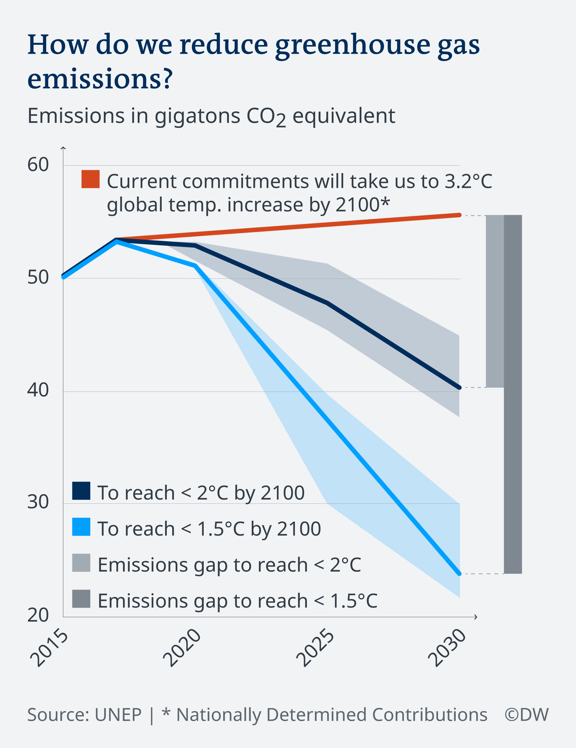
As an example of how IPCC figures might be simplified, one of our participants pointed to UNEP’s alternative for the first IPCC figure we tested (UNEP, 2019, fig 3.1). This UNEP figure was further simplified by Carbon Brief, a UK website that aims to create clear graphics to help improve the understanding of climate change (Fig. 2A vs. Figure 1A). We also found that the UNEP figure was simplified by climate journalists at the news organization Deutsche Welle (Fig. 2B). After presenting our findings and recommendations to IPCC authors, they revised their draft (Fig. 2C). This is the only one of the three draft figures we tested that ended up in the final version of the IPCC’s Working Group III Sixth Assessment Report’s Summary for Policymakers (IPCC 2023b).
A comparison to the IPCC’s draft figure (Fig. 1A) shows that the alternative figures (Fig. 2A-C) address most of the comments our participants gave in response to the draft figure, and our recommendations for how to address those (Table 2). Specifically, when comparing the IPCC’s draft figure with the simplified versions created by Carbon Brief, Deutsche Welle, and the IPCC itself (Fig. 1A vs. Fig. 2A-C), two differences stand out. First, each of the simplified figures appears less cluttered than the original IPCC draft, so that the key message is easier to see. There are fewer scenarios in the revisions by Deutsche Welle and IPCC, while the insets at target years were integrated in the figure by Carbon Brief, omitted from the version by Deutsche Welle, and presented separately in the revision by the IPCC (Fig. 2B-C). Second, unlike the IPCC’s original figure, the alternative figures used clear titles and labels to support the key message. The title of the IPCC’s draft figure (Fig. 1A) only referred to the presented variables without stating the key message: “GHG emissions trends and projections (2000–2050)” In contrast, the Carbon Brief title (Fig. 2A) explains: “Greenhouse emissions remain far off track for global climate goals” followed by labels stating: “Current policies and NDCs get the world nearly halfway from the baseline to the 2C trajectory”, “But a gap of 12 to 15 gtCO2e remains”, “And the gap is more than twice as large to reach the 1.5C trajectory.” The figure by Deutsche Welle (Fig. 2B) simplified it even further, with a title that asks “How do we reduce greenhouse gas emissions?” and a label that answers it: “Current commitments will take us to 3.2 ̊ C global temp increase by 2100.” The final version published by the IPCC also uses a more descriptive title “Projected global GHG emissions from NDCs announced prior to COP26 would make it likely that warming will exceed 1.5 ̊ C and also make it harder after 2030 to limit warming to below 2.0 ̊ C” (Fig. 2C). Moreover, five out of the eight figures in the summary for policymakers associated with the IPCC’s Working Group III Sixth Assessment Report used a title that states the key message (IPCC 2023b).
Of course, some caution is warranted when drawing conclusions about the usefulness of these simplified figures (Fig. 2A-C). While it is clear that the simplified figures follow the recommendations that emerged from our findings and are in line with best practices in graph design (Table 2; IPCC 2018), we have not user-tested these simplified figures with policymakers. Hence, we have no direct evidence that policymakers will find them easier to understand than the original IPCC figure.
3.5.3 Limitations
One limitation of this work is that interviews were conducted with policymakers and practitioners who were recruited through IPCC networks and volunteered to participate. It is likely that we did not reach policymakers and practitioners who would have been more critical of the presented figures. Moreover, other audiences of IPCC reports, such as members of the public worldwide (Pearce & Lindemer 2022) may not be as knowledgeable and positive as our interviewees. To understand these audiences’ needs, additional user-testing may need to be conducted (Morelli et al. 2021).
Additionally, our sample size was not sufficient to assess the prevalence of participants’ comments about the figures. Conducting 20 qualitative interviews is appropriate for identifying what policymakers and practitioners may have to say about IPCC figures, but follow-up surveys are needed to assess how many hold specific views (Bruine de Bruin and Bostrom 2013). Follow-up surveys could be used to investigate how specific views are associated with self-reports of using graphs in their work (Bruine de Bruin and Bostrom 2013).
A third limitation is that figures were presented in the same order. As a result, participants’ responses to the second or third figure may have been affected by fatigue, or learning from what they had previously seen.
3.5.4 Practical implications
The recommendations that emerged from our findings (Table 2) align with the best practices in graph design that are summarized in the IPCC’s (2018) visual style guide. Even though IPCC authors were presented with this 24-page visual style guide, their initial drafts of IPCC figures didn’t follow some of these best practices. To make best practices easier to use, we turned our recommendations into a one-page graph design checklist (Supplemental Materials), which we presented to the IPCC to inform their revisions of draft figures (Section 3.5.2).
As in Table 2, the recommendations in the graph design checklist focused on emphasizing a key message relevant to policymakers and removing unrelated details, creating a figure that is clear without reading the caption, and presenting a caption that includes the key message and explains each part of the figure. The graph design checklist additionally suggested the importance of user-testing draft figures, as we did for this paper (Bruine de Bruin and Bostrom 2013), and checking the graph design literature (e.g., Garcia-Retamero and Cokely 2017; Harold et al. 2016; Kause et al. 2020).
Adding our recommendations (Table 2) and our graph design checklist (Supplemental Materials) to the IPCC’s (2018) existing visual style guide or its next edition should be useful for the next round of IPCC reports, as well as for other organizations that communicate climate change information to policymakers. However, these materials alone may not be sufficient for scientists who have limited training in designing graphs for non-academic audiences (Dasgupta et al. 2015). In addition to making our materials available, the figure design process should include iterative consultations with members of the intended audience(s) from the start, guidance from multi-disciplinary experts in graph design, and strong commitment from the entire author team (Morelli et al. 2021). Such an approach to figure design should also be useful for creating climate change graphs for wider audiences.
Data availability
Anonymized interview transcripts are available from the first author upon request.
References
Barkemeyer R, Dessai S, Monge-Sanz B, Renzi BG, Napolitano G (2016) Linguistic analysis of IPCC summaries for policymakers and associated coverage. Nat Clim Chang 6:311–316. https://doi.org/10.1038/2Fnclimate2824
Bosetti V, Weber E, Berger L, Budescu DV, Liu N, Tavoni M (2017) COP21 climate negotiators’ response to climate model forecasts. Nat Clim Chang 7:185–190. https://doi.org/10.1038/nclimate3208
Bruine de Bruin W, Bostrom A (2013) Assessing what to address in science communication. Proc Natl Acad Sci 110:14062–14068. https://doi.org/10.1073/pnas.1212729110
Carbon Brief (2019) UNEP: 1.5C climate target 'slipping out of reach'. https://www.carbonbrief.org/unep-1-5c-climate-target-slipping-out-of-reach/
Cohen J (1960) A coefficient of agreement for nominal scales. Educ Psych Measurement 20:37–46. https://doi.org/10.1177/001316446002000104
Dasgupta A, Poco J, Wei Y, Cook R, Bertini E, Silva CT (2015) Bridging theory with practice: An exploratory study of visualization use and design for climate model comparison. IEEE Trans Vis Comput Graph 21:996–1014. https://doi.org/10.1109/TVCG.2015.2413774
Deutsche Welle (2020) German government, states agree on coal phaseout. https://static.dw.com/image/46471207_7.png
Fischer H, van den Broek KL, Ramisch K, Okan Y (2020) When IPCC graphs can foster or bias understanding: evidence among decision-makers from governmental and non-governmental institutions. Environ Res Lett 15:1–12. https://doi.org/10.1088/1748-9326/abbc3c
Franconeri SL, Padilla LM, Shah P, Zacks JM, Hullman J (2021) The science of visual data communication: What works. Psychol Psy Publ Int 3:110–161. https://doi.org/10.1177/2F15291006211051956
Garcia-Retamero R, Cokely E (2017) Designing visual aids that promote risk literacy: A systematic review of health research and evidence-based design heuristics. Hum Fact 59:582–627. https://doi.org/10.1177/0018720817690634
Harold J, Lorenzoni I, Coventry KR, Minns A. (2017) Enhancing the accessibility of climate change data visuals: Recommendations to the IPCC and guidance for researchers. Report published by the Tyndall Centre for Climate Change Research, Norwich, UK. https://tyndall.ac.uk/wp-content/uploads/2021/09/Data_Visuals_Guidance_Full_Report_0.pdf. Accessed 28 Feb 2024
Harold J, Lorenzoni I, Shipley TF, Conventry KR (2020) Communication of IPCC visuals: IPCC authors’ views and assessments of visual complexity. Clim Change 158:225–270
Harold J, Lorenzoni I, Shipley TF, Conventry KR (2016) Cognitive and psychological science insights to improve climate change data visualization. Nat Clim Change 6:1080–1089. https://doi.org/10.1038/2Fnclimate3162
Hegarty M (2011) The cognitive science of visual–spatial displays: implications for design. Top Cogn Sci 3:446–474. https://doi.org/10.1111/2Fj.1756-8765.2011.01150.x
IPCC (2018) IPCC Visual Style Guide for Authors. IPCC WGI Technical Support Unit. https://www.ipcc.ch/site/assets/uploads/2019/04/IPCC-visual-style-guide.pdf. Accessed 28 Feb 2024
IPCC (2023a) About the IPCC. https://www.ipcc.ch/about/
IPCC (2023b) IPCC Sixth Assessment Report: Mitigation of Climate Change. Downloads: Drafts and Review Materials. https://www.ipcc.ch/report/ar6/wg3/downloads/drafts-and-reviews/
Kause A, Bruine de Bruin W, Fung F, Taylor A, Lowe J (2020) Visualizations of projected rainfall change in the United Kingdom: An interview study about user perceptions. Sustainability 12:1–21. https://doi.org/10.3390/su12072955
Kim S, Lombardino LJ (2015) Comparing graphs and text: Effects of complexity and task. J of Eye Movement Res 8:1–17. https://doi.org/10.16910/jemr.8.3.2
Lynn J (2018) Communicating the IPCC: Challenges and opportunities. Handbook of Climate Change Communication. Springer. https://doi.org/10.1007/978-3-319-70479-1_8
McMahon R, Stauffacher M, Knutti R (2015) The unseen uncertainties in climate change: reviewing comprehension of an IPCC scenario graph. Clim Chang 133:141–154. https://doi.org/10.1007/2Fs10584-015-1473-4
Morgan MG, Fischhoff B, Bostrom A, Atman CJ (2002) Risk Communication: A Mental Models Approach. Cambridge University Press. https://doi.org/10.1017/CBO9780511814679
O’Neill S, Williams HTP, Kurz T, Wiersma B, Boykoff M (2015) Dominant frames in legacy and social media coverage of the IPCC Fifth Assessment Report. Nat Clim Change 5:380–385. https://doi.org/10.1038/nclimate2535
Pearce W, Lindemer A (2022) Communications. In: De Pryck K, Hulme M (Eds). A critical assessment of the Intergovernmental Panel on Climate Change. Cambridge University Press (244–252). https://doi.org/10.1017/9781009082099
Taylor AL, Dessai S, Bruine de Bruin W (2015) Communicating uncertainty in seasonal and interannual climate forecasts in Europe. Philos Trans Royal Soc A 373:1–16. https://doi.org/10.1098/rsta.2014.0454
Tufte E (1983) The Visual Display of Quantitative Information. Graphics Press
UNEP (2019) Emissions gap report 2019. United Nations Environment Programme. Fig 3.1. (p. 26). https://www.unep.org/resources/emissions-gap-report-2019
Acknowledgements
We thank Marwa Mohammad (USC) for coding the interviews, Justin Kenney and Fatimah Alyas (formerly UNF), and Renee van Diemen (Imperial College and IPCC) for commenting on earlier drafts. We also thank the Intergovernmental Panel on Climate Change (IPCC) Working Group III Technical Support Unit, Coordinating Lead Authors, and Lead Authors for engaging with the study and its findings. We thank participants of Carnegie Mellon University’s 2023 Doctoral Student Participatory Workshop on Climate and Energy Decision Making for their comments.
Funding
Open access funding provided by SCELC, Statewide California Electronic Library Consortium. We gratefully acknowledge funding from the United Nations Foundation. Bruine de Bruin was additionally supported by a gift from the Golden Belt Community Foundation, and a grant from the Center for Climate and Energy Decision Making (CEDM) through a cooperative agreement between the National Science Foundation and Carnegie Mellon University (SES-0949710).
Author information
Authors and Affiliations
Contributions
Bruine de Bruin designed the study and drafted the manuscript. Rabinovich conducted the interviews and led the coding. All authors contributed to manuscript revisions and approved of the submitted version. Note: Reported affiliations reflect authors’ current affiliations. Alix Kashdan and Monica Dean used to be at the United Nations Foundation. Sigourney Luz used to be at the Intergovernmental Panel for Climate Change (IPCC) and United Nations Foundation.
Corresponding author
Ethics declarations
Ethics approval
Obtained at University of Southern California (UP-21–00012).
Conflicts of interest
None.
Disclaimer
This paper is not a product of the Intergovernmental Panel on Climate Change (IPCC) and has not undergone the IPCC panel draft, review and approval process.
Additional information
Publisher's Note
Springer Nature remains neutral with regard to jurisdictional claims in published maps and institutional affiliations.
Supplementary Information
Below is the link to the electronic supplementary material.
Rights and permissions
Open Access This article is licensed under a Creative Commons Attribution 4.0 International License, which permits use, sharing, adaptation, distribution and reproduction in any medium or format, as long as you give appropriate credit to the original author(s) and the source, provide a link to the Creative Commons licence, and indicate if changes were made. The images or other third party material in this article are included in the article's Creative Commons licence, unless indicated otherwise in a credit line to the material. If material is not included in the article's Creative Commons licence and your intended use is not permitted by statutory regulation or exceeds the permitted use, you will need to obtain permission directly from the copyright holder. To view a copy of this licence, visit http://creativecommons.org/licenses/by/4.0/.
About this article

Cite this article
Bruine de Bruin, W., Rabinovich, L., Weber, K. et al. Improving figures for climate change communications: Insights from interviews with international policymakers and practitioners. Climatic Change 177, 57 (2024). https://doi.org/10.1007/s10584-024-03704-7
Received:
Accepted:
Published:
DOI: https://doi.org/10.1007/s10584-024-03704-7